Blog
Tuesday, March 29th, 2011
Personal perspectives
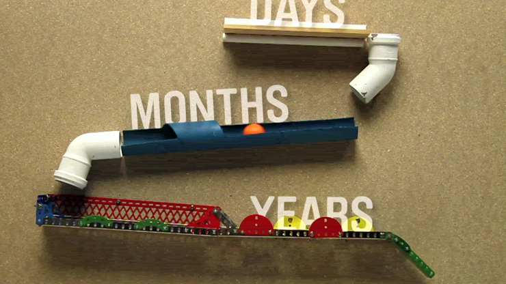
Here you can find the videos made by students for the last exercise of this year’s DensityDesign lab course. Enjoy!
Monday, February 28th, 2011
Digital methods for communication design
The results of the second exercise of the DensityDesign lab course are online!
Wednesday, February 23rd, 2011
The ‘how-to’ trend: Greenpeace + DensityDesign
In a time when everybody seems to consider themselves suitable in telling everybody ‘how to’ do something, how to visualize this, how to visualize that, we cannot be less.
But, guess what? We are so much more self-confident than our colleagues around the world that first we give you the evidence that our ‘how-to’ guide is useful, and then we’ll explain you the method.
We’re very proud to present you our contribution in the latest Greenpeace campaign against FADs and purse seining.
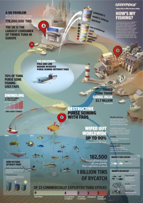
Click here for the article on greenpeace.org.uk and a higher resolution version.
In less than three weeks they already persuaded TESCO (which was the worst tuna fisher in Greenpeace target list) to change their fishing methods.
This list of UK ‘bad guys’ in tuna fishing is made by six: 5 more to persuade.
As we are the most self-confident ‘how-to’ visualizer of the planet, we are sure our work will carry on helping Greenpeace to persuade all the others bad fisher.
Make your bet and stay tuned for the real how-to. We’ll post it here the next few days and it’ll look like the one we did from Boston, when we were invited to present our Map of the Future at Northeastern University: if you missed it or you want to refresh your memory, here you are.
Thursday, February 17th, 2011
Six Stories about Uncertainty | Open Day 2011!
The lack of certainty is a distinctive feature of our contemporary society: the variable economic trends, the unstable work dynamics, the commodification of job and the environmental issues are only few agents of uncertainty.
This current condition is enhanced by uncertain knowledge of the phenomena listed above: is there such thing as the economic crisis? Is the environment really in danger? Are fixed-term contracts synonymous with precariousness or flexibility? Are public schools and university at risk?
This year students tried to answer these question and will present their findings in a open to public presentation (a party-like one!) at the Politecnico di Milano.
You’re invited to come and share this day with us!
24th February 2011, 11:30 AM
CT48 – Building N
Bovisa Campus
Politecnico di Milano
Via Durando 10, 20158 Milan

Wednesday, January 5th, 2011
Computer Arts interview
Today we publish an interview we made some time ago. Donato and I were asked about two projects (listed below) and, more generally, about our design approach and research laboratory. It appeared on Computer Arts Magazine, issue #141 and the interview was conducted by Julia Sagar, production editor for ‘Computer Arts Projects’.
Enjoy the read.
Oh and, by the way, happy new year to everyone, trusted followers.
read more…
Saturday, December 11th, 2010
DensityDesign is hiring!
DensityDesign is looking for a versatile developer with experience in data mining and interactive software prototyping to work on our research projects and tools development.
Check the opportunities section of our website to see the full collaboration description!
Friday, November 19th, 2010
Insecurity and its features
This year’s DensityDesign lab course at Politecnico di Milano focuses on the insecurity theme as a social dimension.
The lack of certainty is in fact a distinctive feature of our contemporary society: the variable economic trends, the unstable work dynamics, the commodification of job and the environmental issues are only few agents of uncertainty.
The educational purpose is to teach how to observe, understand and let others see what we have understood. The aim of the project is to facilitate policy makers and citizens in making more conscious decisions.
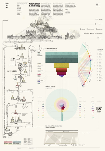
The first exercise of the course focused on the visualization of statistical data from official sources (e.g. ISTAT, the Italian National Institute of Statistics). The students (which were divided in groups and given a sub-theme each) had to both visualize this data and to create a system map which represents actor, relations and flows. You can see the results of their work on flickr!
Friday, October 29th, 2010
And, at last…
…the new site is finally online!
The old blog posts will be online as soon as we complete the mass import. Thank you for waiting!
Thursday, July 1st, 2010
Sankey Visualizations
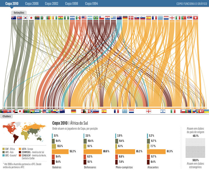
The brazilian news site Estadão.com.br created a sankey visualization that analyzes the composition of the national football teams partecipating the world cups from 1994 to 2010.
Thanks to this visualization it is possible to understand the import and export rates of each national team: it is in fact possible to relate the composition of the national teams with the ones of the clubs, divided by country.
Sankeys are indeed a great way to visualize flows and/or distribution: they are able to give back a general idea of the relative quantities of these flows.
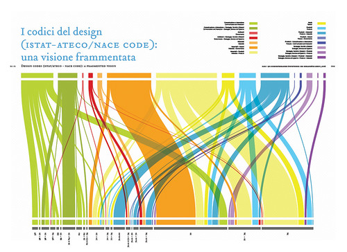
Back in 2008 we did a similar work for DRM, a publication about the state of design research in Italian universities and schools.
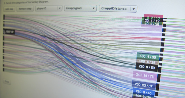
In this case it is only a matter of distribution, but in another project, done for Politecnico di Milano, we developed a visualization that represented students flows during their academic career.
In this way it is possible to analyze how students behave. Do they change specialization from the B.A. courses to the M.A.? What kind of marks do they get? Do they find internships in their same area of specialization?
We are now working on a flexible Sankey generator tool, capable of visualizing both distributions and flows. The project is still ongoing, more news are coming soon!
Sunday, June 27th, 2010
Mapping for Change
On July 6, 8 and 9 Map Fest takes place at Mediamatic. Map Fest brings together professionals, techies, amateur enthusiasts and artists, to explore, create, define and oppose maps.
We start with an evening on Mapping for Change with Wietske Maas, Christian Nold, Malkit Shoshan and Annelys de Vet.
It’s very good to see the increasing production of ‘subjective maps’: is cartography, after the digital era, seeking for new point of views, new dimensions to focus?
- Make 5 Sentences about Saying Disagreement
- Payment Agreement Sample Philippines
- Can Landlord Charge for New Tenancy Agreement
- Spirit Airlines Tax Receivable Agreement
- Ancillary Services Agreement
- Download Agreement by Shanko Rasheed
- Facebook User Agreement Photos
- Music Production Contracts Templates
- Do Contractors Do Financing
- Free Trade Agreement Russia
- Stock Purchase Agreement Good or Bad
- Terminating Employee Contract Early
- It Support Agreements
- Iran Nuclear Agreement Terms
- Rental Lease Agreement for Ct
- Tcode for Display Contract Status
- Contracts Manager Jobs in Bangalore
- Behavioral Health Contractors Association
- User Agreement in Arabic
- Rcuh Agreement for Services

