According to the article of Veronique Greenwood in SEED Magazine… more
Archive for the “Representation” Category
Complexity, Complication, Visualization and Interaction
Tuesday, March 24th, 2009321 Definitions of the word map
Sunday, February 1st, 2009Definitions of the word ‘map’, 1649-1996 compiled by J. H…. more
Jules & Jim
Friday, January 23rd, 2009Often love affairs are instable, fleeting and unpredictable. It seems… more
The traveller in the map
Monday, December 15th, 2008A close-up of the Earth Globe by Coronelli in which… more
Visual Literacy
Sunday, December 14th, 2008I read Kevin Kelly article on New York Times magazine and I found the concept of Visual Literacy very interesting. Even if our society it is getting aware of the importance of visual language for our contemporary communication, visual language need more research to get to the point of being totally accepted in artefacts where traditionally we use text.
Project progress report 02. Systemic approach and causal loop model
Tuesday, November 25th, 2008A causal loop model has been developed in order to help understand the complex systemic structure of poverty in all its dimension. System diagramming is here a loose term used to describe the activity of conceptually representing and visualizing a system in its constitutive elements: the elements, the relationships and the system boundary distinguishing what does and does not belong to the set.
The assumption of this qualitative exercise is that poverty, and its dimensions, are the result of the dynamics between a wide variety of factors from macro-politic, to the personal behavioral patterns.
The key element of the visualization are the factors and the variables. They are the environment attributes and characteristics that have an influence level of poverty.
How does a Murmur come to life?
Monday, November 10th, 2008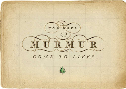
It all began last week, in a city of huge grace.
And wondering how cool would have been
to look around through the eyes of “Media Space”,
we found in a great workshop the solution within.
Murmur. Project Progress Report 01
Monday, November 10th, 2008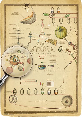
Murmur, originally uploaded by densitydesign.
After a week of cañas, tapas, fried food and heavy work this is the first result of the Visualizar’08 Workshop.
More specifically this is the wiki page of murmur
Project progress report 01. Economic statistic & Communication Design
Thursday, October 30th, 2008Economic statistic concerns understanding complex, multidimensional, ambiguous and dynamic phenomena building formal representations (models) based on statistical data. Communication Design addresses complex phenomena to interact with them building multi-dimensional visual representations based (in some cases) on statistical data.
The DensityDesign Lab approach, partially modified despite past editions, tries to foster this alliance in order to explore socio-economic phenomena that present both representational and visual problems. In fact they could be:
complex;
* multidimensional;
* dynamic and evolutionary;
* not numerically measurable if not qualitatively;
* ambiguous and fuzzy;
* not dichotomous;
* of great impact on people and society.
The goal is to contribute to the construction of representation and visualization model respecting and preserving the inner structure of the analyzed phenomena, allowing users to know (see) them as a whole. This is not primarily a design issue, but an epistemological one; the aspect of visual representation and communication is only one part of a bigger topic. The broader aim is helping in build a cognitive process that integrates and combines different disciplines and skills.
Numbers & Statistics, Biases & Emotions
Sunday, October 26th, 200827 August 2008
Michael Bond
http://www.newscientist.com/article/mg19926711.500-how-to-keep-your-head-in-scary-situations.html
This has led Slovic to suggest we need to imbue statistics with more emotional significance so that we take them to heart. “We learn how to deal with numbers from a young age as cold or abstract entities – to read them, add them, multiply them – but we don’t learn to think about how they represent reality in a way that conveys feeling and meaning. We need to think how to teach people to step away from their intuitive response, which is insensitive to magnitude, and think more carefully about what numbers represent.” […]
- Make 5 Sentences about Saying Disagreement
- Payment Agreement Sample Philippines
- Can Landlord Charge for New Tenancy Agreement
- Spirit Airlines Tax Receivable Agreement
- Ancillary Services Agreement
- Download Agreement by Shanko Rasheed
- Facebook User Agreement Photos
- Music Production Contracts Templates
- Do Contractors Do Financing
- Free Trade Agreement Russia
- Stock Purchase Agreement Good or Bad
- Terminating Employee Contract Early
- It Support Agreements
- Iran Nuclear Agreement Terms
- Rental Lease Agreement for Ct
- Tcode for Display Contract Status
- Contracts Manager Jobs in Bangalore
- Behavioral Health Contractors Association
- User Agreement in Arabic
- Rcuh Agreement for Services