Blog
Saturday, April 27th, 2013
Behind the scenes: visualizing debates on Wikipedia
How consensus on wikipedia is reached? During the 2013 DensityDesign course, a group of students was analyzing the different positions on the abortion as family planning method.
To identify how persons with different positions interact, part of their work focused on the italian Wikipedia page “Dibattito sull’Aborto” (Abortion Debate). Wikipedia, in fact, is a place where knowledge is built through the collaboration of several contributors that don’t necessarily share the same point of view: the results are neutral contents built with negotiation.
The video below was part of the final keynote to present their project, “Unborn discussion“, and is the animated synthesis of the visual report they’ve produced.
We found really effective the way our students analyzed and presented it, so we asked them to explain the design process they used both to analyse and to visualize it.
The project has been realized by Alberto Barone, Maria Luisa Bertazzoni, Martina Elisa Cecchi, Elisabetta Ghezzi and Alberto Grammatico.
Observation and confusion – First phase
Searching through the page changes in Wikipedia chronology, the whole pool of changes has been obtained and taken in account for the processing phase. The first step consisted in excluding the ones made by wiki-bots, the spelling corrections and the format changes as they did not bring any meaning alteration to the page, thus obtaining 147 relevant changes out of the former 289. These changes were already divided by year, month, day, hour, number of bytes (added or removed) and author. Then the changes with a high number of bytes added or removed and the principal authors of the changes have been investigated. The first striking observation was that these big changes were not characterized by the presence of other related changes in the previous or following days, and that their authors were seldom the same. Furthermore, the different authors of these big changes weren’t contributing from the birth of the page: it become clear soon that focusing the attention on a single author or a single change was not the right strategy to find a way through this maze.
Img. 01 First bar chart of edits in time
Understanding and creating a method – Second phase
Interestingly, in the first three years of the page, from 2006 to 2008, there were more edits and more high bytes changes in comparison to the other years: the focus of the analysis shifted then from the author of the edit, to the discrete number of edits and its size in bytes. The first part of the page analyzed in this way was the page index. Since the page was started, the index has been modified four times: the first three times, only some paragraphs were removed or changed, but the fourth time, instead, it was completely rearranged. The best way to analyze the page changes was then concentrating on single paragraph and comparing through time its edits and orientation. Following this method it was easier for us to compare the edits made in the same paragraph, to see which word or sentences were changed and how it changes the orientation of the page. Page changes orientation had been classified as: pro life, neutral/pro life, neutral, neutral/pro choice, pro choice, accordingly to the meaning the changes gave to the remaining text. After having established the procedure, every paragraph from 2006 to 2012 has been rated and analyzed in this same way. This method revealed that high number of bytes changes, as for example a whole paragraph editing, happened mostly as a result of a debate gathering in the end on a version shared by the community. Concerning small size edits, it was evident a lot of continuos adding and removal of low amount of bytes: these are called “edits’ war”, mirror of the diversity of the points of view. The interesting point was that often this “edits’ war” was made by highly oriented changes, but its result was frequently a neutral final edit: this confirms the nature of negotiated development that we hypothesized as a basis of Wikipedia pages growth.
The last phenomenon that was possible to observe was something beyond the edits and “edits’ war”: the spoiling attitude of some users in adding off-topic comments and insults.
Img. 02 Excel tables of paragraphs categorizations
Visualizing the wikipedia processing – Third phase
Img. 03 Sketches of the visualizations
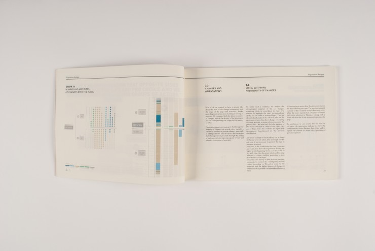
The first visualization wants to give general idea about the state of the changes orientation from the origin of the page until nowadays. We compared both the discrete number of changes and the corresponding size of bytes as they add or delete contents. From this comparison it appeared that though the majority of changes was neutral, there was also a consistent number of oriented changes, especially, adding contents in a neutral/pro life and pro life orientation. That led us to the conviction that the negotiation proceeds through the adding of partisan contents imposing a point of view and a further restoration of neutrality.
Img. 04 Numbers and bytes of changes over the years
The second visualization starts with the awareness of the importance of the chronological sequence of the 147 changes: the result was a simple a bar chart composed by time on the x axis and amount of positive or negative bytes on the y axis all with the orientation classification.
More over the time expansion and restriction shows that the negotiation density was higher from 2006 to 2008: with time the discussion faded and the page achieved a certain stability, proposing a more shared and neutral vision of the topic.
The comprehension is guided by a line that goes up and down through the edits and “edits’ war”: this idea comes from the continuos adding and removing of the same bytes as a kind of tennis match. We also decided to analyze contemporary historical events related to the theme of abortion; interestingly we noticed that the discussion on the Wikipedia page rises in the days following some relevant abortion-related events, as comments on the topic from prominent persons (belonging to the Church or to different organizations) or news.
Img. 05 Changes in time and correspondence with topic-releted events
Then another visualization has been realized as part of the one described before in order to explain in details what words or sentences in particular were added or removed and their orientation.
Img. 06 Zoom in some interesting edit wars
The last visualization concerns the relationship between the orientation of the changes and the typology of the users undertaking them. The result is a pie chart that shows that the registered members of Wikipedia mostly changes the page in a neutral way. On the other hand, the unregistered users identified with IP, have proportionally made more pro life or neutral/pro life oriented modifications
Img. 07 Changes by authors
Wednesday, April 24th, 2013
Visualizing the School of Design
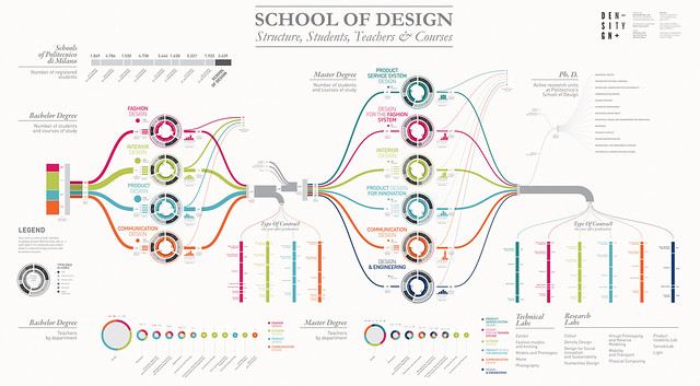
Politecnico di Milano, in order to present the School of Design in its own stand at Salone del Mobile 2013, asked DensityDesign to realize a 4 mt x 2 mt poster showing the structure and the efficiency of the School of Design system at Politecnico. The visualization is a picture of the 2010 / 2011 academic year. We began with the visualization of the figures related to students.
On the left side you can start following the students path from the admission test to their bachelor degree, which is connected to data related to the type of contract one year after graduation (data referred to a 2010 survey).
We decided to integrate the visualization with informations realted to credits distribution. Every circle is a course of study and shows its typology of exams (theorical curses, labs, etc…) with related C.F.U. (university course credits). Inside it is shown the average of earned credits by students every year. In the right side you can see the same data related to master degree.
We also visualized how many teachers each department gives to the school of design.
The poster has been completed with informations about Ph.Ds, technical and research labs and the number of students for each school of Politecnico.
The poster was realized in one week by Gabriele Calvi and Sara De Donno with the supervision of Michele Mauri.
Saturday, April 20th, 2013
Information Visualization on the Move. A Brief and Initial Overview
As new symbionts, tablet devices are part of our life by now. We are researching on data visualization and interaction on these devices and focusing on actual and future perspectives for dataviz.
Looking for mobile applications that convey information in a visual way, we found different tools for different purposes:
- Reference: applications that visualize data as tools for share knowledge about specific topics as well as encyclopedic information.
- Business: tools that allow users to visualize and control dynamics of data (mainly financial).
- Entertainment: applications created for show, group, share or collect information about music, sports, movies or social networks.
We noticed that reference and entertainment applications are more experimental than business apps, trying to take advantage from the specific types of interaction allowed by the device.
We present here a first selection of examples of these applications, grouped by the three main purposes. The short description highlights what kind of visualization and interaction are used for each app. Some of the cases already suggest novel forms of interaction and approaches, but certainly there is room for improvement and for opening new research lines.
REFERENCE:
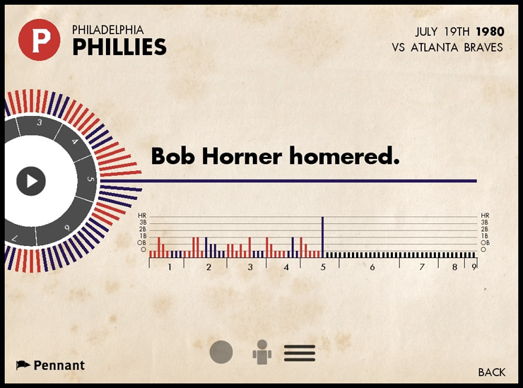
Storytelling for baseball stats: Pennant by Steve Varga
Pennant is an interactive history of baseball available for the iPad. Pennant’s interface allows fans to browse and view data from over 115,000 games that have taken place from 1950 to 2010. Seasons, games and events are graphically represented and visualised in a manner that takes them beyond the numbers. The app consists of two main parts, the application itself that lives on the ipad, and the data, which exists on external servers.
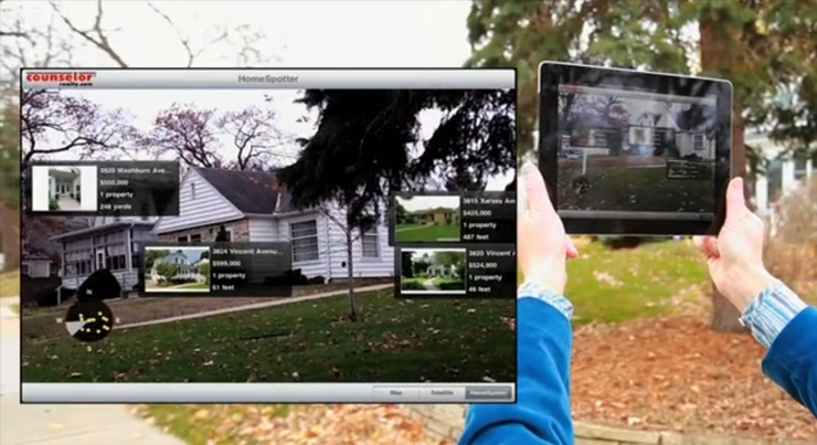
Augmented reality: Homespotter by Mobile Realty Apps
HomeSpotter uses augmented reality coupled with a smartphone or tablet’s GPS and compass to overlay property information on a device’s live camera feed. As a home hunter points their smartphone or tablet down the street, they see a view of the street and info on all the houses for sale pops up. There’s even a radar display that show the direction and proximity of nearby properties for sale.
BUSINESS:
Visualize, interact with, and share data: Spotfire by Tibco
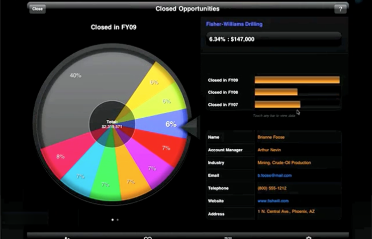
The Spotfire App extends the reach of Spotfire analytics to anyone with an iPad. You can visualize, aggregate, filter, and drill into data sets of virtually any size, so you can spot opportunities and risks buried in the data.
Analysis dashboard: Roambi by MeLLmo
Roambi Analytics turns data and business reports in visualizations. The application includes reports for mobile systems that allow to touch a scroll informations on the animated display.
ENTERTAINMENT:
Collecting real time data: AntiMap by Trent Brooks
Using accelerometer and compass sensors, Antimap allows to collect and create own data. The application visualize real time information about speed, rotation and inclination using a dashboard style infoviz.
Exploration into Open Movie Database: Solyaris by Beat Raess
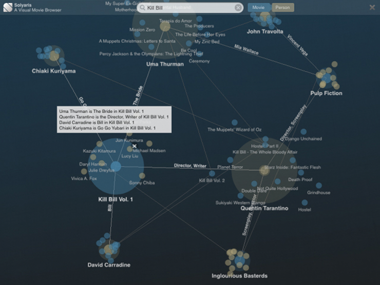
Solyaris is an “exploration into organic information design to visualise movies, actors, directors and their relationship”. The application for iPad made in Cinder allows you to search the entire Open Movie Database (TMDb) collection for movies, actors or directors. Expand nodes to gather information about their connections. Learn about the cast and filmography.
Explore your music collection: Planetary by Bloom Studio
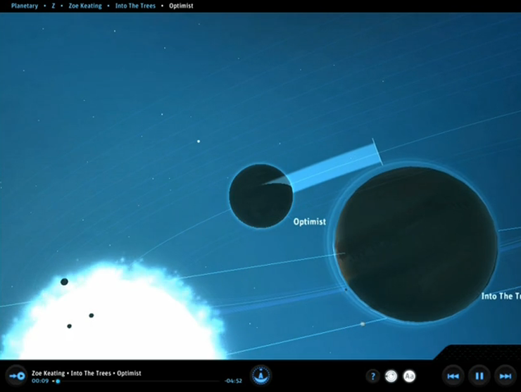
Created using Cinder framework, allows to navigate dynamically through informations about recording artists. Every star in Planetary represents an artist from your music library. Albums are planets, they orbit around their artist star. The planet surface is derived from the album cover art. No two planets are the same. Tracks are moons, they orbit at a speed based on the length of the track. The size of the moon is based on the play count. Artist are filtered by Letter to create a constellation of highlighted stars.
Friday, April 12th, 2013
Whatever the weather
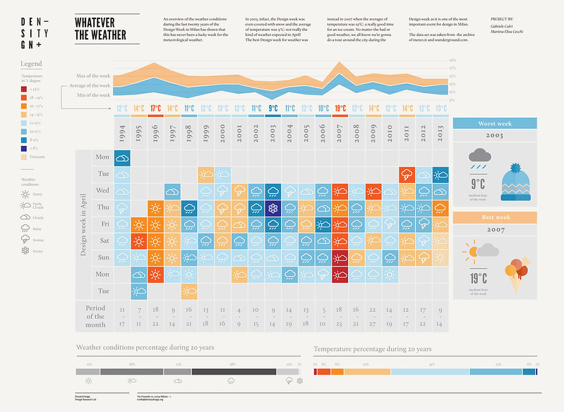
An overview of the weather conditions during the last twenty years of the Design Week in Milan has shown that this has never been a lucky week for the meteorological weather. In 2003, infact, the Design week was even covered with snow and the average of temperature was 9°C: not really the kind of weather expected in April! The best Design week for weather was instead in 2007 when the average of temperature was 19°C: a really good time for an ice-cream. No matter the bad or good weather, we all know we’re gonna do a tour around the city during the Design week as it is one of the most important events for design in Milan.
Infographic made by Martina Elisa Cecchi & Gabriele Calvi
Monday, February 18th, 2013
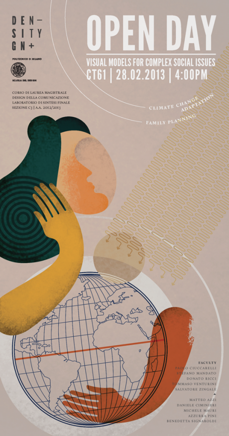
Visualizing Controversies on Climate Change Adaptation
and Family Planning / OpenDay 2013
Friday, December 21st, 2012
Exhibit your Interactive Data Visualization!
In the framework of our researches, we are focusing on interactive data visualizations, particularly on installations during exhibitions or special events. These sort of artifacts indeed offer a simple but effective way to make complex data understandable to as many people.
We’d like to share with you a selection of examples from 2004 on, among which you can find maps, interfaces activated by humans and real-time representations.
Floating.numbers (2004, Art+com studio)
Numbers are commonly seen as quantitative measures of entities. Depending on the context however, they often also have religious, historical, mathematical and philosophical meanings. Floating.numbers attempts to bring back this often forgotten or unknown layer of meaning into their interpretation in the age of digital determinism.
Documenta mobil (2005, ART+COM)
The largest art exhibition in the world went on tour in a 15 meters long truck as part of Kassel’s application to become the Cultural Capital of Europe in 2010 and to celebrate its 50th anniversary. Inside the truck in front of the original posters from the eleven documenta exhibitions so far is an 11 meters long interactive table installation.
Tech Stuff ( 2007, ToDo)
For the launch of the book+DVD Tech Stuff (a documentary made of episodes about techniques, artists and bizarre instruments that made the history of electronic music), ToDo was asked to transform the project into an interactive preview able to convey the identity of QOOB and ISBN Edition and through instant interaction and fun. To build a strong bond with the corporate images of QOOB and ISBN, they developed a concept of interaction based on cubic cardboard and barcode: 9 different types of cubes (one per subject) and an adhesive- barcode on each side of the cube.
Users could then explore the contents of a particular topic, one at a time by placing the 6 faces of the cube on a workstation equipped with a barcode reader, while a second location was possible to ‘tune’ with a simple potentiometer on several samples related audio.
Highly Adaptable (2008, Zum Kuckuck)
At the “Product Experience Center” of the Deutsche Telekom in Darmstadt, Germany, one can experience the productivity of the company’s network infrastructure through the visualization of data streams. Processing analyzes the international data interchange as well as the network traffic in real time, and reproduces it three-dimensionally, creating a cinematic sequence on a large size plasma screen, prominently placed in the room.
mæve (2008, University of Applied Sciences Potsdam)
The interactive installation “mæve” (MACE-Everyville) provides visual and tangible access to the social and intellectual networks behind architectural projects. The installation was part of the 11th International Architecture Exhibition of the Venice Biennale. mæve connects the entries of the Everyville student competition and puts them into the larger context of MACE content and metadata. By placing physical project cards on an interactive surface, users can explore the presented projects, embedded in an organic network of associated projects, people and media.
Interactive city map of Berlin (2009, ART+COM)
Within the scope of the image campaign “be Berlin”, the Berlin Senate Chancellery commissioned ART+COM to create a central installation for the town hall lobby. ART+COM developed an extensive interactive media table, on which visitors can playfully click through the city. The Berlin-shaped, four-square-metre table surface shows a satellite map of the city that displays information on history, interesting places and Berlin cultural sites. In addition to the sights, one can also find life stories about the ambassadors of the campaign.
Pro Aurum Interactive Lobby (2009, Envis Precisely)
Gold vendor Pro Aurum commissioned this visualization for the opening of the headquarters in Monaco It is a permanent exhibition taking place in their foyer and shows data about gold production, trade and about the company itself in a series of interactive animated graphs. All graphics are composed of little golden particles that flock together in order to form shapes, graphics and text. The user can toggle between various visualizations which are shown on a 3×3 monitor matrix using a touchscreen terminal.
London Design Museum Installation (2009, Chris Boardman)
Chris Boardman installation featured as part of the Super Contemporary exhibition, and illustrated the history of the digital industry across London from 1994 through to 2007.
He developed a dynamically-driven, physically-interactive timeline that allowed to collate agency data and then just drop it into the app as XML at runtime. The public were able to control the timeline using a little round knob attached to the wall underneath a plasma display.
Salt worldwide (2010, ART+COM)
The German Salt Museum in Luneburg updated its exhibition with an interactive installation, entitled “Salt Worldwide”. It vividly tells the story of the salt around the world by simulating a virtual world made out of salt: there are 34 touch sensitive salt crystals spreading over the map highlighting salt concentrated areas in the world. When touched the crystals start to glow and from underneath the crystal grains of salt pour over the table and merge into an information window, which displays details of the chosen salt mine through text, images and movies.
Agenda Italia 2020 (2011, ToDo)
In the framework of Stazione Futuro, ToDo did also Agenda Italia 2020, which showed a flow of data and statistics on the actual italian situation (education, job market, public health, elderly people, internet revolution and energetic strategies) and generated a choreography of LED-texts lightly dancing on dark and elegant steles. Not much interactivity, but still an interesting experimentation.
Stazione Futuro (2011, ToDo)
Stazione Futuro was an exhibition for the 150th anniversary of the Italian state. It celebrated the best in Italian creativity and innovation, focusing on the pivots of change in the next 10 years: energy, environment, recycling, chemistry, textiles, mobility, home, food, communication, work, robotics, space.
ToDo agency made an interactive map of future food, allowing to explore slow-food districts scatterd all over the country, including regional specialties. Also, there were other informative tables and severals graphic to tell the prospects offered by endless small concrete initiatives.
Streamflow (2011, Elvis Precisely)
Streamflow is a permanent installation at the Deutsches Museum in Munich. It represents AMGEN, the world’s largest biotech company, which is a sponsor of the museum.
The installation shows a flow of data about the company, text and images move along a stream of light that spans over four screens. You can interact with the data by accelerating and decelerating the flow; to do so, just move your hands along the surface.
Max Planck Research Network (2011, Moritz Stefaner)
This multi-touch installation reveals how Max Planck Institutes collaborate with each other, and with their international partners. Stefaner analysed data from SciVerse Scopus for over 94,000 publications over the last ten years. A dynamic network provides a high-level map of the Max Planck Institutes and their connections; the size of the institute icons represents the number of scientific publications, and the width of the connecting lines the number of jointly published papers between two institutes.
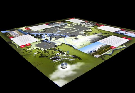
Interactive map at the Hamburg History Museum (2012, ART+COM)
The touch-sensitive installation is the central element of the section The Harbour – A Key Stimulus at Hamburg History Museum. It’s a 3.5 metre square table interactive table that allows visitors to undertake an interactive journey through time and space, exploring the development of the city from the Middle Ages through to the present day. Visitors use a mechanical time wheel to navigate their way through eleven epochs and discover how the structure of the city and the landscape were transformed over time. In each period the most important urban changes and incisive historical events are highlighted.
Prism (2012, Keiichi Matsuda)
Inside the cupola of the Victoria & Albert museum for the London Design Festival, data streams from all over the city were visualised on the faceted surfaces of Japanese/British designer Keiichi Matsuda’s installation. The Prism installation took live information including wind speed, air pollution levels, traffic updates, the number of cycle-hire bicycles currently in use and even the energy consumption of the prime minister’s residence, then represented it with graphic patterns to create a “live patchwork of London”.
Emoto (2012, Nand Studio)
Based on approx. 12.5 million Twitter messages which were aggregated in real-time, Emoto captured trending topics and how they were discussed online in an interactive visualisation which was running live in parallel to the Olympic Games in July and August 2012. Each Tweet was annotated with a sentiment score by the project’s infrastructure using software provided by Lexalytics. This data formed the basis for an extensive profiling of London2012 which was finally documented in this interactive installation and physical data sculpture at the WE PLAY closing exhibition of the Cultural Olympiad in the Northwest.
Porto Maravilha exhibition (2012, Super Uber)
As part of the interventions surrounding the renovation of Rio de Janeiro’s Port area, SuperUber was invited to create the interactive multimedia exhibition allowing the public to explore the new urban project of the Port area. Called “My Porto Maravilha”, the exhibition is divided into three moments: Yesterday, Today, and Tomorrow, with installations integrating the architecture, technology, design, and content created in partnership with Concessionária Porto Novo, Comunicação Mais, Arte 3 e Tecnopop.
Monday, October 22nd, 2012
Visualizing right-wing populism in Europe
The URLs of the populist right, the extreme right and the populist and extreme right together are crawled. Co-link analysis is performed (with privileged starting points), whereby those websites which receive at least one link are retained in the network. Each of the networks is visualized as a cluster graph (according to measures of inlink centrality), and the findings are described. First, are there other (heretofore) undiscovered groups found through the link analysis? Second, where are the sites registered and hosted? Is the network more local, national, regional or international? Third, what types of websites are there, such as home pages, blogs, social media, etc.? Do they have Facebook groups (with how many members) and pages (with how many likes and talk-abouts)? If they use Twitter, do they use it to broadcast (only to their followers), or do they use it as a two-way communications medium? Are the websites fresh and are they particularly active? Apart from the ‘technical’ characteristics of the websites in the networks, we are interested in the groups’ activities, especially in their outreach, forms of communication as well as recruitment. Do they have radio stations? Is there an active music scene? Where does one go in order to participate in the scene?
Finally, we are also interested in the counter measures, the initiatives that seek to address the rise of the populist right and the activities of the extreme right. While this analysis is less extensive than that of the right itself, we are particularly interested in the ‘match’ between the right’s activities and those of the counter-measures.
Tuesday, October 16th, 2012
2012 Visualizing Global Marathon

From November 9-11, students around the world will immerse themselves in the field of data visualization, catch workshops and presentations from data visualization experts, connect with students from different cities, and collectively work to solve some of the world’s most complex issues. Students can participate virtually or at one of the hosted meetups, and visualizing.org will be awarding more than $10,000 in prizes.
Groups of students from the Communication Design Program at Politecnico di Milano and friends from the Bolzano School of Art and Design are already registered at the meetup hosted by Politecnico. Join us!!!
- Friday, 9 16:00 – 22:00 Local Time (15:00 – 21:00 UTC)
- Saturday, 10 09:30 – 21:00 Local Time (8:30 – 20:00 UTC)
- Sunday, 11 09:30 – 21:00 Local Time (8:30 – 20:00 UTC)
Registration is on a first-come, first-served basis (open until the venue reaches capacity).
At the meetup, you’ll have a stimulating and fun space to work, interact, and plug-in to the event as it occurs on Visualizing. You’ll need to bring:
- Your computer and charger
- Snacks (meals will not be provided)
- Your valid school ID
Here you can download the “Survival Kit” – everything you need to know about Global Marathon.
Monday, October 15th, 2012
DensityDesign Course 2013 / Tell a story about Milano

Our course at Politecnico di Milano started last Monday, and students are already working hard.
As first exercise, they were asked to visualize a story about Milano, using the new Open Data website www.dati.comune.milano.it
It has been a flash 48-hours exercise, have a look to results here!
Comments and critics are, as always, welcome.
Tuesday, September 11th, 2012
Process Visualization Workshop
On September 3rd I attended the first International Workshop on Theory and Applications of Process Visualization (TAProViz). The workshop took place in Tallinn, Estonia, within the 10th International Conference on Business Process Management (BPM2012).
The workshop was organized by professors Ross Brown (University of Queensland), Simone Kriglstein and Stefanie Rinderle (University of Vienna).
The workshop constituted also an attempt of the organizers to create a scientific community around the topic of business process visualization: a fairly new research area emerging from Business Process Modeling which is intended to explore new possible approaches and representation models for business process data.
Although the topic has already been part of the BPM research for several years, most process representations have not developed beyond minimal and standardized workflow diagrams, and just lately scholars are discussing the opportunity to introduce principles and techniques typical of information visualization and user interface design.
The workshop was introduced by a keynote by professor Manfred Reichert, who made a point about the increasing amount of process data produced by organizations and brought out the importance of introducing visualization elements to help the users make sense and interact with data.
Many software tools exist on the market to analyze and visualize business process data, nevertheless most of the research community revolves just around disciplines such as computer science and management. Therefore most of the research on the topic so far applies to the standardization of notation languages (such as OMG’s UML), in order to facilitate the development phase.
Hence the exploration of new visualization patterns has not really brought into question. Even if process visualization strongly relates to information visualization and more specifically to communication design, there seem to be no concrete involvement of the design discipline (this also proved by the fact that I was the only designer of the workshop, and probably of the entire conference).
Interesting explorations emerged though from the workshop, particularly from a couple of speeches by Jan Claes (Ghent University) and professor Kazuo Misue (University of Tsukuba). The first one presented a sort of meta-tool for process analysis, which is devoted to examine the way in which business processes are designed, through event logs used as input for PPMCharts (that is charts that describe graphically the process of process modeling).
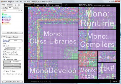
Professor Misue’s speech had an even more designerly vocation, even if starting from a computer science – visual analytics approach. The paper suggest the importance of information visualization techniques to explore activities in large-scale organizations and introduces a panoramic view tool. The analysis tool called SaaG (Series at a Glance) permits the exploration of tasks (here defined as “tickets”) through both a hierarchical and temporal representation. The main view is constituted by a treemap showing the ticket groups structure and a timeline within each ticket (represented by cells) expressed internally through Gantt or Polyline charts.
Despite the absence of an actual design community, the workshop provided several stimuli that revealed to be very useful and productive also for the design discipline.
- Make 5 Sentences about Saying Disagreement
- Payment Agreement Sample Philippines
- Can Landlord Charge for New Tenancy Agreement
- Spirit Airlines Tax Receivable Agreement
- Ancillary Services Agreement
- Download Agreement by Shanko Rasheed
- Facebook User Agreement Photos
- Music Production Contracts Templates
- Do Contractors Do Financing
- Free Trade Agreement Russia
- Stock Purchase Agreement Good or Bad
- Terminating Employee Contract Early
- It Support Agreements
- Iran Nuclear Agreement Terms
- Rental Lease Agreement for Ct
- Tcode for Display Contract Status
- Contracts Manager Jobs in Bangalore
- Behavioral Health Contractors Association
- User Agreement in Arabic
- Rcuh Agreement for Services


