Blog
Friday, February 21st, 2014
Contropedia: 1st Hackathon results

Last week, during an hackathon in Amsterdam, we realized the first working prototype of Contropedia Platform, an application meant for the real-time analysis and visualization of controversies in Wikipedia.
It has been a great experience thanks to the interesting mix of different expertise.
Giovanni and me worked together Médialab (Sciences-Po), Digital Methods Initiative (UvA) and Barcelona Media researchers to realize this early prototype.
Hackathon goal was to refine and correlate some metrics previously identified by Barcelona Media and DMI, and to provide a static visualization of each metrics. We’re quite proud to have overcome that goal realizing a working prototype at the end of the week.
Still, lot of work has to be done, but here you can find some preview of the visualization and a brief description of the design process.
Results
Let’s start with results. Below you can see a static mockup of the application (ASAP the working prototype will be available on the project website).
Up to now we have two visualizations groups: the first one is meant for the exploration of controversial elements within the Wikipedia page. The second one is a more analytical exploration of such elements, giving details on involved users and the revisions list for each element.
Preliminary Work
Before the hackathon, each institution prepared some preliminary work.
Médialab, with its expertise in controversy mapping, prepared a user profile and some use scenarios for the platform, defining the application goals.
DMI was already working on the identification of most edited (and therefore controversial) items in the page.
DensityDesign already worked on the visualization of such items, and provided a brief description of all the available variables.
Barcelona Media brought the study of reply chains on discussion pages.
User scenario
Synthetizing the long document prepared by Médialab, the user is:
- A person that sometimes uses Wikipedia as information source
- Want to know something more about the debate (without having any prior hypothesis about that)
- Knows roughly how Wikipedia works (ability to edit, existence of talk pages).
- Finds the actual structure too fragmented to have a global idea of
The document presents, in form of discourse, user needs. Here is the list of main ones:
- What is controversial in a Wikipedia page?
- How much a given part discussed?
- How many people are discussing it?
- Which are the most debated sections?
- How much the linked pages are controverted?
- How many controverted pages exist about the topic?
- Who are the main actors (see Actor-Network Theory)?
- What is an actor on Wikipedia?
- How the controversiality changes over time?
- Does the debate move among languages?
- What is the temporal trajectory of controversiality?
Metrics
At the hackathon beginning some useful metrics were already identified.
The first one is about the controversial elements within a page. For each wiki-link, image and external link in the page, edits are counted and normalized on each edit size.
It is then possible to evaluate the controversiality level of each element through time, as some of them have been deleted from latest page revision.
The second one is about discussions. Wikipedia talk pages have a tree-structure, and analysing the tree depth, its width (number of branches) and the amount of users is possible to define its controversiality.
There is no explicit link between threads and the page, even if reading them is possible to identify which part of the page they are talking about.
It is also possible to extract the revert network between users: each time that a user reverts another user edit; the link between them is reinforced.
Finally it is possible to define a users network starting from threads: each time a user replies to another, the link between them is reinforced.
Working groups
We divided into three main groups, with different tasks:
- The identification of links between threads and page sections (what section is the most debated?)
- The identification of groups of users starting from threads and reverts network. In both networks indeed link represents opposition between users. Common metrics are based on the opposite paradigm (a link means agreement or at least proximity).
- The identification of a visual layout able to enrich Wikipedia page with the new metrics.
Data objects
Starting from the given description from DMI and Barcelona Media researcher, we draw a first schema of possible data objects we could use.
This kind of schema was useful to identify on which objects we want to focus, and the objects hierarchy.
Some objects were already known: the page itself, the user, the single discussion thread, the page items (links, images, templates).
Some other not: is there a middle element between the whole page and the single item?
Some others were conceptual issues. In particular, what is an “actor” on a Wikipedia page?
Design challenges
The project presented several challenges for the design. At the sprint beginning we were aware of three main kind of analysis (thread chains, controversial elements, revert networks) that were able to cover just part of user requirements.
While knowing how the analysis was performed, no data sample was already available.
Some words used in user description were ambiguous: when talking about controversial topic, how to define a topic on Wikipedia? Is it a single page? Is it a group of page? If the latter, how to define which pages describe a topic? And again, when talking about involved actors (Latour), what is an actor on Wikipedia? How to extract this information?
Without knowing how these entities would have been modelled as data objects, for us was difficult to imagine how to visualize it.
Mockup evolution
As there were lost of open questions, instead of trying to create one coherent application we rather decided to create the most suitable visualization for each kind of analysis. The goal was to use the visualization to understand each analysis relevance and how to combine them in a single app.
We started working on a prototype created by DMI on the ‘Climate change‘ wikipedia page. It was the original page with controversial elements marked with different colours according to controversiality level.

We already worked on that kind of data for another project (EMAPS). So we started from that for the new mockup.

The idea was to keep the page layout with marked words but adding some features. As in the user description is asked to provide an overall view on the page, we decided to insert a minified version of the page, sometimes used in text-editing software like Sublime Text.

In the first static mockup of the page, the minified version was a fixed column on the right representing the whole page.
Working with the real data, we identified that most of the controversial items have a very low value of controversiality. To make them simple to identify, we choose a color scale moving between two colours instead that using different opacities.

As controversiality should be the first information, we choose to remove any other colour from the page, including images. Also we decided to use dark grey instead of black as text colour, to empathise controversial elements.
Creating a minified version of the page arose the need to fine an element in the middle between controversial items and the whole page. Empirically, page sections seemed the best solution: the number of section per page is not too high, their size don’t vary too much – Wikipedia guidelines recommend to avoid too short or too long sections – and each section can be seen as minimum thematic element.

Drawing it we found that sections were also useful to link other information, like related discussion threads. To make even more simple for user to identify where controversy is, we suggested to identify a measure for the overall controversiality of each section. Below, the first mockup:

Using real data on coming from Wikipedia become clear that was not possible to use screen height as scale for the whole page.

We also realized that if the first interaction of the user is with the minified version, it was not useful to show the full text.
We focused on the minified version of the page, imaging a ‘folded’ interaction where in each section user can switch between the visualization and the full text.
To quickly create a mockup, we decided to just hack CSS, using the Block Font to replace words. It worked better than we thought. Having an (almost) working prototype was really useful to identify possible issue with visualization and correcting them.

working with CSS was useful also to quickly switch between the minified and extended version of the page

From beginning, we decided to insert a timeline-bar chart as first visualization representing the overall activity on the page (to be chosen between number of edits, number of active users, number of reverts). User, interacting with the timeline, can choose the temporal period he wants to explore.
Reflecting with the other researchers we understood that temporal evolution is not just about wich revision to show, but also to define on which period analyze the controversy. The same item could have a different controversiality in different times.

Timline become the tool to select a time span, controversial level indicators will be computed on that period.
Meanwhile, Barcelona Media and Sciences-Po found a way to join discussion threads to page sections. We decided to insert also that information in the main visualization – representing them as coloured dots, each one representing a single discussion and its controversiality.
User can open the discussion panel and see a detailed description of threads.
At the time, was difficult to identify what kind of details we had to show – as the analysis was on-going.
One solution was to show the full-text thread in the same page. The risk was to create something too rich (and complex).

In their original publication, Barcelona Media researchers analyzed the full discussion as a tree, visualizing with a tree structure. Below, an image taken from the presentation:

Since threads have a tree structure, are studied as tree structure, and have been previously visualized as tree structure, the ‘duck test‘ persuaded us to represent them as trees.
Also, D3.js has a nice function to do that.
With this visualization it is possible for user to understand some discussion dynamics. Colour shows thread controversiality. Each visualization is a link to the full thread on discussion page.

With the described interface big part of the user needs were addressed. Still it was difficult to see elements controversial in the past but then deleted from the page. To solve this issue we created a page with a list of all the elements involved in the selected time span and visualizing their properties. Working with a sample data about Climate Change, we identified a possible visual solution for these information.

Also in this case we tried to use a folded structure, allowing to get more details about some variables.
The timeline allows the user to see all the edits regarding an actor, marking the deleted and added part for each one.

The bar chart showing user types open a detail on users. We proposed this solution using the available data, without knowing how much would have been relevant to the user. After a discussion with the others we decided to show instead relationship among users (still in development).

Conclusions
Hackathon is a great format for this kind of projects – and with a such rich group of different expertise.
From our point of view, the main issue has been the identification of the workflow. As all the project parts – data collection, data analysis, and data visualization – are performed together in a very short time, it is difficult to set up a proper workflow, and to understand how each part can influence the others.
Lots of questions come to our mind during the hackathon:
Should we discard some kinds of analysis if they are not coherent with the overall application? Is better to keep in mind the overall structure of the app or focus on single visualizations, maybe very different among them? Can designers imagine what kind of data could be useful and ask to produce it? Or should it be the inverse?
Sciences-Po work on user scenario has been a fundamental tool to speed up the choices, we used it to identify the most relevant visualizations without the risk of doing something interesting for us but not for the project.
Due to the lack of time, instead of thinking new visualization for each element we started to work on the other researchers ideas, refining them and understanding how much they were actually suitable or not. Even if this process was forced by time constraints, it turned out as functional co-design practice for the interface development.
Another key factor of the hackathon success is the presence of great and quick developers: each idea from our side was accepted and quickly realized. It’s basilar to test visualizations whit real data to evaluate them. We discarded lots of ideas looking them realized with real data. Without the developers support, this validation process would have been much slower. In this kind of project at least one designer should have a basic knowledge of coding (both to work with data, and to visualize it). Even if it is possible to imagine apps without technical knowledge, it makes harder the communication with the other parts, and especially in an hackathon could make the process really slower.
What’s next?
We will work to create a minimum working prototype of the application and test it on different controversial pages, possibly with issue experts. The aim is to identify which issues address during next hackathon in Barcelona.
Friday, November 29th, 2013
Visualizing Climate Change and Conflict

Last October a small delegation of former DensityDesign students participated at Fall Data Sprint held by Digital Methods Initiative at the University of Amsterdam, a workshop part of EMAPS Project (Electronic Maps to Assist Public Science).
The DMI is developing an ongoing mapping project focused on climate change and leading approaches (and phases) to its study, namely climate change skepticism, mitigation and adaptation. In this workshop they moved towards what could be interpreted as a fourth phase: climate change and conflict.
The workshop envisaged projects concerning the actors and issues, future scenarios and climate fictions as well as the places of conflict. Are there leading scenarios about the coming conflicts (e.g., having to do with refugees, water, and other sources of distress), and whose scenarios are these? Who are liable to be the victims? Where do these conflicts take place? We were also interested in the part played by so-called cli-fi, or climate change fiction. To what extent is fiction, and the imagined futures, organising the issue space?
We took part in two of the three projects realized as visual designers.
Climate Fiction (Cli-Fi)
The first project explores cli-fi—fiction about climate change—in order to understand and categorize fictional scenarios about the future, and the role of human actors in those scenarios. This project uses digital methods to gather data from Amazon and Google Books, in conjuction with manual classification, in order to understand the current zeitgeist of climate change in fiction.
Mainstream discourse suggests that the cli-fi genre aims to humanize the apocalyptic scenarios associated with climate change, and make relatable their potential outcomes:
“Most of the authors seek, at least in part, to warn, translating graphs and scientific jargon into experience and emotion…The novels discussed here do something valuable, too. They refashion myths for our age, appropriating time-honored narratives to accord with our knowledge and our fears. Climate change is unprecedented and extraordinary, forcing us to rethink our place in the world.” (Dissent Magazine)
We chose to investigate these two claims: What kind of scenarios does climate fiction depict? What kind of personal, aesthetic, and emotional experiences does cli-fi it putting forward, and what ‘myths’ does it is refashion?
In order to answer these questions we visualized each cli-fi book’s cover in terms of their scenario and associated issues. The outcome will be an ‘atlas’ of cli-fi places in terms of their scenarios.

FIgure One: Cli-fi Scenarios

FIgure Two: Histogram
When clustering the blurbs of climate fiction books “global warming” and “climate change” were central and seemed to be drivers of the narrative. This puts into question the statement about the normalization of climate change and it being backgrounded on the narratives.
The books appear to share not the details of how these future scenarios look like, but were closer in terms of the personal narratives they introduced. A further step would be to identify and classify in terms of the archetypes of this narratives using a framework (journey back home, searching for the lost land).
In terms of the scenarios depicted they were common themes: global warming, destroyed cities and flood.
When exploring what characters in the book ten to remember included: cities, easier times when fuel was available and the everyday geography that is in their present times gone.
The second project we took part in dealt with the climate conflict vulnerability and victims.
Mapping Climate Conflict Vulnerability and Victims
What are the countries most and least vulnerable to conflict as a result of climate change?
How prominent are these countries in the online issue space of climate change and that of its sub-issues (demarcated through their vulnerability indicators)? How does this resonance vary across online issue space, looking at a country’s resonance within climate change on Google.com, Google News, Twitter (set of one year of climate tweets 22 Oct 2012 – 22 Oct 2013), and within UN General Assembly reports on climate change (dating from 2002-2012)?
How does the issue imagery of climate change (using Google Image results) address these vulnerability indicators? Do we see adapted or vulnerable landscapes? And is the issue humanized (showing people, animals and landscapes) or quantified (in scientific stats and graphs) in imagery?
The first step to address these problems consisted in collecting lists of countries, ranked by their vulnerability to climate change. For this, we have used three indexes with recent data: DARA’s CVM (2012, data from 2011), Germanwatch (2013, data up to 2011), GAIN index (2012, data from 2011). We triangulated the lists and found the countries most and least affected by climate change. For Gain and Germanwatch, we selected the top and bottom 50 countries. For Dara, we used ‘acute’ for the most vulnerable, and ‘moderate’ for the least vulnerable. Subsequently, we have created a world map indicating the least and most vulnerable countries.

Figure Three: Climate Vulnerability World Map
On the world map (Figure Three), the most vulnerable countries (in purple, occurring in all three lists) are located either in Africa or Asia. Very vulnerable countries (in red, occurring in either two of the lists) are also located in the same regions, mostly West African and Southern Asia. Other vulnerable countries (in pink, appearing in at least one list) are more spread out: from South America through Central Europe to Southern Asia.
The most resilient countries (in blue, also appearing in all lists) are also relatively dispersed: Northern Europe, Western Europe, Southern Europe, North Africa and the Middle East. Other resilient countries (in green, occurring in either two of the lists) seem to be mostly confined to Northern and Western Europe, but a few of them are also located in South America, Africa and Asia. Another group of resilient countries (in yellow, appearing in at least one list) is also quite diverse, to be found in regions such as Russia, Southeastern Europe and Western Asia, but also South Africa or Latin America.
The country profiles have been visualized on a separate chart (Figure Four), in which each sub-issue is visualized as a ring, resized according to the resonance of the shortlisted countries within that specific sub-issue. The map shows an aggregate value for each sub-issue on the top right. Each country then is profiled according to its resonance within sub-issues, which are sorted from highest resonance to lowest resonance.
The diamond-shaped labels indicate whether the country is considered vulnerable (red) or resilient (green).

Figure Four: Country Profiles
The profiles demonstrate that the countries resonate most within the sub-issue space of Infrastructure and Human habitat. Food and Water are other consistent sub-issues across countries. Health seems to be specific to Afghanistan and Israel, whereas Ecosystem is specific only to Iceland.
Subsequently, for each country the resonance in the various issue spaces (Google, Google News, Twitter and UN documents) is visualized in a ‘resonance bar’. These resonance bars are placed on a footer that is either green (resilient) or red (vulnerable). With Gephi, a network graph is made of all issues and countries, where only the strongest links are retained to position the countries in relation to their ‘ties’ to a sub-issue. The diameter of a sub-issue shows the cumulative resonance of the set of countries for that sub-issue. The relative position of the countries refers to the commitment of a country to a particular issue (Figure Five).

Figure Five: Resonance Map
Overall, it shows that Infrastructure is an concern of resilient countries, and Human habitat is a concern of vulnerable countries. Furthermore, positioning the sub-issues based on the cumulative resonance, reveals the close relation of Health and Food with the sub-issue of Human habitat.
The Tree Maps that follow visualize the results of the climate change related Google Image searchs according to the index we listed above.
These The most dominant subset of climate change related images according to Google Images is ‘Landscapes’, ‘Science’ and People. The most prominent subcategory within the landscapes was imagery related to disasters, followed by land&sea (floating icebergs).

Figure Six: Images Quantity Overall

Quantities of images for the most climate vulnerable countries
In addition to the quantification of the number of images into the Landscapes, Science, People, Animals, Cartoons, Literature, Metaphors and Other categories, we decided to zoom in on the Landscape imagery, which was translated, visually, into an Issue Landscape comprising panoramic representations of each indicator, grouped according to the subject matter shown in each image.

Here, further analysis could be done of the resonance of countries per online issue space, and per sub-issue. The resonance per sub-issue could then be compared to the ‘hot spots’ defined by the vulnerability indexes per variable (as listed in GAIN and DARA). Furthermore, additional sources could be used, such as blogs.
Another issue that deserves continued research concerns the countries that occurred as both vulnerable and resilient in the triangulated lists (see above, in a lined pattern on the vulnerability map). Such countries – US, Brazil Germany, Italy and Australia, among others – could have been scored both negatively and positively because of the very different indicators used by the sample indexes. For instance, Germanwatch focused on the effects of extreme weather, as quantified through human and financial loss, while GAIN and DARA captured other factors, such as health, infrastructure, habitat and ecosystems. Thus, it would be interesting to see, per sub-issue, why a country can rank both low and high, and also whether this contradiction is reflected by the Web.
Team: Federica Bardelli, Gabriele Colombo, Carlo de Gaetano, Stefania Guerra, Tommaso Renzini
Tuesday, November 19th, 2013
“What the Frack is going on?” at Toulouse Novela Science Festival

“What the Frack is going on?” or, more briefly, “What the Frack?” is a visualization project developed during the Integrated Course Final Synthesis Studio A.Y. 2012-13 and mapping the controversies of soil degradation and hydraulic fracturing. The authors have been awarded with the opportunity of presenting the whole work during La Novela – Fête Connaissance, science festival that took place in Toulouse from September 28th to October 12th, 2013.
Our students’ presentation was part of the International Prize of Cartography of Controversies, promoted by Bruno Latour, whose aim is to collect and publicly present the best projects of the year around topical controversies in order to provide citizens with tools to understand the debates and take a stand within them.
Chiara Andreossi, Massimo Guizzetti, Cristina Palamini, Giulia Peretti and Silvia Recalcati presented on Monday October 7th, at 6pm, in the Salle du Sénéchal in front of students from French (Telecom Paris Tech, Les Ponts Paris Tech, Les Mines Paris Tech, Sciences Po) and American (Princeton University School of Architecture) institutions.
Have a look at their website www.whatthefrack.eu to see all the project outputs and to find out more about the topic!


Thursday, November 14th, 2013
A short interview on Raw

Recently, “The Why Axis” published a post on Raw. They asked us some interesting questions, here we post the complete answers.
Q: How did you decide to transition Raw from an internal to a public tool? How did that evolve?
As a research lab, we are always committed with exploring the potential of data visualization. In order to obtain reproducible visualizations and facilitate our design process, we have developed numerous scripts in the last years. As one-shot scripts, conceived and optimized for very specific tasks and contexts, it is usually very difficult to share and reuse them, often for us too. As deeply involved in educational activities, both at the Politecnico di Milano and in other universities and institutions, we have seen how very time consuming the visualization process can be for students, forcing them to concentrate their efforts to the development stage instead of exploring and experimenting with the data and new ways of visualizing them.
For these reasons, we tried to capitalize our efforts, making scripts and tools more reusable. Raw is the result of this process. It is open-source because we hope to involve the data visualization community in collaborating and implementing the best visualization techniques available.
Q: How did it fit into your workflow at DensityDesign?
Most of our works have an exploratory nature and often even the domain experts we work with do not know how to make sense of the data. Raw is first of all a data exploration tool that allows to quickly produce, discuss and edit visualizations in order to better understand the data. When we find a promising storyline we do most of the data refinement and manipulation with tools like Open refine, Excel or Google Spreadsheets and partly with custom scripts (mostly in Python, JavaScript or Processing). Since Raw allows to visualize datasets in a very quick and easy way, we usually try different layouts (which sometimes suggest us to go back to the data and rethinking about our process). Once we are happy with a visualization, we export the SVG and edit it. At this point we do most of the graphic refinements using vector graphics tool (e.g. Adobe Illustrator) and according to the medium the visualization is built for.
Q: How did you decide which layouts to include in the first release? Were there any reasons you avoided simpler layouts to start?
Many of the layouts come from works we have done in the last years (e.g. “Design Research Map”, “Link#10: Decode or die”, or the works we did for “La Lettura – Corriere della Sera”). These layouts allow us to perform a series of visual analysis that are not possible with other techniques already available in softwares such as Microsoft Excel or Adobe Illustrator. Some others (e.g. dendrograms or sunbursts) come directly from d3.js (or its community) and we decided to include them as well, also to test how difficult it could be to add new layouts in Raw. We avoided “simple layouts” like bar charts or pie charts just because there are plenty of tools that allow you to create them in simple and effective ways.
Q: What are the plans for the future of RAW? How can the larger data visualization community be a part of these plans?
As for the near future, we are currently working on a major redesign of Raw’s architecture, in order to provide APIs to easily create and customize visual layouts and data models. At the same time, we are consolidating the documentation, allowing other developers to understand and improve the code. Our hope is to create a community around the tool, in order to gather new ideas and discuss uses (and misuses) of visual layouts. Moreover, we would like to add new layouts (you can find more information about this here: https://github.com/densitydesign/raw/wiki/Layouts) and understand if and how we can extend the tool to create visualizations based on more than one dataset, such as graphs or geographical data visualization.
Our long-term goal is to understand how building a sustainable research model around Raw. As we stated, Raw was born as an internal response to our needs and we had no idea about the kind of reactions this tool would generate. So far, reactions have been extremely positive and we would like to spend more time and resources on this project. However, being a self funded research project and knowing the amount of efforts needed by this kind of tools, we are aware that the main issue will be to provide a continuous maintenance and support. We are still in the process of understanding and evaluating the possible solutions and thus suggestions and/or collaborations are very welcome!
Thursday, October 24th, 2013
“Around the world: the atlas for today” featuring our students’ works
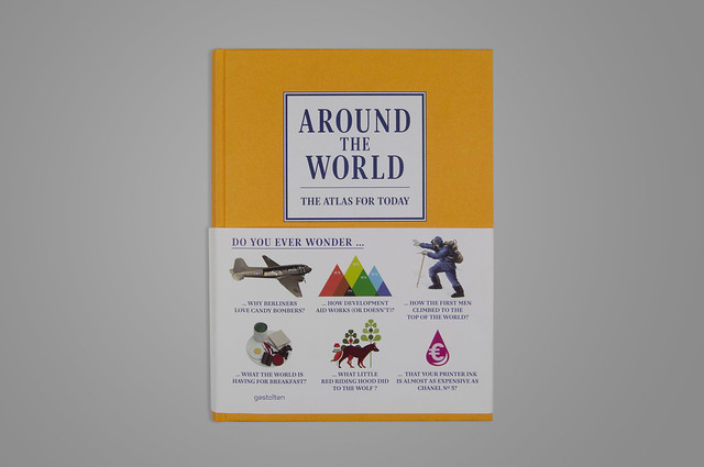
We just received and unpacked “Around the world: the atlas for today”, published by Gestalten. The book features some of our students’ works, made during the Integrated Course Final Synthesis Studio A.Y. 2012-13.
Posters were drawn during a six-month course on the visual representation of complex phenomena. Students analysed controversial topics, developing also visual reports, short animations and interactive applications.
Below you’ll find the list of published works and the link to each project page: have a look at them if you’re interested in the making-of and to learn more about each topic!
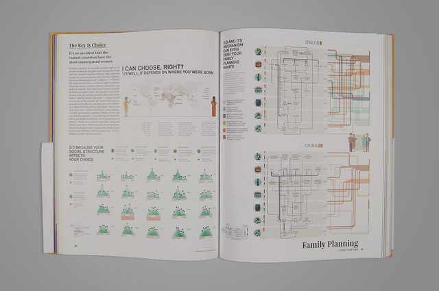
“I can choose, right?“, part of the “Unborn discussion” project, by Alberto Barone, Maria Luisa Bertazzoni, Martina Elisa Cecchi, Elisabetta Ghezzi, Alberto Grammatico.
“The cradle of change“, part of “The morning after pill in Italy“, by Viviana Ferro, Ilaria Pagin, Sara Pandini, Federica Sciuto, Elisa Zamarian.
“Meat or threat?“, part of “The palm pattern” project, by Irene Cantoni, Claudio Cardamone, Sara De Donno, Fabio Matteo Dozio, Arianna Pirola.
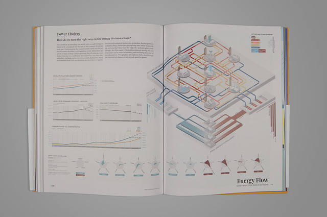
“The energy decision change“, part of “Every light has its shadow” project, by Giulio Bertolotti, Elia Bozzato, Gabriele Calvi, Stefano Lari, Gianluca Rossi.
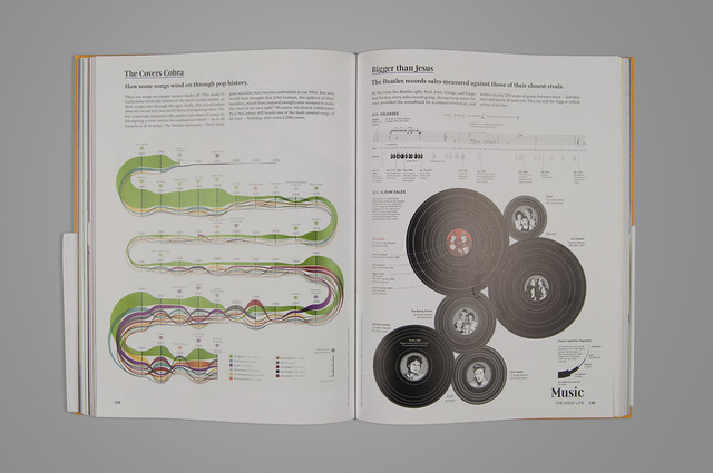
Also”Cover Mania“, originally published on La Lattura #8, has been featured.
Wednesday, October 23rd, 2013
Semi di Futuro (Seeds of the Future) – Interactive installation at Triennale Design Museum
Semi di Futuro is an exhibition celebrating the 150th anniversary of the Politecnico di Milano and taking place at the Triennale Museum of Design, Milan. DensityDesign contributed to the project with an interactive installation showing the present of our university through three points of view: the research brought on by the students, the internationalization and the relationships with other universities around the world and the presence on the national press.
The installation is placed at the end of the exhibition and is composed by three visualizations (one for each point of view):

The user can interact with each view through a tablet placed on the table in front of the projections:

I. Internationalization
This visualization shows the worldwide relationships with other universities in terms of students exchanges (Erasmus, Overseas, Vulcanus and so on). In particular, the visualized data concern the last two years of international exchange projects, divided by nation. The view is composed by a three dimensional map where the users can highlight a single country or a continent. Once an element is chosen, one or more prisms appear on the selected country with respect to the coordinates of the universities hosting or sending students; the height of the prism represents the number of students.

The user also has the choice to filter the number of students in order to see only the incoming ones, the outgoing ones or both.
II. Press
This visualization shows the presence on the national press of the Politecnico di Milano and its associated topics. The data used in this view was obtained by the online archives of the Repubblica and Corriere della Sera newspapers. We retrieved the last 20 years of articles in which our university was referenced, grouped them by month and extracted the other entities present in the texts. Such entities were then divided in three main categories: organizations, people and places. This way, for each month we were able to obtain a network of entities related to Politecnico di Milano. The bigger the circle, the greater is the relevance of a certain item in the graph.

Through the tablet the user may select a particular month on the available period or a year interval. It is also possible to filter out unwanted categories and to focus on a single entity in order to see only its connections in the graph.
III. Research
This visualization shows the keyword of the research brought on by the Politecnico di Milano students. The data used for the view is composed of the tags describing the Bachelor and Master Theses of the last three academic years. Each tag can be more or less relevant to a single faculty, depending on how many times it was used for a related thesis (i.e. “Interaction” is more relevant to the Design faculty rather than Engineering or Architecture, due to its preminent use in Design theses). This correlation is visualized as a spatial and color proximity: each tag is a circle of variable size (depending on the overall count of times it was used), and its color and position in space depends on the relations to the faculties, which are instead visualized as bigger, fixed white circles.

Through the tablet the user can include or exclude faculties and/or its associated schools, and focus on a single keyword to see in detail how many times it was used in every faculty/school.
Here is a video of the installation:
The exhibition will be hosted by the Triennale Museum until December 22th, the entrance is free.
Tuesday, October 1st, 2013
Raw – The missing link between spreadsheets and vector graphics.
UPDATE: the project is now renamed RawGraphs. Check it out here: rawgraphs.io
Raw is a tool we developed to create vector-based visualization based on data. Primarily conceived as a tool for designers and vis geeks, Raw aims at providing a missing link between spreadsheet applications (e.g. Microsoft Excel, Apple Numbers, OpenRefine) and vector graphics editors (e.g. Adobe Illustrator, Inkscape, Sketch). In this sense, it is not intended to be a full “visualization tool” like Tableau or other similar products: as the name suggests it is a sketch tool, useful for quick and preliminary data explorations as well as for generating editable visualizations.
Since we find it very useful in our workflow, we are happy to share it publicly as an open source project. We cleaned up the code and made it easier to add new visual models. From our previous experiences (e.g. Fineo) we have identified some frequently asked features.
Even if Raw is an online app, uploaded data are not sent or stored anywhere. Feel safe to use confidential data because they will stay on your computer!
The visualizations can be exported both as vector (SVG) and raster (PNG) images, so you can easily use and refine them for your work. Moreover, visualizations can be embedded into websites by coping and pasting the HTML code.
Raw is still an alpha version, and many improvements can and will be done. Even better, you can help us to improve it, adding new layouts and fixing the bugs that you will surely find out.
We hope you will find it useful. Any suggestion and critic is very welcome!
If you have any question, please have a look to the FAQs, or post to the Raw Google Group.
Tuesday, August 6th, 2013
Minerva – Data visualization to support the interpretation of Kant’s work
Following the Food Atlas by Giulia De Amicis, we are glad to continue the series presenting the M.Sc Thesis Project of Valerio Pellegrini – Master in Communication Design at Politecnico di Milano.
Introduction
Minerva is a web tool for supporting philosophical historiography research, born from a multidisciplinary collaboration between the DensityDesign Research Lab and a team of philosophical historians from the University of Milan. Initially conceived for exploring Immanuel Kant’s corpus, Minerva allows researchers to work on large corpus of texts by bringing together data visualizations and text annotations. Focused on the evolution of one author’s lexicon, the tool provides two main views on the text. The first one is a visual representation of the whole evolution of the lexicon across the different works of the author, showing and comparing terms frequency. The second one is the ability to access and work on the text by searching and highlighting lemmas and creating annotations at different levels of scale, such as words, paragraphs, or chapters.
Beside simplifying and speeding up the research process in the context of philosophical historiography, Minerva aims also at providing new ways of looking at the texts and generating new possible paths of investigation. The possibility to observe the whole evolution of one or more author’s thoughts as well as the ability to easily move across his or their works fosters a new kind of dialog with the texts: the concept itself of reading takes the form of an interactive and dynamic process that moves between the direct and close access to the text and the distant view provided by the visualizations.
The case study: Kant
The tool stems from a collaboration between the DensityDesign Research Lab and a group of researchers from the University of Milan focused on Kantian Studies, based on the exploitation of data visualization as support for the analysis of the text. The usual research work is based on browsing thousands of pages, looking where and how lemmas appear, identifying structures and patterns of evolution and other elements useful to support the reconstruction and the interpretation of one author’s thought. The idea of combining data visualization with text annotation stems from the will of providing, in a single environment, both a synoptic vision of the whole corpus and the ability to collect together hundreds of notes and comments in their specific context.

Data extraction and organization
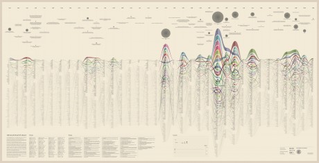
The research started with the selection of 1000 of the most relevant words in the Kantian corpus that have been searched across the whole Kantian work (58 works, 4500 pages) using the Korpora search engine developed at the Universität Duisburg-Essen. After numerous attempts, characterized by a progressive refinement of the search criteria, a list of all the word occurrences in the respective pages and works has been obtained. From this list a first words/works network has been developed.

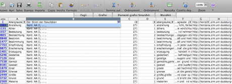

Words/works network
The network provided the researchers with a single view of the relationship between the words across the entire corpus, offering them a new perspective from which to look at the text. Despite an initial moment of skepticism by the researchers, mainly due to the high density of elements and relationships in the networks, issues of particular interest emerged. For instance, the Spring Embedded Layout, a type of circular diagram provided by Cytoscape (a network analysis tool), showed at first glance those words that appear only once in the Kantian corpus – called ‘unicum’ by researchers.
Since the purpose of the research was to visualize the evolution of the lexicon, making possible for philosophers to examine the data, validate assumptions and provide new insights for future research, it was therefore necessary to find a visual model capable to show the lemmas evolution at a glance.


The visual model
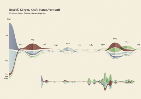
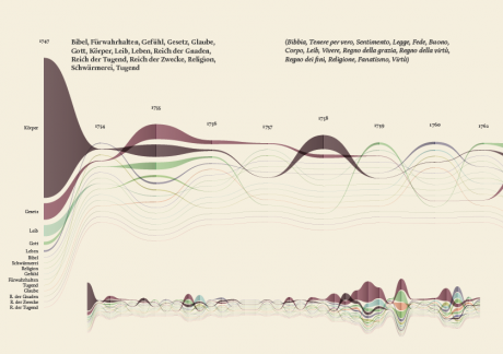
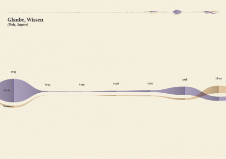
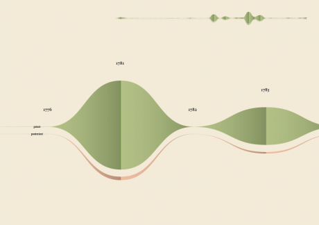
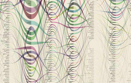
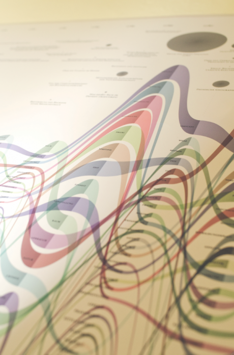
The streamgraph has been figured out as the most effective visual model, since its ability to show the evolution of lemmas (in quantitative terms) across the works (and the time) and, at the same time, to compare them work by work. A particular version of the streamgraph has been developed to separate the flows and to highlight words’ frequency. Once the data have been structured for this visual model some first drafts of the streamgraph have been realized using Scriptographer (an Adobe Illustrator plugin), aiming also at collecting some first feedbacks from the researchers, about the visual model and its readability. As a first result, the visualization has confirmed already known patterns (as the evolution of key terms in the Kantian corpus, such as ‘Ding an sich’ and ‘Noumenon’). But at the same time, the intricate architecture of Kantian vocabulary, immediately assumed a tangible shape.


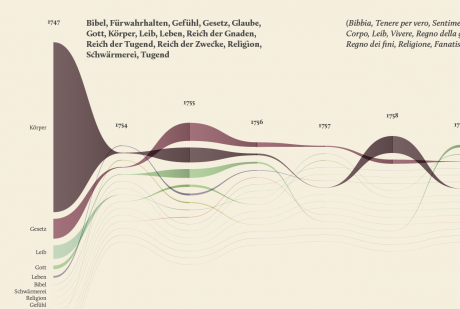


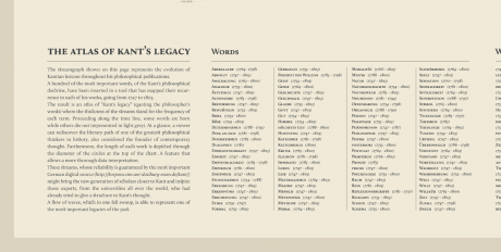
The poster: The Atlas of Kant’s Legacy
During the research process, an idea can actually takes shape while exploring texts, playing with it and jumping through pages and concepts. The work of researchers can stem from the evidence of an enigmatic pitch or a word in an unusual context. Starting from these considerations, we decided to provide the researchers with a view showing the relationships between the lemmas evolution at a glance, as a tool to freely explore the streams. A poster, sized 200×100 cm, has been printed to work as an historical atlas of the words, representing a privileged point of view to examine the top 100 most important words of Kant’s production. HQ version here.


Minerva
While the poster has been received positively by the researchers, it allows to examine the evolution of only 100 selected word and it does not provide a direct access to the text, which is essential for the kind of work carried out by the scholars. Thus, the next step has been the design of an interactive tool to browse and view all the terms and, at the same time, to directly consult the text. Starting from the positive results of the previous visualizations, and in particular the streamgraph view, we had the idea of combining in a single environment the exploration of the words stream, with the ability to work directly on the text. In this way it would be possible to search, trace and study the words in the context they have been used and to add comments and annotations to the text. From these considerations, Minerva has been conceived.
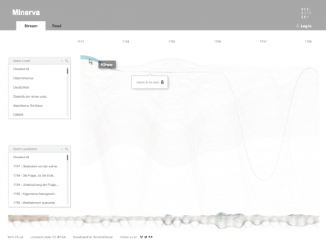
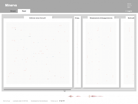
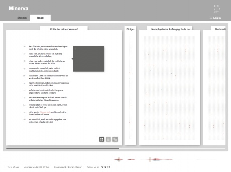
Minerva is a web tool that aims at integrating close and distant readings of a text using data visualizations and text annotations. A streamgraph allows to look at the evolution of an entire corpus’s lexicon, work by work, with the possibility of focusing on specific work or lemmas. An annotation system, instead, makes easy to approach the actual text in an incremental way and to add notes to any part of it.
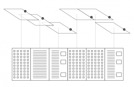
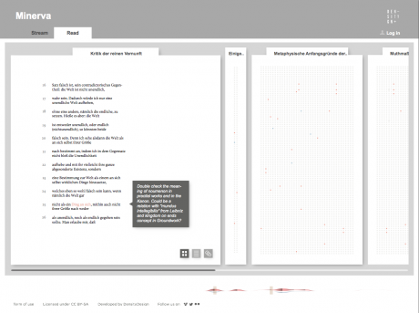
Selecting one or more streams of words, the researcher can observe in a second moment in which parts of the works they appear, progressively approaching the written text (each square corresponds to a verse). Selecting a square then he can enter the text and read the verse (this step allows to switch from the synoptic view of the presence of the words in the verses to the corresponding verse, fundamental aspect for the researcher). Once in the text, notes can be attached to the verses, which will enable the scholar to build its research process. A structure of this type allows to compare works between them through different reading levels.


Conclusions
Minerva has provided a very interesting opportunity to experiment with data visualization within a context, the philosophical historiography, where the use of visual languages is still poorly investigated. The design process has not been simply limited to the technical implementation of pre-established requirements but has moved across a continuous and dialectical collaboration between the parties involved, generating a fertile and agile research environment. The achievements reached so far by the two actors involved are a promising starting point for further investigations and a confirmation that communication design can play an important role within the development of new humanities research tools, based on digital and visual environments.

Currently, Minerva is still under development, but as soon as the tool will be completed, we plan to furtherly test it and improve it, taking advantage also to feedbacks coming from philosophical conferences and communities, at both national and international level. Moreover, we would like to better understand the contribution that Minerva can bring outside the specific context of Kant’s corpus and philosophical historiography, as a support for the analysis of texts by other authors and within other domains.
If you have any comment, suggestion or if you are interested in the development of Minerva, please contact Valerio Pellegrini (valerio.pellegrini.aog@gmail.com) or DensityDesign Lab (info@densitydesign.org).
Tuesday, June 11th, 2013
Food Atlas. Mapping and Visualizing the Food offer in Milano
We are glad to present here the M.Sc Thesis Project of Giulia De Amicis – Master in Communication Design at Politecnico di Milano.
Research and Analysis
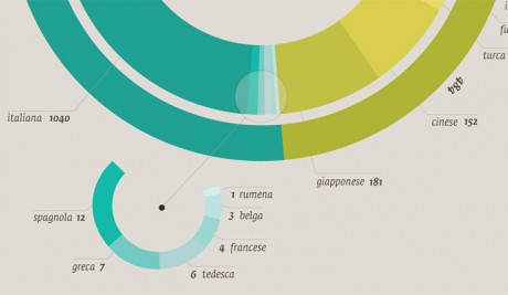
This project aims to analyze a complex system such as the urban environment through the observation of the food offer provided by restaurants, according to the type of cuisine, and its specific characteristics. This study is based on an in-depth Internet analysis of restaurant menus in the city of Milan during the year 2011/2012.
Information gathered in the first step of this analysis on food offer, led to identify key issues in order to recognise means of healthy eating in a growing and international city such as Milan.
The collaboration with a nutrition researcher from IEO (the European Institute of Oncology) was a vital and important asset to establish a thorough and convincing analysis in terms of nutrition and quality of food, ways of cooking and property of the ingredients.
All the informations and observations were shown by a series of thematic tables and infographics that describe through a visual and narrative approach a series of topics ranging from food offer to the geographical distribution of restaurants on the map of the city and the qualities of fish and meat offered every day to customers.
Here’s through Giulia’s words the description of her project.
Results and Visualizations
-The first step of the project concerns the global description of food offer, and answers to various questions such as:
Which different kinds of cuisines are there in Milan? How many Chinese/South American/European/North American restaurants are there? And where are the restaurants located on the city map? Is there a connection between the location of restaurants and specific districts or streets? In the first stages of the project I was able to identify more than 45 different kinds of cuisine, which I then categorized according to their geographical area and country, or culture of origin.


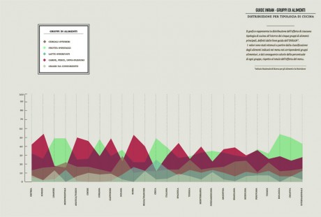
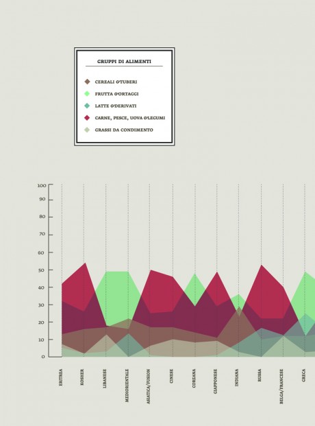
-In a second stage I carried out an accurate analysis of the ingredients of the meals offered by different cuisines.
From the online study of the menus, I was able to create a database of all foods and ingredients, offered in all restaurants per categories. I was this able to compare the food offer in different culinary cultures and traditions and provide an overview of the kind of food most available in the city, in terms of numbers and percentage (e.g. How often does a specific ingredient appear in menus? How many times is it possible to find “tomato” in a Milanese restaurant? Which is the most-offered vegetable/cheese/type of pasta?).
The partition of all the ingredients into alimentary groups (dairy products, meat, fish & legumes, vegetables, condiments & dressings, sweets & sugar), provided a series of hypothesis on the nutritional value of food and reveal many surprising connections and differences between the various categories.
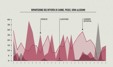
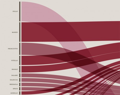
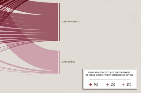
-In order to identify unhealthy behaviors, a specific attention was dedicated to the presence of meat on menus; the visualization made clear that the most offered type of meat (red and processed) is also the most unhealty, as well as responsible of serious illnesses, while the less harmful type (white meat) has the lowest presence on menus.

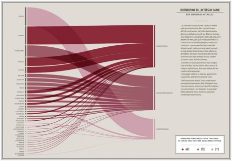
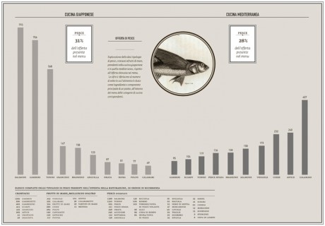
-I undertook the same approach to observe the presence of fish on menus in order to verify the offer of the most common fish sold on the market, and the effects of specific food trends on the consumption of fish (such as the explosion of the sushi-mania in the northen Italy,during the last 10 years).
– The analysis of health trends in the Milanese food offer was detailed and all-encompassing although this project leaves open the possibility of further investigations as this is a complex and composite subject.
The thesis has to be intended as a form of visual-support for nutritional and alimentary researchers, providing, at the same time, the tools for developing additional explorations.
All the data collected during the research was entered into a updatable database that could enhance this field of studies.
Friday, May 31st, 2013
Alberto Cairo: “Designers: Read, Read as much as you can. Inform yourself, see what is around you”
I had the opportunity to interview Alberto Cairo, designer and journalist, and author of “The functional Art, an introduction to information graphics and visualisation” (Pearson), during a series of presentations he delivered in Milan at the beginning of May. I tried to explore with him some concept he deeply stresses in his book and presentations.
(Find italian version on Doppiozero)
1. Let’s begin with a question about your book. Could you tell us about who needs data-literacy today and who you would like to see reading your book?
Well, I originally wrote the book for journalists and designers. I obviously wrote it for my students, but I also wrote it with journalists and designers in mind. On one side I felt that journalists were not getting proper training in the visual presentation of information in schools so I wanted to write a book that would be friendly enough to be read by anybody who wants to attain a theoretical framework about how to approach infographics from the point of view of functionality and clarity. I wanted to show journalists or writers (when I say journalists, I mean writers), that in general, creating a graphic is not particularly hard at the basic level. If you really want to understand a dataset or a piece of information it is absolutely mandatory to visualize it. It’s a great tool to use when you’re writing a story, not just to write the story itself but to create some sort of graphics that provide readers with the evidence behind what you are saying.
On the other side I also wrote it for designers. The reason I did this is because throughout my career I have seen many designers who only care about creating a cool picture with good illustrations, and a lot of connecting lines. They don’t care about the information. They obtain a bunch of data, and instead of worrying about clarity, about telling a story, and helping readers understand the story, their first concern is to create something that looks cool. For me this is good if you want to call yourself a data artist, but if you want to call yourself a data visualizer your priority needs to be clarity, and by clarity I don’t necessarily mean simplicity.
There are many graphics that need to be complex because the information is also complex but when I talk about clarity I mean it in the sense that you are trying to transform a complex dataset into something that is easily understandable and accessible. The other aspect is that designers don’t write. This is true for the many newsrooms that I have worked in. A visualization is not just a piece of visual information, it is a combination of visual and text elements, so you need to know how to write a headline, an introduction, and how to label your graphics.
These are the people I had in mind when I wrote the book, but I discovered that among the thousands of people who are reading the book and taking my courses, perhaps only 20-25% are actually journalists and designers. The people who are reading the book are often scientists and statisticians. I have been called to give presentations at statistics conferences and I always say the same thing. In fact, I will be at the US Census Bureau to give a presentation in a couple of weeks and I was very straight forward with them that my knowledge of statistics is limited. I know the basics, but the people in the audience will be high-end statisticians, so I’m afraid I’m going to say something scientifically incorrect, but they say that this is not an issue, we just want you to help us communicate better. So what I’m seeing, is that there is a growing interest in data visualization in many different areas, not only to understand how to use graphics to analyze data in a scientific or business context but also on how to use graphics to communicate your results and message to the public, often in a journalistic way. Data visualization is not just used to sell a product or something, but also to communicate what you are doing.
These are the people who are reading the book. I didn’t write it for them originally, but I’m discovering that the book is helpful for those kinds of people as well. I’m happy because tI’m seeing a growing interest in the area and that’s great.
2. Moving on to one of the key concepts covered in the book, form follows function. Can you talk about this? Is this always the case and, if not, can you give us some examples in the data visualisation or info graphic field?
Well, what I actually say in the book is that the function restricts the form. I absolutely believe that this is true 100% of the time in communication. If you are creating a piece of data visualization, the function (or functions, because there could be more than one), do restrict the form. They restrict the variety of forms that the data can adopt if you want to communicate. If you want to be a data artist then you are completely free to do whatever you wish. If you take the work by Jer thorp for instance, he is a data artist. I would not call him a data visualizer, because his main goal is not to communicate with clarity, it’s to create an aesthetic experience using the data as a source to create pieces of art. I think that this is wonderful, but if your goal is to communicate, the function or functions, restrict the form and I give many examples of this in the book. A data visualizer starts with a whole variety of existing graphic forms and then discards them until she ends up having two or three that are appropriate for the message or tasks that need to be facilitated.
3. Just to be more precise: can you share your definition of “function” when it comes to data-visualisation?
Well you have to think about what you want your readers to do with the data. I mean, it is not very scientific, in many cases, because you have to base your decisions on intuitions of who the public will be, but it’s a rational process. You can decide that you want the graphic to show correlation, allow for comparisons and show the graphical distribution of some variables. This helps narrow the decisions and the varieties down to particular graphic forms. Then you have some freedom in there to choose, but you don’t have complete freedom to choose any graphic form, you simply have a narrower frame from which you can select different graphic forms.
4. Ok, how would you describe function? Could entertainment be included as a purpose? As an example, how would you describe the U.S. Gun deathby Periscopic,? As I see here form not only follows function, but also emotions. In some ways they are dynamically presenting data, and telling a “possible truth”, by putting data in a human context.
Yes, I actually wrote an article about that. I called this “emotional data visualisation because it is not a news story. It’s an opinion piece based on sound data so it is actually appropriate for that purpose. It’s not something they have made up, that data is there. However, when they encoded the data, they didn’t encode the data visually to facilitate comparisons etc., no, they encoded data to show you how many people are dying, so they wanted to create a dramatic experience with the data. I think this is appropriate if your goal is to create an opinion piece but the graphics do not allow you to compare things. They have impact and this is appropriate is some contexts. I would say that this is also a function. The function of the graphic is to create an emotional experience.

(fig. U.S. Gun death, Periscopic)
5. To follow up on this topic, yesterday you presented some cases, such as Chris Harrison’s “Visualizing the Bible”, which you defined as “data-art”. Do you have a “definition” of this or can you share some more examples on the distinction between data-visualization and data-art? Is it a matter of goals, or about how data consequently used and understood by the audience?
It is a matter of goals but the distinction is very fuzzy. I would say that the goal of Chris Harrison‘s, piece, as wonderful as it is, is not to communicate with precision. It is not a tool for understanding. It creates an emotional experience and awe when you see it. In this way it is very similar to the Periscopic piece. It’s not particularly useful to gain insights from the data, other than how many people died. Of course it is very effective at this, but it’s not a tool for understanding. So I believe that this is the border between data visualization and data art. A data visualization or an information graphics main goal is to communicate with clarity and efficiency, and then it can be beautiful. In data art, the main goal is not to communicate with efficiency.

(fig. Chris Harrison, Visualizing the bible)
6. Staying with the subject of “art”, I very much like your idea that data visualization and art are linked in the same way literature and journalism .To cite your work: “A journalist can borrow tools and techniques from literature, and be inspired by great fiction writing, but she will never allow her stories to become literature. That notion applies to visualization, which is, above all, a functional art”. So, in what ways can a designer be inspired by art for data-visualisations or infographics?
Take a look at what happened with journalism in the past. In the past there were many traditions of journalism and one of them was called ‘new journalism’ . This wave of journalism arrived in the 60’s and 70’s and it is characterized by the fact that they maintained the original ideas of journalism (to communicate with accuracy, precision, and tell relevant stories to the public etc) but they then borrowed tools from literature. They used techniques that were seen in literature, and at first this was wonderful because they wrote news that was not as dry as pure news stories, by creating a new layer of high aesthetics, putting style on top of the news story. But then what happened? This tradition went astray in some senses. Some journalists went beyond what was acceptable and started making things up, by writing what a particular person in a story thought. How can you know that, if you are not inside the head of that person? That is the limit. The limit is accuracy and precision. So whenever an aesthetic decision compromises the accuracy of the data, presentation or integrity of the information you are presenting, you are on the wrong path. If you respect accuracy, your graphic is efficient and looks good, you can worry about making it look more beautiful, but you should never trespass that border, because this compromises the quality of the information that you’re presenting.
7. Ok, moving on from the designer point of view, I also like the concept of “intellectual chaos”, a state of being for information designers / visual communicators. You describe this as systematic and exciting. Can you talk about this?
This is quite difficult to understand. The first piece of advice I try to give anybody who wants to work in this business is not learning data script or statistics or whatever, it is to read. That is the first thing. Read non-fiction, and read as much as you can. Read about politics, science, economics. Inform yourself, see what is around you. What I see among my students for instance is that they don’t read anymore other than social media. I’m on social media, as you know, and I’m very active on twitter, but then, besides doing that, I read a couple of books a week and most of them are non fiction. I read a lot of philosophy, statistics, science etc. That helps me understand what surrounds me a little better, and it gives me a lot of ideas for infographics later. So if you want to write and visualize you have to have something to visualize about so you have to inform yourself. The systematic curiosity is to read as much as you can. Get books, and read, read, read! There are people like me who jump from one area to another all the time because we are not that systematic, but if you are interested in a particular area, for example people who are interested in sports, that’s great, focus on that, but then become the absolute expert on sport infographics because you know so much about sport infographics, that nobody will know more. You have to have deep knowledge and be curious about what you do.
8. I saw you with some students quoting XKCD / the popular author of brilliant and sarcastic comics. Quoting one of his famous strips that says “if you really hate someone, then teach them to recognise bad kerning” http://xkcd.com/1015/, do you see any parallel with data-visualisation?
Yes, I teach bad kerning in my classes and my students learn to recognise it.! I don’t know if there is an equivalent for data visualisation. Maybe teach them why pie charts are so misused. They have there uses. In some cases a pie chart would be appropriate but when you actually make people try to read a multi-portioned pie chart they see that it is not very efficient. It is efficient at letting you see the biggest portion but it is totally inefficient at letting you compare the smaller portions. Once you see this, people realise it’s not the most appropriate graphic in many cases. I would say, don’t teach people how to see graphics, teach them how to ‘read’ graphics. When you teach people how to read graphics they start recognising what is wrong with many graphic forms, considering obviously who the audience is and considering what the goals of the graphics were. When I taught the first and second MOOCs I got a lot of emails from people who had never done data visualization before and the main insight they gained from the course is that they will never see graphics in the same way again. That’s great and what I wanted to achieve.
9. During the meeting with students from Politecnico, Paolo Ciuccarelli asked you about data visualization being temporary hype with growing popular interest in the subject. You positively suggested that this is true, but maybe this is a good thing. Can you expand on that?
It’s very easy to understand. Every new technology that shows up is hyped at the very beginning, so when twitter came out, everybody was talking about it twitter, when Facebook came out, everybody was on Facebook etc..even Google + had a spike at the beginning, so every technology that is thrown to the market has a line going up, but eventually it reaches a point at which it stabilizes. I believe that this will happen with infographics and visualization, or is already happening, so it is hype because it is gaining popularity. It’s not new, because data visualisation is pretty old, but it’s been adopted by the public so everybody wants to get into it and do it. This is great because you will see many good examples, but also many bad examples that will help you learn how to create better examples, so that is a good part of the hype. The key thing is that this hype is not wrong, or useless, it’s just a new technology or something that people are discovering now.
10.To conclude, lots of people say “data is the new oil” / but what is the new gasoline for you? What is the most globally important byproduct of having this kind of access to data? Or, if we want to put it in another way: how is data-visualization going change the world?
Well, if you narrow it down to what we do, I think that the potential of using publicly accessible data, which is not something new, can change your mind about many different things. When you don’t have data all your opinions are based on hunches, but those hunches are only transformed into proper knowledge when you test them, when you compare them with what the information actually says. . Hans Rosling has a perfect example for this which he uses with his students, about fertility rates and populations, when he asks his students: what do you think the fertility rate in a place like Bangladesh is today? All the students say five or six children per woman, but when they see the actual data showing two children per woman they are shocked. This is the effect of data. Data per se doesn’t have any value. The value of data comes when you transform it into something that can provide insights.

(fig. Hans Rosling, Gapminder)
You could say the same thing about data visualisation! You could say that data visualization is the only way to understand certain stories or pieces of information. Is seems pretty straight forward but it’s something that many people don’t really understand. When you present people with a piece of information, and ask them if they understand it, they think they understand it because they have read it. But when you make them transform that same piece of information into a graphic in which they can see patterns and trends, or when you make them display the data on a map, they see the information from a different perspective. So I think that visualisation, as the proper handling of data, can change our views of the world that surrounds us.
- Make 5 Sentences about Saying Disagreement
- Payment Agreement Sample Philippines
- Can Landlord Charge for New Tenancy Agreement
- Spirit Airlines Tax Receivable Agreement
- Ancillary Services Agreement
- Download Agreement by Shanko Rasheed
- Facebook User Agreement Photos
- Music Production Contracts Templates
- Do Contractors Do Financing
- Free Trade Agreement Russia
- Stock Purchase Agreement Good or Bad
- Terminating Employee Contract Early
- It Support Agreements
- Iran Nuclear Agreement Terms
- Rental Lease Agreement for Ct
- Tcode for Display Contract Status
- Contracts Manager Jobs in Bangalore
- Behavioral Health Contractors Association
- User Agreement in Arabic
- Rcuh Agreement for Services