As new symbionts, tablet devices are part of our life by now. We are researching on data visualization and interaction on these devices and focusing on actual and future perspectives for dataviz.
Looking for mobile applications that convey information in a visual way, we found different tools for different purposes:
- Reference: applications that visualize data as tools for share knowledge about specific topics as well as encyclopedic information.
- Business: tools that allow users to visualize and control dynamics of data (mainly financial).
- Entertainment: applications created for show, group, share or collect information about music, sports, movies or social networks.
We noticed that reference and entertainment applications are more experimental than business apps, trying to take advantage from the specific types of interaction allowed by the device.
We present here a first selection of examples of these applications, grouped by the three main purposes. The short description highlights what kind of visualization and interaction are used for each app. Some of the cases already suggest novel forms of interaction and approaches, but certainly there is room for improvement and for opening new research lines.
REFERENCE:
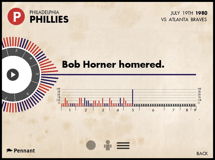
Storytelling for baseball stats: Pennant by Steve Varga
Pennant is an interactive history of baseball available for the iPad. Pennant’s interface allows fans to browse and view data from over 115,000 games that have taken place from 1950 to 2010. Seasons, games and events are graphically represented and visualised in a manner that takes them beyond the numbers. The app consists of two main parts, the application itself that lives on the ipad, and the data, which exists on external servers.
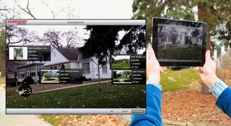
Augmented reality: Homespotter by Mobile Realty Apps
HomeSpotter uses augmented reality coupled with a smartphone or tablet’s GPS and compass to overlay property information on a device’s live camera feed. As a home hunter points their smartphone or tablet down the street, they see a view of the street and info on all the houses for sale pops up. There’s even a radar display that show the direction and proximity of nearby properties for sale.
BUSINESS:
Visualize, interact with, and share data: Spotfire by Tibco
The Spotfire App extends the reach of Spotfire analytics to anyone with an iPad. You can visualize, aggregate, filter, and drill into data sets of virtually any size, so you can spot opportunities and risks buried in the data.
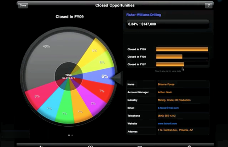
Analysis dashboard: Roambi by MeLLmo
Roambi Analytics turns data and business reports in visualizations. The application includes reports for mobile systems that allow to touch a scroll informations on the animated display.
ENTERTAINMENT:
Collecting real time data: AntiMap by Trent Brooks
Using accelerometer and compass sensors, Antimap allows to collect and create own data. The application visualize real time information about speed, rotation and inclination using a dashboard style infoviz.
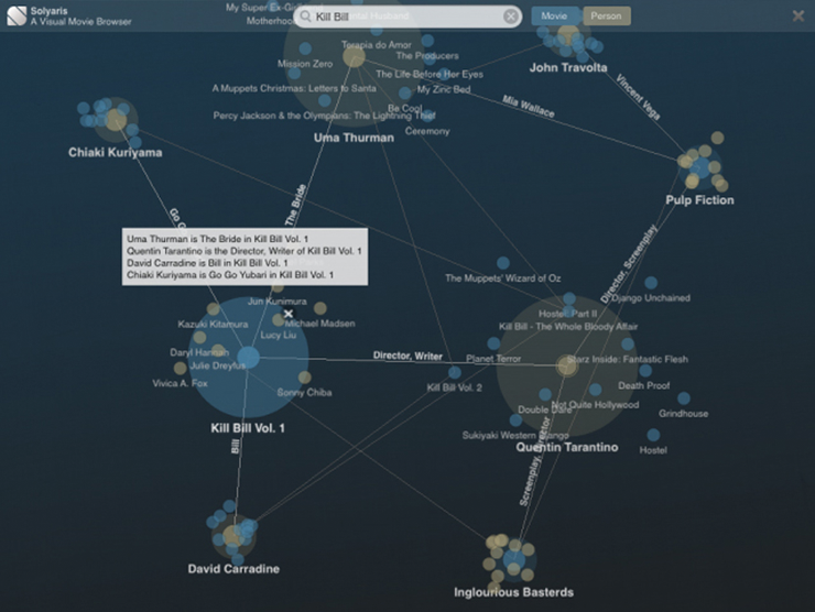
Exploration into Open Movie Database: Solyaris by Beat Raess
Solyaris is an “exploration into organic information design to visualise movies, actors, directors and their relationship”. The application for iPad made in Cinder allows you to search the entire Open Movie Database (TMDb) collection for movies, actors or directors. Expand nodes to gather information about their connections. Learn about the cast and filmography.
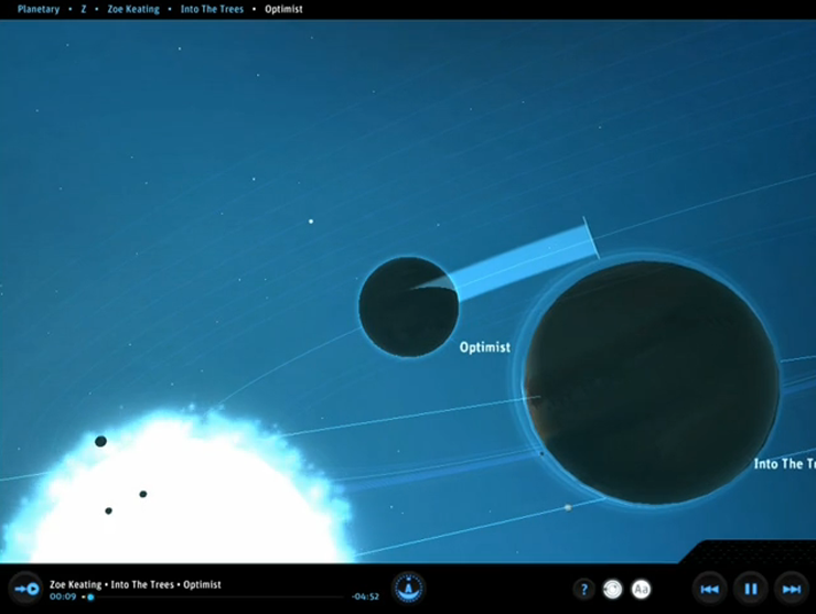
Explore your music collection: Planetary by Bloom Studio
Created using Cinder framework, allows to navigate dynamically through informations about recording artists. Every star in Planetary represents an artist from your music library. Albums are planets, they orbit around their artist star. The planet surface is derived from the album cover art. No two planets are the same. Tracks are moons, they orbit at a speed based on the length of the track. The size of the moon is based on the play count. Artist are filtered by Letter to create a constellation of highlighted stars.
Read the rest of this entry »




[…] Information Visualization on the Move. A Brief and Initial Overview | Density Design […]
April 20th, 2013 at 2:30 pmOpen Source Data Visualization Objects: http://d3js.org/
April 21st, 2013 at 12:50 pm[…] Information Visualization on the Move. A Brief and Initial Overview – As new symbionts, tablet devices are part of our life by now. We are researching on data visualization and interaction on these devices and focusing on actual and future perspectives for dataviz. Looking for mobile applications that convey information in a visual way, we found different tools for different purposes… […]
April 23rd, 2013 at 1:33 pm