Blog
Monday, December 29th, 2008
Monday, December 15th, 2008
The traveller in the map
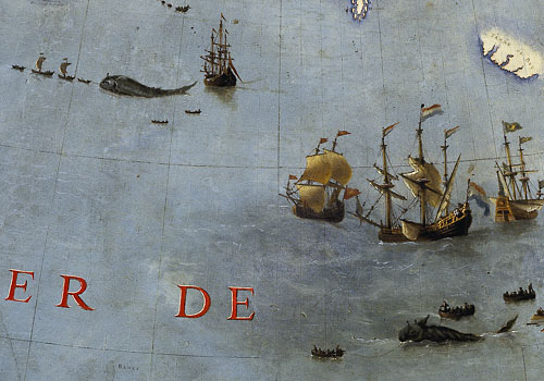
A close-up of the Earth Globe by Coronelli in which narration has a strong relevance.
Extracts from Italo Calvino’s “Collection of sand”, 1980
The simplest form of a map isn’t the one we consider the most natural today, that is the map which represents the surface of the Earth as seen by an extra-terrestrial eye. The early need of fixing places on a map has got references to the topic of “journey”: it’s like the reminder of a series of steps, the layout of a route. The simplest map is a linear image, which can only be drawn on a long paper scroll. Roman maps were in fact scrolls of parchment paper: today we can understand how they were designed thanks to a surviving medieval copy, the «Pautinger’s plate», which includes the imperial road system from Spain to Turkey.
The overall vision of the then known world looks horizontally flattened as a result of an anamorphic transformation. Since the map focused only on the land roads, the Mediterranean Sea was reduced to a thin horizontal wavy stripe between two wider areas (Europe and Africa), so much so that Provence and North Africa look very close to each other and so Palestine and Anatolia.
[…]
Halfway between cartography and landscape painting, a japanese paper scroll which dates back to 1700, is 19 meters long and represents the route from Tokyo to Kyoto: this is a very detailed landscape in which it’s possible to see where the road surpasses high grounds, goes through groves, borders villages, overcomes rivers crossing a little arched bridge, adapts its course according to the extremely variable land conformations. The outcome is a scenery which is always pleasant for the eyes, lacking in human figures although is full of signs of real life. (The starting point and the arrival, that is the two cities, are not in the map: their look would have certainly fought back with the harmony of the landscape). The japanese scroll invites us to identify ourselves with the invisible traveller, to cover that road bend after bend, to climb up and down the little bridges and the hills.
Taking a course from start to end, gives us a particular gratification, both in life and literature (the journey as a narrative structure) so we should ask ourselves why was the topic of “journey” so underestimated in visual arts where it appears only sporadically.
[…]
Understanding an image through time and space is essential in cartography. Time assumed as past story: I’m thinking of Aztec maps always full of visual representations of historical and narrative tales, but also of medieval maps […]. And time as future: think for instance at the presence of possible obstacles scattered along the planned route […].
Therefore a map, even if it’s static, requires a narrative idea behind itself, it is conceived for an itinerary, it’s an Odyssey.
[…] François Wahl once noticed how earth representation was a practice started only when men began to refer ordinary sky grid reference to Earth. Doing that, sky parameters (like polar axis and equatorial plane, meridians and parallels) became Earth parameters, positioned on the surface of our globe, that is the center of universe («the most fruitful error ever»).
[…] «We had chance to describe the Earth just because we have projected the sky over it».
Calvino wrote this inspiring notes after a visit to the exhibition «Maps and figures of the Earth» held at the Centre Georges Pompidou in Paris on 1980.
He had chance to see the biggest globe ever built, ordered by Louis XIV to Venetian friar Vincenzo Coronelli, which had been dismantled in boxes at Versailles for about two hundred years until then.
He describes it this way:
[…] But the greatest surprise of all was the globe, in shades of brown and ocher, with pictures engraved on its surface (like brutal practices of savage cannibals) and inscriptions coming from news brought by explorers and missionaries who filled the gaps where the shape of places was still uncertain.
To Coronelli, California was an island, so he commented in a caption: «Some fools are saying that California is a peninsula …» And in an another point: «Here it is said that there’s an island, but it is false and I do not put it ». As for the sources of the Nile, after having placed them in a precise area and later moved in order to a new witness, Coronelli ultimately wrote down a text near the river, which candidly concludes with these words: «I have found myself with a space to fill and there I wrote these words».
[…]
We must say that it is only with the progress of exploration that the undiscovered world gained the right to appear in a map. What was not seen before, simply didn’t exist. Paris exhibition highlights this aspect of knowledge in which each new acquisition opens new awareness of gaps […].
The moral that emerges from the history of cartography is always a matter of reduction of human ambitions. If in the Roman map the pride to identify the entire world with the Empire itself was implicit, we see Europe becoming small in comparison to the rest of the world in the map drawn by Fra Mauro (1459), one of the first map of the world designed according to Marco Polo’s reports and to the experiences of Circumnavigation of Africa: in this map the reversal of the cardinal points accentuates the reversal of perspectives.
It’s as if the representation of the world on a limited area, would automatically set it as a microcosm, suggesting that there’s a larger world by which is contained. For this reason the map is often the border between two geographies, the one made of parts and the one made of the whole, the one of the entire earth and the one of the sky, which can be taken as astronomical firmament or kingdom of God. […]
From all these aspects we can learn how much subjectivity is important in cartography, which usually is conceived as a purely objective task.
[…]
Regarding the reasons that lead us to design maps, Calvino wrote a clever observation that examines the relationship between cartography that looks at “elsewhere” and the one that focuses on familiar territory. To Calvino, there’s always a tight link between the two, as explained with this anecdote.
In the seventeenth century the French fleet expansion required a regular production of timber, but the forests of France were running out. Then Colbert (translator’s note: the French minister of finance from 1665 to 1683) felt the need for a comprehensive relief map of French forests, in order to have always under control the amount of available trees and to plan rationally refueling and transport of timber to shipyards. At that precise moment in France, just to support maritime expanding, geographical knowledge of the internal territory bacame the primary need.
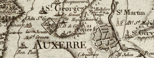
A detail of the famous Cassini’s map of France. Here it is a part of Bourgogne.
As explained by Calvino, Colbert charged Gian Domenico Cassini with the design of this extremely detailed map which took him and his family (four different generations of Cassini’s) more than 60 years to complete. The final map was drawn to scale of 1 to 86.400 and was…
… shown in the exhibition in a reproduction that was spreading all over the walls and the floor. Each forest had been designed tree to tree, every church had its steeple, every village had been squared roof to roof, so one could have had the unbelievable impression of having every tree and every bell and all the roofs of the Kingdom of France under his/her eyes. […]
Cassini’s map missed the human figures that Coronelli still felt the need to include in its globe; but it’s just the fact that these cards are deserted, uninhabited, that awaken in the desire to live them from within, to shrink ourselves to find a road into the thickness of signs, to cover it, to get lost in it.
I’ve found this gorgeous website by Didier Verlaque, who joined all the pieces of Cassini’s map (in high definition reproduction), rebuilding the entire France as seen with the eyes of the seventeenth century.
http://releves.hd.free.fr/cassini/
I’d like to thank him for the great work.
But if you are more experienced with flickr, this is a set of photos of the Cassini’s map with the same awesome high definition:
http://flickr.com/photos/derami/sets/72157594402072857/
Images and additional info for the post, was taken from:
http://www.cg78.fr/culturel/musees/dossier/dossier.asp?Id=21
http://www.groupe-bovis.com/article.php3?id_article=68
http://expositions.bnf.fr/globes/index.htm
http://fr.wikipedia.org/wiki/Globes_de_Coronelli
Sunday, December 14th, 2008
Visual Literacy
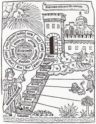
I read Kevin Kelly article on The New York Times Magazine and I found the concept of Visual Literacy very interesting.
Even if our society is getting aware of the importance of visual language for our contemporary communication, visual language needs more research to get to the point of being totally accepted in artefacts where traditionally we use text. But maybe it is the same problem it was for text literacy that has required a long list of innovations and techniques that permits ordinary readers and writers to manipulate text in ways that make it useful and in order to make sense of it. (For instance, if you have a large document, you need a table of contents to find your way through it. And more: quotation symbols, alphabetic index, page numbers and a lot more. They have been invented in the 13th century. As it took several hundred years for the consumer tools of text literacy to crystallize after the invention of printing, we now need “visual-literacy tools” for fully understand something that is completely made of image.
Thursday, December 4th, 2008
Map of the risk of Malaria in Brazil

Map of the risk of Malaria in Brasil, originally uploaded by densitydesign.
I took this picture at San Paolo (São Paulo) Airport. The aim of the map is to inform tourists and any other passenger about the risk of Malaria in the different regions. The choice of the colors associated to the levels of risk seems to be counterintuitive: green for the areas with a higher level of risk; red for medium risk; yellow for low risk and blu for no risk. I’m not able to find any reason for this choice, considering that the message is addressed to an international audience. Can anybody (Brazilian or not) give us possible explanations of this choice?
Tuesday, November 25th, 2008
Project progress report 02. Systemic approach and causal loop model
A causal loop model has been developed in order to help understand the complex systemic structure of poverty in all its dimension. System diagramming is here a loose term used to describe the activity of conceptually representing and visualizing a system in its constitutive elements: the elements, the relationships and the system boundary distinguishing what does and does not belong to the set.
The assumption of this qualitative exercise is that poverty, and its dimensions, are the result of the dynamics between a wide variety of factors from macro-politic, to the personal behavioral patterns.
The key element of the visualization are the factors and the variables. They are the environment attributes and characteristics that have an influence level of poverty.
A Relevance issue was a criterion for deciding which factors belonged to the system. In this case, relevance was determined by a open discussion between the students and the board of the course.
The system has been visualized in a particular format: a causal loop model (or diagram).
In a causal loop model, the system’s elements (factors, variables) are represented by boxes, and the causal relationships between two variables are represented by arrows. The variable at the tail of the arrow has a causal effect on the variable at the point. In addition, a distinction can be made between positive and negative causal relationships. A positive causal relationship implies that both variables will change in the same direction: if variable, a (at the tail) increases, then also variable b (at the point) will increase (and if a decreases, then b decreases). A negative relationship, on the other hand, implies that variables change in oppositedirections (if a increases b will decrease and if a decreases b will increase).
The causalities discussed so far are linear causalities (from a to b). Circular causalities (e.g. from a to b and from b to a) in systems maps are called feedback loops. They are an important feature of causal loop models because they help to explain the dynamic behavior of the system.
Thursday, November 20th, 2008
CityMurmur Project
HAVE YOU EVER THOUGHT OF A URBAN SPACE SEEN THROUGH THE EYES OF MEDIA?
CityMurmur tries to understand and visualize how media attention reshapes the urban space and the city.
On-line newspapers, information agency, blogs and personal websites, thematic media are monitored to highlight the pattern of perceptions on the urban space. This monitoring activity leads to the creation of an atlas that will produce – in real-time – different maps based on news sources, themes, and time. The atlas allows users to understand the urban space as a function of media attention and biases and social and cultural diversity of the city itself.
The goal of the project is to show how different media differently describe the urban space through the attention that is payed on each street of the city. In the hypothesis of the increasing importance of the on-line presence in contemporary society, a media geography has been generated intersecting the media scape with the geographical reality of the city.
CityMurmur aims at addressing maps and diagrams not as passive representation of realities but as tools for interpretation and action. It wants to build a time-based narration, an historical archive of media coverage of the urban space which is able to reveal some hidden dynamics useful for city policy support, critical media analysis, and sociocultural research.
CityMurmur is an on-going project that will be performed in several cities. The first one is Madrid thank to the possibility given by Visualizar’08 workshop.
The media space is composed by a RSS feeds pool containing 733 sources (so far).
Starting from an official list of Spanish media we classified all the sources and their RSS feed through denotative categories (topic, type and impact).
We tagged the RSS feeds also with connotative categories.
Once the RSS downloaded in depth scanning of the texts is performed in order to identify if a street, a place of interest or a district is mentionated.
When a news is related to a specific element of the city, a Murmur comes to life.
In order to reduce the possible divergence between the tags of the news item and their actual topic, a specific content analysis to gather more connotative (and possibly more accurate) tags, is performed.
The news tags and the content analisys results are mixed up to produce a list of georeferenciated semantic keyword.
Accordingly to the amount of Murmurs that each street, places of interest and districts have, the real topography of the city is deformed to produce a series of new maps from the more related to the real geographic space to the ones that ignore the geographic space and focus their interest on the semantic relationships: the result is a combination of an-exact overlapping pictures.
When the network of maps, diagrams and texts, are combined together the media geography appears and it is possible to understand its multifaceted reality.
Monday, November 10th, 2008
How does a Murmur come to life?
It all began last week, in a city of huge grace.
And wondering how cool would have been
to look around through the eyes of “Media Space”,
we found in a great workshop the solution within.
“That’s the flow of the news,
the humans in the world diffuse!“,
said somebody jumping out from behind:
“Yes of course! … but where the hell this could be find?!“.
And silence in the room suddenly fell down.
Because, as you may have understood,
this somebody didn’t even figured out.
Thus we were shot forth to our desk made of wood.
But something out there was going to meet our needs.
Two simple words: RSS feeds.
We should have only searched for streets and places name,
skimming through blogs or online newspaper to please our aim.
“So let’s begin to choose the sources“, Mr. Somebody says now.
And he is right but once again he’s missing to say how.
He desperately wants to be useful, and so he goes a little chitty:
“I will collect manually a list of all the sites which talks about the city!”
Well, at the beginning it sounds fool:
how could a person work like a mule?
But actually it was the only way we figured out
so: “Thanks Somebody! It’s great, no doubt!”
After three or four days, he’s coming out a little slimmed down,
but who cares?! We’ve got a media panel ready to redraw the town!
Here it goes: people select the most influential sites,
based on what an other on-line-human writes.
But from all the media-flow that remains
can pass only the ones with RSS brains.
And last, the ultimate bounce
is only for those which “city” pronounce.
In the microscopic world of information spores
the technology allows us to suck any news cores.
Then we store: carefully handmade bottle are able
(you’d never guess how much) to contain and to label.
And then there’s a map of the street,
and the bottle of news is filling up!
We should make them meet.
How could we ever fill this gap?!
Could be a work for a mule, that’s for sure!
But no! We can’t ask Mr. to do something like before.
The engine we produced will read all the information
and will give the Murmur his own configuration.
That’s it! Now everything has started running faster
and lots of things will be implemented the days after.
Stay tuned on designdensity.org, because it’s worth to.
And this verses are to let you know: we too.
Monday, November 10th, 2008
Murmur. Project Progress Report 01
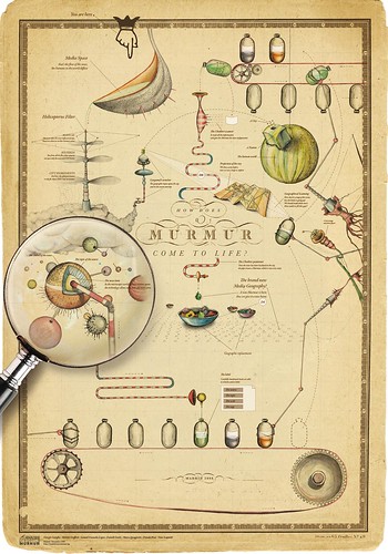
Murmur, originally uploaded by densitydesign.
After a week of cañas, tapas, fried food and heavy work this is the first result of the Visualizar’08 Workshop.
More specifically this is the wiki page of murmur
Thursday, October 30th, 2008
Project progress report 01. Economic statistic & Communication Design
Elective affinities between Economic Statistic & Communication Design
Economic statistic concerns understanding complex, multidimensional, ambiguous and dynamic phenomena building formal representations (models) based on statistical data. Communication Design addresses complex phenomena to interact with them building multi-dimensional visual representations based (in some cases) on statistical data.
The DensityDesign Lab approach, partially modified despite past editions, tries to foster this alliance in order to explore socio-economic phenomena that present both representational and visual problems. In fact they could be:
– complex;
– multidimensional;
– dynamic and evolutionary;
– not numerically measurable if not qualitatively;
– ambiguous and fuzzy;
– not dichotomous;
– of great impact on people and society.
The goal is to contribute to the construction of representation and visualization model respecting and preserving the inner structure of the analyzed phenomena, allowing users to know (see) them as a whole. This is not primarily a design issue, but an epistemological one; the aspect of visual representation and communication is only one part of a bigger topic. The broader aim is helping in build a cognitive process that integrates and combines different disciplines and skills.
The theme: poverty and social exclusion – conditions
Exclusion is a socio-economic status where people are placed on the margins of society, because of their economic, psychological, physical, cultural conditions.
To evaluate its forms and intensity requires models that consider a multitude of dimensions: the determination of poverty status cannot be reduced to simple and single indicator.
The study of poverty should be multidimensional being related to material deprivation, where the non-availability of certain goods, the lack of access to specific services establish a state of social discomfort.
Limits of representations
Traditional tools used for communicating the official data, about social issue, seem to be inconsistent with the characteristics of the phenomena:
– they produce only analytical views;
– the phenomena is over simplified and all the aspects that are blurred and ambiguous are neglected;
– an over-simplification often contains half truths;
– they do not express the approximations and uncertainties inherent to the data elaboration.
It is clear that, the more this kind of phenomena become subject of communication, the more the user should be aware of how the information is treated. We are not pretending everyone to be an expert in economics and statistics; we must build communication processes able to bring the user closer to what he wants to know.
The representation of socio-economic problem is not reducible to a problem or purely algorithmic technology, but not because of the quantity of data: complexity, multi-dimensionality and ambiguity are difficulty reduce into algorithmic computations.
This research area requires developing new visual grammars and communication tools that do not superimpose artistic or vaguely appealing elements over the representation of the phenomena, but should be able to build narratives deeply consistent with its inner structure. Visualization artifacts, diagram and maps, have to respect the robustness of scientific approach on phenomena while remaining consistent with the structure of cognitive and logic capability of the observer.
The first exercise conducted by DensityDesign students is seeking to intervene in this context: starting from 2006 official data (provided by the Istat) they build visualization about the poverty in Italy.
Sunday, October 26th, 2008
Numbers & Statistics, Biases & Emotions
27 August 2008
Michael Bond
http://www.newscientist.com/article/mg19926711.500-how-to-keep-your-head-in-scary-situations.html
[…] So we are predisposed to trust arguments about the safety of nanotechnology, for example, if they are put forward by people of the same social class or of similar political leanings to us, and predisposed to reject arguments put forward by people whose values we reject – regardless of any views we may previously have held on the issue. Unfortunately, that bias won’t necessarily lead to the best choice, so the idea that simply distributing accurate information is the best way to get people to make informed decisions is flawed: people will reject it if it isn’t presented to them by people they feel sympathetic to. Officials or campaigners have to display a plurality of cultural leanings if they want to reach out to as many people as possible.
Changing our decision-making process to enable us to make better choices will not be straightforward. Emotion plays a powerful role in the process, so when we’re feeling fearful or insecure, statistics wither in the face of millennia of evolutionary adaptation.
This has led Slovic to suggest we need to imbue statistics with more emotional significance so that we take them to heart. “We learn how to deal with numbers from a young age as cold or abstract entities – to read them, add them, multiply them – but we don’t learn to think about how they represent reality in a way that conveys feeling and meaning. We need to think how to teach people to step away from their intuitive response, which is insensitive to magnitude, and think more carefully about what numbers represent.” […]
the full article is available here.
- Make 5 Sentences about Saying Disagreement
- Payment Agreement Sample Philippines
- Can Landlord Charge for New Tenancy Agreement
- Spirit Airlines Tax Receivable Agreement
- Ancillary Services Agreement
- Download Agreement by Shanko Rasheed
- Facebook User Agreement Photos
- Music Production Contracts Templates
- Do Contractors Do Financing
- Free Trade Agreement Russia
- Stock Purchase Agreement Good or Bad
- Terminating Employee Contract Early
- It Support Agreements
- Iran Nuclear Agreement Terms
- Rental Lease Agreement for Ct
- Tcode for Display Contract Status
- Contracts Manager Jobs in Bangalore
- Behavioral Health Contractors Association
- User Agreement in Arabic
- Rcuh Agreement for Services

