Blog
Wednesday, September 5th, 2012
Visualizing NYC
During the next 6 months I have the honour to be hosted as a visiting researcher at the Parsons Institute for information Mapping in New York.
Among the case studies I’m collecting (here) on spatial visualizations of geo-referenced data, in this post I selected the ones that analyse and depict several dynamics of New York cities.
The following projects are either interactive interfaces or static images, visualizing User Generated Data as well as other data sources able to enlighten some hidden dynamics of the city.
A pdf of the projects above is downloadable from here , any suggestions on how to integrate this list with other relevant case studies is more than welcome!
–
(1) Livehoods
Livehoods reveal how the people and places of a city come together to form the dynamic character of local urban areas. Each dot on the map (●) represents a check-in location. Groups of nearby dots of the same color form a Livehood. The shapes of Livehoods are determined by the patterns of people that check-in to them. If many of the same people check-in to two nearby locations, then these locations will likely be part of the same Livehood.

–
(2) My Block NYC
MyBlockNYC.com is an interactive mapping website that captures and presents personal video accounts of the life and culture of New York City in order to create an intimate, evolving, and complete portrait of this great city. Users upload videos geographically, building the first fully interactive video map of New York City.

–
(3) Here Now
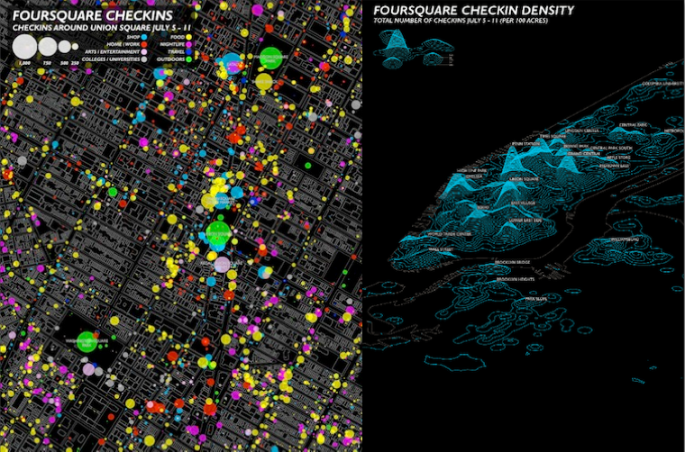
This project analyzes two weeks of of checkin data collected from Foursquare and Facebook API to explore what these new ways of communicating can tell us about New York City.
–
(4) A week on Foursquare
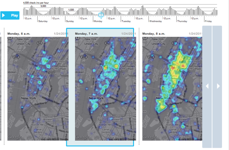
Digits collected every check-in on the service for a week earlier this year, via the Foursquare “firehose.” And what did they find? Broadly: The top individual spots are places like malls, airports and train stations, because so many people filter through those locations. But the top categories are homes, offices, coffee shops and bars, even though each of the individual locations in those categories gets a very small number of check-ins.
–
(5) Flickr geotags
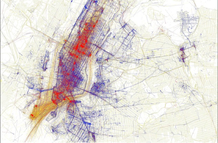
Using Flickr Geotags to Map the World’s Cities. (You’ll also notice a bit of color coding on the maps. Apparently, Fischer was able to guess that the picture taker’s mode of transportation–presumably using the time stamps and distance traveled between a user’s pictures. He then created a color code:Black is walking (less than 7mph), Red is bicycling or equivalent speed (less than 19mph), Blue is motor vehicles on normal roads (less than 43mph); Green is freeways or rapid transit.)
–
(6) A twitter anatomy of a protest
Here’s a visualization of mid and lower Manhattan on MayDay, 2012, plotting the when and where of tweets containing the keywords, MayDay and Occupy (representing a healthy mix of supporters, detractors, and everybody in-between). The visual coordination of three dimensions of data: location, time, and topic, provides an up-to-the-second profile of a social event as it forms, moves, and dissipates.

–
(7) Cascades
Cascade allows for precise analysis of the structures which underly sharing activity on the web.
This first-of-its-kind tool links browsing behavior on a site to sharing activity to construct a detailed picture of how information propagates through the social media space. While initially applied to New York Times stories and information, the tool and its underlying logic may be applied to any publisher or brand interested in understanding how its messages are shared.

–
(8) Pastiche
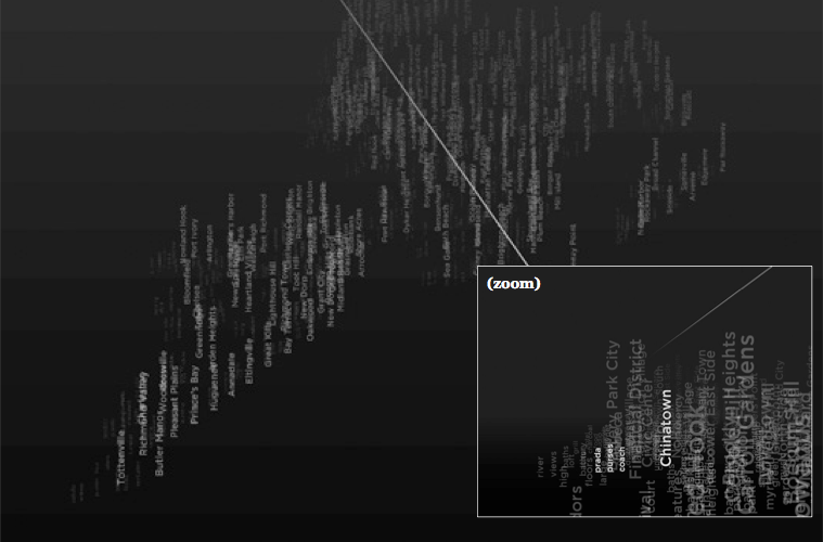
Pastiche is a dynamic data visualization that maps keywords from blog articles to the New York neighborhoods they are written in reference to, geographically positioned in a navigable, spatial view. Keywords are assigned based on relevance and recency, surrounding their corresponding neighborhoods. The result is a dynamically changing description of the city, formed around individual experiences and perspectives
–
(9) Invisible cities
By revealing the social networks present within the urban environment, Invisible Cities describes a new kind of city—a city of the mind. It displays geocoded activity from online services such as Twitter and Flickr, both in real-time and in aggregate. Real-time activity is represented as individual nodes that appear whenever a message or image is posted. Aggregate activity is reflected in the underlying terrain: over time, the landscape warps as data is accrued, creating hills and valleys representing areas with high and low densities of data.

–
(10) Mapping the buzz
The research, presented in late March at the annual meeting of the Association of American Geographers, locates hot spots based on the frequency and draw of cultural happenings: film and television screenings, concerts, fashion shows, gallery and theater openings, through photographs from Getty Images that chronicled flashy parties and smaller affairs on both coasts for a year, beginning in March 2006. The maps show the density of different types of cultural events in New York.

–
(11) Mapping America, every city very block
Browse local data from the Census Bureau’s American Community Survey, which was conducted from 2005 to 2009.

–
(12) NY metro card usage
The Metropolitan Transportation Authority offers several pricing options for subway and bus riders. Here’s a look at where people are swiping different kinds of MetroCards, and how recent fare hikes affected their use

–
(13) Stop Question and Frisks NYC
NYtimes interactive visualization. New York City’s police force, in its fight against crime, has increasingly used a strategy known as “stop, question and frisk,” which allows officers to stop someone based on a reasonable suspicion of crime. One expert has estimated New Yorkers are stopped at twice the national rate. The interface let users navigate the number of STOPS for each neighborhood and block

–
(14) Map your moves
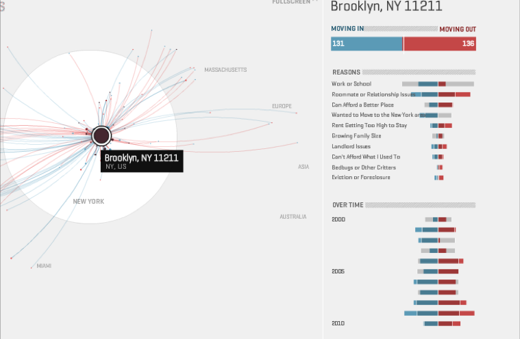
An interactive visual exploration of where New Yorkers moved in the last decade
–
(15) The Museum of the Phantom city
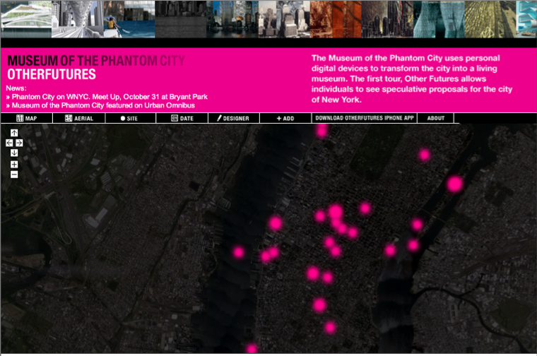
The museum of the phantom city uses personal digital devices to transform the city into a living museum. The first tour, Other Futures, allows individual to see speculative proposals for the city of New York
–
(16) Movements in Mahnattan
Using geolocated tweets to try and see how the movement of people is affected by the urban landscape. Basically, tweets sent by the same person within a 4 hour time-window were used as samples of speed and direction. These samples were used to construct a vector field representing the average flow of people within the area.

–
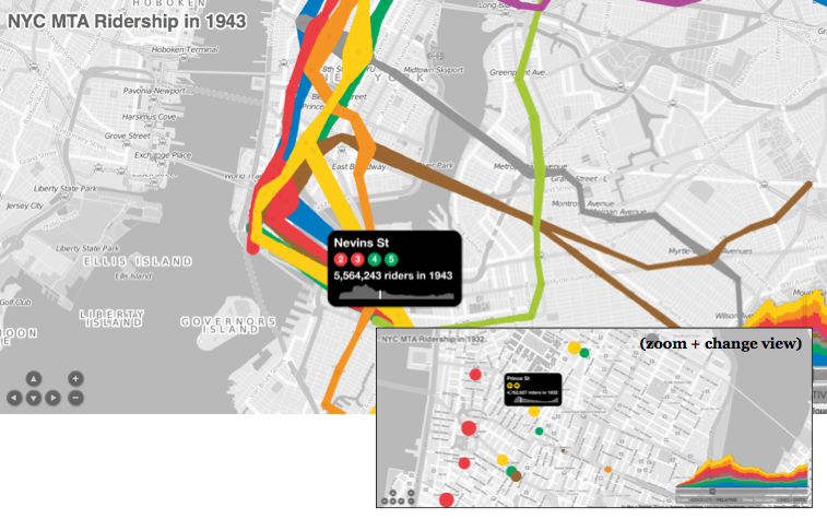
(17) NYC Subway ridership
Interactive time based visualization of NYC MTA riders from 1905 to 2006
–
(18) Lost NYC subways
Lost Subways: Abandoned Stations & Unbuilt Lines. Here’s the current subway map overlaid with eleven subway lines that were planned but never built.

–
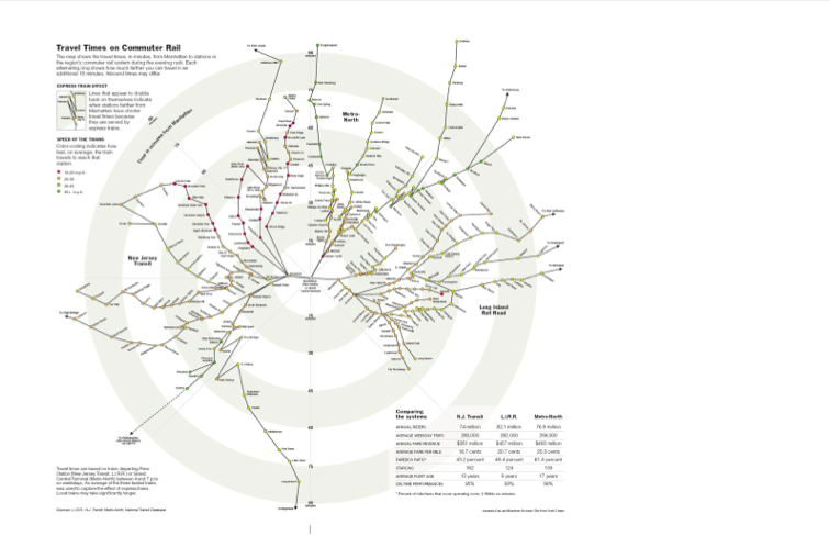
(19) Travel tube map
the map shows the travel times, in minutes, from Manhattan to stations in the region’s commuter rail system dureing evening rush. Each alternating ring shows how much farther you can travel in an additional 15 minutes
–
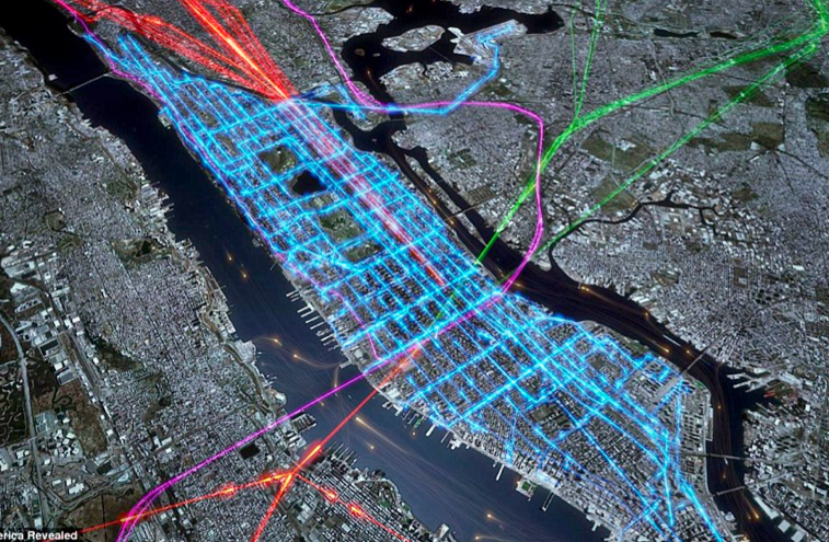
(20) time to work!
New York’s multi-layered morning rush hour detailed by the combined pathways ferries (orange dots), commuter rail services, (green purple and red) and the bus services (blue) that criss-cross the city picking out its famous grid pattern
–
snack time!
(same link as above) GPS trails reveal the routes taken by cycling pizza delivery riders on one Friday night in Manhattan. Each rider’s shift lasts eight to nine hours, in which time they can deliver between 30 and 40 pizzas all over the city

–
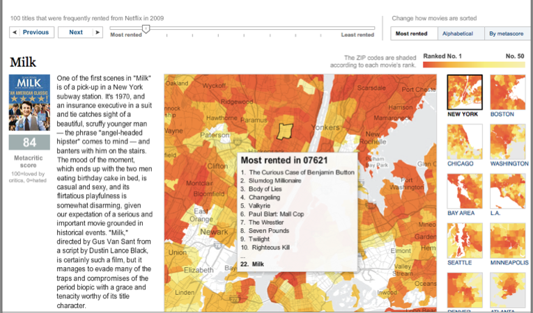
(21) A peak into Netflix Queue
Interactive Graphic by NYTimes examines maps of Netflix rental patterns, neighborhood by neighborhood, in a dozen cities across USA
–
During next months I will focus my research on investigating Health and Urban Geography through User Generated Content, and, of course, creating proper visualizations able to depict such relationship:
What is that makes “spaces” become “places” in people’s minds? What is that define a social and collective engagement with places? How can we discover which citizens’ perceptions that are affecting their urban experience and from what observations can we deduce what makes them satisfied? How to build novel urban qualitative indicators through the content that we everyday share on the different social media?
(stay tuned for updates!)
Tuesday, August 21st, 2012
DensityDesign is hiring
DensityDesign Lab is looking for a talented developer to join the research team!
As a design research lab based at the Politecnico di Milano, Italy we are focused on the visual explorations of social, organizational and urban phenomena through the design of information visualizations and interactive tools.
We are looking for someone constantly updated on both the theoretical and technical aspects of the development of web applications, interfaces, and data management in order to contribute actively to the research projects.
The candidates should be able to:
– develop interfaces and interactive visualizations using the most recent web technologies, such as HTML5, JavaScript, AJAX, Canvas elements and relative libraries and frameworks (jQuery, d3.js, knockout.js, backbone.js, …);
– conceive and develop back-end parts and databases: server-side implementations will be based on web frameworks (Django, API REST) and SQL/noSQl databases (MySQL, PostgreSQL, MongoDB);
– easily manage and manipulate different data formats (CSV, JSON, XML);
– share, document and maintain the code using collaborative revision control systems (GitHub);
Qualified candidates should have a master’s degree, an online portfolio of work and demonstrated code abilities. An orientation toward open-source methodologies and communities is also welcome.
For more information click here
Friday, July 13th, 2012
City of Flows Conference
I’ve attended the first day of the City of Flows Conference, which is hosted in a beautiful theater in Potsdam, and I’ll try here to build a report on the Data Mapping Session, which is the much more interesting for our researches.
–
introduction / city of flows presentation
City of Flows has been presented from professor Hans-Christoph Hobohm (of the City Climate Innovation Institute, in Potsdam) as an interdisciplinary conference on the future of the city.
The conference is actually a first step of a wider initiative that aims at bringing together different Universities departments (social sciences / social work / engineering / architecture / information scientists…), which usually do not really interact but in many areas they are indeed linked.
The interesting point is that organizers and speakers come both from the “analogical world” and the “digital world”, as Hobhom said, matching a very specialist approach with artistic approaches as well.
Everything, to set up the collaboration, started around the question: “what is analogue and what is digital?”inviting professionals and researchers to speculate on it.
–
The first intervention was Till Nagel‘s “Mapping the urban now”
(from SmartSingapore MIT Alliance for Research and Technology University of Applied Science)
As an introduction to the many layers of digital information we everyday produce, he started with a slide telling the story of his morning: checking the weather on his iPhone, sharing on Twitter his intervention to the conference, uploading a picture of the Hans Otto Theater when he arrived…:
actually making his traces visible, making the city become a place where we share some kind of knowledge, producing a city that could be seen as an even more living information system.

How can we use that in an meaningful way?
Nagel presented 3 projects his students have been working on:
(1) Splendor / aggregating data of people that pictures some places.

(2) Venice / discussing ongoing transformations on Venice through an interactive interface, through a physical object (Polyhedron) people could explore different dimensions of data.
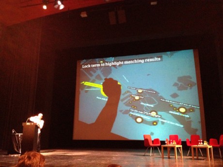
(3) Liquidata / an interactive interface that allows to discover your travel paths (through the GPS integrated in your iPhone), and to represent with a liquid metaphor the flow of the places you visited.

Being inspired from references such as the Naked City of Guy Debord, the idea behind these project is to create playful interactions between people and their environment, making the invisible visible, and enphatizising the emotional and personal level of the urban experience.
Nagel stressed the importance of designing tangible interactions (actual surfaces and object to interact with) for exploring such data, with the main idea of taking back the data to the places they’ve been created, trying to close the loop between digital and physical world.
He then presented Live SIngapore (the famous project of Senseable city Lab),even in this case the focus was on the interactive interface they designed, that allows people explore different perspectives on the same datasets, switching among 3 visualizations that together provide a complete immersion on the public transportation in Singapore.

The overall idea, and the aim of “Urban Data Visualization” is the one to create easy accesses to dataset:
(1) first of all to represent a city we cannot properly see everyday
(2) then to make citizens aware of all the data they produce
(3) then of course to support decision making
(4) and then, to improve our daily life. (and to that we’re at the very beginning, as he said)
–
The second intervention was the one of Michal Migursky from Stamen design who after a brief presentation of some brilliant and well known Stamen projects, opened up a question: when presentation is easy and data / facts are hard, what then?

As Stamen they’ve been approaching this question from different points of view,
(1) looking at collaborative data:
As an example with the open street maps project, which as we know is a sort of wikipedia of the georeferenced data.
A service producing a very dense layer of geographical information, with a growing relevance of the aesthetic quality, which is important when adding details to the representation (the toner view / that it’s working very well in projects where you have data to plot on maps, because it reduces the noise that the map is providing to the visualization, or the watercolor experiment which is much more decorative)

(2) looking at “frontiers data”:
Frontiers Data is a term that they’ve been playing with, that is around the idea of how does data arrive to us.
To answer these question he presented the Crimespotting project.
They realized that working with administrative urban data you have to really understand the context of the city you’re working in, and also how people conceptualize the places where they live.
The result is an interactive map that displays the terms that people use in their everyday life, when talking about safety and crime (light and dark instead of simply day and night).

Another project on frontiers data is Field Papers, where people can customize maps of places drawing on them for different purposes and psychogeography.
(3) and then producing shareable interfaces.
How do you handle meaningful data for which the facts don’t exist in the open? People want to experience and share data, people wants to enjoy. The quality and the fluidity of the interaction are such important as the accuracy of the datasets.
To answer, he presented the URLs for Everything project.
What is going to happen when the sea level rises? An “intense shareable interface producing what if scenarios”
Another project is Where does the money go? The project provides a simple one-dimensional interaction: “You can act only by using the slider, providing a satisfying way of interacting with data given by the intensity of the data displayed at every moment”.
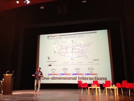
An interesting conclusion was just about “where all the visualizations go?” Isn’t that worth and promising the fact that now (with tools like Pinterest) you can share images, videos and interfaces just with a click? Will the “old Flash” really die now that it could not be integrated with the new ways of sharing information?

–
The third of four intervention was Christian Derix, director of computational design research center at Aedas in London. entitled:Streetwise: Mapping spatial configurations and user behaviors for urban design/ “wise / in the sense that you know what’s happening on the street better being there than looking at an online map.”
Talking about data, them aim at Adeas, is to use design processes to interpret data, integrating them in planning projects.
Christian started with a few references describing their background, stressing the importance of understanding phenomena both looking “from above” and exploring the small scale, “perceiving space while moving through it, being in space, acting with the space, seeing people in space”. Many famous authors and architects have been quoted, from sociological theories of Durkheim about statistical social space or the geometrical space of Haggert and Cloney, to Georges Perec and his observations on field, to the Naked city of Guy Debord, to the organic city and the permeability of SANAA.
As a visualization perspective, they come to the fact that nowadays, with all this massive number of layers the space has and can be interpreted through, they’re trying to produce some, as he called them, “parsimonious visualizations”, where just one layers is shown at a time.(but effectively nothing has been shown at the conference about it.)
He then showed the project they developed in 2011 to model the data generated by Barclays Cycle Hire users in 4 months (where bikes have been picked up and where left down in London)They produced motion visualization of shortest cycle routes between Barclays Cycle Hire docking stations across London with their frequencies of use. They used motion visualizations and 3d view to show intensity.Moreover, they tried to answer to the question of how much Barclays Bike are affecting the city?”Analysis of the data by Aedas suggests that more than two million kilometres have been travelled over the four-month period. While there can be no doubt regarding the value of the Barclays Cycle Hire scheme, the contribution it makes in terms of carbon reduction is tiny; the equivalent of the annual CO2 emissions of an average London office block, or probably less than 0.005% of the estimated 18 million tonnes of CO2 produced by transport in the capital. London clearly has a long way to go to support low carbon living.”

–
the last intervention of the session was from Jason Dykes, a reseacher at the Gi Center / City University / London
go with the flow or map to know? some thought and ideas on flow map design.
Jason overviewed the macro topic of getting people involved with complex phenomena, particularly focusing on big datasets, giving a qualitative speech on how we can we visually play with geographical information: dynamically combining lines, colors, curves and points to show origins and destinations, identifying loops with ellipses, and experimenting a lot with geographical transformations.
How about geographic transformation? is it possible to improve legibility of certain geographic phenomena through the modification of the base territory itself?
A lot of possibilities with the geographical distortions of the map (cartograms) according to a parameter has been used during last years, mainly showing time travels / time patterns within the urban scale (analyzing a lot of case studies I’m collecting here the 90% of the geographical visualization distorted are displaying topics related to mobility and travel patterns).
A few experiments Jason showed are reported as follows:

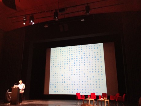


But the main question is: does geographical transformation works in making phenomena really better understandable? With which datasets? Isn’t it better to provide an actual map that everybody can read without effort?Is it possible, instead, to create new models and grids (like the already digested Underground Map) that really enable the comprehension of certain phenomena?
discussion, questions and answers.
Several questions have been proposed from the public. Generally speaking, most of the questions were around the processes of co-creation of data; or the possibility to include people as active participant of such showed maps; or around the word “interactivity”, which some suggested is not appropriate for describing simple interactive interfaces that have nothing to do with the actual intervention and interaction with places.
As a visualization point of view, an interesting point was around the use of complex visualization addressed to the general public (we had different opinions from the audience).
“Will general public (“my mum”) understand those complex visualization? Is the aesthetics you’ve been showing appropriate for showing the phenomena? Do you think that information design could make some step forward on it? In which ways?”

Speakers answered in different ways,
…enlightening that some visualization they showed are designed for decision makers and together with them based on their needs,
…and also proposing that the public has to be exposed to novel visualization – if they’re properly designed and if they address specific needs: as in the case of the underground map, we don’t fear because we learned how to read it, but an initial effort has been done. (even when BBC changed its weather map a lot of citizens has been protesting but then everybody recognize that everything works better with them).
As I see, novel visualization systems has to be explored, but if we’re able to design visualization systems and models that could really disrupt the former in terms of legibility and utility, I’m quite sure the effort that we will require to the audience wouldn’t be so much. (what do you think?)
–
*a remarkable note: there isn’t any wi-fi in the conference rooms.
I was astonished. (since I have no data roaming on my Italian phone I couldn’t participate to the online conversation you can find here: #cof12 )
Then, a tweetwall was in, not quite as sophisticated as the one we designed for Frontiers of Interaction (see picture below) I have to ask which software they used 🙂

Monday, July 9th, 2012
Workshop in Beirut | The Guardian Panorama on Lebanon
Within the rich Beirut Design Week’s events agenda the Density Design Lab (Giorgio Roberto Uboldi, Azzurra Pini and Matteo Azzi) and the Sciences Po-Médialab (Donato Ricci) have been invited for an intensive 3 days workshop about digital methods and data visualization.
Preparatory phase
We used the Guardian API to collect all the articles related to Lebanon from 2005 to 2012, for a total amount of 4634 articles.
By using an ad-hoc software, ANTA, designed and developed at Sciences-Po, the relevant semantic entities of each article have been extracted.
After a semi-automated cleaning process (including among the others tools like Google Refine) the finale dataset was composed of more than 4000 unique entities.
The workshop
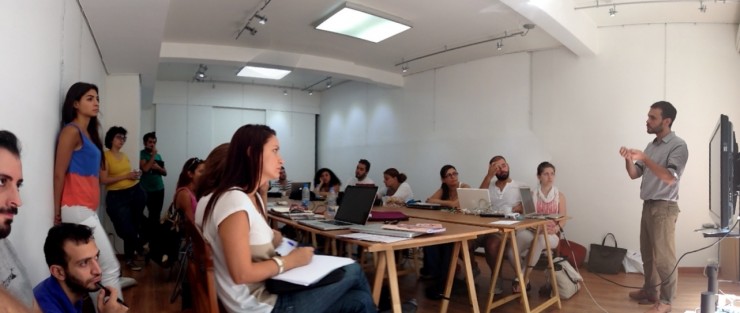
The workshop was structured in three session, each one focusing on different topics and different tasks for the participants. During the first lesson, we introduce the workshop and present the dataset the participants had to deal with for the entire workshop. Then we asked them to enrich the dataset dividing the 4000 entities in different categories (e.g: places, people, institutions).
In this way we prepared the ground for the others tasks that converged in a collective final exhibition divided in three layers:
1- A timeline that showed the trends of the entities and categories from 2005 to 2012
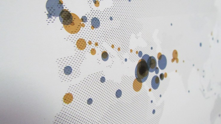
2- A series of maps with all the geographical data linked to Lebanon divided per trimesters
3- A series of network graphs divided per trimesters able to show the relations between the entities in order to show how the actors and topics are connected to each other on the Guardian.
The timeline, visualized through a 9 meters stacked area chart, let us see how the quantity of information about Lebanon on the Guardian is strictly linked to the main events occurred in the last seven years, like the 2006 War or the assassination of Rafic Hariri in 2005.
We could also observe that in the last two years the attention on Lebanon increased enormously due to the evolution of the so called Arab Spring and the Syrian civil war. During the exhibition we asked the visitors and the participants to add notes on the timeline according to the main peaks, in order to make the timeline richer of information.
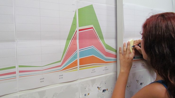
During the second session the students had to extract the entities related to geographical places and visualized them on a map. The exercise revealed the main geographical patterns related to Lebanon and their changes according to the main events.
The last, and probably the most interesting and challenging session, was about creating network graphs in order to show the existing relations between the entities in the articles. Like in the previous task, we asked the students to choose a trimester and visualize the network through Gephi.
The size of the nodes corresponded to the frequency in the trimester and the edges showed if the entities were present in the same article. In this way the participants were able to discover the main discussions occurring on the Guardian and around which actors they evolve. Most of the topics were pretty expected and these are the usual suspects in the press when mentioning Lebanon: Israel, Syria, Iraq, War, United Nations and Terrorism. At the same time we could observe parallel discussions occurring only in certain periods that gave the possibility to unveil and discover hidden stories, that usually lebanese people don’t see related to their country.


Video by Laboratoire d’Art.
See more picture here
We would like to thank especially:
Mena Design Research Center for inviting us and the great organization.
Laboratoire d’Art for hosting us (Thank you very much Brahim!).
All the participants that attended the workshop with great enthusiasm: Aaraj Grace, Adlouni Sarah, Attoui Loryne, Baba Joana, Boukarim Marwa, Eid Charbel, Geagea Nadine, Gebrayel Imad, Gedeon Nayla, Halwaji Lama, Maalouf Nicolas, Matloub Maria, Mhanna Simon, Mishoyan Peno, Nasr Rania, Pier Giuseppe Mariconda, Saad Rana, Sabbouh Tarek, Saudargaite Ieva, Srouji Serene, Zeidan Yara, Zouein Lama.
Friday, June 15th, 2012
Share Your Knowledge
Share Your Knowledge: Why?
Share Your Knowledge: How?
Wednesday, June 13th, 2012
Speed Up Workshop in Milan | Visualising Ageing
DensityDesign is one of the members of the European research project ‘Electronic Maps to Assist Public Science’ (EMAPS). From the 22nd to the 24th of May we organized a workshop with nine of our best students to work with the staff for the creation of several visualizations on the population ageing topic.
Workshop coordinator was professor Paolo Ciuccarelli (DensityDesign’s Scientific Director), with PhD students Michele Mauri and Azzurra Pini. Participants were: Benedetta Signaroldi, Carlo De Gaetano, Federica Bardelli, Francesco Faggiano, Gabriele Colombo, Giulia De Amicis, Stefania Guerra, Stefano Agabio and Valerio Pellegrini.
DensityDesign workshop comes after the Science Po one, which was intended to collect data about the aging phenomenon and provided the datasets for our visualizations. They identified the most useful data sources and created a specific protocol to gather data from each of them. The data format followed data behaviours, that is each topic was described by several data formats, such as tables, networks and unstructured text.
The aim of our workshop was to provide a prompt answer to some specific questions about ageing mutation. We tried to overcome the limits of traditional visual models by experimenting different solutions, in order to find the most suitable one. Our project focused on four main topics. In order to achieve the best solutions, we invited the students to work in small groups.
You can find here all the produced visualizations, as a PDF file.
Preparatory phase
The workshop set up was different from our typical working flow. When we work on visualizations, we should define several visual levels. These are the result of a preliminary phase on frequent exchanges with the client or “domain expert”. The most difficult part is to make them aware of the real potential of data visualization, without letting them underestimate or (worse) overestimate it. Then we start working on drafts and basic visualizations in order to identify the core of communication, the most important things to convey to people. Only at this point we start working on the final visualization, identifying several visual levels (mood, colours, metaphors, typography) that fits the specific topic.
Setting up this kind of process would have been impossible without delaying the needed time. As the conditions were quite unique we worked in a different way.
Michele Mauri and Azzurra Pini were responsible of the first part. In collaboration with Donato Ricci and Tommaso Venturini from Science Po, we identified a specific question for each topic. Questions need to be focused, meaning that they should have a specific but not forced answer (there isn’t only a solution). For example, analysing the words used by websites related to ageing one of the question was “How official and unofficial websites talk about ageing?”.
Then, we created a visual format identifying standard sizes, a colour palette, and an asset of typographic fonts. The creation of a format is very important working with a large number of people, it forces everyone to “talk” the same visual language. Obviously, it can’t be too strict otherwise is impossible to express different concepts.
We prepared formats of different sizes for different purposes. Small ones , A4 and A3, are intended for a booklet fruition. Whereas a bigger one (70x70cm) is intended for a group interaction, allowing more than one person to look at it and discuss about the topic.
The workshop
Participants were divided in four teams, each of which worked on a specific topic and dataset. Selected topics are:
– Wikipedia pages network. The network of links starting from the “Ageing” Wikipedia page.
– Google AdWords. List of keyword suggested by Google for ageing related product, and their effectiveness.
– Meetic. List of 2,000 profiles over 65. Dataset on how they describe their selves and how them describe their ideal partner.
– Semantic analysis of websites. Most used word in websites related to ageing, both official and unofficial ones.
Ageing on Wikipedia
This topic was already visualised with a network graph by Science Po. Our aim was redesigning it avoiding the “hairball” problem of the network: the high density of connections that makes it hard to read.
TEAM:
Benedetta Signaroldi, Gabriele Colombo.
DATA:
Starting from the Wikipedia page on Ageing, Science Po researchers crawled all the linked pages creating a network. We were dealing with a directed network, that is links have a specific direction from one node to another; so for each node two values have been taken in account: in-degree (number of other pages linking it) and out-degree (number of other pages it links to). Nodes have been divided in 8 custom categories, not from Wikipedia but identified by Science Po researchers.
QUESTION:
Does a Wikipedia page refer only to other pages in the same category? Are there differences between in-links and out-links?
VISUALIZATION:
Three different visualizations have been developed from this topic. The first two are variants of the same concept: avoiding the overload of connection in the network graph.
Science Po produced a first visualization of this data using a network graph, and asked to create different visualizations trying to make it more readable. In the original graph the information is conveyed only by nodes position, created with a spatialization algorithm. The coloured edges instead convey lot of noise, and little information. Due to the complexity of the relationships, most of the edges were impossible to read. For this reason we decided to aggregate them to convey more effective information. For each node has been computed the total number of incoming links (in-degree) and the total number of outgoing ones (out-degree). This is a first point very useful to gather more information about each node: which one is more connected? Is there a referential node? Is the balance of in-degree and out-degree similar in each node?
Both in-degree and out-degree are subdivided by the categories of incoming and out coming links. This information is useful to understand how each node is related to other categories: do nodes from other categories link to it? Do in-links categories are the same of out-links?
We settled that the best way to encode this information was through glyphs. Glyphs are graphical entities whose parts are visual encoding of data. A simple example of glyph is a “pie chart”: a graphical entity (the full pie) made up by several parts (the slices). This way is possible to encode data also with their positions, for example on a geographical map or (in our case) using a displacement algorithm for graphs.
We experimented two different kinds of solutions.
In the first map (table 01/A) the total degree is mapped as a ring around each node. The ring is divided into two parts, the in-degree and the out-degree through a separation line. Each part is then divided, like a pie chart, by its categories. In the second map (table 01/B) each node is represented as a double histogram. The left part represents the in-degree, divided by category, while the right side visualises the out-degree.
The third visualization (table 01/C) is an aggregated view of the network, and it considers categories instead of single nodes. A radar plot for each category shows the number of links to or from all the other categories (considering the general degree). This visualization gives an overall view on the graph. It is useful to understand how each category behaves in relation to the others. If it links only to itself, or if it is mainly linked to another one.
Ageing Advertising
This is a series of maps showing how Google classifies keywords related to ageing for online advertising.
TEAM:
Federica Bardelli, Stefano Agabio
QUESTION:
Which are the most offered services on the web, and which are the most searched?
DATA:
The dataset is scraped from the Google AdWords keywords tool. The tool suggests related keyword to a particular query, helping to get a better placement for your product. For each suggested keyword (or group of keywords) the tool specify the competition (how many other sites are using the same keyword) and the demand (the search volume). These two values are defined in a qualitative way (high, medium, low).
61 queries divided in 10 categories related to aging have been tested this way. This produced about 4300 related keywords groups, and a total of 380 single keywords.
VISUALIZATION:
Two different visual models have been used for this topic.
The first one has been used to design a series of similar visualization on different scale. This is due to the high number of single records in dataset. We found that the best way to represent this type of data was the bubble chart because it helps to visualise correlations between dimensions. On the horizontal axis we placed the competition value, on the vertical axis the search volume. The size represents the number of suggestions.
In the first visualization of this series (table 2A) data is aggregated by category. Tables from 2B to 2M visualize in the same way all the single queries exploding each category.
A greatest problem was to visualize data at minimum scale, meaning the single suggestion. As each keyword can have only three possible values (high-medium-low) visualising them using a bubble chart would create an overlapping (table 2N). A possible solution resulted to visualise for each query the number of results in the 9 different areas (table 2O). This visualization gives a deeper insight, showing how suggested words place in the market. Table 2Q visualizes all the queries with the aforementioned visual model.
The second visualization (table 2R) visualizes the network of keywords for each market area. The aim is to find similarities and differences between them.
Ageing Talking
These visualizations show the most popular words used on websites to talk about ageing.
TEAM:
Carlo De Gaetano, Giulia De Amicis, Francesco Faggiano
QUESTION:
Do official and unofficial sources describe aging with different words?
DATA:
A list of websites have been analysed extracting the most relevant words in an automatic way. Each site has been listed as official or unofficial. Each site is also targeted on its nature (commercial, non-profit, institutions…) and on its technical nature (blog, forum…). For each word, depending on the proportion between official and unofficial sources linked, it was created an index (or degree) of “officiality”. For each word it is also computed the number of sources using it.
VISUALIZATION:
The first group of visualization (tables 3A, 3B) shows the original graph. In the first one (3A) the name of the websites are highlighted and coloured according to their typology (official and unofficial).
The second one represents the same network but highlighting the keywords, and colouring them on the proportion of official/unofficial sites linking them.
These two visualizations are a visual explanation of the process: all the following tables won’t show websites, focusing on keywords.
Chart 3C shows all the keywords polarised by their level of officiality. Keywords are displaced from left to right according to the number of quotes from official sites.
In chart 3D are showed once more all the keywords, but polarized on the typology of the kind of website using them. The outer ring shows websites categories, arcs’ partition is proportional to the number of website in each category. Words are placed near the category that uses it the most. Keywords in the middle are equally used by all categories. Colour represents the officiality index. This table helps us to understand which words are mostly used by a category of websites, and if a category attract official or non-official words.
Table 3E uses the same visual model to visualise keyword distribution among a classification based on the website technical nature.
Ageing on date
These visualizations show how elder people describe their selves on a popular dating website (MEETIC) and how they describe their desires.
TEAM:
Valerio Pellegrini, Stefania Guerra
QUESTION:
How elder people describe themselves for a possible date? How do they describe their wishes? Is there a matching between available characteristics what people seek?
DATA:
2,000 profiles of elder people (65+) have been taken from the dating website meetic. These profiles are proportionally divided in four categories: men looking for women, men looking for men, women looking for men, women looking for women.
For each profile have been taken 22 main characteristics (e.g. relationship, nationality, entertainments…) and 16 additional ones (e.g. sports, my pets, political views…).
For each personal profile has been also taken the description of the man/woman the user is looking for. This description is described in 37 characteristics.
VISUALIZATION:
Two first visualizations describe which answers are more used by overall profiles. Chart 4A shows how elder people describe themselves. Each circle represents an answer, while the colour represents the question. By looking at this chart it is possible to understand which are the most used characteristics. Chart 4B uses the same visual model to show how well is described the ideal partner.
Chart from 4C to 4F show similarity and differences between the four typologies of profile. In each chart it is shown the most frequent answer for each question. Charts from 4G to 4L show how the ideal profile is described.
Friday, June 8th, 2012
TwitterWall
From 7th to 8th June we are at Frontiers of Interaction conference, and our application will visualize the live twitter stream about the hashtag #foi12.
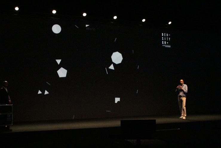
Our aim is to visualize the twitter discussion with simple rules, and simple shapes. Despite its visual simplicity, the application has a very complex set of rules to manage both the shapes and the texts, avoiding overlapping and optimizing for readability.
So, few words to explain what those sci-fi polygons going around on the screen mean.
Each user is visualized as a polygon, the vertices number is equal to the posted tweets using the conference hashtag.

User will slowly move away from the center of the screen. If a user post a new tweet about #foi12, it will return at the center of the screen, gaining a new vertex.

Stay tuned, we will be posting some pictures and videos about it!
The application has been created by Valerio Pellegrini, Robin de Mourat and Michele Mauri.
Special thanks goes to Stefania Guerra for her preliminary work collecting and analyzing case histories.
Tuesday, May 22nd, 2012
Makers
Last weekend – May 19 & 20 – was the weekend of the Maker Faire: “A two-day, family-friendly festival of invention, creativity and resourcefulness, and a celebration of the Maker movement“, says the header of the website. The event is (yet) another idea of Dale Dougherty, the founder of Make Magazine, one of the main references for the Maker movement.
The movement is quite active also in Italy nowadays. “Make” and “Open” have been indubitably two of the key-words of the last Design Week in Milano; some weeks before another event celebrated in Rome the Maker movement: World Wide Rome – the Makers edition – with an outstanding line of speakers: Chris Anderson, Massimo Banzi and Dale Dougherty himself, among the others.
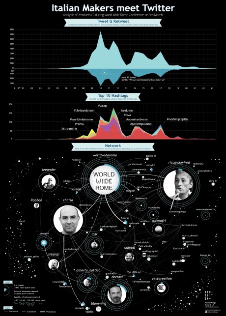
In this period we’re working hard on social media at DensityDesign, with a series of different projects. We decided to track the event in Rome, following the #makers12 hash-tag. We collected around 6.000 tweets in the 24 hours of March the 9th. Here is the visualization developed by Stefania Guerra (with a strong support from Michele Mauri and Matteo Azzi) as the very first exercise of her internship in our lab.
Apart from the official Twitter account of the event, @worldwiderome, Riccardo Luna/@riccardowired – the anchor of the event and former director of Wired magazine, Italian edition – and Chris Anderson/@chr1sa are the most cited speakers. Anderson, Dourgherty/@dalepd and Banzi/@mbanzi didn’t use Twitter during the event, at least not with the official hash-tag. Luca Perugini/@perugini has been the most productive Twitter user, as usual!
One of the tags most frequently associated to #makers12 is – you could guess it – #arduino. Arduino is certainly one of the innovation stories we should be proud of in Italy, and I’m very happy to see that Massimo Banzi will talk about it at TEDGlobal2012. The topic this year is, again, Radical Openness.
Friday, April 27th, 2012
VisualExplorations course > Contents overview
A synthetic overview of the contents we’ll face in the first course of the Visual Explorations program (www.visualexplorations.org):
Week #1 | BASICS | May 07-11, 2012
* history and foundations
* why we do visualize?
* the grammar of data and information visualization
* the raw materials: data, Open Data, Linked Open Data
* the processes: gathering, organization, pre-production
* back to Excel: preparing the visualization process
Week #2 | TOOLBOX | 14-18 maggio 2012
* semi-automatic production of semi-finished visualization artifacts;
* experimenting with visualization tools (Tableau, Google motion charts, treemaps, Raw …);
– R (applied statistics);
– Viz in Illustrator;
– Scriptographer + js;
– Cytoscape.
* towards a communicative final product.
Week #3 | WORKSHOP | May 21-25, 2012
* from (your) dataset to the production and publication of a communicative visualization;
* visualization and narration: applying storytelling to data.
Week #4 | DIGITAL NATIVES (DATA) | May 28 – June 01, 2012
* from structured data to social media and digital foot prints: mining and refining user generated (digital) contents;
* dynamic and interactive visualization;
* from paper to mobile and handheld devices.
Tuesday, April 10th, 2012
Visualizing Twitter
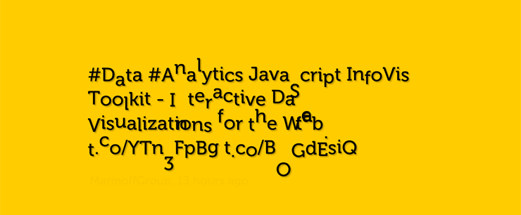
In the framework of our researches, we are focusing on twitter visualization. This social platform indeed offers several opportunities for data visualization: social ties analysis, links between geography and themes/languages, real-time visualization of a particular topic (like a conference), or again to analyse a past topic and its “storyfication”.
We spent last week recognizing recent developments related to the topic, identifying three main fields:
- Real-time visualizations: visualizing twitter stream in realtime during conferences or big events.
- Visual search: online tools that create a dynamic visual output for a twitter search.
- Storytelling: the use of visualization to tell an event in the past. There are both interactive and static examples.
We’d like to share with you a selection of these examples. Selected artworks have been created in the last three years.
Visual search
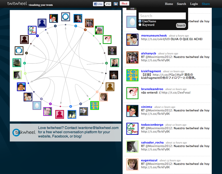
TWITWHEEL (2011) is a tool that shows in the form of a circle the connections between people that are tweeting about the same thing.
BREAST CANCER CONVERSATION (2011, GE) is a visualization tool that allows to explore in real-time tweets about breast cancer. Its way to organize by topics, stories or people help understand the giant nebula of dots.
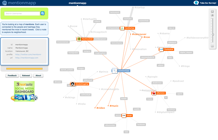
MENTIONMAPP (2011) is useful if you want to see the map of the entities mentioned by a user and hashtags related.
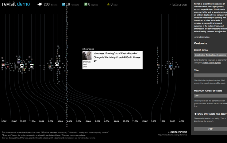
REVISIT (2010, Stefaner Moritz) is a real-time visualization of the latest twitter messages (tweets) around a specific topic, more it provides a sense of the temporal dynamics in the twitter stream, and emphasizes the conversational threads established by retweets and @replies.
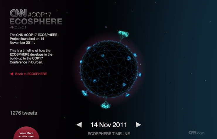
ECOSPHERE (2011, CNN) is a real-time Twitter Visualiser used to aggregate tweets tagged with #COP17, during Durban Conference on Climate Change. The result was an instant snapshot of how the world saw climate change.
HASHTAGIFY (2011, Daniele Mazzini) allows to see clearly what hashtags are related to the one searched. The weight of the connecting line indicates how relevant is the hashtag.
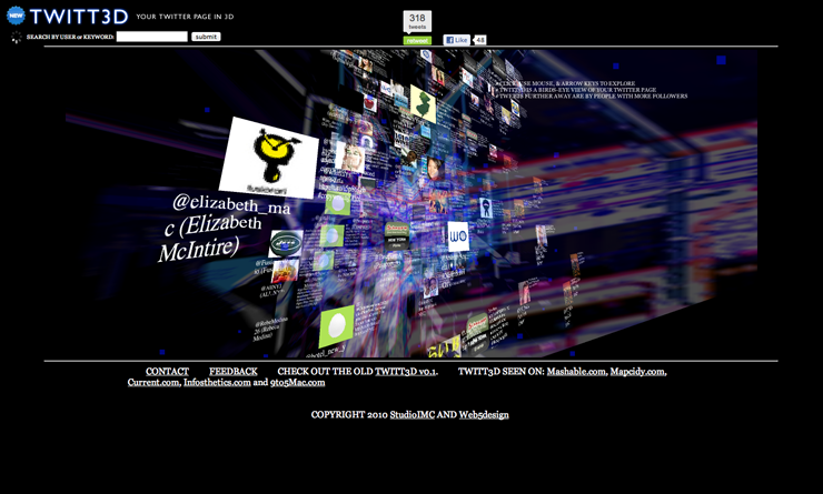
TWITT3D (2010, StudioIMC and Web5Design) displays a twitter page in a 3d map explorable just moving the mouse up and down.
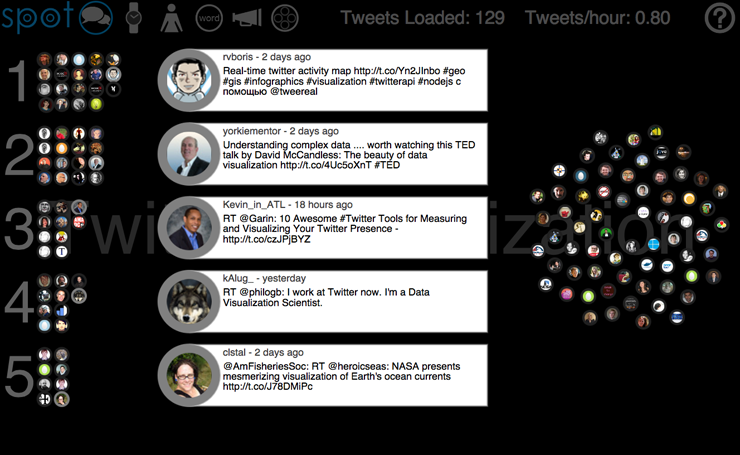
SPOT (2012, Jeff Clark) is an interactive real-time Twitter visualization that uses a particle metaphor to represent tweets. The tweet particles are called spots and get organized in various configurations to illustrate information about the topic of interest. The more useful configurations are by words, timeline and groups.
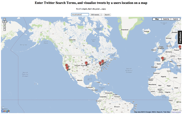
TWITTERMAP (2009) shows on a map tweets about a topic, depending on the location of the user.
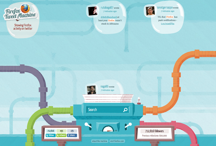
FIREFOX TWEET MACHINE (2010, Quodis Lab) is a graphic visualization of Firefox activity on Twitter.
Real-Time Visualization
VISIBLETWEETS (2009, The Man In Blue) visualize Twitter messages through a simple animation and color background.
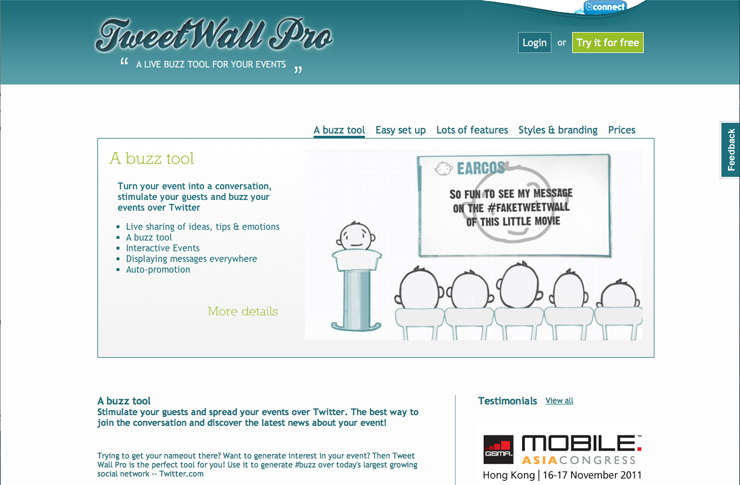
TWITTWALL PRO (2010, Tweet Wall Pro) Guests are visually encouraged to send tweets during event, which results in a worldwide real time buzz and greater exposure. Tweets appear on a screen (Twitter Wall), as they are sent, encouraging audience participation and promoting your event as it happens. Don’t want critics? No problem! There are filters.
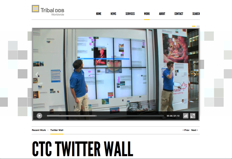
CTC TWITTERWALL (2010, Tribal DDB Worldwide) This mural displays live twitter postings and photos from travellers enjoying their trips in Canada. Even hassled passersby could take pause and interact with the thousands of experiences being posted to the mural in real time.
Storytelling
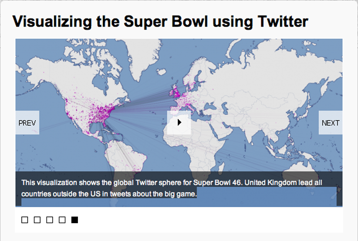
SUPERBOWL (2012, Asim Mittal) The visual map of anyone who tweeted about Superbowl, with particular attention to United States and United Kingdom, the most active tweeter outside US.
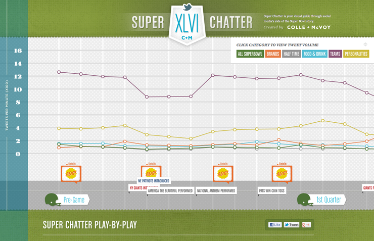
SUPERCHATTER (2012, Colle + McVoy) analyses everything related to Superbowl, and visualizes in a graph showing time and tweet per minutes, the trends of topics like team, food.
SXSW FESTIVAL (2012, Mass Relevance) An infographic with everything from the most retweeted tweets and photos to the most-mentioned brands.
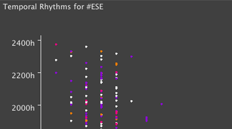
ECLIPSE CONFERENCE (2011, Cate Huston) This infographic wants to explore temporal rhythms around ESE conference, for example to pick out more popular or particularly tweet-able sessions.
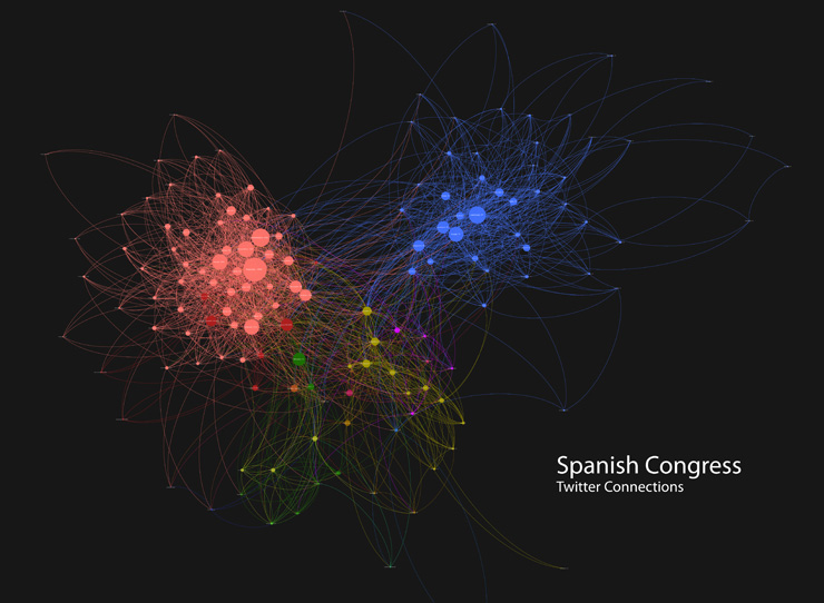
SPANISH CONGRESS (2011, Guillermo del Fresno) This graph presents the spanish congressmen with an account in Twitter and the connections between them. Bipartisan system?
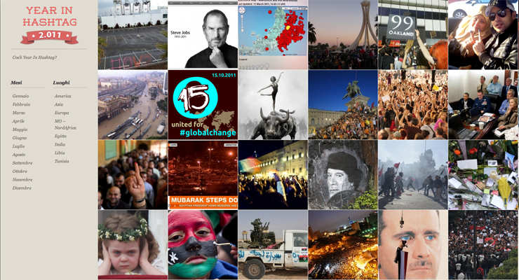
YEAR IN HASHTAG (2011, Claudia Vago, Luca Alagna, Marina Petrillo, Maximiliano Bianchi, Mehdi Tekaya) gathers lots of events from 2011 seen from the citizen point of view. Its simple interface is made of significant images of the event, and a short description followed by videos, tweets and photos. Events can be browsed also by month and place.
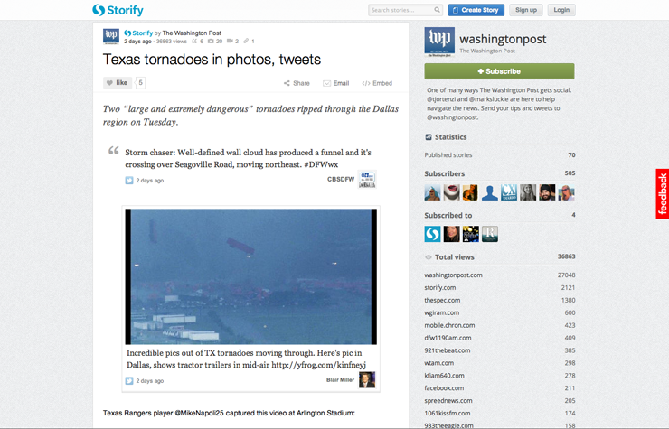
STORIFY (2012, Xavier Damman + Burt Herman) gives the user the possibility to create his own story using photos, videos and status taken from social network like Facebook, You Tube and Twitter.
- Make 5 Sentences about Saying Disagreement
- Payment Agreement Sample Philippines
- Can Landlord Charge for New Tenancy Agreement
- Spirit Airlines Tax Receivable Agreement
- Ancillary Services Agreement
- Download Agreement by Shanko Rasheed
- Facebook User Agreement Photos
- Music Production Contracts Templates
- Do Contractors Do Financing
- Free Trade Agreement Russia
- Stock Purchase Agreement Good or Bad
- Terminating Employee Contract Early
- It Support Agreements
- Iran Nuclear Agreement Terms
- Rental Lease Agreement for Ct
- Tcode for Display Contract Status
- Contracts Manager Jobs in Bangalore
- Behavioral Health Contractors Association
- User Agreement in Arabic
- Rcuh Agreement for Services


