I’ve attended the first day of the City of Flows Conference, which is hosted in a beautiful theater in Potsdam, and I’ll try here to build a report on the Data Mapping Session, which is the much more interesting for our researches.
–
introduction / city of flows presentation
City of Flows has been presented from professor Hans-Christoph Hobohm (of the City Climate Innovation Institute, in Potsdam) as an interdisciplinary conference on the future of the city.
The conference is actually a first step of a wider initiative that aims at bringing together different Universities departments (social sciences / social work / engineering / architecture / information scientists…), which usually do not really interact but in many areas they are indeed linked.
The interesting point is that organizers and speakers come both from the “analogical world” and the “digital world”, as Hobhom said, matching a very specialist approach with artistic approaches as well.
Everything, to set up the collaboration, started around the question: “what is analogue and what is digital?”inviting professionals and researchers to speculate on it.
–
The first intervention was Till Nagel‘s “Mapping the urban now”
(from SmartSingapore MIT Alliance for Research and Technology University of Applied Science)
As an introduction to the many layers of digital information we everyday produce, he started with a slide telling the story of his morning: checking the weather on his iPhone, sharing on Twitter his intervention to the conference, uploading a picture of the Hans Otto Theater when he arrived…:
actually making his traces visible, making the city become a place where we share some kind of knowledge, producing a city that could be seen as an even more living information system.

How can we use that in an meaningful way?
Nagel presented 3 projects his students have been working on:
(1) Splendor / aggregating data of people that pictures some places.

(2) Venice / discussing ongoing transformations on Venice through an interactive interface, through a physical object (Polyhedron) people could explore different dimensions of data.
(3) Liquidata / an interactive interface that allows to discover your travel paths (through the GPS integrated in your iPhone), and to represent with a liquid metaphor the flow of the places you visited.

Being inspired from references such as the Naked City of Guy Debord, the idea behind these project is to create playful interactions between people and their environment, making the invisible visible, and enphatizising the emotional and personal level of the urban experience.
Nagel stressed the importance of designing tangible interactions (actual surfaces and object to interact with) for exploring such data, with the main idea of taking back the data to the places they’ve been created, trying to close the loop between digital and physical world.
He then presented Live SIngapore (the famous project of Senseable city Lab),even in this case the focus was on the interactive interface they designed, that allows people explore different perspectives on the same datasets, switching among 3 visualizations that together provide a complete immersion on the public transportation in Singapore.

The overall idea, and the aim of “Urban Data Visualization” is the one to create easy accesses to dataset:
(1) first of all to represent a city we cannot properly see everyday
(2) then to make citizens aware of all the data they produce
(3) then of course to support decision making
(4) and then, to improve our daily life. (and to that we’re at the very beginning, as he said)
–
The second intervention was the one of Michal Migursky from Stamen design who after a brief presentation of some brilliant and well known Stamen projects, opened up a question: when presentation is easy and data / facts are hard, what then?

As Stamen they’ve been approaching this question from different points of view,
(1) looking at collaborative data:
As an example with the open street maps project, which as we know is a sort of wikipedia of the georeferenced data.
A service producing a very dense layer of geographical information, with a growing relevance of the aesthetic quality, which is important when adding details to the representation (the toner view / that it’s working very well in projects where you have data to plot on maps, because it reduces the noise that the map is providing to the visualization, or the watercolor experiment which is much more decorative)

(2) looking at “frontiers data”:
Frontiers Data is a term that they’ve been playing with, that is around the idea of how does data arrive to us.
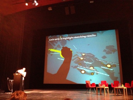
To answer these question he presented the Crimespotting project.
They realized that working with administrative urban data you have to really understand the context of the city you’re working in, and also how people conceptualize the places where they live.
The result is an interactive map that displays the terms that people use in their everyday life, when talking about safety and crime (light and dark instead of simply day and night).

Another project on frontiers data is Field Papers, where people can customize maps of places drawing on them for different purposes and psychogeography.
(3) and then producing shareable interfaces.
How do you handle meaningful data for which the facts don’t exist in the open? People want to experience and share data, people wants to enjoy. The quality and the fluidity of the interaction are such important as the accuracy of the datasets.
To answer, he presented the URLs for Everything project.
What is going to happen when the sea level rises? An “intense shareable interface producing what if scenarios”
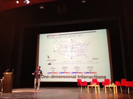
Another project is Where does the money go? The project provides a simple one-dimensional interaction: “You can act only by using the slider, providing a satisfying way of interacting with data given by the intensity of the data displayed at every moment”.
An interesting conclusion was just about “where all the visualizations go?” Isn’t that worth and promising the fact that now (with tools like Pinterest) you can share images, videos and interfaces just with a click? Will the “old Flash” really die now that it could not be integrated with the new ways of sharing information?

–
The third of four intervention was Christian Derix, director of computational design research center at Aedas in London. entitled:Streetwise: Mapping spatial configurations and user behaviors for urban design/ “wise / in the sense that you know what’s happening on the street better being there than looking at an online map.”
Talking about data, them aim at Adeas, is to use design processes to interpret data, integrating them in planning projects.
Christian started with a few references describing their background, stressing the importance of understanding phenomena both looking “from above” and exploring the small scale, “perceiving space while moving through it, being in space, acting with the space, seeing people in space”. Many famous authors and architects have been quoted, from sociological theories of Durkheim about statistical social space or the geometrical space of Haggert and Cloney, to Georges Perec and his observations on field, to the Naked city of Guy Debord, to the organic city and the permeability of SANAA.
As a visualization perspective, they come to the fact that nowadays, with all this massive number of layers the space has and can be interpreted through, they’re trying to produce some, as he called them, “parsimonious visualizations”, where just one layers is shown at a time.(but effectively nothing has been shown at the conference about it.)
He then showed the project they developed in 2011 to model the data generated by Barclays Cycle Hire users in 4 months (where bikes have been picked up and where left down in London)They produced motion visualization of shortest cycle routes between Barclays Cycle Hire docking stations across London with their frequencies of use. They used motion visualizations and 3d view to show intensity.Moreover, they tried to answer to the question of how much Barclays Bike are affecting the city?”Analysis of the data by Aedas suggests that more than two million kilometres have been travelled over the four-month period. While there can be no doubt regarding the value of the Barclays Cycle Hire scheme, the contribution it makes in terms of carbon reduction is tiny; the equivalent of the annual CO2 emissions of an average London office block, or probably less than 0.005% of the estimated 18 million tonnes of CO2 produced by transport in the capital. London clearly has a long way to go to support low carbon living.”

–
the last intervention of the session was from Jason Dykes, a reseacher at the Gi Center / City University / London
go with the flow or map to know? some thought and ideas on flow map design.
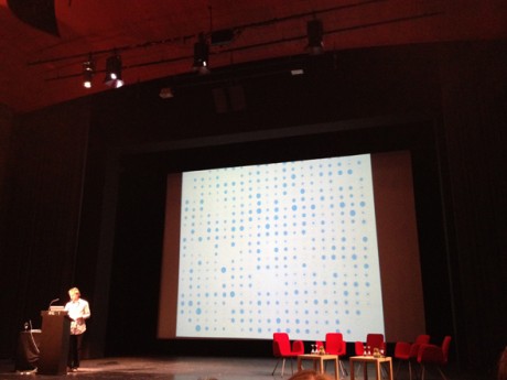
Jason overviewed the macro topic of getting people involved with complex phenomena, particularly focusing on big datasets, giving a qualitative speech on how we can we visually play with geographical information: dynamically combining lines, colors, curves and points to show origins and destinations, identifying loops with ellipses, and experimenting a lot with geographical transformations.
How about geographic transformation? is it possible to improve legibility of certain geographic phenomena through the modification of the base territory itself?
A lot of possibilities with the geographical distortions of the map (cartograms) according to a parameter has been used during last years, mainly showing time travels / time patterns within the urban scale (analyzing a lot of case studies I’m collecting here the 90% of the geographical visualization distorted are displaying topics related to mobility and travel patterns).
A few experiments Jason showed are reported as follows:


But the main question is: does geographical transformation works in making phenomena really better understandable? With which datasets? Isn’t it better to provide an actual map that everybody can read without effort?Is it possible, instead, to create new models and grids (like the already digested Underground Map) that really enable the comprehension of certain phenomena?
discussion, questions and answers.
Several questions have been proposed from the public. Generally speaking, most of the questions were around the processes of co-creation of data; or the possibility to include people as active participant of such showed maps; or around the word “interactivity”, which some suggested is not appropriate for describing simple interactive interfaces that have nothing to do with the actual intervention and interaction with places.
As a visualization point of view, an interesting point was around the use of complex visualization addressed to the general public (we had different opinions from the audience).
“Will general public (“my mum”) understand those complex visualization? Is the aesthetics you’ve been showing appropriate for showing the phenomena? Do you think that information design could make some step forward on it? In which ways?”

Speakers answered in different ways,
…enlightening that some visualization they showed are designed for decision makers and together with them based on their needs,
…and also proposing that the public has to be exposed to novel visualization – if they’re properly designed and if they address specific needs: as in the case of the underground map, we don’t fear because we learned how to read it, but an initial effort has been done. (even when BBC changed its weather map a lot of citizens has been protesting but then everybody recognize that everything works better with them).
As I see, novel visualization systems has to be explored, but if we’re able to design visualization systems and models that could really disrupt the former in terms of legibility and utility, I’m quite sure the effort that we will require to the audience wouldn’t be so much. (what do you think?)
–
*a remarkable note: there isn’t any wi-fi in the conference rooms.
I was astonished. (since I have no data roaming on my Italian phone I couldn’t participate to the online conversation you can find here: #cof12 )
Then, a tweetwall was in, not quite as sophisticated as the one we designed for Frontiers of Interaction (see picture below) I have to ask which software they used 🙂

[…] auch mit Bildern der Folien und auf der Website folgen wohl auch noch Videoaufnahmen. Einen ersten Bericht gibt es hier, der Tag eins und die Visualisierung von Daten […]
July 13th, 2012 at 7:43 pmThank you for the “résumé”.
July 17th, 2012 at 2:46 pmSome more example of smart city oriented devices and experimentation from #Futur_en_Seine @Paris
http://dagautier.tumblr.com/tagged/smartcity
Excellent report, thanks.
July 20th, 2012 at 6:56 am[…] City of Flows Conference por Giorgia […]
August 9th, 2012 at 3:14 am