In the framework of our researches, we are focusing on twitter visualization. This social platform indeed offers several opportunities for data visualization: social ties analysis, links between geography and themes/languages, real-time visualization of a particular topic (like a conference), or again to analyse a past topic and its “storyfication”.
We spent last week recognizing recent developments related to the topic, identifying three main fields:
- Real-time visualizations: visualizing twitter stream in realtime during conferences or big events.
- Visual search: online tools that create a dynamic visual output for a twitter search.
- Storytelling: the use of visualization to tell an event in the past. There are both interactive and static examples.
We’d like to share with you a selection of these examples. Selected artworks have been created in the last three years.
Visual search
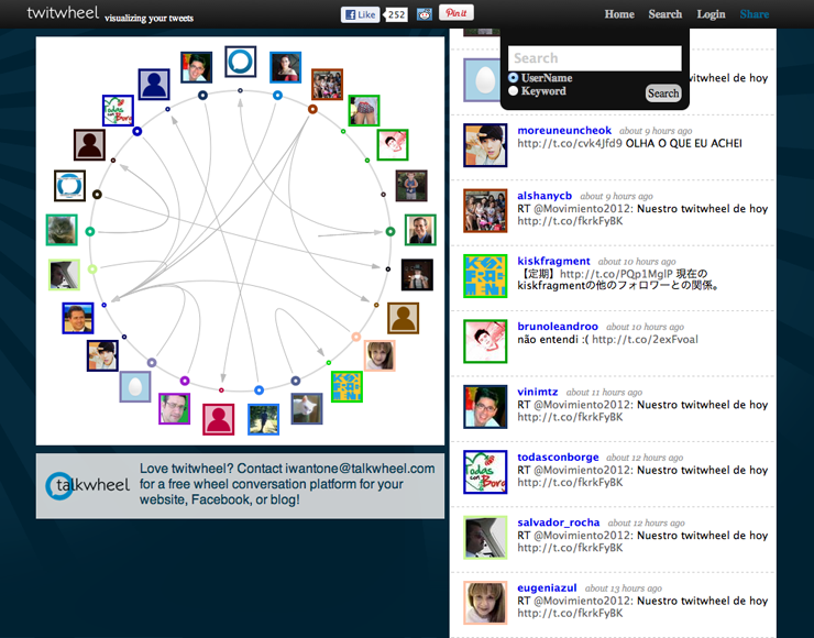
TWITWHEEL (2011) is a tool that shows in the form of a circle the connections between people that are tweeting about the same thing.
BREAST CANCER CONVERSATION (2011, GE) is a visualization tool that allows to explore in real-time tweets about breast cancer. Its way to organize by topics, stories or people help understand the giant nebula of dots.
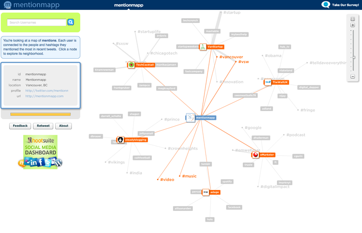
MENTIONMAPP (2011) is useful if you want to see the map of the entities mentioned by a user and hashtags related.
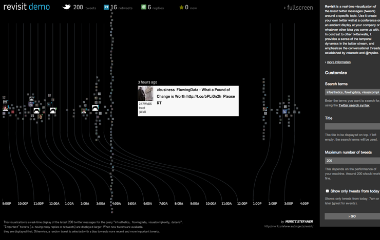
REVISIT (2010, Stefaner Moritz) is a real-time visualization of the latest twitter messages (tweets) around a specific topic, more it provides a sense of the temporal dynamics in the twitter stream, and emphasizes the conversational threads established by retweets and @replies.
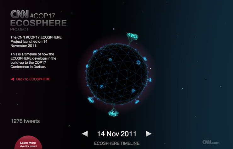
ECOSPHERE (2011, CNN) is a real-time Twitter Visualiser used to aggregate tweets tagged with #COP17, during Durban Conference on Climate Change. The result was an instant snapshot of how the world saw climate change.
HASHTAGIFY (2011, Daniele Mazzini) allows to see clearly what hashtags are related to the one searched. The weight of the connecting line indicates how relevant is the hashtag.
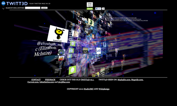
TWITT3D (2010, StudioIMC and Web5Design) displays a twitter page in a 3d map explorable just moving the mouse up and down.
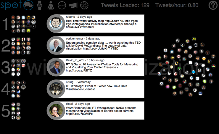
SPOT (2012, Jeff Clark) is an interactive real-time Twitter visualization that uses a particle metaphor to represent tweets. The tweet particles are called spots and get organized in various configurations to illustrate information about the topic of interest. The more useful configurations are by words, timeline and groups.
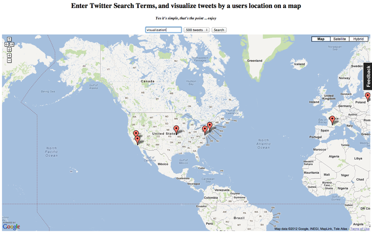
TWITTERMAP (2009) shows on a map tweets about a topic, depending on the location of the user.
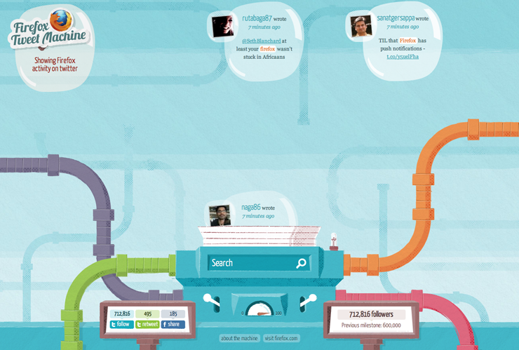
FIREFOX TWEET MACHINE (2010, Quodis Lab) is a graphic visualization of Firefox activity on Twitter.
Real-Time Visualization
VISIBLETWEETS (2009, The Man In Blue) visualize Twitter messages through a simple animation and color background.
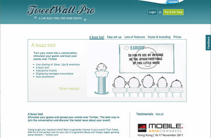
TWITTWALL PRO (2010, Tweet Wall Pro) Guests are visually encouraged to send tweets during event, which results in a worldwide real time buzz and greater exposure. Tweets appear on a screen (Twitter Wall), as they are sent, encouraging audience participation and promoting your event as it happens. Don’t want critics? No problem! There are filters.
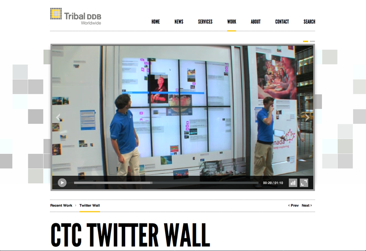
CTC TWITTERWALL (2010, Tribal DDB Worldwide) This mural displays live twitter postings and photos from travellers enjoying their trips in Canada. Even hassled passersby could take pause and interact with the thousands of experiences being posted to the mural in real time.
Storytelling
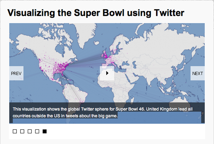
SUPERBOWL (2012, Asim Mittal) The visual map of anyone who tweeted about Superbowl, with particular attention to United States and United Kingdom, the most active tweeter outside US.
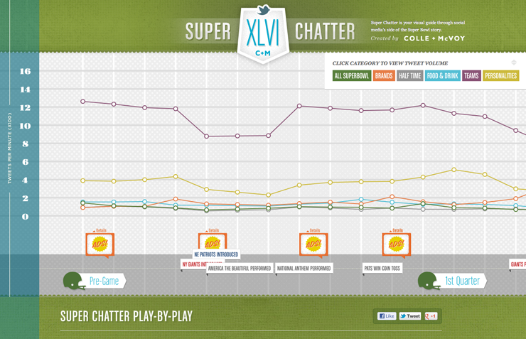
SUPERCHATTER (2012, Colle + McVoy) analyses everything related to Superbowl, and visualizes in a graph showing time and tweet per minutes, the trends of topics like team, food.
SXSW FESTIVAL (2012, Mass Relevance) An infographic with everything from the most retweeted tweets and photos to the most-mentioned brands.
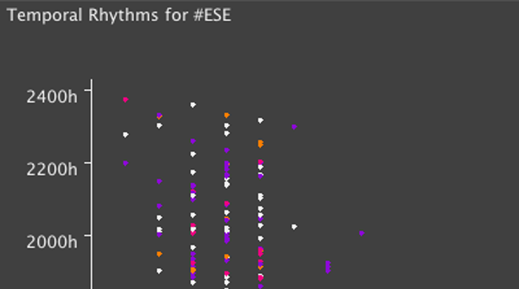
ECLIPSE CONFERENCE (2011, Cate Huston) This infographic wants to explore temporal rhythms around ESE conference, for example to pick out more popular or particularly tweet-able sessions.
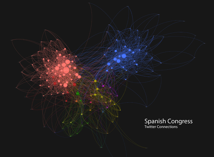
SPANISH CONGRESS (2011, Guillermo del Fresno) This graph presents the spanish congressmen with an account in Twitter and the connections between them. Bipartisan system?
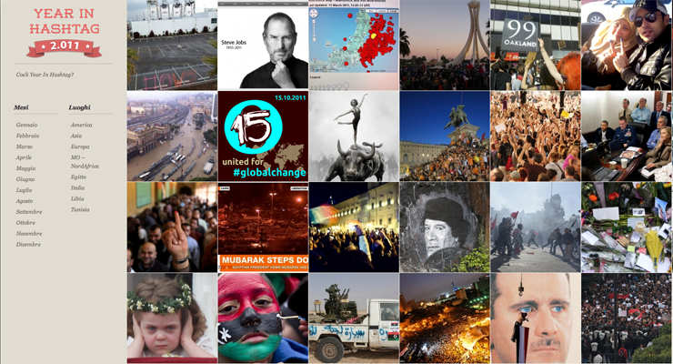
YEAR IN HASHTAG (2011, Claudia Vago, Luca Alagna, Marina Petrillo, Maximiliano Bianchi, Mehdi Tekaya) gathers lots of events from 2011 seen from the citizen point of view. Its simple interface is made of significant images of the event, and a short description followed by videos, tweets and photos. Events can be browsed also by month and place.
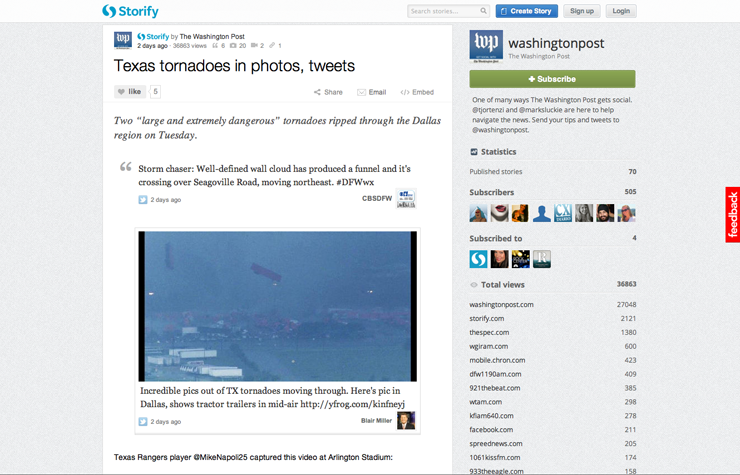
STORIFY (2012, Xavier Damman + Burt Herman) gives the user the possibility to create his own story using photos, videos and status taken from social network like Facebook, You Tube and Twitter.





[…] #learning – The best ways to visualize Twitter data […]
May 25th, 2012 at 9:12 pm[…] The application has been created by Valerio Pellegrini, Robin de Mourat and Michele Mauri. A special thanks to Stefania Guerra for the preliminary work collecting and analyzing case histories. […]
June 8th, 2012 at 9:01 amI just like the valuable info you supply in your articles. I will bookmark your blog and take a look at again right here regularly. I am fairly certain I’ll be told many new stuff proper here! Best of luck for the following!
June 20th, 2013 at 8:43 pmI’m really inspired together with your writing talents and also with the format on your weblog. Is that this a paid topic or did you modify it your self? Anyway keep up the excellent high quality writing, it’s rare to look a nice blog like this one today..
July 5th, 2013 at 6:13 am