Blog
Tuesday, November 6th, 2007
Flower Ænigma
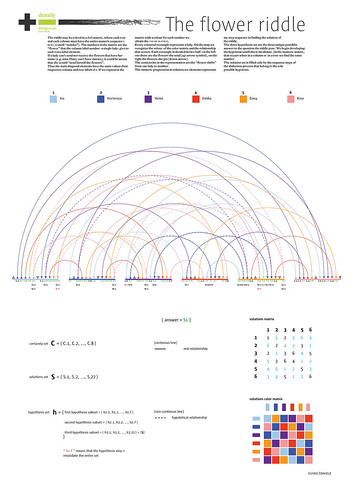
Flower Ænigma, originally uploaded by densitydesign.
The riddle may be solved in a 6×6 matrix, where each row and each column must have the entire numeric sequence 1 to 6 ( a small “sudoku”). The numbers in the matrix are the “flower” that the column label number -a single lady- give to each rows label element. If a lady can’t send nor receive the flowers that have her
name (e.g, miss Daisy can’t have daisies), it could be meant that she would “send herself the flowers”. Thus the main diagonal elements have the same values their
respective column and row labels d o. If we represent the matrix with a colour for each number we obtain the color matrix.
Every coloured rectangle represents a lady. On the map we recognize the colour of the color matrix and the relationship that occurs. Each rectangle is divided in two half: on the left one there are the flowers she send (up-arrow symbol), on the right the flowers she get (down-arrow).
The semicircles in the representation are the “flower shifts” from one lady to another.
The numeric progression in solution set elements represents my step sequence in finding the solution of the riddle.
The three hypothesis set are the three unique possible answer to the question the riddle pose. We begin developing the hypotesis untill she is invalidate (in the numeric matrix, that occurs when in a column or in a row we find the same number. The solution set is filled only by the sequence steps of the abduction process that belong to the sole possible hypotesis.
All the other solution as usual are strored on flickr
Tuesday, November 6th, 2007
Boiling Ocean

Boiling Ocean, originally uploaded by densitydesign.
The map shows both ocean actual situations and an hypotetic future development according to the issues discussed by oceanographer Vincenzo Artale in his essay.
The graphical interpretation point out the growing importance of the mediterranean conveyor processes and the critical relationship that may lead to an incoming “ice age”.
It emphasizes the Mediterranean and Atlantic roles and highlights their stream crossing the whole system.The point width refers to the number of relationship preceding the hypothesis or the argument.
The “phenomena development direction” suggest the way the information had been written down.
This is the first diagram of the series based on the article of Vincenzo Artale, about global warming and its non linear consequence, we have asked to our student to depict what the oceanographer says about the issue.
All the other diagrams are stored on our flickr space, give a look!
Monday, November 5th, 2007
Project progress report 01 Complexity science approach
The first step of Density Design Lab. has been accomplished!
The groups on the basis of the on-going analytic process have made their research hypotesis. A boundary definition of the systems, a process of coarse graining and setting of the observation scale have been also made.
Transport System Italian Infrastructure
Analizing system gives back a wide range in quantity and variety of issues and information avalilable. Main focus is on infrastructural sytem nationwide. Our survey carefully focus on matters and troubles which new infrasctructures create at local level. It make a point of laws and normatives, rules that regolate the infrastructural net development in European countries. As concern an analysis of new infrastructure increase, we have point out how different roles may interact. That is, how citizens can influence the action of the plaintiffs that actually has decisional power in ruling the system. We map foremost critical areas nationwide. Fore each zone we identify main plaintiffs and their thinking.
Hypothesis
Transport system is tightly bound with his hierarchical structure. Main duty is to inform citizen about management level decision. Tools will be given in understanding present status and next approaching development, in order to improve his own way of behaving.
Fashion System Centre & Periphery
An inquiry about present dynamics in Fashion System, in order to support the city of Milan in enhancing existing programs and creating new ones.
Hypothesis
Does talking about Fashion capitals still make sense? Are there new actors on the international scene? Which are their influences on the system?
Media System Integration & convergence
Analogical and digital media are co-participant. After a deep study of the field, overlap fluxes emerge between well-established media and new applications, which brought about a change in terms of global wrapping, in order to keep the costumer into the publisher-system. This pattern describes the trend to an integrated use of the available resources, adding further elements in order to establish a whole.
Hypothesis
Our diagram will be a decision tool for an investor who acts in the media system. It will be usefull to compare and to notice, in the time, the overlap flows that characterise the relationship beetween content and conteiner.

Hospital System From client to Patient
The healthcare system is a complex system that should guarantee to city’s population an indispensable service. Otherwise, it behaves as a business corporation which concepts the patient as a client. This vision influences negatively on the perception that people have about the healthcare system. Our goal in this project is to improve and change this kind of user and patient’s perception during the period in which they must stay at the hospital. We intend to do this by restructuring its environment and its resources (time and costs), which influence the users’ processes involved, and by increasing the communication between users and other subjects. We consider strictly opportune to work with an ideal hospital structure that could support us in a good comprehending about the whole hospital system and about how and where we should intervene in.
Hypothesis
Improving user system perception due to make the user more conscious about systems processes and deleting the “business conception” of the hospital system.
Cinematographic System I Soliti Ignoti
Hypothesis
Italian cinema and public financing: mechanisms and influences. Are the government financings managed or influenced by subjects whose individual affairs are in conflict with the role that they dress again inside the system?
Contemporary Art Valorization mechanisms
Our intent is to map the system of contemporary art in last two years in order to understand which are the effective relations between the actors and then who, between them, influences most the valorization of an art work or an artist. Instead, it seems that the production and the valorization of tha artistic work are determined only by the market logics. Our objective is to demonstrate this convinction and then to modify the system so that the value of the art work can be determined by factors more properly belonged to the artistic sphere, not to the economic one.
Hypothesis
In the system of contemporary art some actors more then others influence the value of a work or of an artist.
Following the link you can take a look at their work, based on the Cilliers’ studies(1) about complexity.
(1) Cilliers, P. (1998) Complexity and Postmodernism: Understanding complex systems, London: Routledge.
Friday, November 2nd, 2007
loop.pH

loop.pH, originally uploaded by densitydesign.
loop.pH worked for York Art Galley on ‘A light installation that visually displays the changing weather patterns, 2005’.
The project consisted in covering some closed windows on the face of the building with panels reflecting light in hte day and emitting in the night. On the panels loop.pH team designed natural growth patterns on a spiral matrix which is displaying different animations based on informations real-time elaborated by weather stations.
The movement of lights is based on eyes movement and it should be learned as all visual languages we are used to by the public of the museum.
It’s really interesting to see all the steps the design studio needed to arrive to the final project explained in the website.
-Tommaso-
Friday, November 2nd, 2007
Donald and his family

the duck’s family, originally uploaded by densitydesign.
Is there an age to learn reading infographics?
In some comics magazines by Disney Companies around the world this family tree has been published. Finally i knew origins of some of my heroes (i like the ‘personalized’ branches like for Scrooge, Gus Goose, Fethry Duck…).
In some versions additional ducks are added or on the side of the page (the polish one is the richest) or with additional braches (dutch one). I’m still wondering which could be the better solution.
(give a look!)
-Tommaso-
Monday, October 22nd, 2007
Idea 2007 Conference Report

Thanks to Daniele@Mentegrafica for sharing his experience at idea2007
Here you can download PDF (with images) via RSS2PDF
Friday, October 19th, 2007
digg labs

digg labs, originally uploaded by densitydesign.
To understand what Digg labs is, is very important to understand what Digg is.
“Digg is a place for people to discover and share content from anywhere on the web. From the biggest online destinations to the most obscure blog, Digg surfaces the best stuff as voted on by our users. You won’t find editors at Digg — we’re here to provide a place where people can collectively determine the value of content and we’re changing the way people consume information online.”
Digg is all about sharing and discovery, there’s a conversation that happens around the content. We’re here to promote that conversation and provide tools for our community to discuss the topics that they’re passionate about. By looking at information through the lens of the collective community on Digg, you’ll always find something interesting and unique. We’re committed to giving every piece of content on the web an equal shot at being the next big thing.”
In four project it can be possible to see the quality of the complexity rappresentation about a big number of datas that are availables in real time. The dinamic infographic rappresentation is a good way to rappresent many layers of the information with an specific attention to the timeline principle which the dynamism is good able to emphasize.
Making sense of the activity on Digg is the mission behind Digg Labs. The Labs offer four different views of Digg data: Arc (shown at left), BigSpy, Stack, and Swarm. Like the Digg site itself, each visualization tracks similar information, including the newest stories that users “digg,” story popularity (number and frequency of “diggs”), and the names of “diggers” themselves. Best of all, the visualizations are in real-time, making the energy and behavior of the Digg community a palpable one. But while the tools give a new perspective on Digg activity, they fall short on helping users see any obvious patterns or draw specific conclusions. Some critics even consider them confusing. Despite the criticism, these data visualizations have provided direction on how to improve the Digg user experience, according to Digg creative director Daniel Burka:
“After seeing users congregate around stories and examining their relationships, we’ve tweaked our algorithms to take [content] diversity into account when determining how popular a story really is,” Burka says. This allows a wider range of subjects to show up on the home page, for example. “Many of the lessons we’ve learned in the Labs are also influencing future feature development and the general direction of the site.”
Friday, October 19th, 2007
The blog generator

Immagine 3, originally uploaded by densitydesign.
The Generator Blog shows many web sites where is possible to partecipate for the production of a communication artefact with the active insertion of some variables which allows the combination of the parts. In this way is possible to create many different objects with the same communicative language. An informatic haiku, where the combination of the accident elements that are however prefixed in the programmation of the software, are able to obtain sometimes a little poetry and linguistic compositions.
Saturday, October 13th, 2007
Our Programs
density calendar, originally uploaded by densitydesign.
Sunday, October 7th, 2007
how make the city a safer place…

crime spotting, originally uploaded by densitydesign.
The ads I wrote to rent the flat near mine said “looking for open couple, freak single, student only if amazing, young people with particular night life…”. I thought it would help me to find a special and funny neighbour, someone you feel free to ask an egg for your midnight pasta.
But maybe I was wrong: I should use the USA methods. I should check if my borough was safe visiting crimespotting, where you can find an interactive map built on the local police department database that shows the crime situation of your borough. It use different colors code: red for murders and theft, blue for prostitution and drug dealing, and green for vandalism and car stealing. Or I could use offender locator a software that aggregates data (that in USA are public!) on the so called sex offender and visualises them on your city’s map. It shows you where people convicted of sex offence are living and it warns you if their move to your neighbourhood. In the creators opinion these are the right methods to make the city a safer place. But I want to suggest a new code for this map, more respectful to privacy and definitely more funny: yellow, for people who want to sleep during the weekend, red for lovers of smelly food as cabbage, and blue for house night party addicted. Maybe it wouldn’t make the city a safer place but it would prevent you to be woke up by the your neighbour’s new 10000 watt hoover at 7 o’clock on Sunday morning. Or, as Donato suggests, we should all live close to our city mafia boss: surely, nothing could happen there.
- Make 5 Sentences about Saying Disagreement
- Payment Agreement Sample Philippines
- Can Landlord Charge for New Tenancy Agreement
- Spirit Airlines Tax Receivable Agreement
- Ancillary Services Agreement
- Download Agreement by Shanko Rasheed
- Facebook User Agreement Photos
- Music Production Contracts Templates
- Do Contractors Do Financing
- Free Trade Agreement Russia
- Stock Purchase Agreement Good or Bad
- Terminating Employee Contract Early
- It Support Agreements
- Iran Nuclear Agreement Terms
- Rental Lease Agreement for Ct
- Tcode for Display Contract Status
- Contracts Manager Jobs in Bangalore
- Behavioral Health Contractors Association
- User Agreement in Arabic
- Rcuh Agreement for Services