Blog
Saturday, June 7th, 2008
Is predictability equals to amelioration?

The suggestion by IXDA forum about basic user interaction design concepts gives us opportunity to make clear an intrinsic paradigm to complexity.
As in, if you can accurately predict what’s going to happen next in a System, it’s because the Action you’re taking is understandable, clear, logical and above all brings ameliorations to the main subject. If you can accurately predict what’s next, It means the System has high ameliorability.
If you can’t accurately predict what’s next, the System has low improvement perspectives.
Thus, Predictability derives from the Actions you’ve chosen to improve on going System and how many data you collected to draw it are relevant choices. However, collecting data and selecting Actions moments are going to be a background where develop tangible solutions, just before and after system visualizing process. Inside both, we might understand some emerging questions.
It’d be a right thesis, in fact according with Ben Fry (2008), the most important part of
“[…] understanding data is identifying the question that you want to answer. Rather than thinking about the data that was collected, think about how it will be used and work backward to what was collected. You collect data because you want to know something about it. I you don’t really know why you’re collecting it, you’re just hoarding it.”
In conclusion, predictability derives from past data still working in the form of governmental statistics, demographical reports, corporation quality manuals, etc. They’re getting us as information as possible to become new topical visualizations to builds ameliorations in order to the society.
So, let’s plan our future.
Tuesday, June 3rd, 2008
Informed simplicity
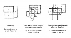
Matthew Frederick in 101 Things I Learned in Architecture School (The MIT Press, 2007) after saying how to draw a line, also says that there are three levels of knowing:
-simplicity, is the world view of the child or uninformed adult, fully engaged in his own experience and happily unaware of what lies beneath the surface of immediate reality.
-complexity, characterizes the ordinary adult world view. It is characterized by an awareness of complex system in nature and society but an inability to discern clarifyng patterns and connection.
-informed simplicity, is an enlightened view of reality. It is founded upon an ability to dicern or create clarifying patterns within complex mixtures.
Frederick’s diktat: create architectural richness through informed simplicity or an interaction of simples rather than through unnecessarily busy agglomerations. Whether an architectural aesthetic is intended to be minimalist or complex, its experience mysterious or clear, its spaces Spartan or richly layered, a building must be a highly ordered thing. Creating simplifying patterns in a building plan is a way of lending order while allowing multiple readings and experiences. Some examples of unnecessary complexity:
-making a dozen separate design moves when three well-informed moves can accomplish as much;
-busying up a project with doodads because it is boring without them;
-agglomerating many unrelated elements without concern for their unity because they are interesting in themselves.
…
but when you set up complexity there’s need to call it informed simplicity? especially when you confuse complex with complicated?
Monday, May 26th, 2008
Macroscopes
Reviewing the book “Shaping Things“, written by Bruce Sterling, John Thackara states: “Our dilemma is not that we receive too much information. We don’t receive anywhere near the quantity of data it takes to overload our neurons; our minds are capable of processing and analyzing many gigabits of data per second—a lot more data than any of today’s supercomputers can process and act on in real time. We feel flooded because we’re getting information unfiltered, unsorted, and unframed. We lack ways to select what’s important. The design task is to make information digestible, not to keep it out. I call them macroscopes. Tools, and aesthetic notions, that help us understand – and act mindfully in – the big picture.”
We can easily associate the definition of Macroscopes to the Diagrams we design in our Density Lab: the general purpose is exactly the same. It has to be said that it’s such a wide and general concept that it can fit a lot of different tools and activities.
Better, we recognize ourself in the description of the Places & Spaces: Mapping Science exhibition found in a blog of a user-experience designer, that recalls Thackara: “It’s a concise, enjoyable and clear exhibit showing concrete examples of what John Thackara might call ‘macroscopes’: artworks, mappings and visualisations of complex interconnected systems (in this case science and intellectual property) that help ‘ordinary folk’ examine the choices they make and those being made for them.”
Looking forward to the next edition!
Friday, May 16th, 2008
Densities Hospital system map
The Hospital system map “From client to patient” introduced by Manuela Ciancilla at “The 2nd Interdisciplinary Conference on Intersections of Visualization Practices and Techniques” 7th-9th May, Loughborough University.
“A JISC funded joint event hosted by vizNET and 3DVisA Following the successful vizNET 2007 event, vizNET 2008 event aims to establish an international medium for the exchange of new ideas and practical experience between researchers working in the field of visualization from scientific and engineering applications to the arts and humanities. The scope of the event covers a wide range of visualization topics that are applicable for novice, novice-advanced, and and expert visualization users.”
Thanks to John O’Brien and Manuela Ciancilla.
You can find a short resume here
Saturday, May 10th, 2008
Designer & the Elastic Mind: an interview with Paola Antonelli (and the relation between scale and complexity)
Quoting from Paola Antonelli interiew:
What has changed in scale is that is not anymore about the dimension, but rather about the complexity
(via SwissMiss)
Tuesday, April 29th, 2008
Pizza (Pie) Chart

Pizza (Pie) Chart, originally uploaded by densitydesign.
Each election period reminds us that magazines and newspapers are playing a fundamental role in the evolution of infographics as a diffused and common (public) language.
Infographics are more and more used not only to communicate data and information, but also to produce eye-catching, evocative illustrations, to be shown in magazine covers. It happens sometimes that the evocative purpose prevails on the informative one, like in the n.1041 of the “Il Venerdì”, a weekly supplement-magazine of the “La Repubblica”, one of the major italian newspaper. The cover of the magazine is an example of misused infographics: the sum of the percentages is more than 100% (155%), and the dimension of the slices is not properly and directly related to the values.
Then, the subjects of the slices are not homogeneous, so we can’t see them all together as a whole: you can’t compare “the best quality of Italians” with “what makes Italian ashamed”. It seems that magazines and newspapers are not aware of their role in disseminating and cultivating the language, even the visual language of people. We could start a new research line on this field of misused infographics…
Wednesday, April 23rd, 2008
Tempting trails left unexplored

Fab, originally uploaded by densitydesign.
[img: Fab/ Summer 2005 /Leonora Sartori+Francesco Meneghini]
As Peter Turchi says (in Maps of the Imagination: the writer as cartographer): “To ask for a map is to say: Tell me a story”.
A selected story, surrounded by blank spaces, sometimes more significant than the story itself, a story from the skew mental map of ourselves
Sunday, April 13th, 2008
Election Day

election day, originally uploaded by densitydesign.
Density Design (GS+DR) is returning officer and secretary in one of the polling station during the italian election day 2008.
The compulsive obsession for graphs and diagrams led us to draw this…
As soon as possible a more detailed piece about the experience that made envy all others polling places 🙂
Skyvideo.gotoAndPlay(1’18”)
Skyvideo.gotoAndPlay(1’30”)
Friday, April 11th, 2008
From the tree to the labyrinth
In the 100 pages of first chapter of Umberto Eco new book From the tree to the labyrinth (Dall’albero al labirinto. Studi storici sul segno e l’interpretazione, Bompiani, nov 2007), Eco writes about semiotic dictionary and encyclopaedia and discusses – trough diagram and charts – the problem of definition and classification. I found it very thought-provoking and it remember me the Nietzsche quote that I tell to my students when I want to point out they have to incorporate indeterminacy when working as designers:
Every word instantly becomes a concept precisely insofar as it is not supposed to serve as a reminder of the unique and entirely individual original experience to which it owes its origin; but rather, a word becomes a concept insofar as it simultaneously has to fit countless more or less similar cases — which means, purely and simply, cases which are never equal and thus altogether unequal
Umberto Eco collects in this volume a series of studies on the history of semiotics and philosophy of language written in recent years. Among curious topics and questions that have made the history of Western philosophy through the whole history of our culture, he writes about metaphors and dogs, from the Cabala to the medieval falsification …
Tuesday, April 8th, 2008
Two Events
Mapping Me / Mapping You
A roundtable meeting about cartography between An Mertens (and other members of Saturdays, Woman and Free Software) , Liesbeth Huybrechts (Cultural studies PHD KuLeuven, researcher, curator), Nicolas Malevé (Tresor software, Towards.be) and Peter Westenberg (Routes + Routines) investigating GEO data control, different layers and perspectives on the art of mapping, subjective cartographic perception and /Home as private territory.
* when : April 25, 18:00 – 20:00
* location : Recyclart, GARE BRUXELLES-CHAPELLE, Rue des Ursulines 25, Brussels
The Map Is not the Territory ?! – Mapping as critical investigation
Wednesday, April 16th | 19:30-22:00hrs_Piet Zwart Institute | Mauritsstraat 36 | 3012 GC Rotterdam (The Netherlands).
With: Bureau d’Etudes (FR), Theo Deutinger (AU/NL), Christoph Wachter and Mathias Jud (CH), Michael Murtaugh and PZI Media Design M.A. students; introduction by Florian Cramer.
more information here
- Make 5 Sentences about Saying Disagreement
- Payment Agreement Sample Philippines
- Can Landlord Charge for New Tenancy Agreement
- Spirit Airlines Tax Receivable Agreement
- Ancillary Services Agreement
- Download Agreement by Shanko Rasheed
- Facebook User Agreement Photos
- Music Production Contracts Templates
- Do Contractors Do Financing
- Free Trade Agreement Russia
- Stock Purchase Agreement Good or Bad
- Terminating Employee Contract Early
- It Support Agreements
- Iran Nuclear Agreement Terms
- Rental Lease Agreement for Ct
- Tcode for Display Contract Status
- Contracts Manager Jobs in Bangalore
- Behavioral Health Contractors Association
- User Agreement in Arabic
- Rcuh Agreement for Services


