Blog
Monday, February 22nd, 2010
A new map of Europe, Wired UK (Proposal)
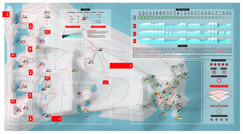
This is a map of Europe as you’ve never seen it. It shows how people in the 27 EU states perceive the impact of the internet and mobile phones on their lives – and then contrasts this with their actual penetration in each country. We wanted to explore new ways to visualize such complex data. So we worked with a statistics team, under Marco Fattore, to crunch data from a 2008 Eurobarometer survey of 27,000 people. The result is this contour map, which makes use of the isobars of traditional cartography. Each panel above refers to a specific question in the survey. The higher a country, the more its citizens say the technology matters. The cartogram shows the tech’s actual penetration. A high penetration of technology doesn’t mean people see a real benefit in using it, the way we see the world is changing as more data is available. We wanted to show a new way to look at geography as Europe’s landscape gets reshaped.
THE EUROBAROMETER SURVEY LAST SEPTEMBER ASKED 27,000 EUROPEANS THESE QUESTIONS: (Numbers relate to the panels on the main map):
1 Has the internet improved how you do your job?
2 Has using a mobile phone helped in your work?
3 Has the internet made you more informed about current issues?
4 Has using a mobile phone helped you to be more informed?
5 Has the internet improved your opportunity to share views/access culture?
6 Have mobile phones helped you to share ideas and content such as photos with others?
7 Has the internet improved how you pursue your hobbies?
8 Have mobile phones helped you better manage your leisure time?
9 Has the internet improved your relationships with family and friends?
10 Have mobile phones helped you keep in contact with family and friends?
“Penetration” is calculated from the percentages of households and businesses with broadband access; and the percentage of households with access to the internet via PC, digital TV and mobile device.
Credits
Paolo Ciuccarelli (Scientific Responsible)
Marco Fattore (Assistant Professor, Faculty of Statistics – data analysis)
Donato Ricci (creative direction Project Coordination)
Michele Mauri, Giorgio Caviglia (coding)
Luca Masud (art direction)
Lorenzo Fernandez, Mario Porpora (designer)
Wednesday, February 10th, 2010
Density Goes to Bari
On March 23-24th i’ll held a conference in Bari, at the Polytechnic, about “Wayfinding and the Image of the City”
During the first day i’ll talk about the history of wayfinding and maps, then we’ll start a short workshop about the visualization of the city. The students will be asked to think of their relationship with the city, their imaginaries, landmarks or key-points. So Bari itself will be mapped from a subjective point of view, in order to obtain and to visualize a kind of “Personal Geography”, using mind-mapping, diagrammatic languages or photographic surveys.
It’s an experiment we’ll start on that event and try to continue in the future, with the same students and maybe new discoveries.
Everybody who’s gonna pass by Bari is invited to the event.
More info to follow
Sunday, January 3rd, 2010
Wish you a wild 2010!
2009 has been a very exciting year,
We visualized poverty, we investigated three some relationships, we understood the meaning of fuzzy, we explored the power of halftone, we folded polyhedrons, we start to twitter, we discussed about uncertainty, turtles, Knowledge Visualization, casual loops and social audits, sustainability and ecological impacts; we addressed urban school needs, we followed student in design schools, we connected design research hubs, we drew map of future, we started a quotation wall, we argued (a lot) we agreed (sometimes) we did our best (almost always); someone went to new Orleans, someone to Paris, someone to Venice, someone to Naples, someone to Como, someone to Korea. Someone is gone and now lives far away, someone will come back. If we draw a map, it will be quite dense, of course.
Now the 2010 has started and I wish everyone an exciting and challenging year again; I wish you be brave and question all the problems you will face, I wish you never stop till you feel it is good enough, I wish you find a way of lighten difficult situations and even more to fully enjoy the pleasant ones, i wish you will keep on telling amazing stories. happy 2010!
Monday, December 7th, 2009
DensityDesign for TEDx: ideas worth spreading.
On november 2009 Density Design has been invited to take part to the first italian TEDx event on Lake Como. What’s a TEDx event? It’s a program of local, self-organized events that bring people together to share a TED-like experience, as told in the official website.
Our research group was there (represented by Paolo Ciuccarelli) to share thoughts about some of our dearest issues like complexity, visualization, knowledge, information aesthetics.
Here you can experience the presentation we designed for the event.
Complexity is a journey to infinity, and beyond! (© 1995, Buzz Lightyear) therefore the story we decided to tell in Como begins from the universe, and goes through the stars and planets, down to Density-Earth, a great place where statistics become information aesthetics, visualizations reveal ‘big pictures’ and potatoes are in fact big problems to solve.
What?!
Seriously, it’s easier if you look at the presentation up here and read the story we’re glad to spread.
If you’d like to watch the official video recording of the evening (and you understand italian), play it below.
For the english-subtitled version, check it out in the next few days.
like making a movie building this perfomances took hundreds (mmm just some to be honest) smart collaborators:
Screenplay – Paolo ciuccarelli
Additional screenplay – Donato Ricci
Concept – Michele Graffieti
Drawings – Michele Graffieti, Mario Porpora
Storyboard Artist – Michele Graffieti
Animation – Michele Graffieti, Mario Porpora
Coordinator – Mario Porpora, Donato Ricci
Flashman – Mario Porpora
Title Designer – Michele Graffieti
Text editing – Eileen Bernardi, Lorenzo Fernandez
Catering – Giorgio Caviglia, Michele Graffieti, Mario Porpora
Monday, October 12th, 2009
La Città senza nome – Nameless City
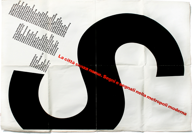
A very interesting set of conferences will take place in Bari, October 22nd-23rd
La Città senza nome – Nameless City
Signs and Signages in the contemporary landscape
The conference will be a good opportunity to discuss about the city, its shape, its function and its identity, together with many different experts, from semiotic or anthropology to information design.
October 22nd
Session I: Reading the city
with Marc Augé, George Ritzer, Enzo Mari
Session II: City edges
with Augusto Ponzio, Giulia Ceriani, Antonio Somaini
Session III: Informing the city
with Giovanni Anceschi, Paul Mijksenaar
October 23rd
Session IV: Highly imaginative horizons
with Franco Federici, Ugo La Pietra, Roberto Casati, Scott Burnham, Sébastien Thiery, Antonio Romano, Renato Nicolini
More information on the website:
http://www.cittasenzanome.com/?page_id=53&language=it
Friday, October 2nd, 2009
We will be here – Map of the future –
What challenges are we going to face in the next 10 years? And what kind of ideas are going to help us in overcoming them?
Even though predicting the future is not a game, a game is exactly what the Institute for the Future used to answer these dilemmas: 8 October 2008, Jane McGonigal, reasearcher at IFTF launched Superstruct (Su` per`struct ‘vt 1.To build over or upon another structure; to erect upon a foundation) , a massively multiplayer online role playing game (MMORPG) that outlined the world of the future, thanks to the ideas and the collaboration of hundreds of users.
After six weeks the game came to its conclusion: Hundreds of ideas, superstructures for our future, guidelines to redefine the world of today and to improve and prepare it for the challenges of the next decade: From big new infrastructure projects to nanotechnology, from overcoming economies of scale to projects of “vertical farming”.
The final report of this first stage of the game was used for the design of our map: The editor in chief of Wired Italia, Riccardo Luna, asked us to visualize the complex net of ideas and assumptions that game’s users produced.
Wednesday, September 23rd, 2009
WhiteBoard
Some exciting sketches for our future projects…
Stay tuned!
Saturday, September 19th, 2009
Density goes to Naples
October 9th 2009
10.00-13.00
International week of Design
PAN – Palazzo delle Arti di Napoli
“Ghost user”
Next month i’ll take part to a conference in Naples, during the International Week of Design organized by AIAP, about the “Ghost user”, concerning the forgotten role of the final user of any design project and its relationship with design process.
I will discuss it together with the semiologist Antonio Perri and some graphic designers, like Silvia Sfligiotti, Max Gaeta and Carlotta Latessa.
My intervention will concern, in particular, the gap between some information design artifacts, such as diagrams, maps and signages, and the final user to whom the projects are meant. The basic statement is always the same: information design should show complexity of the world but making it understandable, clear and ‘readable’.
Sometimes design artifacts are a projection of the designer’s ego, in a sort of narcissistic, self centered vision of projects, disregarding the user needs; some others design processes aren’t even taken into consideration, designers give the goal of understanding for granted: the results are incomprehensible artifacts, where communication isn’t assured, leading to stress, lack of self-estimate, or even to dangerous situations.
Therefore the over mentioned gap is a complex element itself, which need at list to be analyzed.
This and much more in Naples.
Wednesday, July 29th, 2009
CityMurmur going to SIGGRAPH09
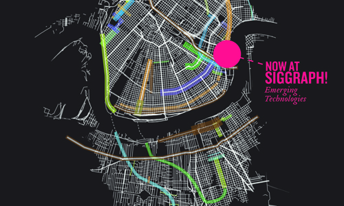
We have been officially invited to present the CityMurmur project at the Emerging Technologies conference at SIGGRAPH09. Citymumur NewOrleans will be launch on the 3rd of August on the occasion of the first day of the conference.
For those who have never heard anything about the SIGGRAPH (short for Special Interest Group on GRAPHics and Interactive Techniques), here is a short description: now in its 36th year, the SIGGRAPH conference is the premier international event on computer graphics and interactive techniques. SIGGRAPH 2009 is expected to draw an estimated 25,000 professionals from five continents to New Orleans, Louisiana. The SIGGRAPH conference attracts the most respected technical and creative people from all over planet Earth. The SIGGRAPH community includes people everywhere who are excited by research, science, art, animation, gaming, interactivity, education, and the web. The SIGGRAPH conference and exhibition is a five-day interdisciplinary educational experience including a three-day commercial exhibition that attracts hundreds of exhibitors from around the world. SIGGRAPH is widely recognized as the most prestigious forum for the publication of computer graphics research. In addition to SIGGRAPH’s leading-edge technical program, the conference’s installations provide close-up views of the latest in digital art, emerging technologies, and hands-on opportunities for creative collaboration.
But what people told me about it? The first time I heard about SIGGRAPH was described as the Woodstock of computer graphics and interactive techniques and I thought about half naked people interacting with muddy computers; then someone said it was the dream of lot of digital kids, where everything is possible and everything is future and in that Woodstock vision I added genius little kids playing with futuristic devices; then I heard there were someone giving relief massages to people over working on computers and this idea completed the picture with awesome transhuman masseuses.
Maybe this vision is a little too much, but I don’t care and to free myself from fears I booked a room in a very nice hotel with a swimming pool on the roof, to keep on feeling on top of the world!
We keep you updated on this adventure, be back about CityMurmur New Orleans soon.
Wednesday, July 8th, 2009
From what to what? DensityDesign at DD4D
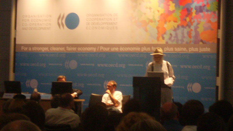
The main focus of DD4D Conference (Data Designed for Decisions) organized by OECD (Organisation for Economic Co-operation and Development) and IIID (International Institute for Information Design) was to understand the process involved in the transformation from data to information and how to present them in order to facilitate the decision-making process. An impressive and variegated amount of ideas, discussions, solutions and, especially, new questions have emerged during this intense 3-days meeting.
Perhaps the most immediate consideration is the increasing relevance of storytelling aspects inside information design discipline. On this point, the main question is probably to figure out who will be the main narrators of these stories and which tools should they use. Are the foundations of Information Design still valid today? Should the statisticians think about a new vision of statistics, focused more on people, rather than on abstract figures? Do statistical data and information empower people?
An amazing collection of visualization tools and methods has been presented. In my personal opinion these are the most interesting talks.
Elizabeth Pastor of Humantific showed her amazing work on how to face the complexity of organizational contexts through the strategic activities of SenseMaking and ChangeMaking, involving the practice of visual and design thinking and the information design techniques. Nic Marks from New Economics Foundation illustrated the National Accounts for Well-Being project, a website where the multidimensional concept of well-being is measured, through both personal and social indicators. Seth Flaxman talked about city quality indicators and presented CityRank.ch, where people can create their personal rankings in order to compare different cities. Mikael Jern from NCVA explained the already famous OECD eXplorer, highlighting some new features, such as the possibility to annotate stories and create Wikipedia pages.
Other speakers pointed out the need of more insight on the effects of visualization techniques, asking for new valuation methods for Information Design. On this point the amazing work conducted by David Sless and his group of benchmark volunteers, all around the world, is particularly remarkable.
An enjoyable show has been engaged by Yuri Engelhardt and Raul Nino Zambrano about the role of animation and rhetoric, through a curious comparison between Hans Rosling and Otto Neurath. The presentation of Professor Kirti K. Trivedi on the concepts of self-evidence and interpretation of data patterns was also really engaging.
Topics like well-being, healthcare, safety, social justice, sustainability (some of the most wicked problems as Robert Horn calls them) have emerged as the next issues on which designers, visualization researchers and statisticians should focus their joint efforts. The concept of trust seems to be one of the main challenges we’ll have to face in the future (a design of trust? ), together with the need to involve people, institutions and governments into the process of fostering knowledge.
- Make 5 Sentences about Saying Disagreement
- Payment Agreement Sample Philippines
- Can Landlord Charge for New Tenancy Agreement
- Spirit Airlines Tax Receivable Agreement
- Ancillary Services Agreement
- Download Agreement by Shanko Rasheed
- Facebook User Agreement Photos
- Music Production Contracts Templates
- Do Contractors Do Financing
- Free Trade Agreement Russia
- Stock Purchase Agreement Good or Bad
- Terminating Employee Contract Early
- It Support Agreements
- Iran Nuclear Agreement Terms
- Rental Lease Agreement for Ct
- Tcode for Display Contract Status
- Contracts Manager Jobs in Bangalore
- Behavioral Health Contractors Association
- User Agreement in Arabic
- Rcuh Agreement for Services

