For the “Frontiers of Interaction” conference DensityDesign Research Lab was asked to visualize the twitter streaming during the conference. The interactive visualization would have been projected on a wall behind the speakers.
This project allowed us to explore the filed of twitter real-time visualization, identifying the most interesting case histories.
Our goal was to override the atomic view of single tweets and to visually represent the social dynamics that arises around a topic. After analyzing the main involved variables, we choose to concentrate on the relations between users, how much they are active, how they interact with the topic and each other. Rather than an analytical visualization, we were looking for a visual metaphor able to represent these dynamics. At the same time, we wanted to use simple elements, in order not to be intrusive or distracting for the audience.
We choose to concentrate mainly on movements and shapes, and the solar system/galaxy metaphor came to the mind.
The wall is the space of debate, and each user is an element that moves in it. There is a center, a core of the debate that coincides with the center of the screen. Elements (users) revolve around the center, but slightly they tend to go away. To remain close to the center they must be active: most active users in the debate move toward the middle, while passive users slightly move away and disappear. Elements have also a weight, the number of contributes: more contributes they bring to the discussion, more weight they get. Elements can attract each other’s: if a user cites another one, they become closer.
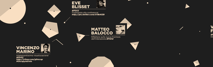
Visually, we decided to create a black space in which users are represented as polygons. The graphic style is essential, designed not to be intrusive or distracting for the conference audience. Also because of the conference topic we tried to bring back the visual appeal of old videogames like “Space invaders” or “Asteroids”. The visualization is left without explanations, and users understand step by step the meaning of elements.
Gradually, it becomes clear that each polygon is a user, and the number of edges represents the number of tweets.

Size is proportional to the distance from the center: most distant elements are smaller than the ones in the middle.

When a user tweets a new message containing a specific hashtag it moves toward the middle of the screen, and gather a new edge. When a user cites another one, both of them move to the center.

Each tweet is shown using a small box reporting username, image and the tweet’s text. If there are no new tweets, randomly are shown old ones.

Despite the simplicity of its rules, the application needs some time to be understood, and users are stimulated to experiment tweeting their own voice and looking what happens on the screen.
Future developments
While we implemented only the behaviors described above, we identified some feature we’d like to add in the future if we’ll have again the pleasure to work on this kind of project.
- Hashtags: the network of correlated hastags. The polygons (users) break down in their single tweets, represented as dots that move around the most cited hastags.

- Timeline: again polygons are disaggregated and the single tweets are represented as dots and disposed on a timeline.

- Location: polygons (users) are grouped by their geographical location.

Another possible development is to create a set of keywords that users can use to interact with the tweetwall.
Technology and reuse
The project has been realized in Processing, and used during the Frontiers of Interaction conference and during the TEDx Beirut.
If you’re interested in using it contact us at info@densitydesign.org