In 2009 we should decrease our graphing addiction and increase attention to coincidences!
happy new year!
Archive for the “Icon” Category
New Year's resolutions
Monday, December 29th, 2008Election Day
Sunday, April 13th, 2008 
election day, originally uploaded by densitydesign.
Density Design (GS+DR) is returning officer and secretary in one of the polling station during the italian election day 2008.
The compulsive obsession for graphs and diagrams led us to draw this…
Chemical Atlas
Thursday, December 20th, 2007 
Chemical Atlas, inserito originariamente da densitydesign.
Some nice infographics from ‘Chemical Atlas or The Chemistry of Familiar Objects’ by Edward Livingston Youmans (1855) at Strasbourg Universities.
Flower Ænigma
Tuesday, November 6th, 2007 
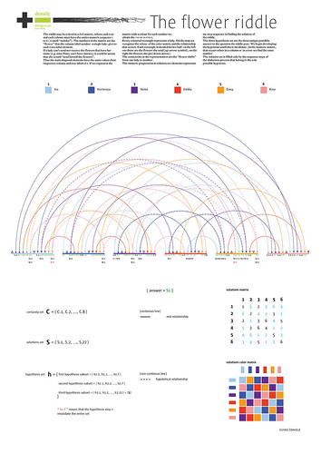
Flower Ænigma, originally uploaded by densitydesign.
The riddle may be solved in a 6×6 matrix, where each row and each column must have the entire numeric sequence 1 to 6 ( a small “sudoku”). The numbers in the matrix are the “flower” that the column label number -a single lady- give to each rows label element. If a lady can’t send nor receive the flowers that have her
how make the city a safer place…
Sunday, October 7th, 2007 
crime spotting, originally uploaded by densitydesign.
The ads I wrote to rent the flat near mine said “looking for open couple, freak single, student only if amazing, young people with particular night life…”. I thought it would help me to find a special and funny neighbour, someone you feel free to ask an egg for your midnight pasta.
Flags by Colours
Monday, September 17th, 2007 
Flags by Colours, originally uploaded by densitydesign.
Each sector of these piecharts is proportional to the area of the colour on the respective flag.
Using a list of countries generated by The World Factbook database, flags of countries fetched from Wikipedia (as of 26th May 2007) are analysed by a custom made python script to calculate the proportions of colours on each of them.
alchool!
Wednesday, September 5th, 2007 
alchool!, originally uploaded by densitydesign.
Icon?
Sunday, June 24th, 2007
todoscontralfuego, originally uploaded by densitydesign. If design and graphics are “visual languages”, chinese also. Here you are an example:
Forest + Flame = Fire
But, with a little of imagination, you can see it yourselves:
This character is mu (wood) means tree and, its shape could have a remembrance to one of them.
This is lin (forest), and it’s just to “mus” together. Logical.
Huo means flame, and looks like one (OK, you need some perspective)
And if we add a flame to the forest we got… Fen, which means “burn” or “fire”.
Partiti?
Tuesday, June 19th, 2007A semi seriuos interview with David Hillman, one of the Pentagram partner, about italian party logos
Graphic language for touch
Tuesday, June 19th, 2007 This work explores the visual link between information and physical things, specifically around the emerging use of the mobile phone to interact with RFID or NFC.
As mobile phones are increasingly able to read and write to RFID tags embedded in the physical world, I am wondering how we will appropriate this for personal and social uses.
I’m interested in the visual link between information and physical things. How do we represent an object that has digital function, information or history beyond it’s physical form? What are the visual clues for this interaction? We shouldn’t rely on a kind of mystery meat navigation (the scourge of the web-design world)
- Make 5 Sentences about Saying Disagreement
- Payment Agreement Sample Philippines
- Can Landlord Charge for New Tenancy Agreement
- Spirit Airlines Tax Receivable Agreement
- Ancillary Services Agreement
- Download Agreement by Shanko Rasheed
- Facebook User Agreement Photos
- Music Production Contracts Templates
- Do Contractors Do Financing
- Free Trade Agreement Russia
- Stock Purchase Agreement Good or Bad
- Terminating Employee Contract Early
- It Support Agreements
- Iran Nuclear Agreement Terms
- Rental Lease Agreement for Ct
- Tcode for Display Contract Status
- Contracts Manager Jobs in Bangalore
- Behavioral Health Contractors Association
- User Agreement in Arabic
- Rcuh Agreement for Services


