Blog
Wednesday, September 7th, 2011
Moving (to the next door)

Time present and time past
Are both perhaps present in time future,
And time future contained in time past.
If all time is eternally present
All time is unredeemable.
What might have been is an abstraction
Remaining a perpetual possibility
Only in a world of speculation.
What might have been and what has been
Point to one end, which is always present.
[…]
from ‘Burnt Norton from Four Quartets‘, by T. S. Eliot
Monday, September 5th, 2011
Evaluating social politics impact with Fineo
From the very beginning of the Fineo development, our partners at CRISP (Centro di Ricerca Interuniversitario sui Servizi di pubblica utilità alla Persona) tested the tool with their own different data sets to explore the temporal evolution of the samples and to understand the differences between different categories. On one side, they provided us with valuable contributions, on the other they started to figure out a possible integration into a BI platform.
Today they’ve released one of the data sets they’ve used with Fineo, giving us the permission to redistribute it in order to make possible a comparison with other tool.
The data set have been developed inside the Labor Project, using administrative data to analyse how Regione Lombardia’s social politics impact on the labour market. It contains a sample of about 2,000 individuals and their evolution in 7 months in terms of employment contract, job qualification, field and required skill level. The data set also contains information about socio-demographic variables such as age, education, nationality.
You can try the online application with this dataset.
The used data set, in TSV format, is available at this link.
This data set is provided “as is” only for testing purposes, CRISP is owner of all copyrights.
Thursday, September 1st, 2011
CIID Summer School
During the first week, held by Patrick Kochlik of The Product*, we experimented the potential of Processing through a series of really process oriented assignments. The aim of the exercises was to translating simple data from an input medium (usually an image) to a series of static and interactive outputs exploring their aesthetic. A new way for us to think about data and how to visualize them.


Saturday, July 9th, 2011
The few differences between Fineo and ParSets
In the last days some discussions about the affinity between Fineo and ParSets have been arised. Here are just a few notes about why they look similar but they are conceptually very different.
The main difference between Fineo and ParSets is the way they manage the relations between data dimensions, from one axis to the other. Fineo works by comparing two dimensions at the time without caring about other dimensions (the previous and the next ones). The other way around (the ParSets’s one) more information is shown at the expense of readability. But this is the same old trade-off.
read more…
Thursday, June 30th, 2011
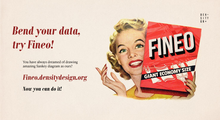
Bend your data
You have always dreamt drawing amazing Sankey diagram.
You always wondered how we could managed them in our works.
You probably don’t even know that the Captain Sankey had four names.
And yet you surely know everything about Napoleon’s invasion of Russia.
One day Minard’s diagram began it all and, ever since, you desired to draw it yourself.
Life is strange, don’t tell us.
Fineo, the best tool to create Sankey diagrams.
or read more about it
Wednesday, May 4th, 2011
New project: Greenpeace McKinsey’s MAC Curve

For the second time we are very proud to present you another work done with Greenpeace UK. While last time it was about Tunas, this time the visualization represents the issues of the Marginal Abatement Cost Curve used by Governments to take action against environmental pollution. The point is… the curve is only a simplicistic approach to the pollution issue and should not be used to take such important measures.
You can read about the project in the research section!
Thursday, April 21st, 2011
New Project: Expo 2015 Themes Visualization
As many of you already know the Universal Exposition will come back to Milan in 2015, after 109 years, and if we couldn’t help back then we tried our best this time! Food will be the next Expo theme and given its complexity Expo 2015 S.p.A. asked DensityDesign to make sense of it by means of a visualization.
You can check it out here.
Good read!
Wednesday, April 13th, 2011
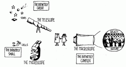
Macroscopes and Visualization (again): a circular path
Three years ago (almost), I discovered an interesting comment about the Places and Spaces: Mapping Science exhibition (2006 edition), curated by Katy Börner (Indiana University, Director of the InfoVis Lab), and I found particularly interesting the quotation of John Thackara (author of In the Bubble: Designing for a complex world. 2005. Cambridge, MA: MIT Press), talking about Macroscopes. In fact that metaphor is, in my opinion quite compelling if you want to talk about the quest for the ‘big picture’ (that actually is often our aim at DensityDesign).
So I investigated a bit and I found a previous book by our colleague (and friend of Thackara) Ezio Manzini (1989. The Materials of Invention: Materials and Design. Cambridge, MA: The MIT Press) where the concept of the macroscope is used: «The quality of the mental image, which is the point of departure for the problem setting, and the overall map of the possible, whence one can progressively derive more detailed maps upon which to trace the path of the problem solving, originate with the macroscope», and finally I went back to the book of Joël de Rosnay (…), where the author hope for new tools to face the complexity of the world: «Microscope, telescope: these words evoke the great scientific penetrations of the infinitely small and the infinitely great […] Today we are confronted with another infinite: the infinitely complex. We are confounded by the number and variety of elements, of relationships, of interactions and combinations on which the functions of large systems depend. We are only the cells, or the cogs; we are put off by the interdependence and the dynamism of the systems, which transform them at the very moment we study them. We must be able to understand them better in order to guide them better. […] Now a new tool is needed by all those who would try to understand and direct effectively their action in this world, whether they are responsible for major decisions in politics, in science, and in industry or are ordinary people as we are. I shall call this instrument the macroscope (from macro, great, and skopein, to observe).»
Then we started using the idea of macroscope in our presentations (TEDx Italy 2009 – 11:00 – and Better Software 2010) and in some of our papers (itAIS 2010).
Now is quite interesting and even more motivating to see on one of the very recent paper from Katy Börner (2011. Plug-and-Play Macroscopes. Communications of the ACM. Vol. 54(3), 60-69, ACM Press) the concept and the metaphor of macroscope taken (again) into consideration!
Monday, April 4th, 2011
Digital cartography of international design
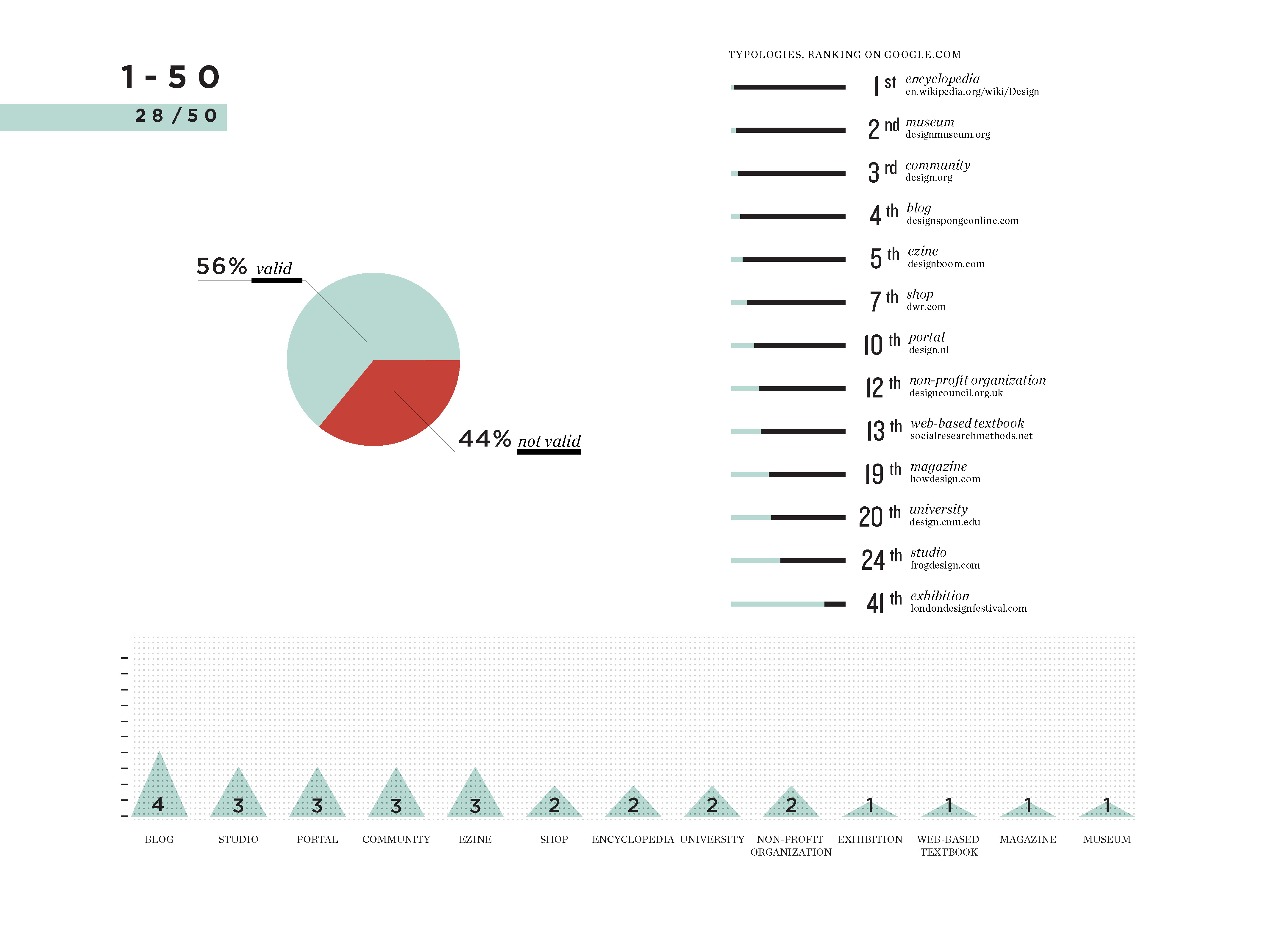
Today we show you the first result of the Digital cartography of international design project, developed using digital methods of research. This first exploration provides a general insight into the world of design, showing related actors and issues emerging from the research on the web.
The generic query “design” on google.com produces 26 valid results out of the first 50. These selected results come from well founded sources and highlight different issues and themes related to design, providing a categorical description of design through entries in menus, tags and sections in the websites. The sources are mostly blogs, design firms, portals, communities and ezines, while the number of universities, non-profit organizations and museums is limited. In particular the first results for universities and design firms are after the 20th position in the ranking on google.com.
Friday, April 1st, 2011
Brain houses: three intérieurs stories
How about some new tangled world to lose yourself in? Come on, it’s spring and visual narratives are also made for that purpose.
DensityDesign proudly offers you this chance.
This time we’d like to do it, showing you what we did for Domus magazine. It’s a visualization called ‘Brain houses‘ and it is the intricate story of three “interiéurs” and their three auteurs.
Hope it will stir up your… brains.
Related project
 Brain houses: three ‘intérieurs’ stories |
- Make 5 Sentences about Saying Disagreement
- Payment Agreement Sample Philippines
- Can Landlord Charge for New Tenancy Agreement
- Spirit Airlines Tax Receivable Agreement
- Ancillary Services Agreement
- Download Agreement by Shanko Rasheed
- Facebook User Agreement Photos
- Music Production Contracts Templates
- Do Contractors Do Financing
- Free Trade Agreement Russia
- Stock Purchase Agreement Good or Bad
- Terminating Employee Contract Early
- It Support Agreements
- Iran Nuclear Agreement Terms
- Rental Lease Agreement for Ct
- Tcode for Display Contract Status
- Contracts Manager Jobs in Bangalore
- Behavioral Health Contractors Association
- User Agreement in Arabic
- Rcuh Agreement for Services


