Blog
Monday, April 2nd, 2012
Città Polifoniche: a contribution on TafterJournal
We’re glad to announce our contribution on Tafterjournal. We’re presenting the article “Città polifoniche. Visualizzazione di User Generated Content geo-localizzati a supporto della comprensione dei fenomeni urbani”
that summarizes our field of research on digital traces at the urban scale.
Tuesday, March 20th, 2012
Jaime Serra works | Visual Journalism
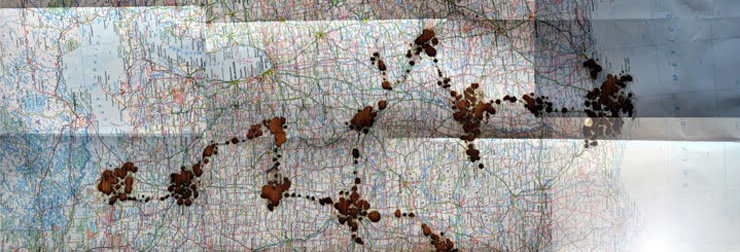
Lucia Pigliapochi for DensityDesign Lab
On tuesday night at CaixaForum in Barcelona, I had the pleasure to attend the reading of the Columns that Jaime Serra published en La Avanguardia since 2010. The occasion was the book presentation of Una paradoja domenical (A Sunday paradox) that presents a selection of his columns with an infographic poster on the back side.
Jaime Serra is the head of infographic and illustration department of La Vanguardia, the catalonian journal. Since 1990 he has been worked visualizing information and ideas and he had a big role in the diffusion of infographic in the newspapers redesign revolution working between Europe and Southamerica.
In Italy we know his job because he is one of the creator of the visual style of main journals: Il Corriere della Sera, Il Sole 24 Ore and La Stampa. He worked for many others international journals for example The indipendend and the argentinian Clarín where he experimented de plastic info graphics.
Through his Sunday column he offers a reflection about the reality by playing with words and visualizations: drawings, photographs, infographics, illustrations. His genius passes through irony and satire and he breaks boundaries by melting infographic with opinion, art and individual expression.
It could be possible read (in spanish) the book of his columns published in La Avanguardia here.
If you want to have a panoramic view of Jaime Serra his blog offers samples of his work. If you want to have a look through the infographics of La Avanguardia you could click here.
The Columns reading has been introduced by José Luis de Vicente, a spanish journalist and commissary of exhibitions of art and digital culture. He talked about the importance of visualization in decision making. He presented emblematic personage such as Florence Nightingale: she were a nurse and during the Crimean War she demonstrated by collecting data and displaying it, that the British hospital system had to be reorganize.
Some of her projects are in Behance Network.
Tuesday, March 20th, 2012
DensityDesign in Bruxelles – when visualization meets other disciplines (and sets the fire on!)
We’re just back from a speech at the Human Cities Symposium, in Bruxelles.
Human Cities is a network of professionals dedicated to research, action and information on spatial, social and political innovation pertaining to public space.
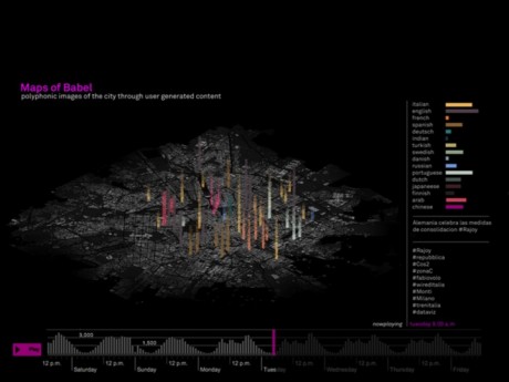
We presented a paper, called Maps of Babel, within the methodological section, that focuses on the methods as well as the theoretical frameworks mobilized by researchers to observe, describe, understand, assess, theorize and/or spread interpretations and actions on the topic of “humancities”.
Maps of Babel is one of the experiments we’re conducting in the field of urban sensing and data visualization. Within this field, our ongoing applied research aims at designing a new method for interpreting, crossing, analyzing and visual representing digital traces, as well as User Generated content at the urban scale. The final goal is to return dynamic alternative polyphonic images of the city as it is used and perceived by its inhabitants.
You can find the preview of the Speech here.
The experiment has been carried within a multidisciplinary and extra-department team of collaborators (Paolo Patelli from Urban Planning Department of Milan Politecnico; Luca Simeone from Medea University, Malmoo; and Salvatore Iaconesi from La Sapienza, Roma).
As you can see from the speech preview, the experiment tried to understand patterns of how different groups live the city in terms of spatial distribution (correlation with specific places and areas), and temporal distribution (time of the day, days of the weeks) inquiring the contributions between people that post in different languages.
I (Giorgia Lupi) was speaking at the conference presenting the background, the methods and some first results.
As we see it, presenting our work in front of an urbanist and planning based audience, should have been useful to gain insights (and critics) on how to properly integrate those data with other quantitative and qualitative ones; or to discuss on the effective utility of this research in terms of decision making processes and planning at the urban scale.
Unfortunately, we were not able to do it. In fact, my intervention unleashed a hot debate on a completely different topic: the ethic issue of showing User Generated Content.
“data are private! you cannot use them in that way!”
“there must be an ethic debate around it”
“those data could be mis-used by the authority!”
“we felt very scared seeing your presentation / we were dots on the map! it’s scaring!
“it’s urban marketing, companies can use these data against our cities!”
In 2012 we didn’t expect such a reaction.We feel that everybody should know that what we everyday share on blogs and social networks is public, if not kept private on purpose.
As we see, it’s not by avoiding to visualize these kind of public data that prevents us from any mis-use by the authorities or the company; everybody already has access to these data and that’s because they’re public! Obviously the debate around what’s private and what is not is very slippery at the moment; we deeply believe though that people involved in urban planning and decision making should start taking into account that those data exist, that there’s a new layer of information that we cannot turn our heads away from.
Anyway a lot of positive comments have been collected within the debate (that I’m personally happy to have generated!).
Starting from our research, it has been enlightened the importance of the role of designer in helping people (planners and citizens) to understand: transforming those data into stories, and making those data collectively explorable; as well as the possibility to generate awareness on people just because we make what they share visible. Other interesting comments have been done on the possibility to make a step forward in thinking the concept of the actual public space.
I particularly appreciated the conclusions on the panel, held by Matej Nikšič, (Urban Planning Institute of the Republic of Slovenia) which enlightened that the central question should be how those data can become really useful in making us better deal with our cities and not how we can save us “from the Man”.
Monday, March 12th, 2012
Visual explorations for (design) research
We are in Munich at IDEO to explore the (potential) role of Data and Information Visualization in different phases of the design process. I’m very excited about it, especially for one reason: this is an opportunity to go back to my first research domain, the one of design as a knowledge process. The circle is going to be closed, hopefully!
Monday, March 5th, 2012
Visualizing controversies on climate change – final assignment results
For the final assignment of this year’s DesnityDesign Lab., our students produced some high-quality info-videos about climate change and related controversy.
Enjoy here, and let us know what do you think about it!
Tuesday, February 21st, 2012
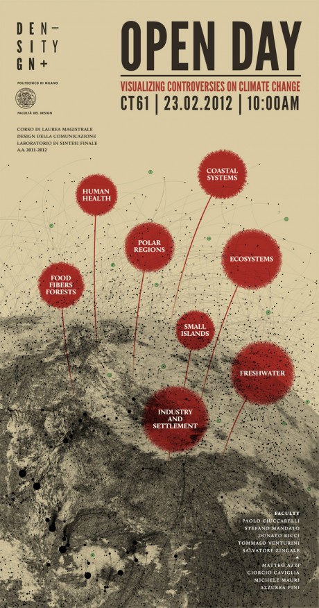
Visualizing Controversies on Climate Change | Open Day 2012
The climate change phenomenon has long been a controversial subject in science, technology and society. Even though there is a large scientific and mediatic consensus on the global warming issue, we can’t ignore other equally important positions of dissent. The increasing availability of datasets and reports on global warming has contributed to the rising of public discussions and a growing desire for knowledge and involvement from individuals.
During this open day we are going to delve together into several controversies on climate change phenomenon through mappings, visual explorations of the web and narrative artifacts.
You’re all invited, come and share this day with us!
23rd February 2012, 10:00 AM
CT61 – Building N
Bovisa Campus
Politecnico di Milano
via Durando 10, 20158 Milan
Thursday, December 22nd, 2011
Visual explorations

We are glad to announce“Visual explorations”, two courses of three and four weeks aimed at students, visual communication professionals, journalists, and any others interested in learning about and experimenting with visual tools and methodologies to help different users understand and make sense of data and information.
The quantity and the complexity of data and digital information produced from science, media, the world of economics, and individual activity on the Web has grown exponentially. However, amid a situation of abundance and richness, the opposite is also true, and the ability to extract value and enable the construction of meaning appears to be poor. People need and have the desire to access, understand, and use this huge quantity of information in an effective way, and explicitly need skills concerning both the construction of a visual representation of complex data, as the direct contact with the data: its extraction, manipulation, organization and communication.
DATA VISUALIZATION IN THE TIME OF DIGITAL MEDIA
The first course of “Visual Explorations” has the aim of providing students the skills to approach the visualization process critically and consciously, from the study of visual models to the design of cross-media applications.
DIGITAL METHODS AND DATA VISUALIZATION
The second course has the aim of developing the skill of (re)building a story; digging into and inquiring information from digital sources, such as on-line social networks; and visualizing the results. The two courses are linked by a common thread, a common approach to visualization as a cognitive tool, involved in the active construction of knowledge, triggering the engagement, making comprehension easier, and supporting users’ decisions.
For more informations visit the website: visualexplorations.org
Friday, November 25th, 2011
DataViz Workshop
We are excited and proud to announce the “DATAVIZ: VISUAL REPRESENTATION OF COMPLEX PHENOMENA” workshop.
Brought to you by Better Nouveau, it will feature a partnership between the NodeBox — Experimental Media Research Group and DensityDesign.
Inspired coders, designers but also viz-amateurs are welcome with their knowledge, skills and creativity for a full-immersion visualization experience.
All the details can be found here.
See you in Turin from December 12 to 17.
Friday, November 25th, 2011
DensityDesign in Paris: when visualization meets other disciplines
Dear friends, a informative post (in a long silent period) just to say that we’re in Paris this week – and the following one – to start two very interesting new challenges. Since yesterday we’re presenting at the conference “Ignis Mutat Res: Penser l’architecture, la ville et les paysages au prisme de l’énergie” (November 24-25th) where the selected research projects for the homonymous call funded by French government will be presented. We participated in writing one of the selected proposal, and so we’ll partner with Elioth (Egis Concept), Shanghai Tongji Urban Planning and Design Institute, École Nationale Supérieure du Paysage de Versailles (ENSPV), Ecole Nationale Supérieure d’Architecture Paris-Malaquais (ENSAPM), École Nationale des Ponts et Chaussées (ENSP) in the [Re][For][Me] project. The aim of this two-years project is to create a new cartography of energy, where all the flows that make a city alive will be mapped and visually integrated. Our specific role is to develop a dynamic and interactive visual platform that will represent the city from the very (and wide) perspective of energy. The topic of energy in general is a very hot one (!) and we’re very pleased to work together with architects and urban planners to help them – and all the other stakeholders – to understand and represent the behavior of the cities of Paris, Milan and Shanghai in terms of energy flows.
Next week (November 29-30th), the kick-off meeting of the EMAPS European project (Electronic Maps to Assist Public Science) will take place. We will work together with Fundació Barcelona Media Universitat Pompeu Fabra, Technische Universität Dortmund, Digital Methods Initiative – University of Amsterdam, Fondation Nationale des Sciences Politiques (Sciences Po), The Young Foundation – UK for the next three years in observing trough the Internet two main socio-technical controversies climate change and life expectancy. More precisely, the aim of EMAPS, in the domain of science-society interactions, is to get a better understanding of whether the web can provide a meaningful equipment to produce an enhanced interest of a wider public (i.e. scientists, journalists, activists, corporations or citizens…) in science and technology issues, not as receivers of information about end results of science, but as potential participants in science in the making.
Our role in this project is to conceive visualization tools able to depict the form of complex social phenomena assuming that understanding a phenomenon means understanding its form and understanding the form means, also, to see and to visualize its data and information patterns. The main effort is to reveal and dynamically describe connections between people, politics, information and scientific issues.
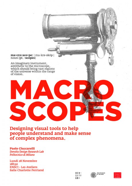
In the middle of these two kick-off meetings, on Monday the 28, I’ll be very pleased to talk about our work – and our vision/approach to visualization – at ENSCI Les Aterliers, where I’ll meet also some very good friends! The speech is scheduled in the evening, with the title “Macroscopes. Designing visual tools to help people understand and make sense of complex phenomena“. A title that I actually like very much!
We’re all very excited at DensityDesign for these new challenges: two great opportunities to improve our knowledge on the potential role of design in making the complexity of social phenomena visible, accessible and usable. It’s also a very positive sign, showing how very different disciplines are nowadays looking at visualization as a tool to improve their research/knowledge processes. Between infographics for the media-scape and visualization for Business Intelligence and fast analytics there is a huge territory to be explored, an extension of the scientific visualization domain where understanding is really the first goal: (economic) performances and the quest for attractive and glittering pictures only come after, if any. In this territory we believe designers have a fundamental role to play.
We’ll try to keep you updated about these new projects via our blog.
Friday, September 23rd, 2011
Welcome Helena!
A warm welcome to our first intern – Helena Castro from Universidade de Aveiro (Portugal) – funded by the Leonardo da Vinci program. A great opportunity to fertilize our lab with external knowledge and view points…and to feel a bit more international!
- Make 5 Sentences about Saying Disagreement
- Payment Agreement Sample Philippines
- Can Landlord Charge for New Tenancy Agreement
- Spirit Airlines Tax Receivable Agreement
- Ancillary Services Agreement
- Download Agreement by Shanko Rasheed
- Facebook User Agreement Photos
- Music Production Contracts Templates
- Do Contractors Do Financing
- Free Trade Agreement Russia
- Stock Purchase Agreement Good or Bad
- Terminating Employee Contract Early
- It Support Agreements
- Iran Nuclear Agreement Terms
- Rental Lease Agreement for Ct
- Tcode for Display Contract Status
- Contracts Manager Jobs in Bangalore
- Behavioral Health Contractors Association
- User Agreement in Arabic
- Rcuh Agreement for Services


