Blog
Sunday, July 5th, 2009
The Design Research Map awarded
The Design Research Map (DRM) initiative has been included into the ADI Design Index 2008, the annual selection that leads to the biennial Compasso d’Oro Award. We contribute to DRM with a intense and very demanding activity on data and information design and visualization. You can see the results also in the official DRM website and in our dedicated Flickr set.
Looking forward to the next DRM campaign!

Monday, June 15th, 2009
FRONTIERS OF INTERACTION V
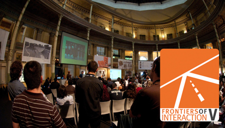
Last Monday the Fifth Edition of Frontiers of Interaction took place in Rome, confirming itself as one of the most interesting event in the panorama of interaction design. A rich schedule -full of people and thoughts to share- and a wonderful location -the Aquario Romano- to talk about how technologies are changing our life.
The issue of complexity turned out as one of the frontiers that have to be explored. A first moment of reflection on that topic was given by Daniele Galiffa, CEO and co-founder of VISup, teaching assistant at Density Design Lab in 2004: he introduced the importance of using visualization methods in order to describe the complexity that is part of interaction design and information technology projects.
The tools and techniques coming from the world of information visualization can be adopted for analyzing, designing and also explaining complex phenomena such as a digital eco-system, taking advantage from the power of visualization to facilitate the observation, the ideation and the comprehension.
These thoughts became more tangible for the audience through the contribution of Andrea Vaccari, a research associate at the MIT SENSEable City Laboratory, who presented several techniques they’ve developed for giving visibility to social activities.
Again the visualization turns out as a basic support for the description of complex phenomena, augmented by the power of computer technology. They create software able to record and show data that are so complex that humans can hardly control and express.
Their use of technology together with the excellent control of the visual languages and the visual qualities conveying information is of course something that overcomes the frontiers.
Saturday, June 13th, 2009
Voilà, CityMurmur! (please read with French "R")
On 3rd and 4th June, CityMurmur project (www.citymurmur.org) landed in Paris to take part to HyperUrbain.2, a conference about Information Technologies and Communication in urban areas, which was at its second edition this year.
Theme of the symposium was “la ville cartographiée” (the city map), and to give our contribute to the discussion, we were warmly welcome to the ‘Cité des sciences et de l’industrie‘; built in the 19th arrondissement, just beside Parc de la Villette, ‘La Cité des Sciences et de l’Industrie’ is one of the world’s largest and most visited science museums, and looks as an impressive modern site which offers a wide variety of exhibitions and shows.
Both the organizing committee (who selected CityMurmur project in March) and the audience (composed by journalists, professionals, students and researchers) expressed their interest after our “poetic” presentation (as it was called), pointing the attention on the effective results we collected from the beginning of the project on November 2008 in relation with the reality of the actual/traditional media scape. Most of the questions, were about the perspective of CityMurmur in journalism world or as a tool for policy or security tasks: we were pleased to answer that the project is absolutely on-the-making and any interest in new developments (and funding, why not?) is appreciated.
The “french trip” represented of course the opportunity to meet lots of kind and interesting people like Prof. Khaldoun Zreik (University Paris 8 ) who is the president of the organizing committee of HyperUrbain, Paul Girard (research engineer and member of R&D Committee for SciencesPo Médialab) and Christophe Leclercq (CITU, Université Paris 1). We take here the opportunity to thank them once again.
Our next “murmur” is going to born on August, in New Orleans (US). We’re preparing the energies to implement CityMurmur for the “jazzy-city”: Dixieland, we’re coming… (and “Yes”, we know: stereotypes are hard to die. Tell the media! Not us!).
Till then, here you are the Paris slideshow, embedded in it two videos…don’t miss them
Tuesday, June 9th, 2009
In Whiteboard we trust
[link expired, set_id=72157619406741257]
This is the DensityDesign’s whiteboard, as usual, full of projects and thoughts. Each week (about), we’ll post on Flickr a picture of our whiteboard to keep you updated on our activities.
Stay tuned!
Monday, June 8th, 2009
The Economist: Mapping a better world
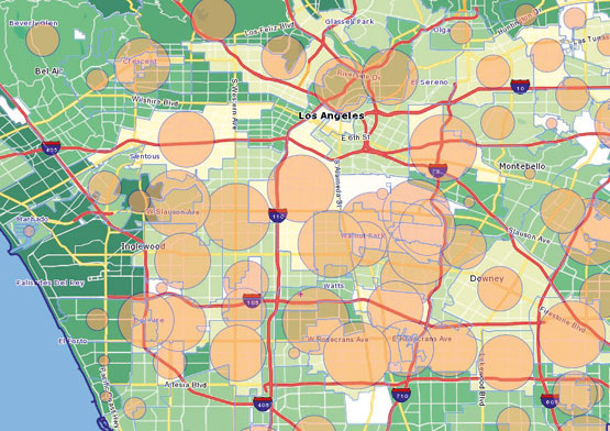
This morning flipping trough the last issue of the Economist, I ran into an interesting article titled “Mapping a Better World“. Since we have been working together with the LA based NGO Iridescent Learning in the “Urban Schools Needs Project”, I’ve became quiet familiar with the shape of Los Angeles. When, flipping the last page before heading to the office, I bumped in a full color LA Map showing relations between parks diffusion and childhood obesity; I felt that somehow they were talking also about us.
The article goes trough different successful examples of mapping tools that have been used to visualize correlation between different data and places on a map.
The ending is quite evocative:
” Maps don’t change the world – but people who use maps do.”
We couldn’t agree more.
Tuesday, May 26th, 2009
Cartografare il presente, Mapping the world.
A very interesting set of conferences (about to end but we’re still in time) about cartography. The occasion is the next issue of the Atlas of Le Monde Diplomatique.
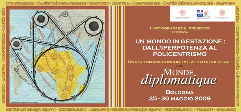
http://www.cartografareilpresente.org
http://www.cartografareilpresente.org/spip.php?page=cartes&lang=it
http://www.france-bologna.it
http://www.dds.unibo.it
SIMPOSIO “GEOPOLITICA E MIGRAZIONI”
Complesso di San Giovanni in Monte, Aula Prodi, Piazza San Giovanni in
Monte 2, Bologna. Sabato 30 maggio, ore 10
Saluti: Carla Giovannini (Preside della Facoltà di Lettere e Filosofia
dell’Università di Bologna), Alberto De Bernardi (Direttore del
Dipartimento di Discipline Storiche dell’Università di Bologna)
Interventi: Catherine de Wenden (Centre d’études et de Recherches
Internationales, CNRS/Sciences Po), Gigi Roggero (Università di Bologna),
Olivier Clochard (rete Migreurop), Caroline Intrand (associazione Médecins
du Monde)
Presiede: Carlo Galli (Presidente del Comitato Internazionale di Bologna
per la Cartografia e l’Analisi del Mondo Contemporaneo)
Tuesday, May 19th, 2009
The image of the city – Visualization of sense
My PhD Thesis – Work in progress, year 1/3.
Throughout the centuries cities have been constantly changing, together with their image, their imageability. Therefore their graphic representations must be constantly ‘adapted’ to those changes too.
Classic cartography deals with the topographic aspects of the cities, without explaining what happens inside them, describing their elements, whereas recent technological approaches (MIT Senseable City above all) are using the city as a data to analyse, elaborating flows, activities, habits, offering new images of it, but somehow discarding any cultural aspect of the city.
During the middle age, cartography was a way of conveying sense, maps were not so closely linked to the territory, they were most likely a tool for understanding a vision of the world. Some city maps were only a symbolical artefact, people didn’t use them to find their bearings; sometimes map-makers hardly knew the mapped city itself. They were conscious of the meaning of the city, that was enough.
“To ask for a map is to say, Tell me a story” said Peter Turchi.
It’s only a matter of deciding which story to tell: design is choice.
My PhD research aims to identify new ways of looking at the city, in order to find a graphic language that can show cultural aspects, telling a different story about the city, showing its sense, its values, its history.
A kind of archeology of sense.
Saturday, May 9th, 2009
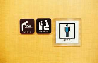
Pictograms for fathers
My three kids make me especially interested in the topic: could anyone help me with the meaning of the pictogram in the middle? As the third one could suggest, they are located beside the door of a male bathroom equipped to support fathers with children.
Wednesday, April 29th, 2009
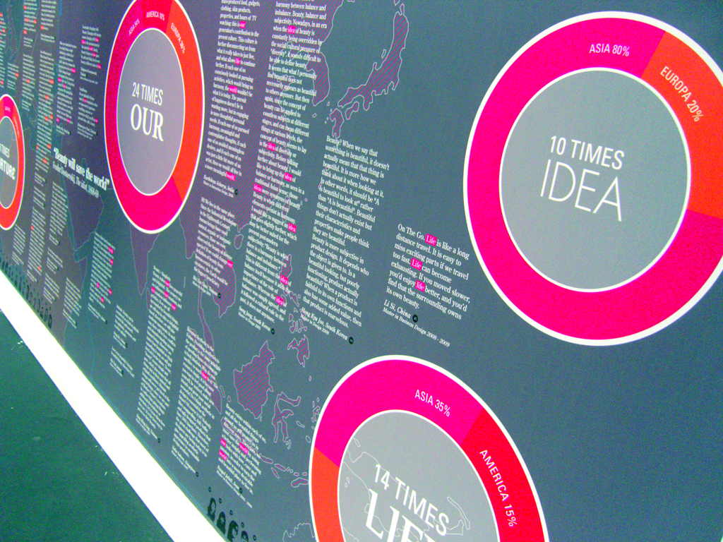
Changing with Beauty
From our friends at Domus Academy.
“Beauty will save the world”
Feodor Dostoevskij, The idiot, 1868-69
“If anything can save us: that will be beauty!”
Ettore Sottsass, 2001
In a time in which World and Design are concentrated on reflections on the major issues of sustainability, energy and globalization Domus Academy’s international students and Alumni wonder about the courage and the innocence needed to measure themselves with a so sublime and yet so present pursuit as the Search for Beauty.
Received quotes are ingredients of/for a graphic representation, that synthesize emerging terms and how them are related to the geographical origin of thoughts, showing how peculiarities of local culture impacts on personal interpretation of beauty.
The panel has been on show at That’s Design 2009, in the occasion of Salone del Mobile, the biggest event here in Milano concerning Design in all its multiple identities!
Monday, April 27th, 2009
Information Design Conference 2009

After the Density design course I start a thesis about form design and the relation between people, bureucratic structure and information. In the beginning of April I went to London to partecipate at the information design conference 2009, held in Greenwich.
Not only the visualization of complex data, but also the simplification of complex informations to act in daily life: documents, forms, wayfinding, health information, instruction and explanation, are some of the topics discussed.
Contributions emphasized the multidisciplinarity of information design, by gathering linguists, psychologists, specialized authors, communication designers: two days of debates and meeting in a confortable exchange mood.
Organizers Paul Stiff and Rob Waller of the Reading simplification centre were among the speakers.
An interesting contribution with regard to Inclusive Design came from Colette Jeffrey, who presented as an example the legible london project and future applications of information-inclusive-design.
Max Gadney, (Commissioning Executive in BBC Vision) illustrated some information graphic projects. He also speaks about sharing research in the information designer community.
Borries Schwesinger, author of “Formulare gestalten”, presented a comparative analysis of online services offered by European governments: they complicate life and probablty we have to be patient.
Boag Associates, Text Matters and Studio Lift, all dealing with document design, were attending.
Regarding complex system mapping and data visualization, the next upcoming meeting will be the DD4D (Data Design for Decision) Conference in Paris in June.
- Make 5 Sentences about Saying Disagreement
- Payment Agreement Sample Philippines
- Can Landlord Charge for New Tenancy Agreement
- Spirit Airlines Tax Receivable Agreement
- Ancillary Services Agreement
- Download Agreement by Shanko Rasheed
- Facebook User Agreement Photos
- Music Production Contracts Templates
- Do Contractors Do Financing
- Free Trade Agreement Russia
- Stock Purchase Agreement Good or Bad
- Terminating Employee Contract Early
- It Support Agreements
- Iran Nuclear Agreement Terms
- Rental Lease Agreement for Ct
- Tcode for Display Contract Status
- Contracts Manager Jobs in Bangalore
- Behavioral Health Contractors Association
- User Agreement in Arabic
- Rcuh Agreement for Services

