As a research lab, we are always committed to exploring new research fields and new data sources.
Sometimes it happens that these self initiated explorations become small side projects that we develop in our spare time and publish after a while. This is what happened in the past with RAW and other side projects. In this kind of work we think is important to keep things simple and proceed step by step in order to have flexible and iterative processes and the possibility to experiment new tools and visual models that we can use later.
The rise and growth of many car sharing services has been an important factor in changing the way people move inside the city.
Visualizing and analyzing data from carsharing services and other forms of urban mobility allows for a better understanding of how the city is used and helps to discover the most prominent mobility patterns.
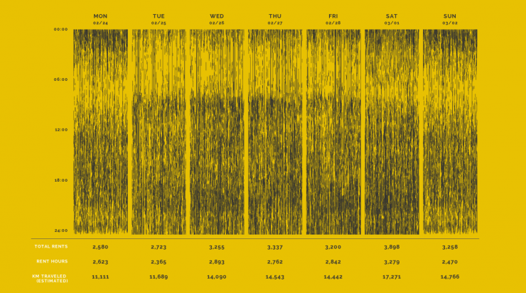
The website is structures around a series of visual explorations of data collected over the time span of one week from one of the main car sharing services in Milan called Enjoy.
We started this project as a small experiment to investigate through different techniques how urban traffic patterns evolve day by day and the main characteristics of use of the service.
In february 2014 we started scraping data directly from the Enjoy website getting the position of all the cars available every 2 minutes. We collected more than 1,700,000 data points resulting in more than 20,000 rents, and 800 days of usage.
Since the beginning the idea was to combine different kind of visualizations, both geographical and not in order to explore the different dimensions of the phenomenon, the biggest challenge was to combine them in a linear story able to convey some insights about mobility in Milan.
For this reason we decided to build a single page website divided in five sections. Each one enable the user to explore a dimension of the phenomenon and give some interesting insight.
Since Enjoy doesn’t provide any information about the routing, but just the position of the available cars, one of the biggest technical challenge was to find a way to explore the individual routes.
Inspired by this interesting project by Mappable we decide to process the data using an open routing service (Open Source Routing Machine) to estimate route geometries for each rent. The data has then been translated into a geojson file and visualized with Processing, using the Unfolding library, to create a video and with Tilemill and Mapbox.js to create an interactive map.
To see all the visualizations, discover our process and some insights please visit the project here.


