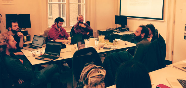
Last week, during an hackathon in Amsterdam, we realized the first working prototype of Contropedia Platform, an application meant for the real-time analysis and visualization of controversies in Wikipedia.
It has been a great experience thanks to the interesting mix of different expertise.
Giovanni and me worked together Médialab (Sciences-Po), Digital Methods Initiative (UvA) and Barcelona Media researchers to realize this early prototype.
Hackathon goal was to refine and correlate some metrics previously identified by Barcelona Media and DMI, and to provide a static visualization of each metrics. We’re quite proud to have overcome that goal realizing a working prototype at the end of the week.
Still, lot of work has to be done, but here you can find some preview of the visualization and a brief description of the design process.
Results
Let’s start with results. Below you can see a static mockup of the application (ASAP the working prototype will be available on the project website).
Up to now we have two visualizations groups: the first one is meant for the exploration of controversial elements within the Wikipedia page. The second one is a more analytical exploration of such elements, giving details on involved users and the revisions list for each element.
Preliminary Work
Before the hackathon, each institution prepared some preliminary work.
Médialab, with its expertise in controversy mapping, prepared a user profile and some use scenarios for the platform, defining the application goals.
DMI was already working on the identification of most edited (and therefore controversial) items in the page.
DensityDesign already worked on the visualization of such items, and provided a brief description of all the available variables.
Barcelona Media brought the study of reply chains on discussion pages.
User scenario
Synthetizing the long document prepared by Médialab, the user is:
- A person that sometimes uses Wikipedia as information source
- Want to know something more about the debate (without having any prior hypothesis about that)
- Knows roughly how Wikipedia works (ability to edit, existence of talk pages).
- Finds the actual structure too fragmented to have a global idea of
The document presents, in form of discourse, user needs. Here is the list of main ones:
- What is controversial in a Wikipedia page?
- How much a given part discussed?
- How many people are discussing it?
- Which are the most debated sections?
- How much the linked pages are controverted?
- How many controverted pages exist about the topic?
- Who are the main actors (see Actor-Network Theory)?
- What is an actor on Wikipedia?
- How the controversiality changes over time?
- Does the debate move among languages?
- What is the temporal trajectory of controversiality?
Metrics
At the hackathon beginning some useful metrics were already identified.
The first one is about the controversial elements within a page. For each wiki-link, image and external link in the page, edits are counted and normalized on each edit size.
It is then possible to evaluate the controversiality level of each element through time, as some of them have been deleted from latest page revision.
The second one is about discussions. Wikipedia talk pages have a tree-structure, and analysing the tree depth, its width (number of branches) and the amount of users is possible to define its controversiality.
There is no explicit link between threads and the page, even if reading them is possible to identify which part of the page they are talking about.
It is also possible to extract the revert network between users: each time that a user reverts another user edit; the link between them is reinforced.
Finally it is possible to define a users network starting from threads: each time a user replies to another, the link between them is reinforced.
Working groups
We divided into three main groups, with different tasks:
- The identification of links between threads and page sections (what section is the most debated?)
- The identification of groups of users starting from threads and reverts network. In both networks indeed link represents opposition between users. Common metrics are based on the opposite paradigm (a link means agreement or at least proximity).
- The identification of a visual layout able to enrich Wikipedia page with the new metrics.
Data objects
Starting from the given description from DMI and Barcelona Media researcher, we draw a first schema of possible data objects we could use.
This kind of schema was useful to identify on which objects we want to focus, and the objects hierarchy.
Some objects were already known: the page itself, the user, the single discussion thread, the page items (links, images, templates).
Some other not: is there a middle element between the whole page and the single item?
Some others were conceptual issues. In particular, what is an “actor” on a Wikipedia page?
Design challenges
The project presented several challenges for the design. At the sprint beginning we were aware of three main kind of analysis (thread chains, controversial elements, revert networks) that were able to cover just part of user requirements.
While knowing how the analysis was performed, no data sample was already available.
Some words used in user description were ambiguous: when talking about controversial topic, how to define a topic on Wikipedia? Is it a single page? Is it a group of page? If the latter, how to define which pages describe a topic? And again, when talking about involved actors (Latour), what is an actor on Wikipedia? How to extract this information?
Without knowing how these entities would have been modelled as data objects, for us was difficult to imagine how to visualize it.
Mockup evolution
As there were lost of open questions, instead of trying to create one coherent application we rather decided to create the most suitable visualization for each kind of analysis. The goal was to use the visualization to understand each analysis relevance and how to combine them in a single app.
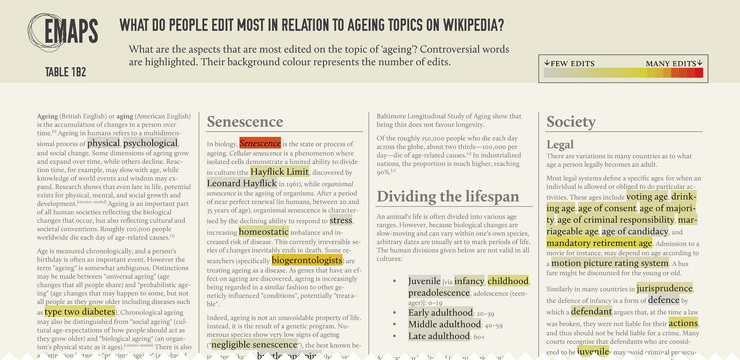
We started working on a prototype created by DMI on the ‘Climate change‘ wikipedia page. It was the original page with controversial elements marked with different colours according to controversiality level.
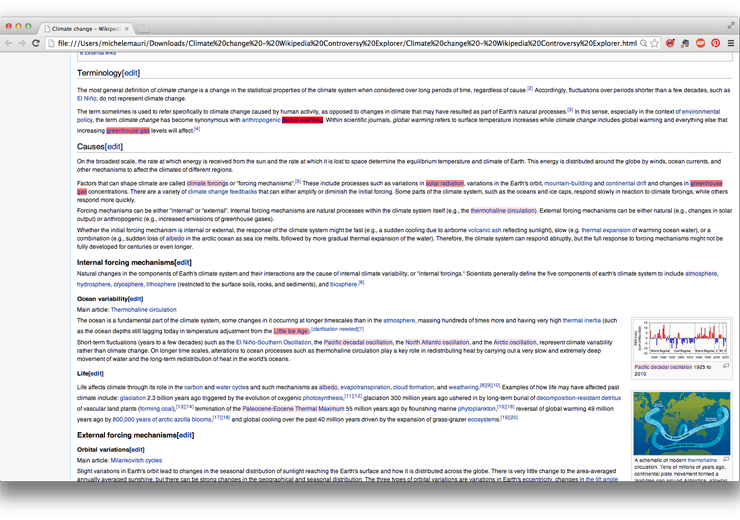
We already worked on that kind of data for another project (EMAPS). So we started from that for the new mockup.
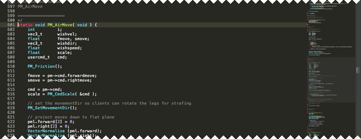
The idea was to keep the page layout with marked words but adding some features. As in the user description is asked to provide an overall view on the page, we decided to insert a minified version of the page, sometimes used in text-editing software like Sublime Text.
In the first static mockup of the page, the minified version was a fixed column on the right representing the whole page.
Working with the real data, we identified that most of the controversial items have a very low value of controversiality. To make them simple to identify, we choose a color scale moving between two colours instead that using different opacities.
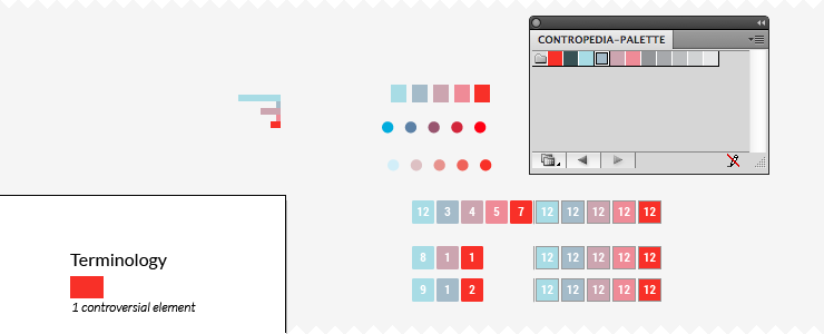
As controversiality should be the first information, we choose to remove any other colour from the page, including images. Also we decided to use dark grey instead of black as text colour, to empathise controversial elements.
Creating a minified version of the page arose the need to fine an element in the middle between controversial items and the whole page. Empirically, page sections seemed the best solution: the number of section per page is not too high, their size don’t vary too much – Wikipedia guidelines recommend to avoid too short or too long sections – and each section can be seen as minimum thematic element.
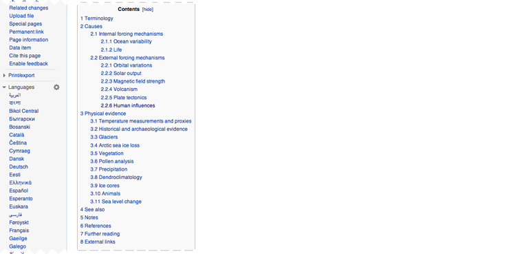
Drawing it we found that sections were also useful to link other information, like related discussion threads. To make even more simple for user to identify where controversy is, we suggested to identify a measure for the overall controversiality of each section. Below, the first mockup:
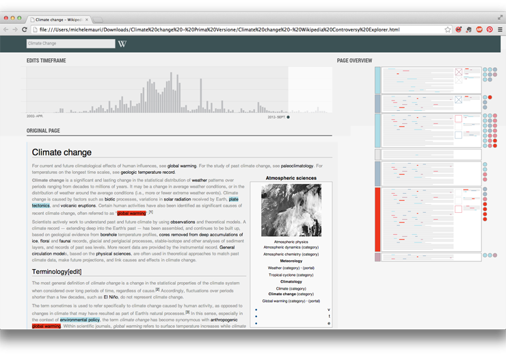
Using real data on coming from Wikipedia become clear that was not possible to use screen height as scale for the whole page.
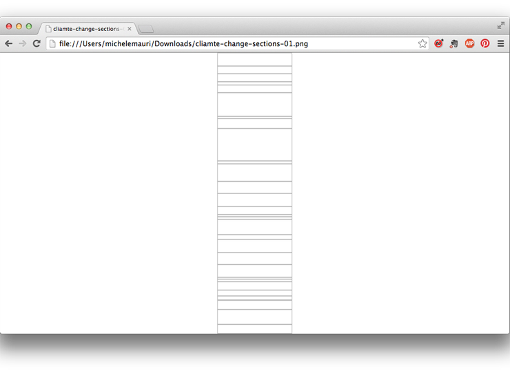
We also realized that if the first interaction of the user is with the minified version, it was not useful to show the full text.
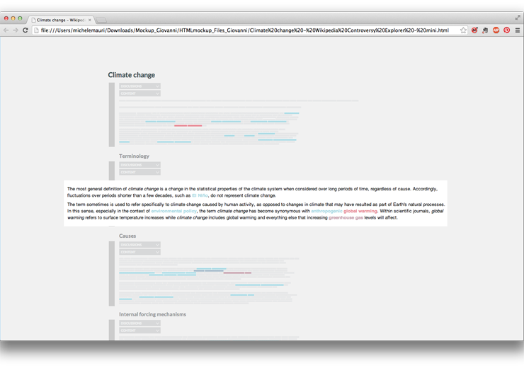
We focused on the minified version of the page, imaging a ‘folded’ interaction where in each section user can switch between the visualization and the full text.
To quickly create a mockup, we decided to just hack CSS, using the Block Font to replace words. It worked better than we thought. Having an (almost) working prototype was really useful to identify possible issue with visualization and correcting them.
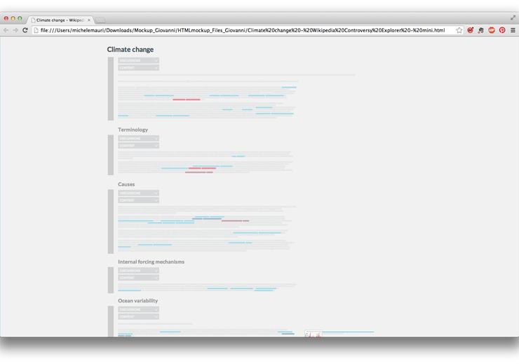
working with CSS was useful also to quickly switch between the minified and extended version of the page
From beginning, we decided to insert a timeline-bar chart as first visualization representing the overall activity on the page (to be chosen between number of edits, number of active users, number of reverts). User, interacting with the timeline, can choose the temporal period he wants to explore.
Reflecting with the other researchers we understood that temporal evolution is not just about wich revision to show, but also to define on which period analyze the controversy. The same item could have a different controversiality in different times.

Timline become the tool to select a time span, controversial level indicators will be computed on that period.
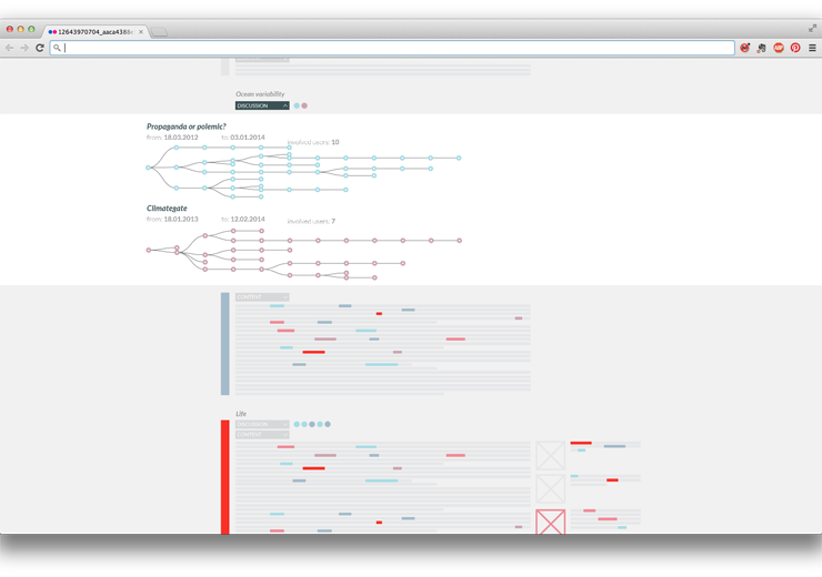
Meanwhile, Barcelona Media and Sciences-Po found a way to join discussion threads to page sections. We decided to insert also that information in the main visualization – representing them as coloured dots, each one representing a single discussion and its controversiality.
User can open the discussion panel and see a detailed description of threads.
At the time, was difficult to identify what kind of details we had to show – as the analysis was on-going.
One solution was to show the full-text thread in the same page. The risk was to create something too rich (and complex).
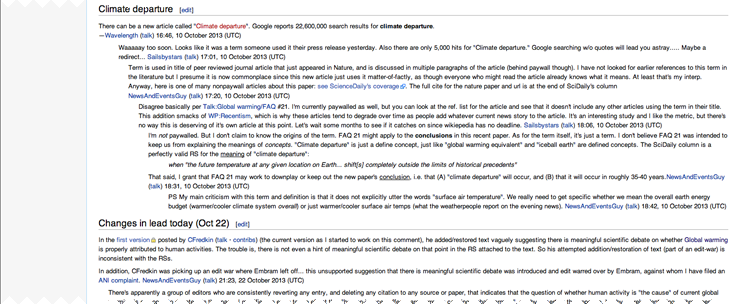
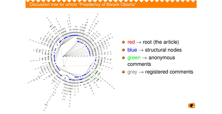
In their original publication, Barcelona Media researchers analyzed the full discussion as a tree, visualizing with a tree structure. Below, an image taken from the presentation:
Since threads have a tree structure, are studied as tree structure, and have been previously visualized as tree structure, the ‘duck test‘ persuaded us to represent them as trees.
Also, D3.js has a nice function to do that.
With this visualization it is possible for user to understand some discussion dynamics. Colour shows thread controversiality. Each visualization is a link to the full thread on discussion page.
With the described interface big part of the user needs were addressed. Still it was difficult to see elements controversial in the past but then deleted from the page. To solve this issue we created a page with a list of all the elements involved in the selected time span and visualizing their properties. Working with a sample data about Climate Change, we identified a possible visual solution for these information.
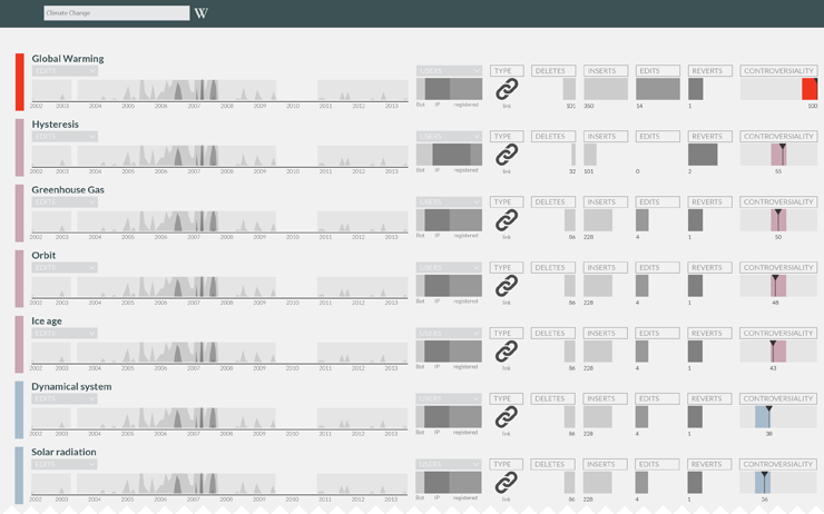
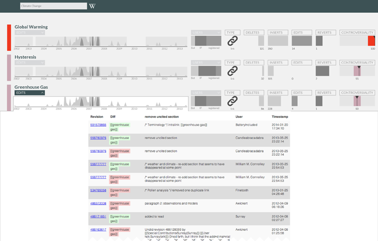
Also in this case we tried to use a folded structure, allowing to get more details about some variables.
The timeline allows the user to see all the edits regarding an actor, marking the deleted and added part for each one.
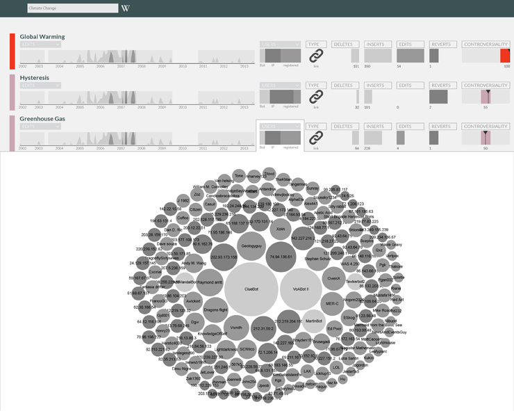
The bar chart showing user types open a detail on users. We proposed this solution using the available data, without knowing how much would have been relevant to the user. After a discussion with the others we decided to show instead relationship among users (still in development).
Conclusions
Hackathon is a great format for this kind of projects – and with a such rich group of different expertise.
From our point of view, the main issue has been the identification of the workflow. As all the project parts – data collection, data analysis, and data visualization – are performed together in a very short time, it is difficult to set up a proper workflow, and to understand how each part can influence the others.
Lots of questions come to our mind during the hackathon:
Should we discard some kinds of analysis if they are not coherent with the overall application? Is better to keep in mind the overall structure of the app or focus on single visualizations, maybe very different among them? Can designers imagine what kind of data could be useful and ask to produce it? Or should it be the inverse?
Sciences-Po work on user scenario has been a fundamental tool to speed up the choices, we used it to identify the most relevant visualizations without the risk of doing something interesting for us but not for the project.
Due to the lack of time, instead of thinking new visualization for each element we started to work on the other researchers ideas, refining them and understanding how much they were actually suitable or not. Even if this process was forced by time constraints, it turned out as functional co-design practice for the interface development.
Another key factor of the hackathon success is the presence of great and quick developers: each idea from our side was accepted and quickly realized. It’s basilar to test visualizations whit real data to evaluate them. We discarded lots of ideas looking them realized with real data. Without the developers support, this validation process would have been much slower. In this kind of project at least one designer should have a basic knowledge of coding (both to work with data, and to visualize it). Even if it is possible to imagine apps without technical knowledge, it makes harder the communication with the other parts, and especially in an hackathon could make the process really slower.
What’s next?
We will work to create a minimum working prototype of the application and test it on different controversial pages, possibly with issue experts. The aim is to identify which issues address during next hackathon in Barcelona.

