The project is a collaboration between DensityDesign and CSI Piemonte .
CSI is a public consortium grouping a large number of Public Administrations and it is organized along “private” lines. It focuses on the development and operation of  Information & Communication Technology projects for the public sector. It’s a public institution working with open data and trying to experiment novel ways of integrating open-data in their current analysis and services they provide.
Our collaboration aimed to explore how to display temporal series of datasets with two different projects:
- a very first experimental one visually represent 50 years of history of farms and vineyards in Piemonte,
- and a more consistent consecutive one producing 3 interactive interfaces exploring data on the public administration’s connectivity level, public school’s on-line services and the internet connectivity throughout the whole Piemonte region.
Farms and vineyards in Piedmont: 50 Years of History
Starting from the data of the last 5 censuses of agriculture, we produced a simple and brief storytelling, to allow any citizen to understand the changes occurred in Piedmont in this area, in a time-lapse from 1961 to nowadays.
How much territorial surface was dedicated to agricultural production and what about the situation now? How about the relationship among the overall surfaces of agricultural production and the portion dedicated to vineyard, which Piemonte is quite famous for, and how this evolved through time? Moreover, how about the evolution of Piemonte’s farms regarding their surface and kind of production through decasdes?
The very first stage tried to find very simple, intuitive and iconic visual models able to represent the phenomena, as we’ve been asked to.
We started with static data visualizations helping them to introduce the project’s main idea through a public presentation they organized within the CSI consortium. We tried to come up with a simple language able to display very quick and understandable comparisons among the variables.
They did like it, and we then moved forward to a more interactive representation of such data, through a simple interactive interface we designed and built able to these comparisons dynamically explorable through time.
Link to our app:Â http://labs.densitydesign.org/CSI
Further explorations and interactive applications
We then had the possibility to experiment more on Piemonte’s territorial data thanks to a more consistent set of explorations we later started with CSI. Since we found the 3  datasets being fairly similar as typology of attributes, our main idea was to design a unique format of interactive interfaces, where similar operations and contents’ typology could appear displayed as the same; this was to provide the project a global coherence and to allow users’ to better navigate the application.
A Piemonte’s zoomable map would arrange the main view, a time-slide would be both dedicated to display trends’ indications and to directly manipulate time, “stats” dedicated part of the interface would be always positioned within the same wireframe for all of the 3 diverse projects. Data representation and analysis will provide 4 subsequential zooms level, starting from a regional exploration, moving towards provinces, municipalities down to singular elements in each of the visualization.
Schools’ online services
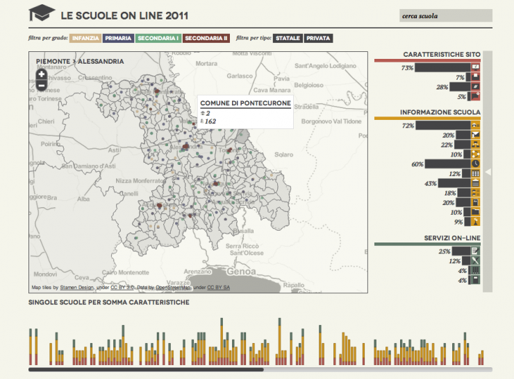
Schools’ online services / This set represents on-line offer of information and services each school of the Region includes in its’ website. Schools can be filtered per typology (private institutes and public institutes) or per grade level (e.g. primary, secondary, college). Singular schools are represented through a dot on the map and referenced on the bottom part of the screen elucidating the sum of working facilities per each one. Working facilities per each zoom level are represented in the right side of the screen’s stat part and an update is displayed as zooms change.
Public Administration’s connectivity
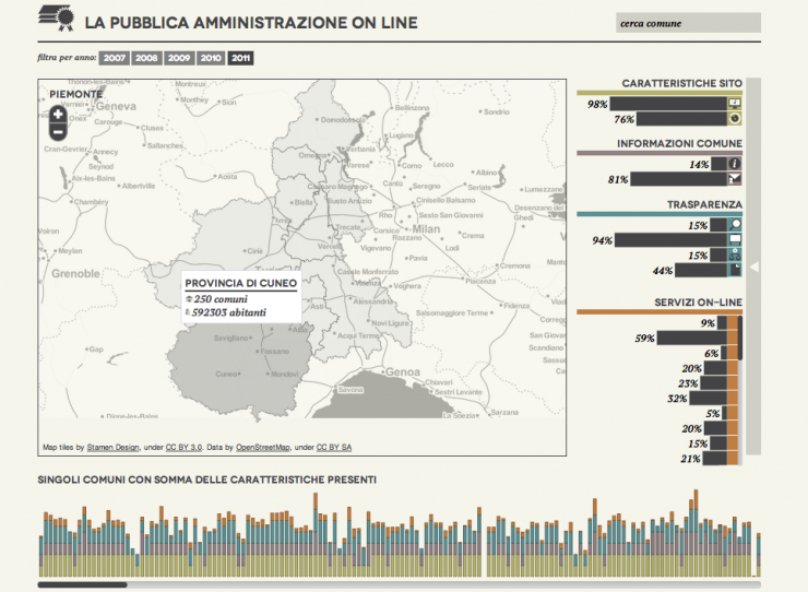
Public Administration’s connectivity / Quite similar to the application above, we designed a further development of the main interface representing how Piemonte’s Public Administrations (municipalities) perform well in terms of on-line offers of informations and facilities for their citizens. PA’s performances can be filtered through a time-serie, singular PAS’s sum of working facilities is represented on the bottom part of the screen, likewise the schools’ interface. Working facilities per each zoom level are represented in the right side of the screen’s stat part and an update is displayed as zooms change.
Internet connection in Piemonte
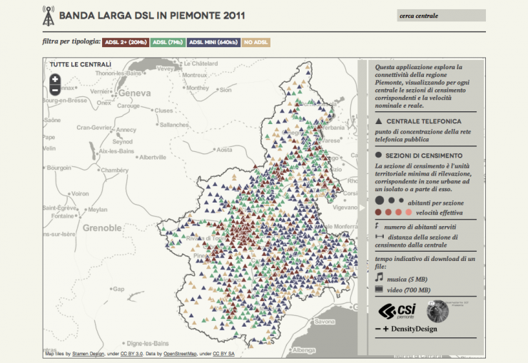
Internet connection in Piemonte: /Â This third application visualizes the census tracts and the nominal and actual speed for every exchange center. To give a more intuitive understanding of this complex system of information, we designed some useful comparisons able to better imagine which values we are exploring: internet connection speed is visually represented by the download time of an mp3 and a movie of average size.


