Semi di Futuro is an exhibition celebrating the 150th anniversary of the Politecnico di Milano and taking place at the Triennale Museum of Design, Milan.
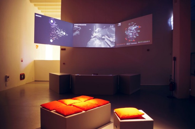
DensityDesign contributed to the project with an interactive installation showing the present of our university through three points of view: the research brought on by the students, the internationalization and the relationships with other universities around the world and the presence on the national press.
The installation is placed at the end of the exhibition and is composed by three visualizations (one for each point of view):
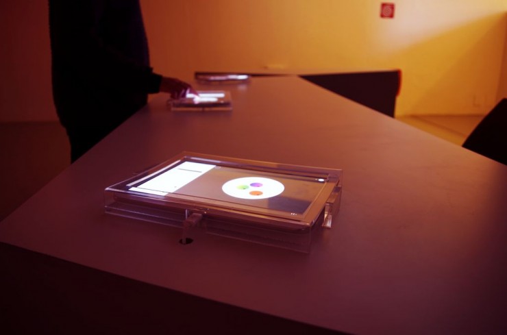
The user can interact with each view through a tablet placed on the table in front of the projections:
I. Internationalization
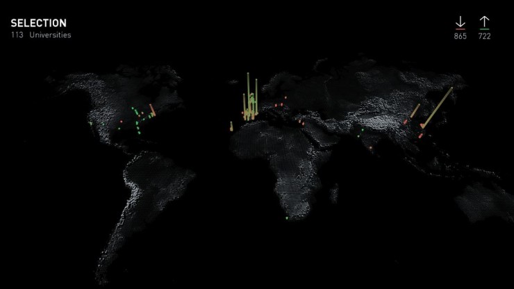
This visualization shows the worldwide relationships with other universities in terms of students exchanges (Erasmus, Overseas, Vulcanus and so on). In particular, the visualized data concern the last two years of international exchange projects, divided by nation. The view is composed by a three dimensional map where the users can highlight a single country or a continent. Once an element is chosen, one or more prisms appear on the selected country with respect to the coordinates of the universities hosting or sending students; the height of the prism represents the number of students.
The user also has the choice to filter the number of students in order to see only the incoming ones, the outgoing ones or both.
II. Press
This visualization shows the presence on the national press of the Politecnico di Milano and its associated topics. The data used in this view was obtained by the online archives of the Repubblica and Corriere della Sera newspapers. We retrieved the last 20 years of articles in which our university was referenced, grouped them by month and extracted the other entities present in the texts. Such entities were then divided in three main categories: organizations, people and places. This way, for each month we were able to obtain a network of entities related to Politecnico di Milano. The bigger the circle, the greater is the relevance of a certain item in the graph.
Through the tablet the user may select a particular month on the available period or a year interval. It is also possible to filter out unwanted categories and to focus on a single entity in order to see only its connections in the graph.
III. Research
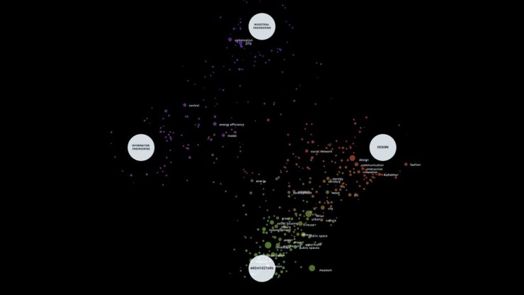
This visualization shows the keyword of the research brought on by the Politecnico di Milano students. The data used for the view is composed of the tags describing the Bachelor and Master Theses of the last three academic years. Each tag can be more or less relevant to a single faculty, depending on how many times it was used for a related thesis (i.e. “Interaction” is more relevant to the Design faculty rather than Engineering or Architecture, due to its preminent use in Design theses). This correlation is visualized as a spatial and color proximity: each tag is a circle of variable size (depending on the overall count of times it was used), and its color and position in space depends on the relations to the faculties, which are instead visualized as bigger, fixed white circles.
Through the tablet the user can include or exclude faculties and/or its associated schools, and focus on a single keyword to see in detail how many times it was used in every faculty/school.
Here is a video of the installation:


