Abstract
Since the last decade journalism has been going through a fast and substantial revolution. The morning paper is now replaced with almost real-time news on the Internet. In this digital revolution, social media play an important role since they created a space where citizens have the same opportunities (broad audience) as reporters. These social networking sites can be seen as conversational spaces, where interactions between users and shared content reflect not only opinions, but eye witnessed material as well. It became pretty clear in the last few years that journalism should make use of social networking not only to increase the traffic to the website, but as a source of information to improve reporting.
However, these platforms continuously produce an information overload that makes it impossible for journalist to dive into. What they are missing is the clarity of bigger picture, which is necessary in order to see those elements that need further investigation.
This workŌĆÖs goal is therefore to design a tool able to support journalists and academics in both the exploration and investigation of such ŌĆ£ambient information streamŌĆØ. The project aims to help in two directions: on the one hand by providing an overview and on the other hand by giving the possibility to reach a granular level of information. The first one will be fulfilled by using a visual layer, following de RosnayŌĆÖs notion of macroscope. The second one will be actualized by a structured level of interaction, able to show details-on-demand.
The combination of the two finds in Information Visualization the technique able to carry out those journalismŌĆÖs needs that this project aims to answer.

Ōåæ The diagram shows a simplified schema of the journalistsŌĆÖ workflow. On top of it the purpose of this project: help the exploration and investigation (of social media content) by using a visual layer.
Research question
This work aims to answer to one of nowadays journalists’ needs: making sense of User Generated Content. Social media platforms continuously produce an information overload that is impossible for journalists to keep under sight. Furthermore, the produced content is a mix of information, opinions, and spam messages, which make the exploration even more difficult. Social media platforms themselves present all this content as a textual list chronologically sorted, with few options to filter and no option to have an overview.
There is therefore need for new tools able to help in the exploration and investigation of this “ambient information stream” where both the big picture and the granular information are combined.
Methodology
To have a better understanding of the current journalism situation, the project has been preceded by a deep theoretical research on the field, consisted in the study of several papers written in the journalism literacy in the last few years. In addition, interviews with several journalists and professionals who work close to them have been done, always with the purpose to create something useful and valid to the target.
The project focused on the analysis of Twitter data in the day of the crash of the Malaysian Airlines plane happened on 17th July 2014.
To help journalists to explore and investigate UGC I designed a tool that work through the use of a visual layer as representation of the conversational space. The main direction was set by the notion of Visualization Information as cognition amplifier (Card et al.), where the main value resides in insights (discovery) rather than pictures.
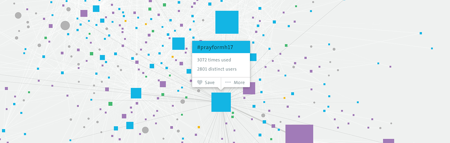
The main visualization is a bipartite network where users, hashtags, and content (visually separated into URLs, images and videos) populate the space of the canvas. Relations between each of them and other values define the positioning and the size of each node.
Other visualizations consist of a geo-located tweets map and of a content timeline that shows how the most popular entities changed over time.
Each visualizations aim to portrait a bigger picture from different perspectives and always giving the option get details-on-demand in order to carry out part of the investigation process.

Ōåæ┬ĀRedrawn (slightly adapted) of the Visualization model diagram as intended by Card et al. in the 1999 ŌĆÖReadings in information visualization: using vision to thinkŌĆÖ. The thesis follows the same path in the explanation of the process from data to visualisations.
Results
The goal of the project, to support the exploration of UGC by the use of a visual layer, has been accomplished with positive results, confirmed by a validation with hypothetical final users. In addition, during the development of the project I encountered positive and interested feedback from many professionals in the journalism field, meaning that social media content and its analysis represent a challenge of today.
Even though the gathered Twitter data were only from a relatively small amount of time, all the three visualizations in all their variables were able to give insights about how information has spread on the platform. In particular one main finding is that a previous knowledge of the topic is not required in order to understand the content of the visualization: it is instead through the exploration of the visualization itself that new knowledge can be acquired.
As confirmed during the validation, the project demonstrates to be a valuable tool for journalists and academics in news reconstruction and social media analysis, especially for its capacity to give both a macroscopic and microscopic view enhanced by a time filter.
The visual layer showed to have the potential to provide new angles and perspectives about a story, always an important element in journalism.

Ōåæ┬ĀThe ŌĆśEntities TimelineŌĆÖ visualization presents all entities grouped by type (shared images in this case) and sorted by number of occurrences in the dataset; each column is a different time span (marked in the timeline below). Each stream shows the ranking of an entity over time.