“A Field Guide to Fake News” is a collaborative project aimed at collecting digital techniques to trace the circulation of fake news. The project is lead by Public Data Lab (which our lab is part of) with support from First Draft.
You can download a copy of the book and read more at this link:
Below, we will describe our point of view as design researchers on the project.
Abstract
In the last years ÔÇśfake newsÔÇÖ become a buzzword, used (and misused) by several people, groups, organisations.
Designing a Field Guide
When at the Public Data Lab (PDL, an international group we are part of) came out with the idea of collecting analyses based on digital methods to explore fake news, we were quite worried.
We were quite worried since we know that the web is a shifting medium, continuously changing, and because we collaborate to this kind of analysis since several years. Enough to know that when you analyse the web, you start from an idea and you end up with something completely different.
Therefore, when Liliana, Jonathan and Tommaso asked us if it was possible to define a ‘format’ for analysis yet to be done, by people unknown, using new methods, you could easily imagine our concerns thinking to all the challenges related to such project.
What was interesting and intriguing in this project is that it was not related to the design of visualisations, or the layout of a book. It was about the design of the collaboration among people.
Before starting the project, the only clear things were that:
- analyses would have defined during the collaborative sprints;
- the final output of the research would have been a visual artefact collecting all the results.
For these reasons, it was fundamental to define a format flexible enough to avoid to impose a too many boundaries to the analysis design. Our approach can be therefore synthesized in three steps:

- The design of constraints;
- The co-design of analyses;
- The re-design of results.
Design of constraints
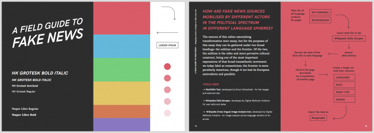
Two slides taken from the format for the Amsterdam Sprint, designed by Gabriele Colombo
Usually, in the design of visualizations we start from the data features. But in this case, no data was available, and even worst the analyses were not defined. We had an idea of them, but it was clear that outcomes could have been very different from each other.
The risk of using a pre-designed format was to kill the evolution of analysis, containing them in strong boundaries. The first challenge therefore was to design this format able to drive the analysis in the same direction, as output, but leaving the analyst free to follow the preferred analysis path.
From a visual point of view, we therefore defined:
- A graphic template defining fonts and colors. It could sound strange, but imposing this kind of choices designers can focus on core part of the project without losing time in stylistic choices.
- Clear spatial constraints. The output of any protocol must be readable if printed on an A4. Defining spatial constraints help designers to understand the level of complexity that can be encoded in a visualization, and therefore to suggest to the other analysts when was the case to divide an analysis in multiple parts.
- A content template. All the analysis must be described using the same fields. This helps all the involved people to keep in mind the expected goals of the analysis.
- Process schema. We said to each working group that it was compulsory to produce a schema representing all the performed actions, the used tools, and the output of each operation. Every was free to choose how to represent it, also in this case the schema must be readable on a printed A4.
Co-design of analyses
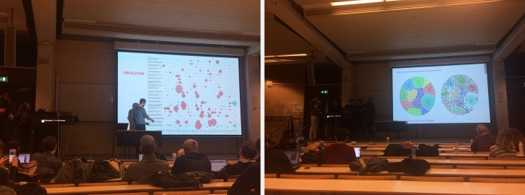
Moments from the Amsterdam Sprint, March 2017.
After this preparatory work, we participated to a first sprint in Amsterdam, that lasted five days. In that period, we produced a huge variety of analyses.
The analysts worked in thematic groups, and two or three designer were part of each group. Since they were used to digital methods analysis, they were able to create a discussion on the analysis evolution: how to design the data collection, how to collaborate on the editing of the same dataset, etc. Having in mind the described constraints, designers were also able to remember to the other components of the group the expected outputs.
Re-design of analyses
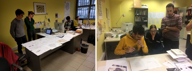
Moments from the design sprint in Milan
At the end of the sprint, as expected, many different results were produced. After the selection of the most interesting results, we started an iterative process with the project coordinators: first, they described the analyses in form of recipes. They described the intended aim, the series of operation, the outcome and the possible readings that can be done through them.
Starting from such descriptions, we defined a graphic format able to contain the descriptions and the visualizations related to the same recipe (out of metaphor, the same analysis process).
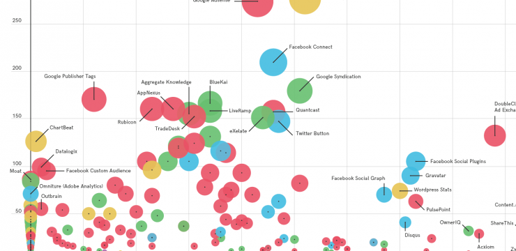
All the visualizations were also redrawn according to the new format. We tried to produce as many visual languages as possible to experiment on the memorability of single visualizations. Since similar visual models were used more than one, for example network diagrams, we tried to give a specific visual identity to each one: for this reason, you will find a huge variety of variation for the same model, as in the image.
Outcome

The printed version of “A field guide for Fake News”, alpha release. It contains the first three chapters of the book.
The Field Guide was intentionally designed for readers who have probably never worked with digital methods. The book’s design is made up of various components that support the reading and guide the analysis of recipes through a fluid and dynamic reading of the steps, tools and actions that must be carried out in each recipe.
The results of the project are condensed in a form of a book, which we thought as best medium for our idea of field guide: a collection of good practices that can be reused on different topics or areas. It is composed by thematic chapters, each one focused on a specific source or on specific features of fake news.
Each chapter is then divided into ÔÇśrecipesÔÇÖ: each recipe is defined by a research question and all the operations needed to collect the data (ad to visualize it) in order to answer the research question.
Within a recipe, finally, we can have several steps, each one aimed at the creation of a semi-finished artifact (such as, a dataset, or a visualization) needed to complete the recipe. You can imagine them as the parts that compose a course: the meat, the side dish, the topping.
Each recipe is visually synthesized with a protocol diagram highlighting all the operations performed, the used tools, and their outcomes. Through each recipe, one or more visualization are presented. Each visualizations answers to a specific sub-question, and is visually optimized to help the reader in finding an answer to the posed question.
The field guide book is an evolving artifact, and while being a book, it is continuously updated and accepts new suggestions. This is the reason why all the source file for the book have been collected in a GitHub repository, with the aim of making it reusable and editable for any possible declination of our guide.
Acknowledgements
We would like to thank Liliana Bounegrou, Jonathan Gray and Tommaso Venturini for having made the project possible. We would also thank the designers that we involved in the project: Agata Brilli, Carlo De Gaetano, Mariasilvia Poltronieri.
Get your copy
You can download a copy of the book and read more at this link:

