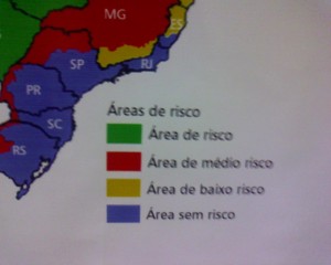
Map of the risk of Malaria in Brasil, originally uploaded by densitydesign.
I took this picture at San Paolo (São Paulo) Airport. The aim of the map is to inform tourists and any other passenger about the risk of Malaria in the different regions. The choice of the colors associated to the levels of risk seems to be counterintuitive: green for the areas with a higher level of risk; red for medium risk; yellow for low risk and blu for no risk. I’m not able to find any reason for this choice, considering that the message is addressed to an international audience. Can anybody (Brazilian or not) give us possible explanations of this choice?


