I had the opportunity to interview Alberto Cairo, designer and journalist, and author of “The functional Art, an introduction to information graphics and visualisation” (Pearson), during a series of presentations he delivered in Milan at the beginning of May. I tried to explore with him some concept he deeply stresses in his book and presentations.
(Find italian version on Doppiozero)
1. Let’s begin with a question about your book. Could you tell us about who needs data-literacy today and who you would like to see reading your book?
Well, I originally wrote the book for journalists and designers. I obviously wrote it for my students, but I also wrote it with journalists and designers in mind. On one side I felt that journalists were not getting proper training in the visual presentation of information in schools so I wanted to write a book that would be friendly enough to be read by anybody who wants to attain a theoretical framework about how to approach infographics from the point of view of functionality and clarity. I wanted to show journalists or writers (when I say journalists, I mean writers), that in general, creating a graphic is not particularly hard at the basic level. If you really want to understand a dataset or a piece of information it is absolutely mandatory to visualize it. It’s a great tool to use when you’re writing a story, not just to write the story itself but to create some sort of graphics that provide readers with the evidence behind what you are saying.
On the other side I also wrote it for designers. The reason I did this is because throughout my career I have seen many designers who only care about creating a cool picture with good illustrations, and a lot of connecting lines. They don’t care about the information. They obtain a bunch of data, and instead of worrying about clarity, about telling a story, and helping readers understand the story, their first concern is to create something that looks cool. For me this is good if you want to call yourself a data artist, but if you want to call yourself a data visualizer your priority needs to be clarity, and by clarity I don’t necessarily mean simplicity.
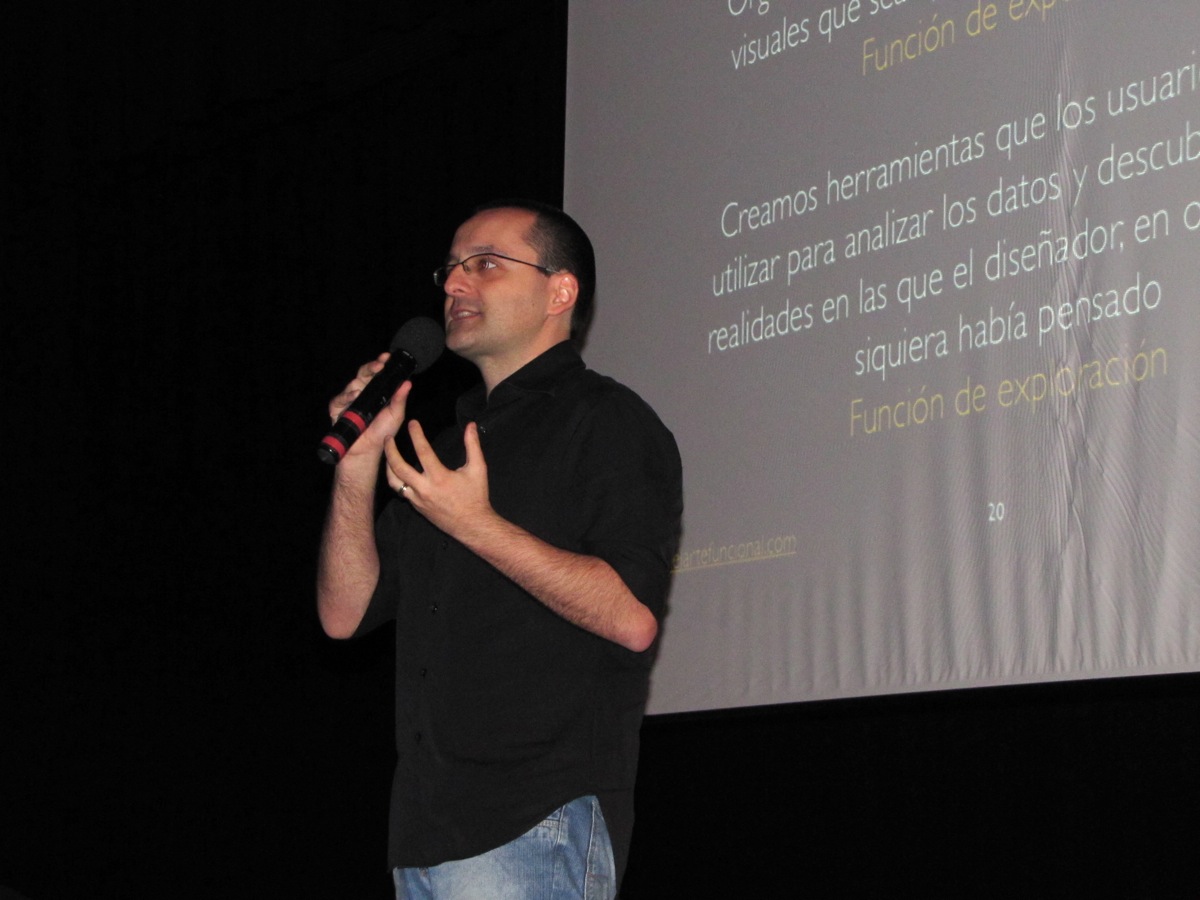
There are many graphics that need to be complex because the information is also complex but when I talk about clarity I mean it in the sense that you are trying to transform a complex dataset into something that is easily understandable and accessible. The other aspect is that designers don’t write. This is true for the many newsrooms that I have worked in. A visualization is not just a piece of visual information, it is a combination of visual and text elements, so you need to know how to write a headline, an introduction, and how to label your graphics.
These are the people I had in mind when I wrote the book, but I discovered that among the thousands of people who are reading the book and taking my courses, perhaps only 20-25% are actually journalists and designers. The people who are reading the book are often scientists and statisticians. I have been called to give presentations at statistics conferences and I always say the same thing. In fact, I will be at the US Census Bureau to give a presentation in a couple of weeks and I was very straight forward with them that my knowledge of statistics is limited. I know the basics, but the people in the audience will be high-end statisticians, so I’m afraid I’m going to say something scientifically incorrect, but they say that this is not an issue, we just want you to help us communicate better. So what I’m seeing, is that there is a growing interest in data visualization in many different areas, not only to understand how to use graphics to analyze data in a scientific or business context but also on how to use graphics to communicate your results and message to the public, often in a journalistic way. Data visualization is not just used to sell a product or something, but also to communicate what you are doing.
These are the people who are reading the book. I didn’t write it for them originally, but I’m discovering that the book is helpful for those kinds of people as well. I’m happy because tI’m seeing a growing interest in the area and that’s great.
2. Moving on to one of the key concepts covered in the book, form follows function. Can you talk about this? Is this always the case and, if not, can you give us some examples in the data visualisation or info graphic field?
Well, what I actually say in the book is that the function restricts the form. I absolutely believe that this is true 100% of the time in communication. If you are creating a piece of data visualization, the function (or functions, because there could be more than one), do restrict the form. They restrict the variety of forms that the data can adopt if you want to communicate. If you want to be a data artist then you are completely free to do whatever you wish. If you take the work by Jer thorp for instance, he is a data artist. I would not call him a data visualizer, because his main goal is not to communicate with clarity, it’s to create an aesthetic experience using the data as a source to create pieces of art. I think that this is wonderful, but if your goal is to communicate, the function or functions, restrict the form and I give many examples of this in the book. A data visualizer starts with a whole variety of existing graphic forms and then discards them until she ends up having two or three that are appropriate for the message or tasks that need to be facilitated.
3. Just to be more precise: can you share your definition of “function” when it comes to data-visualisation?
Well you have to think about what you want your readers to do with the data. I mean, it is not very scientific, in many cases, because you have to base your decisions on intuitions of who the public will be, but it’s a rational process. You can decide that you want the graphic to show correlation, allow for comparisons and show the graphical distribution of some variables. This helps narrow the decisions and the varieties down to particular graphic forms. Then you have some freedom in there to choose, but you don’t have complete freedom to choose any graphic form, you simply have a narrower frame from which you can select different graphic forms.
4. Ok, how would you describe function? Could entertainment be included as a purpose? As an example, how would you describe the U.S. Gun deathby Periscopic,? As I see here form not only follows function, but also emotions. In some ways they are dynamically presenting data, and telling a “possible truth”, by putting data in a human context.
Yes, I actually wrote an article about that. I called this “emotional data visualisation because it is not a news story. It’s an opinion piece based on sound data so it is actually appropriate for that purpose. It’s not something they have made up, that data is there. However, when they encoded the data, they didn’t encode the data visually to facilitate comparisons etc., no, they encoded data to show you how many people are dying, so they wanted to create a dramatic experience with the data. I think this is appropriate if your goal is to create an opinion piece but the graphics do not allow you to compare things. They have impact and this is appropriate is some contexts. I would say that this is also a function. The function of the graphic is to create an emotional experience.

(fig. U.S. Gun death, Periscopic)
5. To follow up on this topic, yesterday you presented some cases, such as Chris Harrison’s “Visualizing the Bible”, which you defined as “data-art”. Do you have a “definition” of this or can you share some more examples on the distinction between data-visualization and data-art? Is it a matter of goals, or about how data consequently used and understood by the audience?
It is a matter of goals but the distinction is very fuzzy. I would say that the goal of Chris Harrison‘s, piece, as wonderful as it is, is not to communicate with precision. It is not a tool for understanding. It creates an emotional experience and awe when you see it. In this way it is very similar to the Periscopic piece. It’s not particularly useful to gain insights from the data, other than how many people died. Of course it is very effective at this, but it’s not a tool for understanding. So I believe that this is the border between data visualization and data art. A data visualization or an information graphics main goal is to communicate with clarity and efficiency, and then it can be beautiful. In data art, the main goal is not to communicate with efficiency.

(fig. Chris Harrison, Visualizing the bible)
6. Staying with the subject of “art”, I very much like your idea that data visualization and art are linked in the same way literature and journalism .To cite your work: “A journalist can borrow tools and techniques from literature, and be inspired by great fiction writing, but she will never allow her stories to become literature. That notion applies to visualization, which is, above all, a functional art”. So, in what ways can a designer be inspired by art for data-visualisations or infographics?
Take a look at what happened with journalism in the past. In the past there were many traditions of journalism and one of them was called ‘new journalism’ . This wave of journalism arrived in the 60’s and 70’s and it is characterized by the fact that they maintained the original ideas of journalism (to communicate with accuracy, precision, and tell relevant stories to the public etc) but they then borrowed tools from literature. They used techniques that were seen in literature, and at first this was wonderful because they wrote news that was not as dry as pure news stories, by creating a new layer of high aesthetics, putting style on top of the news story. But then what happened? This tradition went astray in some senses. Some journalists went beyond what was acceptable and started making things up, by writing what a particular person in a story thought. How can you know that, if you are not inside the head of that person? That is the limit. The limit is accuracy and precision. So whenever an aesthetic decision compromises the accuracy of the data, presentation or integrity of the information you are presenting, you are on the wrong path. If you respect accuracy, your graphic is efficient and looks good, you can worry about making it look more beautiful, but you should never trespass that border, because this compromises the quality of the information that you’re presenting.
7. Ok, moving on from the designer point of view, I also like the concept of “intellectual chaos”, a state of being for information designers / visual communicators. You describe this as systematic and exciting. Can you talk about this?
This is quite difficult to understand. The first piece of advice I try to give anybody who wants to work in this business is not learning data script or statistics or whatever, it is to read. That is the first thing. Read non-fiction, and read as much as you can. Read about politics, science, economics. Inform yourself, see what is around you. What I see among my students for instance is that they don’t read anymore other than social media. I’m on social media, as you know, and I’m very active on twitter, but then, besides doing that, I read a couple of books a week and most of them are non fiction. I read a lot of philosophy, statistics, science etc. That helps me understand what surrounds me a little better, and it gives me a lot of ideas for infographics later. So if you want to write and visualize you have to have something to visualize about so you have to inform yourself. The systematic curiosity is to read as much as you can. Get books, and read, read, read! There are people like me who jump from one area to another all the time because we are not that systematic, but if you are interested in a particular area, for example people who are interested in sports, that’s great, focus on that, but then become the absolute expert on sport infographics because you know so much about sport infographics, that nobody will know more. You have to have deep knowledge and be curious about what you do.
8. I saw you with some students quoting XKCD / the popular author of brilliant and sarcastic comics. Quoting one of his famous strips that says “if you really hate someone, then teach them to recognise bad kerning” http://xkcd.com/1015/, do you see any parallel with data-visualisation?
Yes, I teach bad kerning in my classes and my students learn to recognise it.! I don’t know if there is an equivalent for data visualisation. Maybe teach them why pie charts are so misused. They have there uses. In some cases a pie chart would be appropriate but when you actually make people try to read a multi-portioned pie chart they see that it is not very efficient. It is efficient at letting you see the biggest portion but it is totally inefficient at letting you compare the smaller portions. Once you see this, people realise it’s not the most appropriate graphic in many cases. I would say, don’t teach people how to see graphics, teach them how to ‘read’ graphics. When you teach people how to read graphics they start recognising what is wrong with many graphic forms, considering obviously who the audience is and considering what the goals of the graphics were. When I taught the first and second MOOCs I got a lot of emails from people who had never done data visualization before and the main insight they gained from the course is that they will never see graphics in the same way again. That’s great and what I wanted to achieve.
9. During the meeting with students from Politecnico, Paolo Ciuccarelli asked you about data visualization being temporary hype with growing popular interest in the subject. You positively suggested that this is true, but maybe this is a good thing. Can you expand on that?
It’s very easy to understand. Every new technology that shows up is hyped at the very beginning, so when twitter came out, everybody was talking about it twitter, when Facebook came out, everybody was on Facebook etc..even Google + had a spike at the beginning, so every technology that is thrown to the market has a line going up, but eventually it reaches a point at which it stabilizes. I believe that this will happen with infographics and visualization, or is already happening, so it is hype because it is gaining popularity. It’s not new, because data visualisation is pretty old, but it’s been adopted by the public so everybody wants to get into it and do it. This is great because you will see many good examples, but also many bad examples that will help you learn how to create better examples, so that is a good part of the hype. The key thing is that this hype is not wrong, or useless, it’s just a new technology or something that people are discovering now.
10.To conclude, lots of people say “data is the new oil” / but what is the new gasoline for you? What is the most globally important byproduct of having this kind of access to data? Or, if we want to put it in another way: how is data-visualization going change the world?
Well, if you narrow it down to what we do, I think that the potential of using publicly accessible data, which is not something new, can change your mind about many different things. When you don’t have data all your opinions are based on hunches, but those hunches are only transformed into proper knowledge when you test them, when you compare them with what the information actually says. . Hans Rosling has a perfect example for this which he uses with his students, about fertility rates and populations, when he asks his students: what do you think the fertility rate in a place like Bangladesh is today? All the students say five or six children per woman, but when they see the actual data showing two children per woman they are shocked. This is the effect of data. Data per se doesn’t have any value. The value of data comes when you transform it into something that can provide insights.

(fig. Hans Rosling, Gapminder)
You could say the same thing about data visualisation! You could say that data visualization is the only way to understand certain stories or pieces of information. Is seems pretty straight forward but it’s something that many people don’t really understand. When you present people with a piece of information, and ask them if they understand it, they think they understand it because they have read it. But when you make them transform that same piece of information into a graphic in which they can see patterns and trends, or when you make them display the data on a map, they see the information from a different perspective. So I think that visualisation, as the proper handling of data, can change our views of the world that surrounds us.
[…] […]
June 1st, 2013 at 2:17 pm[…] Top URLs in Tweet in G1: datadrivenjournalism.net/featured_projects/Behind_the_Aus… gs10.globalsuccessor.com/fe/tpl_GuardianNews01.asp?newms=…; http://www.tumblr.com/Z72CSym1qI8O postgraphics.tumblr.com/post/51818823313/behind-the-scene… visualizing.org/contests/visualizing-meteorites http://www.businessinsider.com/best-maps-from-maps-on-the-web-tu… datadrivenjournalism.net/resources/a_super_simple_tool_to… bit.ly/ZkLaVm thepoliticsofsystems.net/2013/05/playing-with-the-new-yor… http://www.densitydesign.org/2013/05/alberto-cairo-designers-rea… […]
June 6th, 2013 at 1:44 am[…] Top URLs in Tweet in G1: datadrivenjournalism.net/featured_projects/Behind_the_Aus… gs10.globalsuccessor.com/fe/tpl_GuardianNews01.asp?newms=…; http://www.tumblr.com/Z72CSym1qI8O postgraphics.tumblr.com/post/51818823313/behind-the-scene… visualizing.org/contests/visualizing-meteorites http://www.businessinsider.com/best-maps-from-maps-on-the-web-tu… datadrivenjournalism.net/resources/a_super_simple_tool_to… bit.ly/ZkLaVm thepoliticsofsystems.net/2013/05/playing-with-the-new-yor… http://www.densitydesign.org/2013/05/alberto-cairo-designers-rea… […]
June 15th, 2013 at 6:52 pm[…] Top URLs in Tweet in G1: datadrivenjournalism.net/featured_projects/Behind_the_Aus… gs10.globalsuccessor.com/fe/tpl_GuardianNews01.asp?newms=…; http://www.tumblr.com/Z72CSym1qI8O postgraphics.tumblr.com/post/51818823313/behind-the-scene… visualizing.org/contests/visualizing-meteorites http://www.businessinsider.com/best-maps-from-maps-on-the-web-tu… datadrivenjournalism.net/resources/a_super_simple_tool_to… bit.ly/ZkLaVm thepoliticsofsystems.net/2013/05/playing-with-the-new-yor… http://www.densitydesign.org/2013/05/alberto-cairo-designers-rea… […]
September 7th, 2013 at 3:16 pm[…] Top URLs in Tweet in G1: datadrivenjournalism.net/featured_projects/Behind_the_Aus… gs10.globalsuccessor.com/fe/tpl_GuardianNews01.asp?newms=…; http://www.tumblr.com/Z72CSym1qI8O postgraphics.tumblr.com/post/51818823313/behind-the-scene… visualizing.org/contests/visualizing-meteorites http://www.businessinsider.com/best-maps-from-maps-on-the-web-tu… datadrivenjournalism.net/resources/a_super_simple_tool_to… bit.ly/ZkLaVm thepoliticsofsystems.net/2013/05/playing-with-the-new-yor… http://www.densitydesign.org/2013/05/alberto-cairo-designers-rea… […]
February 4th, 2014 at 11:53 pm