On late November 2010 Greenpeace UK commissioned DensityDesign an infographic as part of their oceans campaign. Specifically, their need was to articulate FADs. A FAD is a Fish Aggregation Device (often equipped with a sonar device built in) used by fishing fleets to carry out industrial fishing: nevertheless this fishing method is too intensive and destructive for the ocean ecosystem, and that’s why Greenpeace is taking action against it.
Our task in this project was fairly ordinary but we decided to embrace the mission as a chance to formulate and test a new (to us, at least) design process which could give strength to our research in transforming data and stories into a visual narrative artifact.
A design method for storytelling
To us, designing for narrative is a matter of engagement, inclusiveness and meaning-making. To convey a story from client’s mind into visual is a fascinating process that cannot lean only on designers’ graphic skills in the visual transposition of a plot itself (however solid it might be) but has to relate with the potential of communication design (a quite fruitful mix of graphic design, data collection and illustration in our particular case). Hence it’s all a matter of taking advantage of the discipline which the story is being told with.
Cinema, one of the most prolific forms of visual storytelling, stand as very good examples of this exploitation: very few filmmakers would best estimate a movie with the greatest of the stories but filmed without the support of a consistent cinematic eye. It’s no accident that the first acknowledged masterpieces in cinema history have emerged only 20-25 years after the birth of their art form: the first silent movies ever produced were inevitably a ‘recorded reproduction’ of theatrical scenes arranged in sequences, but then cinema gradually stood out as a new form of art itself, with its own distinctive features, rules and, again, potential.
So, the shameless version of this dissertation could be: «In our research, we aim to do for ‘narrative info-visualization’ exactly what cross-cutting technique did for the language of movies and, yes, we kindly disagree with whom of you think that we would never be as cool as D.W. Griffith!»
The humble version: «We want to experiment new engaging ways to use at best the tools of our discipline to convey narrative paths in the mind of our observers with the final goal of let them understand data and dynamics otherwise invisible (or hardly emerging)».
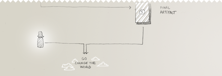
At all events, what follows is the description of the method we tested on the Greenpeace team (our ‘client’) and, guess what?, it has the form of a game.
1. Understanding data and story
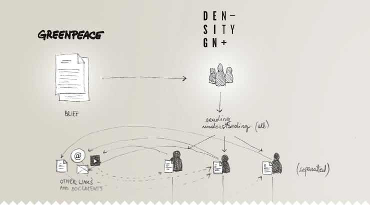
We firstly received a 10-page brief about context and objectives of the campaign, the contents that Greenpeace intended to communicate with the infographic, technical specs and miscellaneous stuff like deadlines and a short style guide that we were free to follow or not.
After reading all the attached documents, our team discussed the brief and shared some thoughts. In this first step, we decided that the best way to rationalize the little time we were given (this project was opened and closed just in two weeks!) was to divide parts and organize separated reading sessions.
The aim of these sessions was to deeply investigate the FADs world, to search for actors of the tale we were about to tell, to find the ‘locations’ we needed to portray and, more generally, to discover the principal nodes (chapters?) to articulate the story.
2. ‘Visual rephrasing’
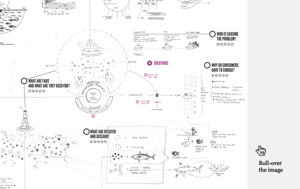
One day to read and another one to draw, to sketch, or, as we like to say, ‘visually rephrasing’ the found nodes of the story. In this second step, we forced ourselves to make visual representations of everything we were reading and then to combine all those visual concepts into one single schematic. A network of actors and situations emerged from the schematic and there we saw the big picture of the story. But the question here was: are we missing anything? Is this big picture big enough? Or maybe too big? Only Greenpeace could have answered and we had a good way in our hands to grasp these answers, better than simply ask them: the schematic itself as seen as a sort of game board.
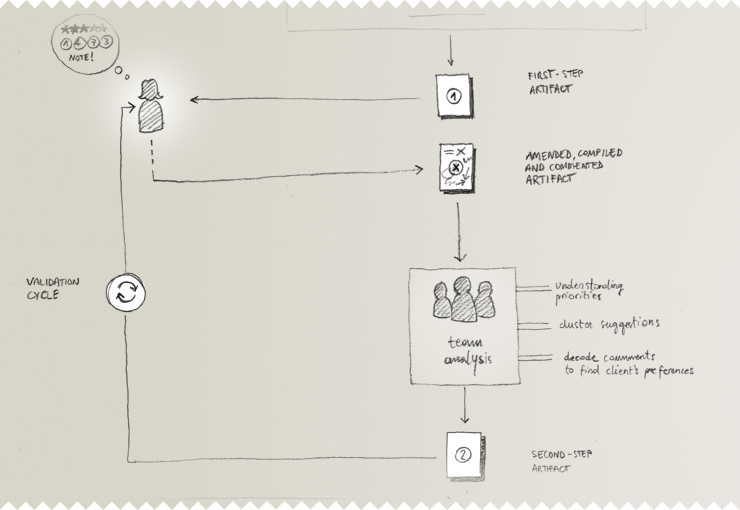
So we sent the schematics to Greenpeace and asked them to participate in the game, in order to go on with the next step of the process. We asked them to work on the drawings and perform three actions:
- rating from one to five stars the different parts of the drawing proportionally with the importance they wanted to give to those contents in the final infographic;
- putting in sequence the different sections as in a scene setting, from what they thought it should be the prologue to the ending, writing a number inside some blank circles;
- and last but not least, the most important contribution, annotating, deleting, adding details, cutting, overwriting, moving, underlining, stressing, enlarging, selecting, shrinking, imagining, being creative and drawing everything comes to their mind when looking at that first map.
One day later, they sent the schematic back to us and the results were way better than we expected. Suddenly, we were looking at our visual thoughts, visually amended.
3. Analysis + Interpretation
Step 3 consisted in the analysis of the amends provided by Greenpeace: our team was then able to understand which importance each information should have had in the overall economy of the visualization, thanks to ratings, ordering and classification.
But even more value was attributed to the notes and the unexpected comments which sometimes came out to be revealing. Focusing on those ones, we started an interpretation phase which led to an other version of the previous schematic.
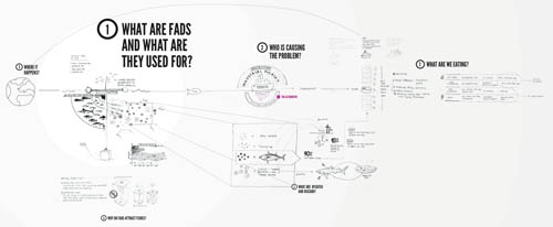
As the older, the new one showed the linear story of the final visualization but this time it were divided in 3 levels:
- the main subject, obtained by merging different visual elements, which fully depicted how a FAD works;
- a sub-plot about ‘industrial scale fishing’ and the role of supermarkets;
- some corollaries that showed information about where the fads are.
We sent it to Greenpeace and, after some few additional corrections, we had the final structure of our story.
4. Visualization
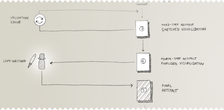
Concerning the visualization process, we would like to show some of the sketches we drew and submitted to Greenpeace for their validation.
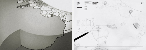
The first ones (see below) were conceived to get the best point of view in which UK, Ghana (one of the most important harbor for UK fishing fleets) and the ocean between the two countries were all clearly visible.
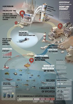
Then, along with Greenpeace, we change strategy and we removed the geo-referential level in favor of the fishing dynamics rather than specific geographical coordinates. The images below are the final sketch and the final visualization which also shows our work on data and benefits of the sharp copy-writing by the Greenpeace team.
5. Designers’ incessant hope and incurable super-ego
Two weeks is a very short time to deliver an infographic like this, you would admit it. So after sending the final version to London on December just before Christmas, we were proud to have done our seasonal good deed. But we didn’t know that yet on January, Greenpeace would have called again to give us some great news: the work wasn’t done yet!
During that month of holidays, TESCO, one of the company in charge for FADs-fishing targeted by Greenpeace in this ‘ocean campaign’, were persuaded to state publicly that it meant to avoid fishing with FADs and for this reason Greenpeace asked us to update the black list of ‘bad tuna fishers’ we included in the infographic.
We cannot say how useful this work will be in the next future, but we surely will be very satisfied if many more updates like this one will be requested.
-
Extras


