Blog
Friday, May 28th, 2010
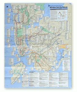
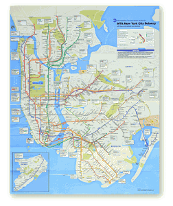
New York Subway Map: a redesign
Next month, the Metropolitan Transportation Authority will unveil a resized, recolored and simplified edition of the well-known map, its first overhaul in more than a decade.
Read the article and navigate the map
Sunday, May 16th, 2010
VisualEyes / Open Seminar
Data are everywhere.
Many disciplines are addressing the issues of giving access and making sense to all these data.
What can and should (visual) design do?
“VisualEyes / The Role of Design in Data, Information and Knowledge Visualization”
Open Seminar
Thursday 20 May 2010 | 10.00 – 13.30
Politecnico di Milano | Campus Bovisa | Facoltà del Design | Aula CT63
[Event’s page on Facebook ]
10:00
“Understanding through Visualization: a Design Challenge?”
Paolo Ciuccarelli | Politecnico di Milano | dCom | DensityDesign
[ http://www.densitydesign.org ]
10:30
“Social Data Visualization”
Andrew Vande Moere | Senior Lecturer at University of Sydney & KULeuve
[Information Aesthetics | http://www.infosthetics.com ]
11:15
“Bootstrapping: use visualization to create visualizations”
Moritz Stefaner | Well Formed Data
[ http://moritz.stefaner.eu/ ]
12:00
“Web visualizations tools and trends”
Daniele Galiffa | VISup
[ http://www.visup.it ]
12:45
Open discussion
Wednesday, May 12th, 2010
The sky is not the limit
Here‘s an interesting article about a new way to map and re-discovery the ancient world through the technologies.
For a quarter of a century, two archaeologists and their team slogged through wild tropical vegetation to investigate and map the remains of one of the largest Maya cities, in Central America. Slow, sweaty hacking with machetes seemed to be the only way to discover the breadth of an ancient urban landscape now hidden beneath a dense forest canopy.
They yielded 3-D images of the site of ancient Caracol, in Belize, one of the great cities of the Maya lowlands. In only four days, a twin-engine aircraft equipped with an advanced version of lidar (light detection and ranging) flew back and forth over the jungle and collected data surpassing the results of two and a half decades of on-the-ground mapping, the archaeologists said. After three weeks of laboratory processing, the almost 10 hours of laser measurements showed topographic detail over an area of 80 square miles, notably settlement patterns of grand architecture and modest house mounds, roadways and agricultural terraces.
Monday, May 10th, 2010
From our foreign correspondents in Boston
Here in Boston, we participated at the Art and Humanities Complex Networks satellite conference at the Northeastern University. We had the amazing opportunity to present the Map of the Future and to share with this remarkable audience the experience of creating a narrative approach for understanding complex systems. We got a lot of feedbacks and we discussed about the future of data and information visualization. It was a great day. We saw very interesting projects presented by other speakers, Fernanda Viégas and Martin Wattenberg, Michael Schober, Ward Shelley, David Crandall, Martin Warnke and Carmen Wedemeyer, Jane Prophet just to named some; we met Isabel Meirelles again after Siggraph09, we shared enthusiasm for visualization and humanities with Hyperstudio Executive Director Kurt Fendt, we finally met Noah Iliinsky in person after long time digital correspondence.
We want to thanks all the organizers in particular Maximilian Schich and all the people we had the pleasure to talk with.
Here the slides of the presentation.
Thursday, May 6th, 2010
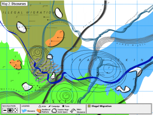
Mapping migrations and borders
The MigMap is produced by k3000 collective in collaboration with the Transit Migration project, in which researchers, media-makers, activists and artists conduct research on new border regimes in Europe. MigMap is a multi-layered, online visualization of the many complex processes, places and actors that play a role in the current dynamics of migration and the construction of the border regime.
Taken from “An Atlas of Radical Cartography”
Saturday, May 1st, 2010
Mapping context series
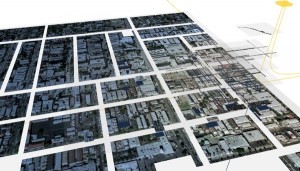
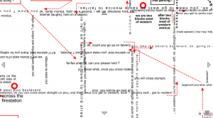
This is a very interesting set of projects done some years ago by Dietmar Offenhuber: subjective geographies in which the city is analysed through some particular point of views: 5 minutes places, Los Angeles in relative space, Loopcity .
http://web.media.mit.edu/~dietmar/MappingContext/
“We usually consider space as being structured by absolute units. A meter is considered to have a constant length regardless of its position in space. However, in our daily life we often use units that are relative in nature: we measure space in minutes, costs or memories.
Wegzeit is a project about Los Angeles and how it is transformed when brought to relative space. Asking someone in L.A. about the distance between two locations usually prompts a response in minutes. It seems paradoxical that people rely on subjective parameters for their spatial decisions in a city with a largely regular, cartesian layout. But especially here, where the influences of physical space are leveled by this regularity, the importance of subjective, relative spaces become visible more strongly.
The project consists of six dynamic virtual environments that propose models of how to visualize three-dimensional relative spaces. They deal with certain properties and effects caused by the nature of relative space such as the asymmetry of temporal distances.”
Saturday, May 1st, 2010
Digital Cartography
An interesting video about digital cartography.
Saturday, May 1st, 2010
A map of possible scenarios
The Afghan Conflict – A Map of Possible Scenarios starts with the current Timeline, a single line on the map. Which then splits into more and more possible future scenarios currently discussed. The scenarios split and join, or lead to other ones according to events that may take place or decisions made. The design is pure and minimalistic, using only lines and typographic elements, which does not resemble the ugliness of a war, but helps understanding a complex structure of problems without being visually manipulated by polemic images.
Sunday, March 7th, 2010
Density in Stockholm
Last November Density Design has been invited by the School of Art and Architecture of Stockholm to organize a workshop of data visualization with the student of a master. They were working on the same topic, the city of Pune in India, trying to understand how to visualize some data about the city.
Students had different background studies, none of them was a graphic designer, mostly architects and artists, so data visualization was a challenge for them all.
Groups had different themes to work on about Pune, different questions to be answered “graphically”:
– How the city of Pune is Green? analyzing the environmental changes of the city,
– How accessible is Pune? exploring the ways of transportation from/to Pune,
– How the IT technology affects the life of the citizens? showing why Pune is the IT Capital of India,
– What is growing in Pune? trying to understand how urban landscape is changing through the city-expansion.
During our week in Stockholm we had some design talks with the students, trying to understand the graphic issues linked with their data about the city of Pune. They had a week to produce a poster, so it has been a nice challenge for everybody. All groups produced very interesting visualizations, if we consider that they had no experience with graphic languages, and especially with information design.
Tuesday, February 23rd, 2010
Tell them anything but the truth: they will find their own
The listener (in fables or music) or the observer (in cinema and theater) plays a fundamental role in the narration process. The narrator evokes whereas the observer interprets through his imaginary. The more qualitative is the narrator evocation, the more the observer becomes co-author of the story.
In the visualization of complex networks, the designer should use a narrative mode of though, giving to the audience a good story more than a sound argument. As the movie director, the designer aim to choose the visualization that more preserves the complexity of the environment. As a result he takes a political stance: he directs actors (the elements of a system), he decides the light design (the choice of the elements to visualize), the set designs (the imagery to evoke), the different optical lens (the power of focusing) and most important, the critical point of view of the camera (intentionality).
We will present our research in the visualization of complex systems. The paper “Tell them anything but the truth: they will find their own. How we visualize the map of the future with respect to the audience of our story” focuses on the emerging need for a narrative approach for the understanding of complex networks. We consider narrations as tools with the paramount function of myths <to find a shape, a form, in the turmoil of human experience>.
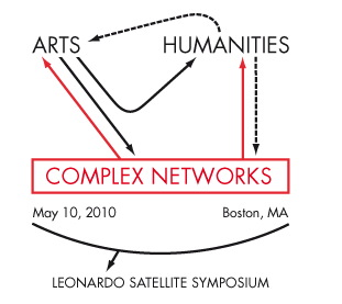
We are proud to present it at the Arts | Humanities | Complex Networks — a Leonardo satellite symposium at NetSci 2010 taking place at BarabásiLab — Center for Complex Network Research, Northeastern University in Boston, MA, on Monday, May 10, 2010.
See you there!
- Make 5 Sentences about Saying Disagreement
- Payment Agreement Sample Philippines
- Can Landlord Charge for New Tenancy Agreement
- Spirit Airlines Tax Receivable Agreement
- Ancillary Services Agreement
- Download Agreement by Shanko Rasheed
- Facebook User Agreement Photos
- Music Production Contracts Templates
- Do Contractors Do Financing
- Free Trade Agreement Russia
- Stock Purchase Agreement Good or Bad
- Terminating Employee Contract Early
- It Support Agreements
- Iran Nuclear Agreement Terms
- Rental Lease Agreement for Ct
- Tcode for Display Contract Status
- Contracts Manager Jobs in Bangalore
- Behavioral Health Contractors Association
- User Agreement in Arabic
- Rcuh Agreement for Services

