Blog
Monday, April 27th, 2009
Telling amazing stories
We have receive the visit from a friend that is now working at SENSEable City Lab at MIT, we shared opinions and project on information visualization; inspired by his stopover, we discuss the needs of being able to tell stories about what our visualizations. Paolo stated our reflections in a very effective way, saying we need to prove three abilities:
– Collecting consistent data
– Designing meaningful visualizations
– Telling amazing stories
About the third point I read a very interesting post by Shawn Callahan in Anecdote that can help us in improving storytelling talent:
there are three story plots we humans dearly love:
– the creativity plot where the protagonist solves one or more puzzles through shear ingenuity, persistence and always with a dash of dumb luck. The DaVinci Code is an example.
– the connection plot where people come together from different walks of life: different race, class, affluence, nationality, power. This week Sheen and I re-watched the movie Notting Hill which is definitely an example of a connection plot: famous celebrity connects with impoverished book store owner.
– the challenge plot where the protagonist faces a daunting challenge, everyone is sceptical whether is can be done, and especially by our hero, but in the end she triumphs. You might not have heard of Susan Boyle but this video is a classic example of a challenge plot told in 7 minutes.
Susan Boyle made me loving the challenge plot!
image via politewinter.com
Sunday, April 26th, 2009
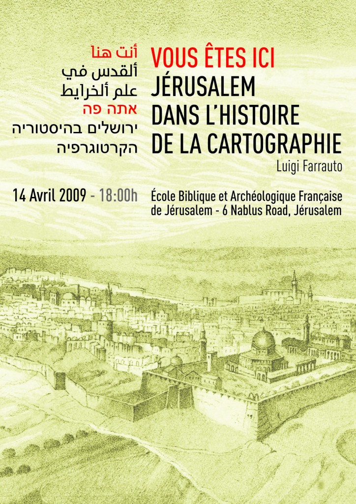
Back from Holy Land
The French School of Biblical and Archaeological Studies of Jerusalem is a strange place. It’s very close to Damascus Gate, the main crowdy access to the old city of Jerusalem, however time seems to be stuck in the mists of time… It’s a huge monastery, founded in 1890, where you can meet incredible people, doing interesting researchs or studies which seems to belong to another time-frame. The noises of the city, just outside the monastery walls, don’t seem to take their mind off their thoughts, their interests: once you enter in the monastery you got to a different dimension…
When I got to the school I was slightly anxious about it, I had never done any presentation in a monastery, I totally ignored the kind of situation I could have found myself in… But the atmosphere was incredible. Apart from studying the Bible, the School is the main center for archeological studies of the area, they have a great museum/collection of finds: old clays, roman coins, jars and… maps!
I’m very keen on archeology, and being there for me was like having a match at the Maracanà for a footbal fan…
During the presentation the stalls were crowded with very interesting/interested people: bible scholars, extinct languages professor, archeologists…
I spoke them about the graphic representation of the city of Jerusalem throughout the history of cartography, showing how the technics and the purposes of the representation have changhed, from symbolical depictions of an imaginary city, based on some suggestions contained in the Bible, (the renowned T-O maps), to well-detailed portrayals of the Holy Land. As Jerusalem has always played an important role/position in cartography, people enjoyed this kind of map-tour, showing a lot of interest in what I was saying.
After the presentation I visited the archaeological museum, and I saw a little part of the Map Room: a breathtaking moment, I handled representations of Idrisi maps, ancient topographies of Jerusalem, old diagrams… I was like a child in a toy factory.
Then I spent some time in the museum, drinking with some archaeologists, sumeric and ugaritic language teachers, talking about archaeological excavations, cuneiform characters, Qumran manuscripts. We were surrounded by old pieces, which my new friends were handling so naturally, asking themselves whether a coin was of a period or of another, whether and iscription on a tablet was babilonese or eblaitic… I felt I was ‘only’ a graphic designer… but that was fun.
Luigi Farrauto
Thursday, April 23rd, 2009
Densitydesign now on twitter

Density design joined the twitter community!
We won’t use any Plug-in to upload our posts, we care for handmade processes.
We won’t twit too frequently, we prefer low rhythms.
We will always answer your replies, we love to discuss and networking.
We will twit all the blog’s contents and even more, we prefer addition to subtraction.
We will let you know what our people are doing, we value the same the parts and the whole.
We will never use twitter as a marketing tool, we believe in the power of opinion.
Ops! That’s more than 140 characters…
Wednesday, April 22nd, 2009
Visual Cooking | Variazioni grafiche in cucina
Finally we’re able to show the result of a side project, part of the DensityDesign Lab teaching program: the visualization of complex experiences and processes. Our students faced the preparation of “Risotto al radicchio tardivo”, a traditional Italian dish. Like any cooking experience, it can’t be exhaustively represented by linear languages (i.e. textual recipes). It’s a matter of interactions between many variables: the familiarity with the raw materials, the choice of the tools and how to us them till time management and the scheduling of the different moments of the preparation. Variables and connections make the preparation of the dish a complex experience, calling for diagrammatic representations.
Monday, April 20th, 2009
10 out of 50
It’s a great pleasure for us and a great boost to our work being reviewed ten times as great infographers and knowledge visualizators
Monday, April 6th, 2009
Density people and Wayfinding
Our brand new PhD student Luigi Farrauto – one of the very first students of the Density Design Lab – has been invited to give a conference at the “Ècole Biblique et Archéologique Francaise de Jerusalem” on the topic of cartography: “Vous êtes ici. Jérusalem dans l’histoire de la cartographie”. Luigi did his MA thesys on the design of a wayfinding system for Damascus. His project is currently under development by the local government. I hope he will be able afterward to post here a synthesis of his conference.

Tuesday, March 31st, 2009
Malofiej 17 + Density People
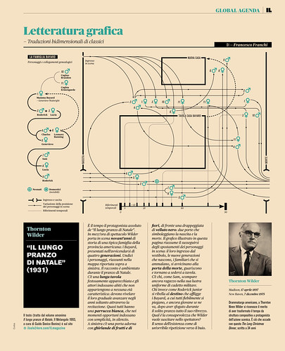
After Samuel Granados, I’ve to compliment two other talented graphic designers that passed through our Density Design course: Francesco Franchi and Luca Pitoni (is also Ilaria Tomat still part of the staff?). They are in charge (Francesco is the art director) for the design of the magazine “IL – Intelligence in Lifestyle”, edited by Il Sole 24 Ore. The magazine received last week five awards at the well known Malofiej competition (17th edition), organized by SND – Society of News Design.
Most of the infographics produced for the magazine can be seen here. I like especially those called “Letteratura grafica”, a visual synthesis of classic oeuvres. They reminds me the work done by Giada Coppi in our course, and the thesys produced with the tutorship of Prof. Marco Maiocchi. The title of the thesys – discussed during the 2004/05 academic year – is “From words to images: graphic mapping of narrative structures”, in Italian: “Dalla parola all’immagine : la mappatura grafica di strutture narrative” (I hope my traslation is correct!). Also in our Density Design course we deal since some years with narrative structures, like the movies Memento and – just done this year – Jules and Jim. The non-linear and unpredictable structure of these movies is a good base for approcahing complexity and the construction of visual models.

Coming back to Francesco, Luca and their awards, well done guys!
Thursday, March 26th, 2009
Design + Statistics
I couldn’t agree more with one of the last post of Nathan in FlowingData:
“Basically, what I’m trying to say is that design can do wonders for visualization, yes, but so can analysis. Put the two together, and you’re going to gain a much better understanding of a dataset than if you were to have just one or the other. In my experience, designers are afraid of statistical methods and statisticians are oblivious to design. I say – put the two together. Learn both, and we’ll all be that much better at understanding the even bigger data to come.”
We made it, and I can say that the relationship with the Statistics Department of Bicocca University (thanks to Marco and Mario) works very well at the moment: none is afraid, and there are a lot of common interests. Let’s see!
Tuesday, March 24th, 2009
Complexity, Complication, Visualization and Interaction
According to the article of SEED Magazine about data visualization, complication is the problem, and interaction is the solution: “One way to solve the problem of overly complicated diagrams is to introduce interactivity.” Interactivity is also a way to escape the flatness of certain maps: “interactive displays may be much more useful than inert maps. A flat picture of a network does not suffice.” Colin Ware – quoted in the article – introduce some numbers: 30 is the maximum of nodes for a flat-non-interactive diagram; with interactivity you can “work up to few thousands”. Moreover, network diagrams are considered among “the most confusing new visualizations”.
It has to be said that normally we don’t work with massive database neither with final users when we produce our visualizations – especially in the Density Design Master Course. Anyway, we have here something to think about. And probably also something to say. At least, what I miss often in this critiques is a deeper consideration in scope, context and target: something that makes the difference if we talk about design!
Thursday, February 19th, 2009
Sustainability message

Sustainability message , originally uploaded by Samuel Mann.
Just used in a class about interactivity and engagement (and sneaking a dose of sustainability). Thanks folks.
- Make 5 Sentences about Saying Disagreement
- Payment Agreement Sample Philippines
- Can Landlord Charge for New Tenancy Agreement
- Spirit Airlines Tax Receivable Agreement
- Ancillary Services Agreement
- Download Agreement by Shanko Rasheed
- Facebook User Agreement Photos
- Music Production Contracts Templates
- Do Contractors Do Financing
- Free Trade Agreement Russia
- Stock Purchase Agreement Good or Bad
- Terminating Employee Contract Early
- It Support Agreements
- Iran Nuclear Agreement Terms
- Rental Lease Agreement for Ct
- Tcode for Display Contract Status
- Contracts Manager Jobs in Bangalore
- Behavioral Health Contractors Association
- User Agreement in Arabic
- Rcuh Agreement for Services


