As a research lab, we are always committed to exploring new research fields, new data sources and new ways to analyze and visualize complex social, organizational and urban phenomena.
Sometimes it happens that self initiated explorations become small side projects that we develop in our spare time and publish after a while. This is what happened in the past with RAW and other side projects.
In this kind of work we think is important to keep things simple and proceed step by step in order to have flexible and iterative processes and the possibility to experiment new tools and visual models that we can use later.
In this sense in the last months we decided to work on a small project we called “Seven days of carsharing”. The rise and growth of many car sharing services around the world has been an important factor in changing the way people move inside the city.
Visualizing and analyzing data from these services and other forms of urban mobility allows for a better understanding of how the city is used and helps to discover the most prominent mobility patterns.
The website is structured around a series of visual explorations of data collected over the time span of one week from one of the main car sharing services in Milan called Enjoy.
We started this project as a small experiment to investigate through different techniques how urban traffic patterns evolve day by day and the main characteristics of use of the service.
Data Scraping
Since Enjoy doesn’t provide any information about the routing, but just the position of the available cars, one of the biggest technical challenge was to find a way to explore the individual routes.
Inspired by this interesting project by Mappable we decide to process the data using an open routing service (Open Source Routing Machine) to estimate route geometries for each rent. The data has then been translated into a geojson file that we used for two visualizations.
Visualizations
Since the beginning the idea was to combine different kind of visualizations, both geographical and not in order to explore the different dimensions of the phenomenon, the biggest challenge was to combine them in a linear story able to convey some insights about mobility in Milan.
For this reason we decided to build a single page website divided in five sections. Each one enable the user to explore a dimension of the phenomenon and give some interesting insights.
The first visualization, created with d3.js, is the entry point on the topic and it represents an overview of the total number of rents. Every step is a car and every rent is represented by a line that connects the pick-up moment and the drop-off. Consequently, the length of the line represent the duration of time a single car has been rented. In this way it’s possible to discover when the service is most used and how the patterns evolve depending on the day of the week and the hour.
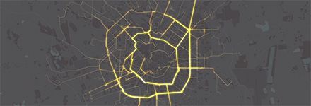
The second section of the website is focused on the visualization of the routes we extracted using the routing service. The routes data has then been visualized with Processing, using the Unfolding library to create a video and Tilemill and Mapbox.js to create the interactive map and the map tiles. Each rent has a start and an end time, and could hence be displayed in its own timeframe. In addition, the position of the car in the path was computed by interpolating its coordinates along the route with respect to the total duration and length of the rent.
Seven days of car sharing in Milan from DensityDesign on Vimeo.
The resulting routes represent the most likely way to go from the start point to the end point in the city. Obviously, the main streets (especially the rings of the city), are the most visible. It should be noted that this phenomenon is also the result of the service we used to get the routes that tend to privilege the shortest path instead of the quickest one and it doesn’t take in account other factors like traffic and rush hours.
In the last sections of the website we decided to focus on the availability of cars and their position during the week to understand which areas of the city are more active and when.
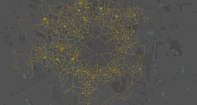
In the first visualizations we used a Voronoi diagram buil din D3.js in order to visualize both the position of the cars, represented by yellow dots, and also the area “covered” by each car. The areas surrounding the cars in fact contain all the points on the map closer to that car than to any other.
To better understand the patterns we decided to plot, beside the maps, the number of available cars for each of 88 neighbourhoods of Milan using a streamgraph. The streams show the number of cars available every hour for each neighbourhood, sorted by the total amount of cars available during the whole week.
General Remarks
We really enjoyed working on this project for many reasons.
First of all, working on small and self-initiated side projects like this gives us the opportunity to experiment a wide range of tools, in particular open mapping tools like Tilemill and Unfolding. In this way we could better understand the limits and advantages of different technologies and visual models.
Another important and positive aspect of this project was the possibility to involve different people of our lab, from software engineers to interns, experimenting flexible and agile workflows that allowed us to test multiple options for each visualizations that can be implemented in other projects in the future.


