DensityDesign Research Lab took part in the Digital Methods Initiative (DMI) Winter School, held in Amsterdam from the 13th until the 18th of January. DMI holds annual Summer Schools and Winter Schools, where designers and students from DensityDesign participate as facilitators.
DMI is an Internet Studies research group directed by Richard Rogers, where new media researchers design methods and tools for repurposing online devices and platforms for research into social and political issues.
This year’s Winter School topic was “Post-API research? On the contemporary study of social media data.” Specific research questions guided each project that might evolve and vary during the week. Using tools from DMI, designers and tecno-anthropologists co-operated to create issue maps and visualizations that aid social research.
Here you can read the full reports!
Haters gonna hate: Dissecting hate speech on social media
Visualisations by Noemi Schiavi
Presentation here
The official definition of hate speech does not consider the linguistic dimension, as the public incitement to violence or hatred might be performed with various linguistic degrees. Haters gonna hate wanted to find a measure to implicit hate speech using a multilingual approach.

This visualisation shows the most recurring offensive words from messages in right-wing Telegram channels.
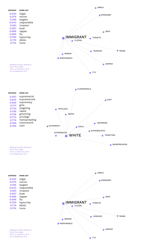
This is an example of how non-hateful words might trigger hate speech.
The word immigrant is not offensive, but gets a negative connotation in the alt-right ideology, evoking offensive words.

Amazon Tracking Exposed
Visualisations by Beatrice Gobbo and Matteo Bettini
Presentation here
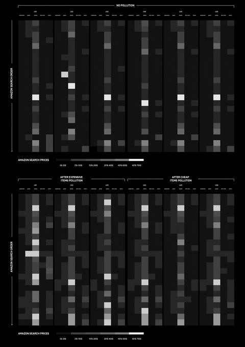
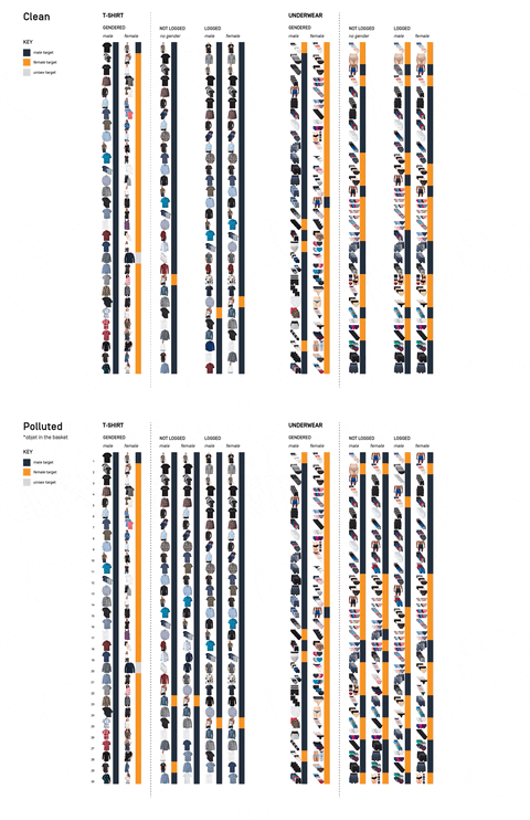
How can Amazon personalisation algorithm be understood and what data does it take into consideration? The research was approached with different perspectives, investigating whether online shopping is affected by the users’ wealth and gender.
Apps and Their Practices
Visualisations by Gabriele Colombo, Carlo de Gaetano and Jacopo Poletto
Presentation here
Considering the web as informational space, social media as a space for user-generated content and connectedness, what type of space is the app space? This project tried to answer this question by researching in two different ways. One part of the team focused its research on the differences and similarities of beautification apps and what kind of body enhancements they offer. The other one focused on whether is possible to know how users’ data get from the device sensors to third parties APIs.
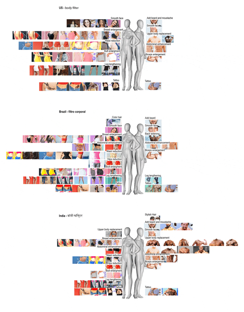
This visualisation highlights the different kinds of body modifications addressed by beautification apps in Brazil, in India and in the USA: in the USA and Brazil beautification apps are mainly focused on women bodies, whereas in India, they are more focused on men bodies.
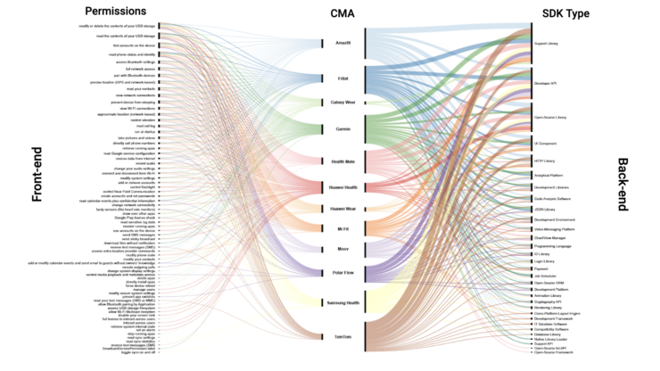
(By Jacopo Poletto) For most of the apps, the connection between the sensors that collect users’ data, and third parties APIs gets lost. The only device where is possible to track down this path is Fitbit.
Who is /ourguy/?
Presentation here
Users on websites like 4chan, Tumblr, and Reddit mostly find social cohesion through cultural bonding. Cultural objects like mascots and memes come to the fore that function as collective masks. But what about the collective face? How does the practice of reflecting on public figures work as a means for collective identity formation within pseudonymous & anonymous Internet subcultures? Four teams tried to answer this question from different perspectives. Following are shown the results from two of them.
Who, dare I ask, is /ourguy/?
Visualisations by Matteo Banal
Considering /ourguy/ as a genre of discourse it involves text, images and discussion. This part of the research focused on studying images, which figures and personalities recurred over time, and whether there were any identifiable image practices that could be discerned.
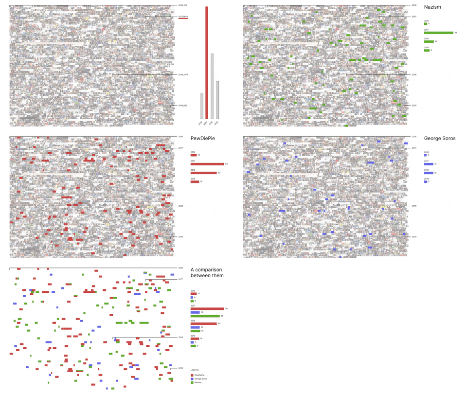
Colouring-in blank canvases
Visualisations by Giovanni Lombardi and Alessandra Facchin
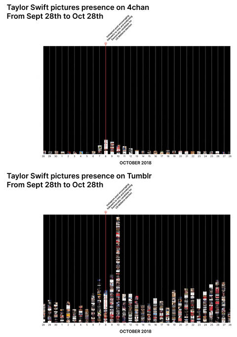
Taylor Swift and PewDiePie were widely perceived unpolitical/apolitical before a specific turning point at which politicisation occurred either by chance or by choice. Both have a longitudinal presence across 4chan, Tumblr, and Reddit and both are available for multiple repurposing opportunities by groups which are forming collective political identities, making it possible to have a cross-platform approach to the research.
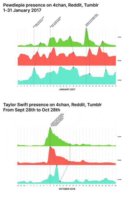
Conspiracy Creation Techniques
Visualisations by Guilherme Appolinário and Andrea Benedetti
Presentation here
How do conspiracy theories develop online, on platforms like Reddit and 4chan? Is there a pattern they follow? Starting from preliminary findings, this project analysed two cases of conspiracy theories to see how they evolved through time using the specific vernacular affordances of 4chan and Reddit.
Epstein didn’t kill himself
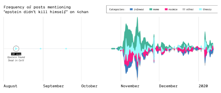
How, when, and where did the Epstein suicide conspiracy theory transform into a memetic phrase that was popularized outside of online conspiracy culture? Starting as a true conspiracy theory, the phrase “Epstein didn’t kill himself” became more of a meme than a true statement believed by users online and “IRL”. This shift in narrative is highlighted on Reddit and 4chan.
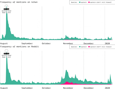
(by Guilherme Appolinário) The queries “Epstein” and “Epstein didn’t kill himself” are searched on Reddit and 4chan, so that the quantity of post mentioning them is compared, highlighting that in November EDKH became a memetic phrase on these two
The Birth of Q-Anon
In 2017, the mysterious user “Q” left a message on /pol/, the “politically incorrect” board on 4chan, where alt-right supported usually gather to share content. Soon after, a series of these messages that seemingly hinted at a broader conspiracy (named “breadcrumbs”) appeared using the same vernacular language of the original post by “Q”.
With the specificity of affordances in 4chan, the research focused on how disseminating information (breadcrumbs left by Q) is handled by the ephemerality of the platform, identifying a network of citations and a continuous black-boxing of these breadcrumbs inside other posts.
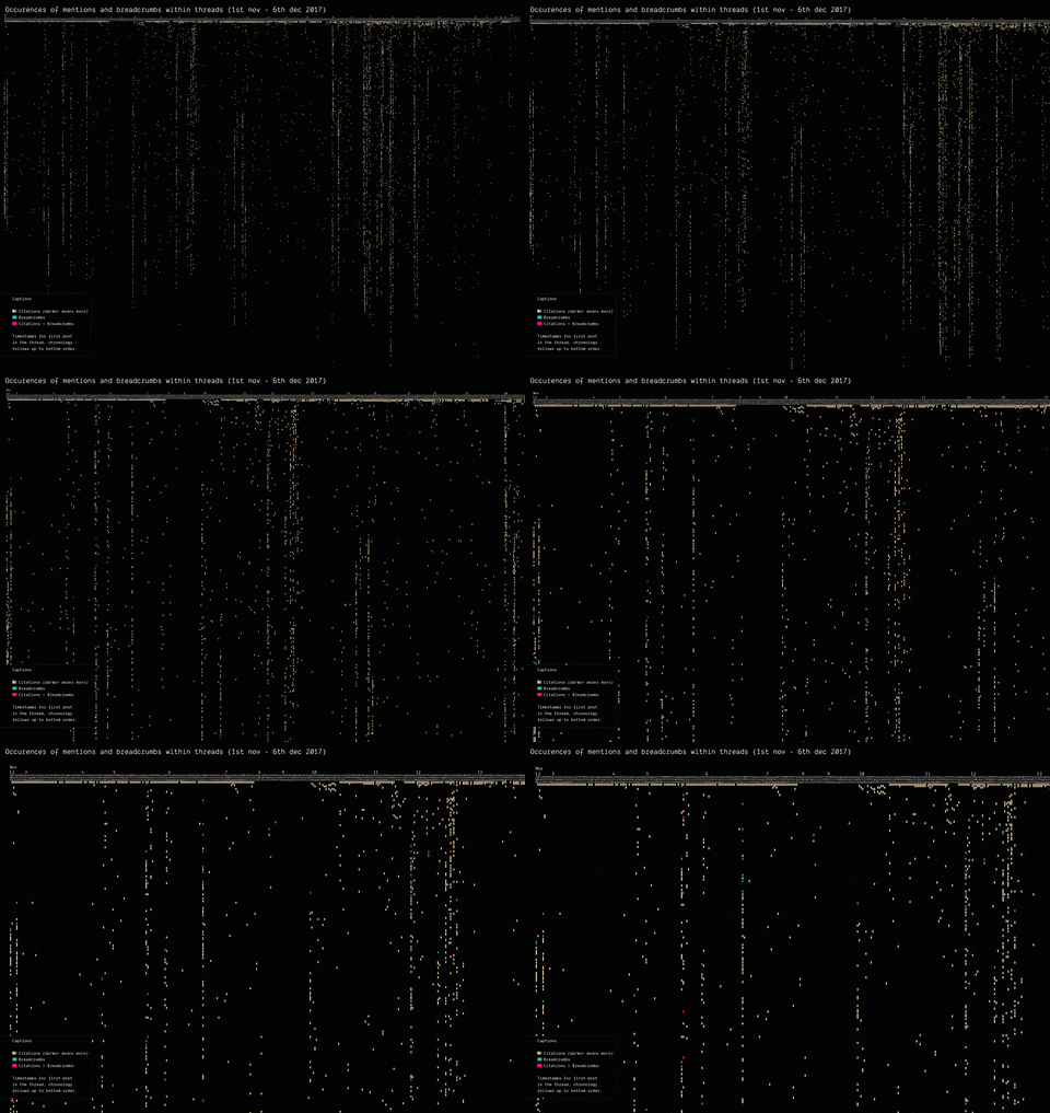
(by Guilherme Appolinário) Breadcrumbs (in red) were left by Q in various threads on /pol/ in month following the appearance of the first breadcrumb. The opening post (“OP”, the first row of the visualisation) of each thread usually cited a previous breadcrumb (in taupe).
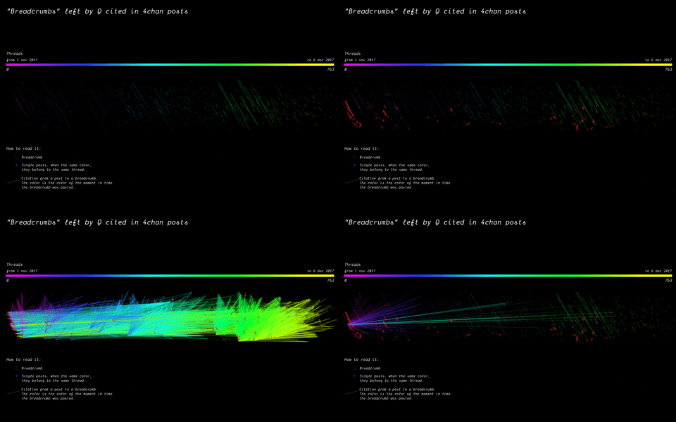
(by Andrea Benedetti) Building on top of the previous visualisation, the actual connections between the breadcrumbs were drawn in the second visualisation. These connections show how far back in time these citations span.
Analysing Neo-Nationalism movements across language communities in Europe
Visualisations by Cristina Pita da Veiga
Presentation here
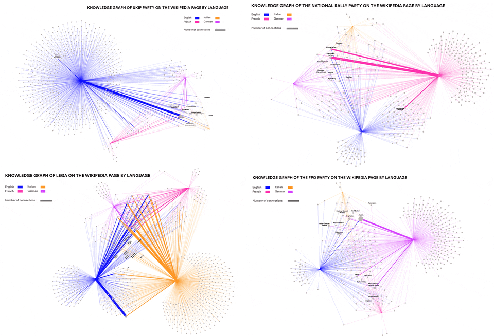
This research wanted to identify concepts and entities specific to particular language communities that are relevant in the context of Neo-Nationalism. Can such concepts and entities be identified automatically? How similar are right-wing elements in different languages and cultures? This was done by using Event Knowledge Maps.

Newswork on Wikipedia
Visualisations by Antonella Autuori and Federica Bardelli
Presentation here
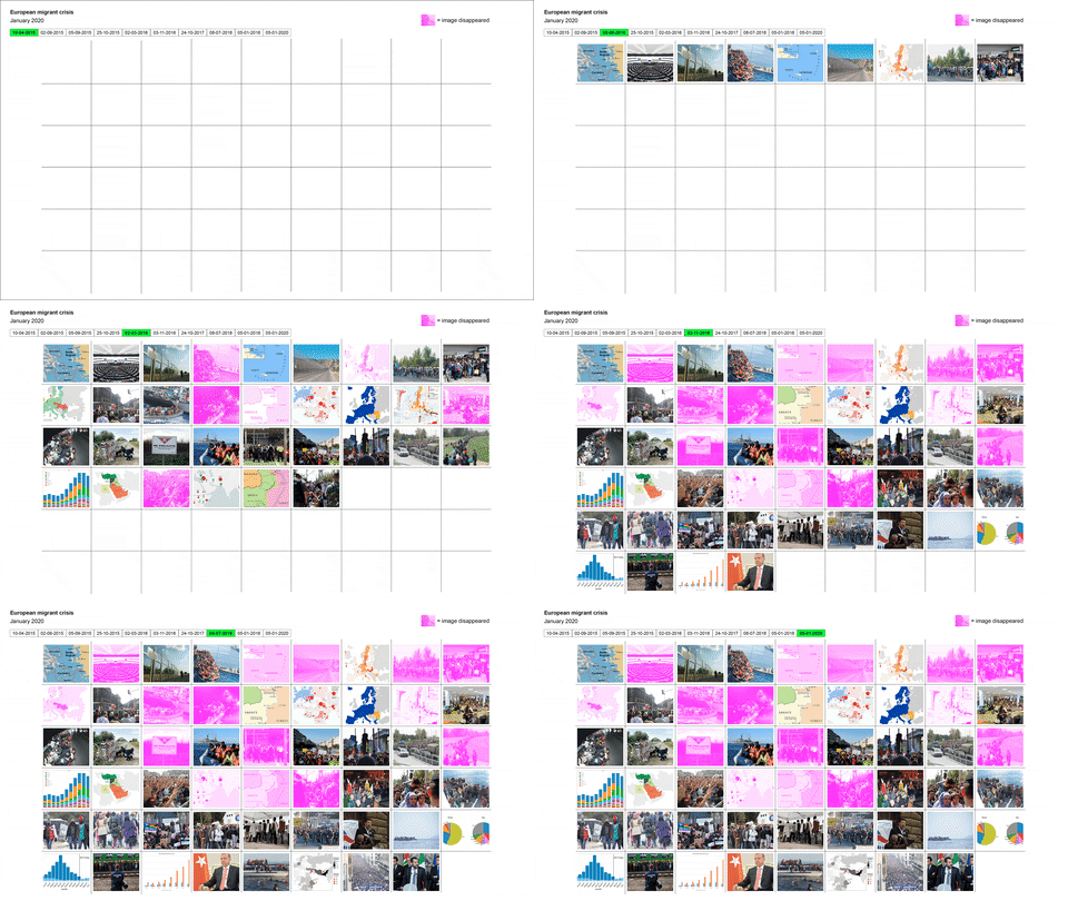
How does newswork on Wikipedia evolve over time? To what extent does the evolution of news differ across Wikipedia language versions? A Wikipedia back-end research of “Arab Spring” and “European Refugee Crisis” across 10 different time points of references, images, visualization and linguistic terms was conducted in this project.

