The CNRS, the Gephi Consortium and the University of Aalborg organized a one-week datathon in Paris, in collaboration with the médialab at the SciencePo. Along with volunteers from the community that maintains Gephi, the open source software used to visualize networks, we participated to identify ways to improve some aspects of the tool.
More in detail, we focused specifically on the modularity algorithm, which allows to identify communities of nodes inside a network that share connections between one another. The algorithm is widely used by the community that uses Gephi, as it lets perform visual network analysis quite easily.
Developers and researchers that use and develop the platform, however recognize some weaknesses in how the algorithm is used: currently, the modularity class algorithm returns clear cut communities, while in reality many areas of the network may be ambiguous. Since the algorithm is non-deterministic (meaning that each run may return slightly different results), not all nodes in a network may always belong to the same community.
In the example above, ten different runs of the algorithm on the same network return different results. In the current implementation of the algorithms, however, the user is not encouraged to run it multiple times to compare the results, especially if they don’t have a previous understanding of how it works.
By discussing during the workshop, two concerns (at least), emerged:
- How to visualize the modularity itself?
- How to make the multiplicity visible to the user who would otherwise run the modularity clustering just once?
These two questions open up a field of explorations that try to address the ambiguity in the results of the algorithm, making it a feature of the visualization methods.
Indeed, we present two explorations developed during the week in collaboration with the community of Gephi.
Visualizing the modularity algorithm
Observable Notebook developed by Mathieu Jacomy, Andrea Benedetti and Tommaso Elli
The first exploration focused on visualizing the algorithm itself, in an effort to involve the user in the process that it follows to group nodes into larger and larger communities. The algorithm works iteratively, meaning that at each iteration it tries to group a node to its neighbours recursively. At the beginning, each node belongs to its own community, and it ends with an overall number of communities that is related to the “Resolution” parameter of the algorithm.
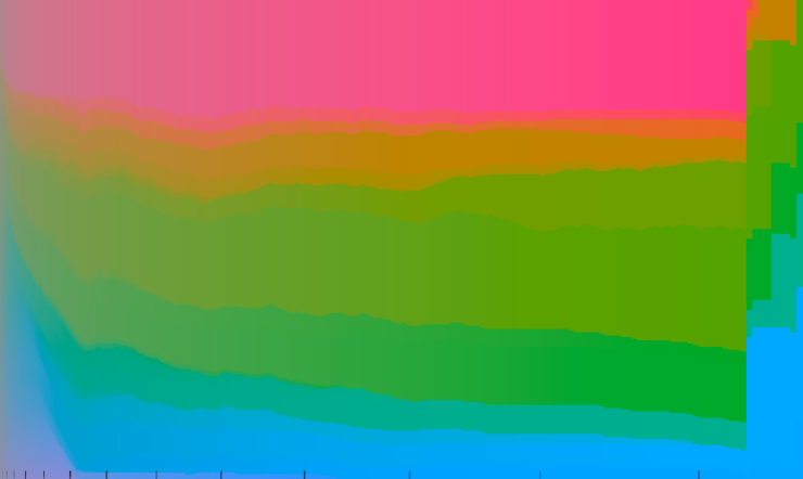
To visualize the algorithmic process, we used the color space to map communities and their evolution. Using the CIELAB color space, we assigned a color hue to each node, sampling the hue circle. Each iteration, the color is increasingly more vivid, starting from grey and reaching full chroma in an effort to represent the certainty of these communities after each iteration.

The data was constructed to have a list of communities detected and their relative population in each iteration. This let us experiment with various visualization techniques that did not directly reference the topology of the network, rather that abstracted it into a two dimensional visualization. The visualization is split into a grid, where horizontal lines represent communities and their height the population, while vertical slices represent iterations of the algorithm.

The visualization allowed us to have an insight of how the algorithm works, tracking the evolution of its results. The visualization sparked an interesting discussion on how the major groupings that depend on the Resolution parameter happen all at once at the end of the iterations. Additionally, the color space slicing could be used to represent the evolution of the algorithm directly on the network, tying back the visualization to its topology.
Modularity classes fluctuations
Observable Notebook developed by Tommaso Elli, Andrea Benedetti, Côme Brocas, Axel Meunier
The second exploration dealt with the non-deterministic nature of the algorithm, and how data visualization could help in showing the ambiguous nature of specific nodes in the network.
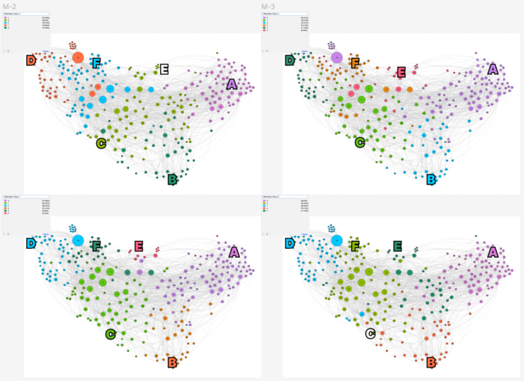
In this exploration, the data was handcrafted by the team by running the modularity class ten times on a network that has three stable areas, and a central where nodes have a high chance of falling into one of the three main communities interchangeably. We then visually retrace different classes to have consistent names in each run. This was done qualitatively, looking at ten images generated with Gephi, and by discussing with the developers attending the workshop it emerged as one of the most challenging aspects to implement computationally in Gephi.

After these first steps, we had 10 classes for each node. We computed three simple additional values (that could be replaced with more sophisticated calculations):
- Hesitancy metric, which counts how many times a node switches classes;
- Mode value, which stores the most occurrent class for each node;
- Mode intensity, which calculates how many times the mode class appears (in percentage).
Using these three metrics, we were able to explore visually how we could represent this kind of information. We explored mapping these metrics with various visual variables: saturation, opacity, intensity of color etc.
These experiments raised many interesting discussions on the feasibility of the method. In the contained context of the workshop, many of the experiments were weighted with pros and cons on their effectiveness.
Wrap up
The week was streamed on Twitch on datalgo’s page, you can catch up to the final presentations on the recorded streaming where all the other results of the week were discussed.

