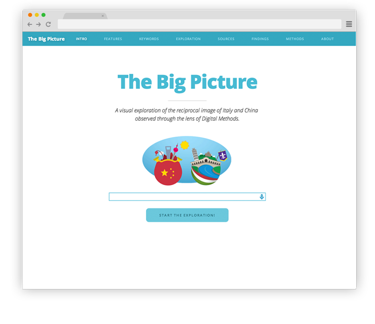
A visual exploration of the reciprocal image of Italy and China observed through the lens of Digital Methods.
After Borders and Visualizing Controversies in Wikipedia, I introduce here The Big Picture, my M.Sc Thesis for the Master in Communication Design at Politecnico di Milano. Together with the project we will also introduce http://thebigpictu.re, the website showcasing the research. The project has been carried out under the supervision of professor Paolo Ciuccarelli and the co-supervision of YANG Lei, Curator and Exhibition Director at China Millennium Monument Museum of Digital Art of Beijing.
Introduction
The project, starting from my personal experience of living in China for more than one year, aims to examine the peculiarities of the narrative of both countries in one another’s web space. It consists in the collection, categorisation and visualisation of 4,800 images from the reciprocal national internet domains of Italy and China.
The exponential growth of non-professional and professional media producers has created a new cultural situation as well as a challenge to our normal ways of tracking and studying culture (Manovich, 2009). Thanks to this massive production of data we are able to make a number of analyses that were not possible previously. In a context where the language barrier represents a big obstacle, images can be the medium for cultural analysis by taking advantage of both the visual properties and their intrinsic storytelling capabilities.
The questions we were interested in were, first, whether we could use the collection of images found in the reciprocal web of Italy and China as a tool to investigate the perception of respective national identities, and, second, what kind of insights these images would provide.
Methods
The background to this research combines two approaches developed by the Digital Methods Initiative of Amsterdam and the Software Studies Initiative of New York. The first method, which considers the digital sphere both as a measure of the impact of new technologies on the user and as a resource used by the real world as a political and social space (Weltevrede 2009), introduces the term “online groundedness” in an effort to conceptualise the research that follows the medium, to capture its dynamics and make grounded claims about cultural and societal change (Rogers 2013, 38). The second approach focuses on research into software and the way computational methods can be used for the analysis of massive data sets and data flows in order to analyse large collections of images. “If media are ‘tools for thought’ through which we think and communicate the results of our thinking to others, it is logical that we would want to use the tools to let us think verbally, visually, and spatially.”(Manovich 2013, 232)
Selection of the Sources
Having decided to examine the perceived identities of these nations in their mutual web-spaces through images and to pay close attention to how this identity is “broadcasted”, search engines, being a crucial point of entrance and exploration of the web, seemed a natural place to start. The two main sources for the collection of data were therefore the two main image-search engines of the two countries. Google’s position as the main search engine in Italy (we refer here specifically to the national domain google.it), is mirrored by Baidu in China, which commands about two-thirds of the booming search market there[7]. To add a further layer to the research, we employed Google’s advanced search instruments to conduct a second series of queries limited to a selection of domains concerning specific news websites that carried particular meaning for either country. Thus the collection included 2,400 images for each data set obtained by searching for the translated name of one nation in the local nation’s web space: 900 images retrieved directly from the respective search engine and 300 from five different news websites scraped via the search engine.
Data Collection
In order to ensure that research on the images was as objective as possible, it was crucial to isolate it from personal computer and search engine use. Some rules were implemented for this purpose:
- Log out from any Google service
- Delete all customisation and localization services related to social networks and browser history
- Empty the search engine’s cache
Because data collection from the Chinese web was done in mainland China, it was not necessary to use proxy or other software to simulate the originating location of the queries. Each query was conducted from the country of the specific domain. The collection of images was carried out between 01-15/02/2013 for images pertaining to China, and between 01-15/03/2013 for images regarding Italy. The period in question is fundamental for the analysis of the content. The results show a combination of collective memories, everyday narratives and the peculiarities of each day: a sampling of separate moments, seasons, amplifications and contractions of time as they appeared at the instant in which they were harvested.
Data Processing
Before beginning to visualise, it was necessary to understand all the data enclosed in the images. We first measured the properties in each image by using the QTIP digital image processing application that provided us with measurement files listing the mean values of brightness hue and saturation in each image. Then, to provide a qualitative dimension to the research, the images selected were manually categorised. They were organised into a hierarchical and multiple taxonomy. This allowed us to track the characteristics of each image and identify the main thematic clusters. We ended up with around 100 sub-categories belonging to seven main categories: Architecture, Disaster report, Economics, Nature, Non-photo, Politics, Society, and Sport.
Visualizations
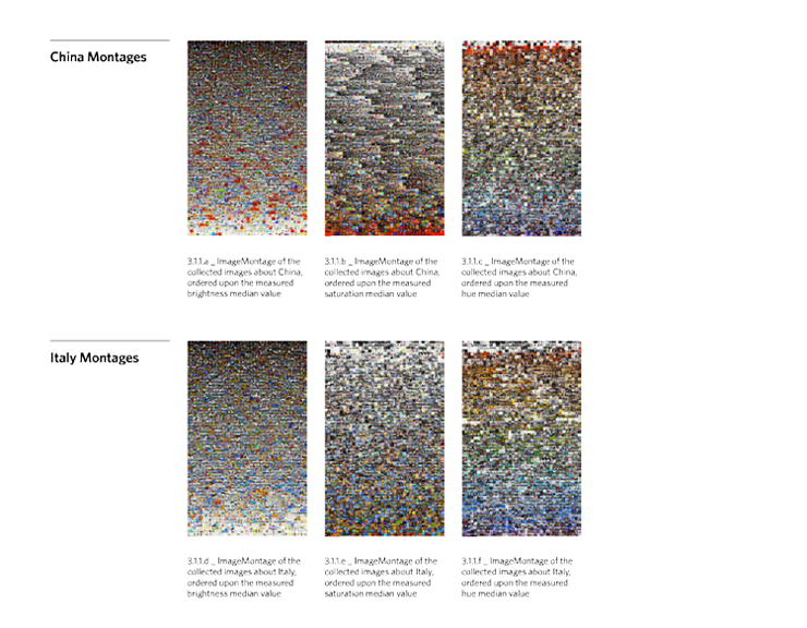
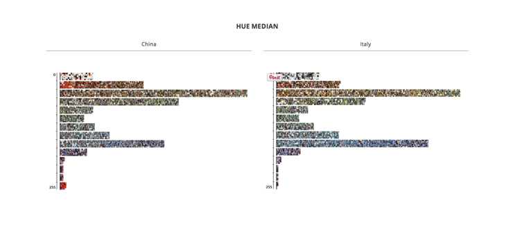
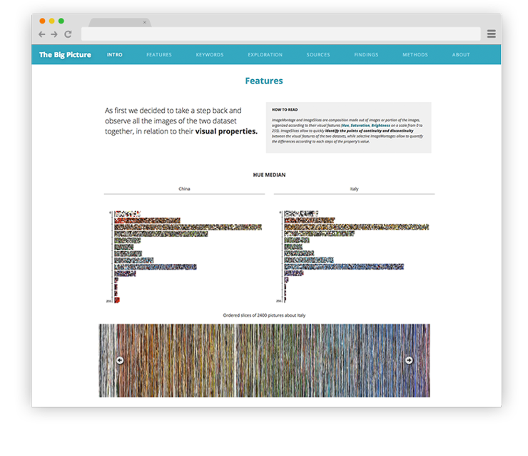
The first intention was to take a step back and compare the images of the two datasets in relation to their visual features. We relied on the Cultural Analytics tools and techniques developed by the Software Studies Initiative at the University of California, San Diego. By exploring large image sets in relation to multiple visual dimensions and using high resolution visualisations, the Cultural Analytics approach allows us to detect patterns which are not visible with standard interfaces for media viewing. In contrast with standard media visualisations which represent data as points, lines, and other graphical primitives, Cultural Analytics visualisations show all the images in a composition.
These representations allow us to identify easily the points of continuity and discontinuity between the visual features of the two data sets, while selective ImageMontages quantify the differences according to each step of the value. As we can see from the visualisations, each nation has a specific Local Colour: visual attributes and dominant tones, which relate to specific cultural territories.
A specific visual model was then developed to visualise the categories and its subcategories. It shows the main category as the central bubble around which the sub-keywords are disposed in circles for the identification of relevant issues. Each image is tagged with one or more keywords/sub-keywords, and the dimension of each bubble is proportional to the number of images tagged with a keyword or sub-keyword.
In order to compare the relevance of each keyword to each of the sources, we made a series of bar charts. Each one represents the profile of a single source. In this way we could easily contrast the different “vocations” of the sources by highlighting the space given to each topic.
The Website
The conclusion of our experimental project has been the creation and development of the website http://thebigpictu.re where the main visualisations have been collected. In the process of creating this interface our focus has remained on the same idea from which this project originated: to increase awareness of the way we see and the way we are seen by a culture radically different from our own. This was done by making a tool which makes the topic comprehensible to outsiders, without the need for simplification, as well as to specialists in the field.
From a data visualisation point of view, the biggest challenge was to find an appropriate structure: simplified enough to show the big picture emerging from the data and detailed enough to preserve all the interesting details in the data. We acted on this in two ways: first, we decided to set up the narration consistently on a comparative level; and second, to give the user a tool for a multifaceted exploration of data. Keeping the visualisation and the storytelling on a comparative level helped to keep the exploration clean and structured, which also enabled us to explain each level of the research.
The narrative leads the user into a more in depth engagement with the data where own hypotheses can be formulated and tested. To make this possible we realized the exploration tool, a personal instrument for navigating the data set. It aims to enrich current interfaces with additional visual cues about the relative weights of metadata values, as well as how that weight differs from the global metadata distribution.
To conclude, we can say that the work allows the user not only to explore all the singular elements of the database but also to focus on the database as a whole. We hope that this work will provide insight into the big picture for the general reader while offering the specialist a practical tool to test hypotheses and intuitions. As the title states, the overall purpose and outcome is to show a big picture including all the facets that make it unique.
Full Thesis
For any comment or suggestion please feel free to contact me at giuliofagiolini@gmail.com or the DensityDesign Lab. at info@densitydesign.org.


[…] The Big Picture | Density Design […]
September 6th, 2014 at 3:39 pm[…] The Big Picture | Density Design […]
September 8th, 2014 at 6:49 am[…] (Via Density Design) […]
September 12th, 2014 at 10:37 am[…] this week’s selected projects:The Big Picture | Giulio Fagiolini(image: Giulio Fagiolini)(Via Density Design)#NFL on Twitter | Twitter(image: Twitter)Who will control the Minnesota House of Representatives? | […]
September 18th, 2014 at 2:13 pm[…] (Via Density Design) […]
January 13th, 2015 at 12:11 pm[…] (Via Density Design) […]
January 23rd, 2015 at 1:40 pm