During the next 6 months I have the honour to be hosted as a visiting researcher at the Parsons Institute for information Mapping in New York.
Among the case studies I’m collecting (here) on spatial visualizations of geo-referenced data, in this post I selected the ones that analyse and depict several dynamics of New York cities.
The following projects are either interactive interfaces or static images, visualizing User Generated Data as well as other data sources able to enlighten some hidden dynamics of the city.
A  pdf of the projects above is downloadable from here , any suggestions on how to integrate this list with other relevant case studies is more than welcome!
–
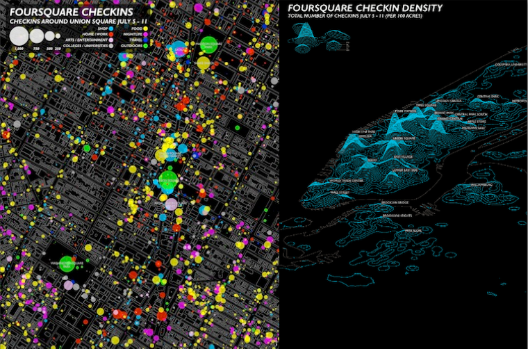
(1) Livehoods
Livehoods reveal how the people and places of a city come together to form the dynamic character of local urban areas. Each dot on the map (â—Ź) represents a check-in location. Groups of nearby dots of the same color form a Livehood. The shapes of Livehoods are determined by the patterns of people that check-in to them. If many of the same people check-in to two nearby locations, then these locations will likely be part of the same Livehood.

–
(2) My Block NYC
MyBlockNYC.com is an interactive mapping website that captures and presents personal video accounts of the life and culture of New York City in order to create an intimate, evolving, and complete portrait of this great city. Users upload videos geographically, building the first fully interactive video map of New York City.

–
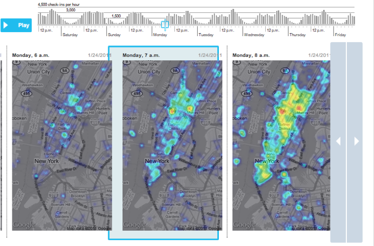
(3) Here Now
This project analyzes two weeks of of checkin data collected from Foursquare and Facebook API to explore what these new ways of communicating can tell us about New York City.
–
(4) A week on Foursquare
Digits collected every check-in on the service for a week earlier this year, via the Foursquare “firehose.” And what did they find?  Broadly: The top individual spots are places like malls, airports and train stations, because so many people filter through those locations. But the top categories are homes, offices, coffee shops and bars, even though each of the individual locations in those categories gets a very small number of check-ins.
–
(5) Flickr geotags
Using Flickr Geotags to Map the World’s Cities. (You’ll also notice a bit of color coding on the maps. Apparently, Fischer was able to guess that the picture taker’s mode of transportation–presumably using the time stamps and distance traveled between a user’s pictures. He then created a color code:Black is walking (less than 7mph), Red is bicycling or equivalent speed (less than 19mph), Blue is motor vehicles on normal roads (less than 43mph); Green is freeways or rapid transit.)
–
(6) A twitter anatomy of a protest
Here’s a visualization of mid and lower Manhattan on MayDay, 2012, plotting the when and where of tweets containing the keywords, MayDay and Occupy (representing a healthy mix of supporters, detractors, and everybody in-between). Â The visual coordination of three dimensions of data: location, time, and topic, provides an up-to-the-second profile of a social event as it forms, moves, and dissipates.

–
(7) Cascades
Cascade allows for precise analysis of the structures which underly sharing activity on the web.
This first-of-its-kind tool links browsing behavior on a site to sharing activity to construct a detailed picture of how information propagates through the social media space. While initially applied to New York Times stories and information, the tool and its underlying logic may be applied to any publisher or brand interested in understanding how its messages are shared.

–
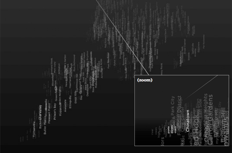
(8) Pastiche
Pastiche is a dynamic data visualization that maps keywords from blog articles to the New York neighborhoods they are written in reference to, geographically positioned in a navigable, spatial view. Keywords are assigned based on relevance and recency, surrounding their corresponding neighborhoods. The result is a dynamically changing description of the city, formed around individual experiences and perspectives
–
(9) Invisible cities
By revealing the social networks present within the urban environment, Invisible Cities describes a new kind of city—a city of the mind. It displays geocoded activity from online services such as Twitter and Flickr, both in real-time and in aggregate. Real-time activity is represented as individual nodes that appear whenever a message or image is posted. Aggregate activity is reflected in the underlying terrain: over time, the landscape warps as data is accrued, creating hills and valleys representing areas with high and low densities of data.

–
(10) Mapping the buzz
The research, presented in late March at the annual meeting of the Association of American Geographers, locates hot spots based on the frequency and draw of cultural happenings: film and television screenings, concerts, fashion shows, gallery and theater openings, through photographs from Getty Images that chronicled flashy parties and smaller affairs on both coasts for a year, beginning in March 2006. The maps show the density of different types of cultural events in New York.

–
(11) Mapping America, every city very block
Browse local data from the Census Bureau’s American Community Survey, which was conducted from 2005 to 2009.

–
(12) NY metro card usage
The Metropolitan Transportation Authority offers several pricing options for subway and bus riders. Here’s a look at where people are swiping different kinds of MetroCards, and how recent fare hikes affected their use

–
(13) Stop Question and Frisks NYC
NYtimes interactive visualization. New York City’s police force, in its fight against crime, has increasingly used a strategy known as “stop, question and frisk,” which allows officers to stop someone based on a reasonable suspicion of crime. One expert has estimated New Yorkers are stopped at twice the national rate. The interface let users navigate the number of STOPS for each neighborhood and block

–
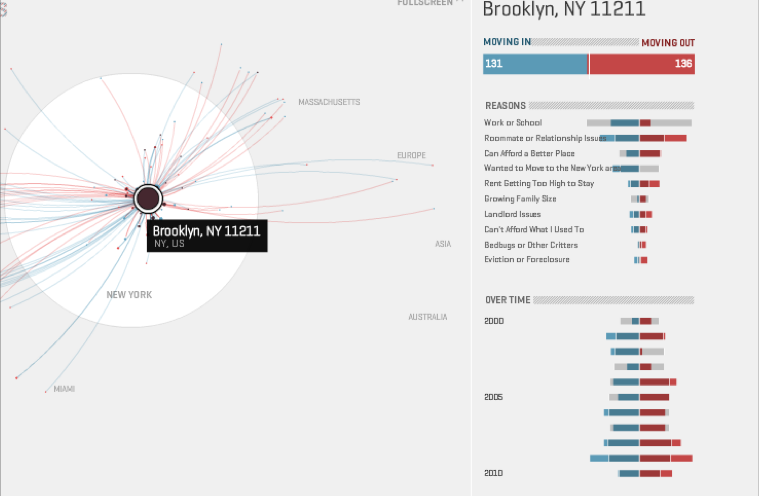
(14) Map your moves
An interactive visual exploration of where New Yorkers moved in the last decade
–
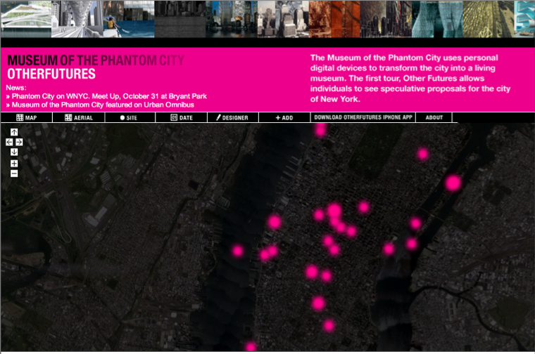
(15) The Museum of the Phantom city
The museum of the phantom city uses personal digital devices to transform the city into a living museum. The first tour, Other Futures, allows individual to see speculative proposals for the city of New York
–
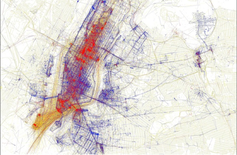
(16) Movements in Mahnattan
Using geolocated tweets to try and see how the movement of people is affected by the urban landscape. Basically, tweets sent by the same person within a 4 hour time-window were used as samples of speed and direction. These samples were used to construct a vector field representing the average flow of people within the area.

–
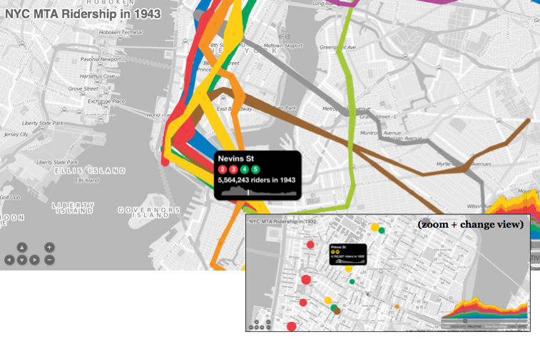
(17) NYC Subway ridership
Interactive time based visualization of NYC MTA riders from 1905 to 2006
–
(18) Lost NYC subways
Lost Subways: Abandoned Stations & Unbuilt Lines. Here’s the current subway map overlaid with eleven subway lines that were planned but never built.

–
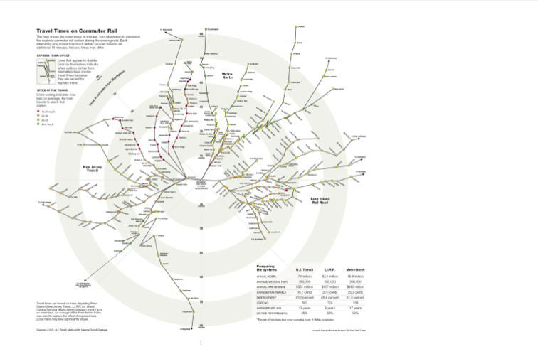
(19) Travel tube map
the map shows the travel times, in minutes, from Manhattan to stations in the region’s commuter rail system dureing evening rush. Each alternating ring shows how much farther you can travel in an additional 15 minutes
–
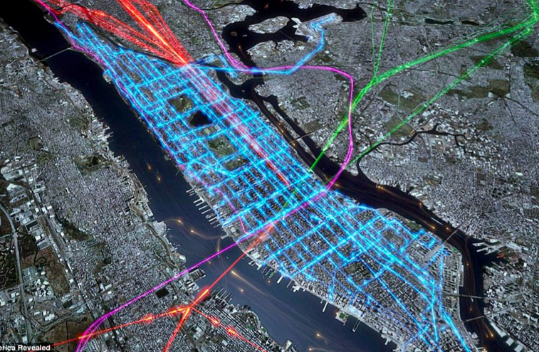
(20) time to work!
New York’s multi-layered morning rush hour detailed by the combined pathways ferries (orange dots), commuter rail services, (green purple and red) and the bus services (blue) that criss-cross the city picking out its famous grid pattern
–
snack time!
(same link as above)Â Â GPS trails reveal the routes taken by cycling pizza delivery riders on one Friday night in Manhattan. Each rider’s shift lasts eight to nine hours, in which time they can deliver between 30 and 40 pizzas all over the city

–
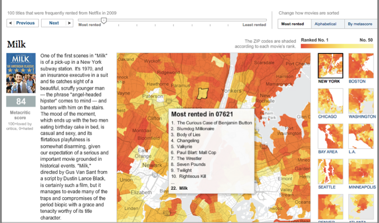
(21) Â A peak into Netflix Queue
Interactive Graphic by NYTimes examines maps of Netflix rental patterns, neighborhood by neighborhood, in a dozen cities across USA
–
During next months I will focus my research on investigating Health and Urban Geography through User Generated Content, and, of course, creating proper visualizations able to depict such relationship:
What is that makes “spaces” become “places” in people’s minds? What is that define a social and collective engagement with places? How can we discover which citizens’ perceptions that are affecting their urban experience and from what observations can we deduce what makes them satisfied? How to build novel urban qualitative indicators through the content that we everyday share on the different social media?
(stay tuned for updates!)
[…] Among the case studies I’m collecting (here) on spatial visualizations of geo-referenced data, I selected the ones that analyse and depict several dynamics of New York cities and I wrote a post on DensityDesign website: https://densitydesign.org/2012/09/visualizing-nyc/ […]
September 6th, 2012 at 3:17 pmHi, I will be moving to NYC soon. I will be Assistant Professor at NYU Poly where we are setting up a Visual Analytics Lab. I would be happy to meet you.
Best,
September 6th, 2012 at 5:32 pmEnrico.
[…] does this well, as does the NYTimes Online. Here are some interesting visualizations of New York, and maps made by local artists/designers Sha Hwang and Eric Fischer. It seems like a […]
October 1st, 2012 at 5:54 am[…] tweeting about it at the same time)Â had on May 2012. A Twitter Anatomy of a Protest, on UXBlog via Density Design […]
February 4th, 2013 at 7:28 am