We are glad to present here the M.Sc Thesis Project of Giulia De Amicis – Master in Communication Design at Politecnico di Milano.
Research and Analysis
This project aims to analyze a complex system such as the urban environment through the observation of the food offer provided by restaurants, according to the type of cuisine, and its specific characteristics. This study is based  on an in-depth Internet analysis of restaurant menus in the city of Milan during the year 2011/2012.
Information gathered in the first step of this analysis on food offer, led to identify key issues in order to recognise means of healthy eating in a growing and international city such as Milan.
The collaboration with a nutrition researcher from IEO (the European Institute of Oncology) was a vital and important asset to establish a thorough and convincing analysis in terms of nutrition and quality of food, ways of cooking and property of the ingredients.
All the informations and observations were shown by a series of thematic tables and infographics that describe through a visual and narrative approach a series of topics ranging from food offer to the geographical distribution of restaurants on the map of the city and the qualities of fish and meat offered every day to customers.
Here’s through Giulia’s words the description of her project.
Results and Visualizations
-The first step of the project concerns the global description of food offer, and answers to various questions such as:
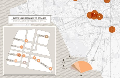
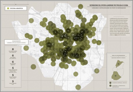
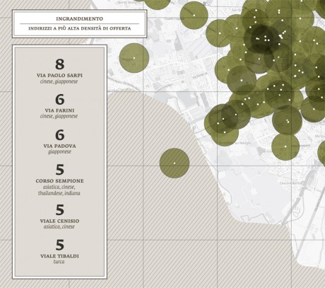
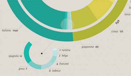
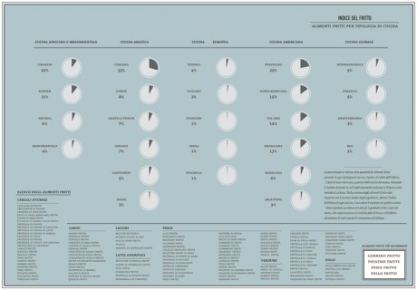
Which different kinds of cuisines are there in Milan? How many Chinese/South American/European/North American restaurants are there? And where are the restaurants located on the city map? Is there a connection between the location of restaurants and specific districts or streets? In the first stages of the project I was able to identify more than 45 different kinds of cuisine, which I then categorized according to their geographical area and country, or culture of origin.


-In a second stage I carried out an accurate analysis of the ingredients of the meals offered by different cuisines.
From the online study of the menus, I was able to create a database of all foods and ingredients, offered in all restaurants per categories. I was this able to compare the food offer in different culinary cultures and traditions and provide an overview of the kind of food most available in the city, in terms of numbers and percentage (e.g. How often does a specific ingredient appear in menus? How many times is it possible to find “tomato” in a Milanese restaurant? Which is the most-offered vegetable/cheese/type of pasta?).
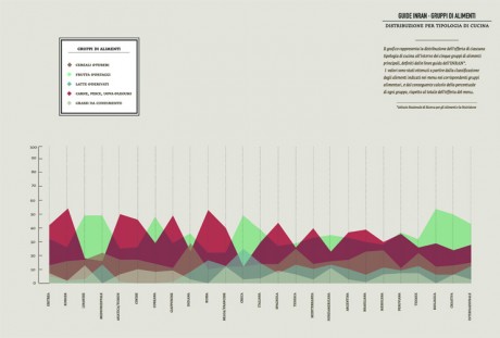
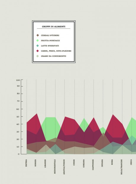
The partition of all the ingredients into alimentary groups (dairy products, meat, fish & legumes, vegetables, condiments & dressings, sweets & sugar), provided a series of hypothesis on the nutritional value of food and reveal many surprising connections and differences between the various categories.
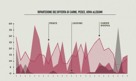
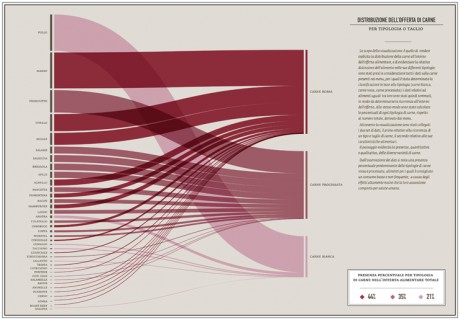
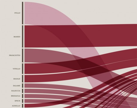
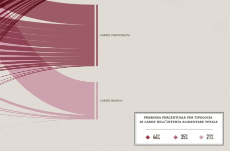
-In order to identify unhealthy behaviors, a specific attention was dedicated to the presence of meat on menus; the visualization made clear that the most offered type of meat (red and processed) is also the most unhealty, as well as responsible of serious illnesses, while the less harmful type  (white meat) has the lowest presence on menus.

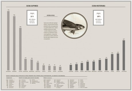
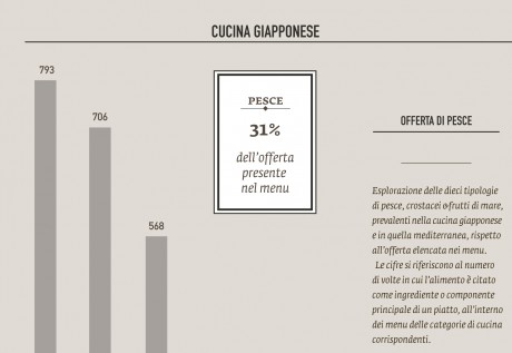
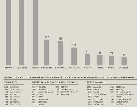
-I undertook the same approach to observe the presence of fish on menus in order to verify the offer of the most common fish sold on the market, and the effects of specific food trends on the consumption of fish (such as the explosion of the sushi-mania in the northen Italy,during the last 10 years).
– The analysis of health trends in the Milanese food offer was detailed and all-encompassing although this project leaves open the possibility of further investigations as this is a complex and composite subject.
The thesis has to be intended as a form of visual-support for nutritional and alimentary researchers, providing, at the same time, the tools for developing additional explorations.
All the data collected during the research was entered into a updatable database that could enhance this field of studies.
[…] Blog Search for: Home → Blog → Minerva – Data visualization to support the interpretation of Kant’s work < […]
August 7th, 2013 at 11:17 pm