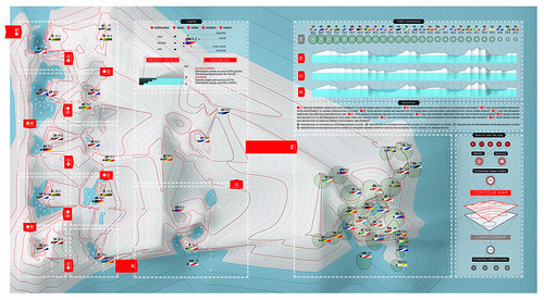
This is a map of Europe as you’ve never seen it. It shows how people in the 27 EU states perceive the impact of the internet and mobile phones on their lives – and then contrasts this with their actual penetration in each country. We wanted to explore new ways to visualize such complex data. So we worked with a statistics team, under Marco Fattore, to crunch data from a 2008 Eurobarometer survey of 27,000 people. The result is this contour map, which makes use of the isobars of traditional cartography. Each panel above refers to a specific question in the survey. The higher a country, the more its citizens say the technology matters. The cartogram shows the tech’s actual penetration. A high penetration of technology doesn’t mean people see a real benefit in using it, the way we see the world is changing as more data is available. We wanted to show a new way to look at geography as Europe’s landscape gets reshaped.
THE EUROBAROMETER SURVEY LAST SEPTEMBER ASKED 27,000 EUROPEANS THESE QUESTIONS: (Numbers relate to the panels on the main map):
1 Has the internet improved how you do your job?
2 Has using a mobile phone helped in your work?
3 Has the internet made you more informed about current issues?
4 Has using a mobile phone helped you to be more informed?
5 Has the internet improved your opportunity to share views/access culture?
6 Have mobile phones helped you to share ideas and content such as photos with others?
7 Has the internet improved how you pursue your hobbies?
8 Have mobile phones helped you better manage your leisure time?
9 Has the internet improved your relationships with family and friends?
10 Have mobile phones helped you keep in contact with family and friends?
“Penetration” is calculated from the percentages of households and businesses with broadband access; and the percentage of households with access to the internet via PC, digital TV and mobile device.
Credits
Paolo Ciuccarelli (Scientific Responsible)
Marco Fattore (Assistant Professor, Faculty of Statistics – data analysis)
Donato Ricci (creative direction Project Coordination)
Michele Mauri, Giorgio Caviglia (coding)
Luca Masud (art direction)
Lorenzo Fernandez, Mario Porpora (designer)
[…] http://www.densitydesign.org/2010/02/22/a-new-map-of-europe-wire… […]
February 22nd, 2010 at 1:18 pm[…] Leave a Comment » via densitydesign.org […]
February 26th, 2010 at 8:26 pm[…] Credit: Density Design […]
April 8th, 2010 at 8:14 am